Why Things Might be Different
Market Update: Take a look at the divergence taking place between BTC and ETH


Felling wedge.
An unfamiliar item for city dwellers.
At first glance, the pedestrian appearance of a felling wedge looks like a giant doorstop. It can be made from hard plastic and comes in absurdly bright colors like yellow or orange.
This paperweight-like object is a quintessential tool for lumberjacks. For them, as the American Express advertising slogan goes: Don’t leave home with it.
Reason being is strategy.
When out in the woods alone with an ax or gnarly toothed chainsaw in tow, chances are you want to minimize the possibility a tree falls in the wrong direction.
This is where the felling wedge comes in.
It dictates the direction a tree falls to help avoid taking another tree down with it or perhaps your own home - the lumberjack’s version of getting liquidated.
After making a shallow incision in the tree’s base, the felling wedge is tapped into the trunk. This wedge is what helps prevent the tree from falling into your primary entry point.
But in other ways, this wedge is only one tool of many that complete the job. A successful cut means taking into account the slope of the land, wind direction, health of the tree, follow up cuts, and more.
The combination of tools and experience is what helps determine the direction of that fall. And when it comes to the market, the same thing applies more so now than in the prior nine months.
There is no single metric or chart that can tell us where the market will be tomorrow.
So instead of acting like we only need one tool, let’s keep building on our prior two market updates, lean on some the charts introduced in those updates, and bring a few new charts into the mix… All to help aid us in determining the direction of the market over the next week.
Let’s start hacking…
Rewind
In our July 8th market update “The Market is Changing” we dropped a liquidity map discussing the pools formed around the $25-26,000 price range for bitcoin. We did this because our research suggested the market was shifting.
In the months prior, price never swept liquidity to the upside. But with firms and lending platforms Three Arrows Capital, Celsius, and Voyager entering formal legal hearings, the forced selling slowed. The data confirmed it as well.
And with this slow down in forced selling, price began to seek out liquidity to the upside. Meaning the market was getting ready to hunt pools of liquidity formed from shorts.
Here was the chart we shared nearly two weeks ago, where you can see price beginning its march towards the pools at and above $25k.
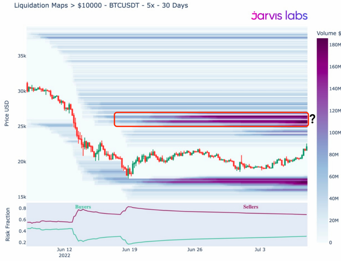
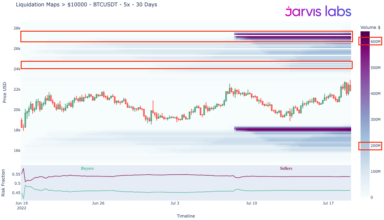
We still sit below this pool… Now before you wonder where those dark purple bands sit today, take note of the volume legend on the right-hand side. In the chart above dark purple reflects $160-180 million in volume. In the chart, below, that same color represent about $600 million in volume.
The market activity over the last week is substantially higher than before. It’s as if somebody turned the lights back on around noon UTC on July 8th - any guesses?
These two charts were both focused on bitcoin. And while we quite haven’t seen the sweeps we want to toward the upside for bitcoin, we have witnessed them taking place with ETH the past few days.
Take a look at the liquidity map below.
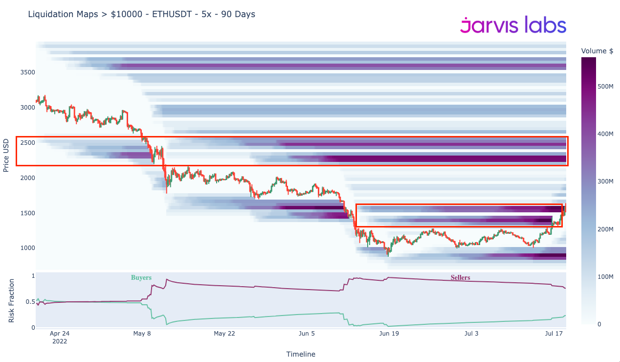
The sweep over the last few days helped spur about $150 million in shorts being liquidated during a four hour stretch on July 16th according to Coinglass.com. More followed on the July 18th move higher as well.
As a quick aside… It is important to note that all liquidity pool models like ours is heavily steeped with assumptions. Liquidity pools like the ones you just looked at are never 100% accurate. It’s mainly for discretionary knowledge and to give color on price movements, which is why we use them for Espresso. The manner in which we use these for our Software-as-a-Service autonomous Jarvis AI trade system is a bit different and outside the scope of today’s essay… Perhaps we can expand on that at a later date. But for now, I’d like to make that clarification before readers get too attached to these visuals… Now getting back to our market update.
The change in price action sweeping upside pools is the change we were anticipating. It is good to see it unfold as it indicates the market is moving away from a forced selling environment, and towards a more normal cadence as we outlined in the July 14th market update, “The Missing Bucket”. The market’s vibe as we call it.
In that update we stressed this shift unfolding. But we also mentioned there was a piece missing. A catalyst.
And while Michael Saylor is apparently buying more bitcoin as I write this essay, that really isn’t the catalyst we were anticipating. Instead we really wanted to see solid accumulation by large entities over time. But perhaps Saylor is the first of more to come.
So while we haven’t really seen this accumulation unfold in bitcoin… when it comes to Ethereum, we are getting mixed messages.
Digging Deeper
Bitcoin is a bit of a Debbie Downer. For those that don’t know Debbie can suck out any bullish hopium that exists in a room.
In the two charts below, you’ll see what I mean because as of now, bitcoin isn’t giving us much to get excited about.
The first chart is BTC divergence. It lets us know what type of wallet persona is buying at various price levels. We want red and orange. These colors both indicate whales are buying, while red indicates small wallets are also joining in on the action.
As you can see, there hasn’t been much of those two colors lately - red box below. Red and orange tend to present themselves before significant legs higher - white boxes.
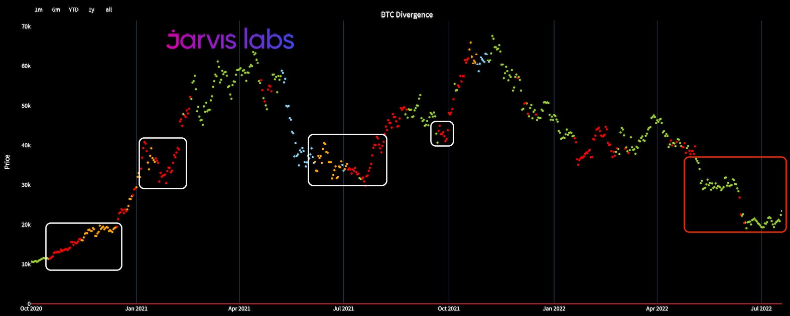
The other chart is the change in large wallet holdings overtime. We still see larger entities not stepping up on the buy side as of yet. We want to see this pattern of colored dots begin moving up and to the right. If we get it, then that’ll be a positive sign that any rally could have significant momentum behind it.
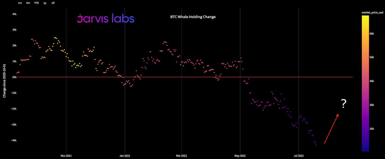
And because of what these two metrics indicate, along with a few others, it is hard to get too excited about a rally extending beyond the liquidity that sits around $28,000. Doing so would bring BTC into its May trading range. And while overcoming that price level would be great, right now it’s hard to imagine it. For now the lower band at $25k seems most likely.
Now, where things get a bit odd is Ethereum. Let’s pull up its red and orange colored divergence chart to see the difference between it and BTC.
The chart below showcases prior areas of red, which indicate both whales and smaller wallets buying. There are a couple of false signal periods as noted with a “X”.
The red box below is what we see today, and it’s littered with red dots, which is showcasing good buying behavior.
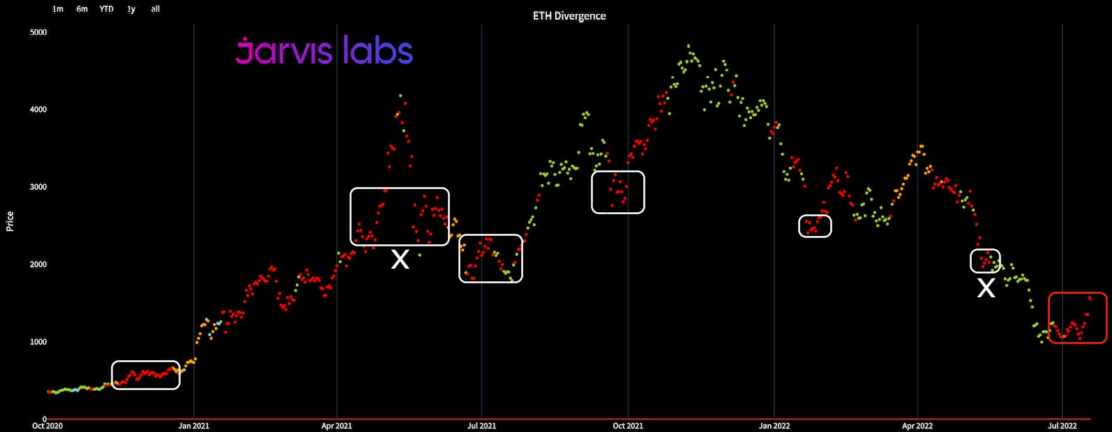
So while not every occurrence of whale and retail buying ETH translates to stronger overarching trends, we shouldn’t discredit it. There is some signal in it.
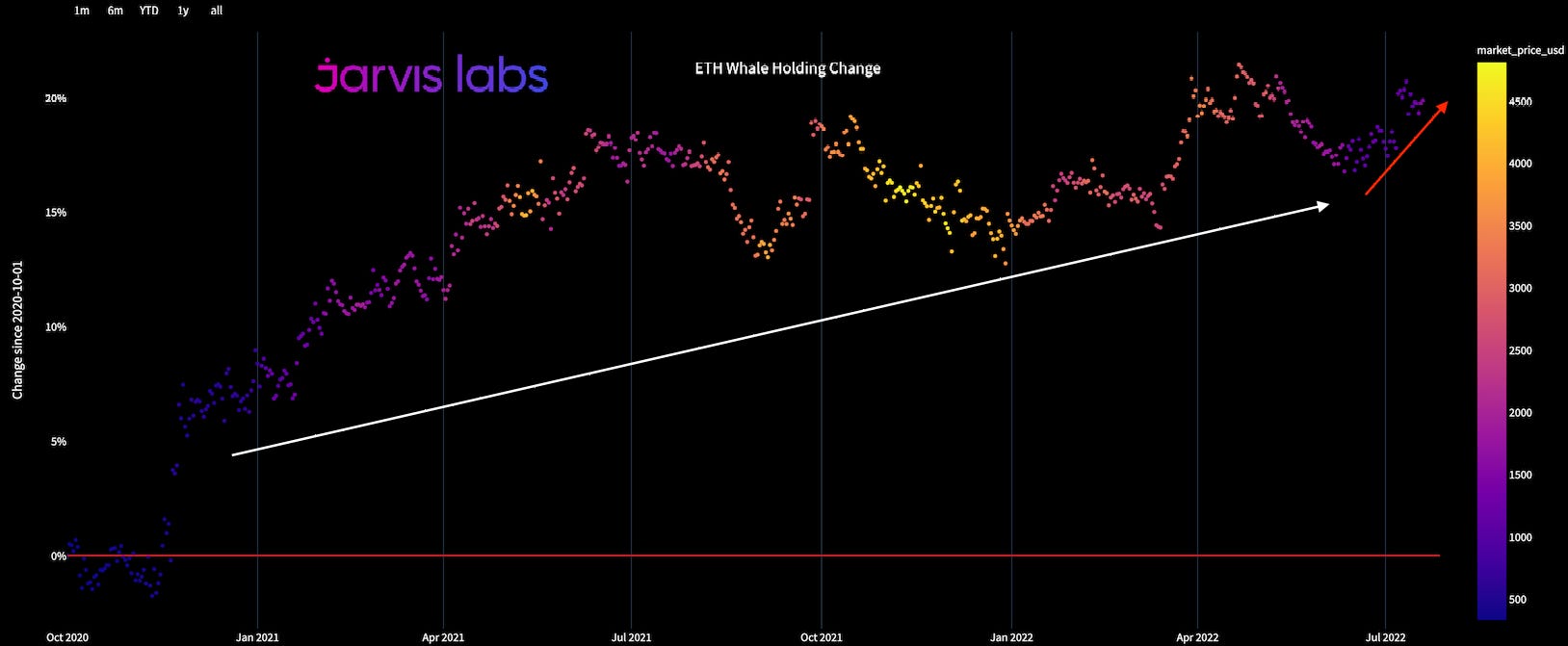
In fact, when we bring up the change over time of whale holdings for ETH, the picture gets more interesting. The chart below suggests since October 2020 whale holdings have been rising… And what’s more, this trend is accelerating.
Again, the color of the dots denote price level. Purple/Blue is $500-$1500. Yellow is $4000+. When the dots rise higher, this suggests accumulation.
This mixed signal between what we see in bitcoin and ether is a very interesting dynamic unfolding. Yes, Ethereum has a large catalyst coming up as it transitions from Proof-of-Work to Proof-of-Stake. There are many benefits to this upgrade and perhaps this is the catalyst we are looking for.
But for now, we want to spend some more time diving into the data. And instead of throwing away our metrics that indicate when things get overheated and believing this time is different, let’s instead be cautious.
Yes, ETH is possibly setting up for something unique in the market. But here’s what I’d like to see before getting too excited...
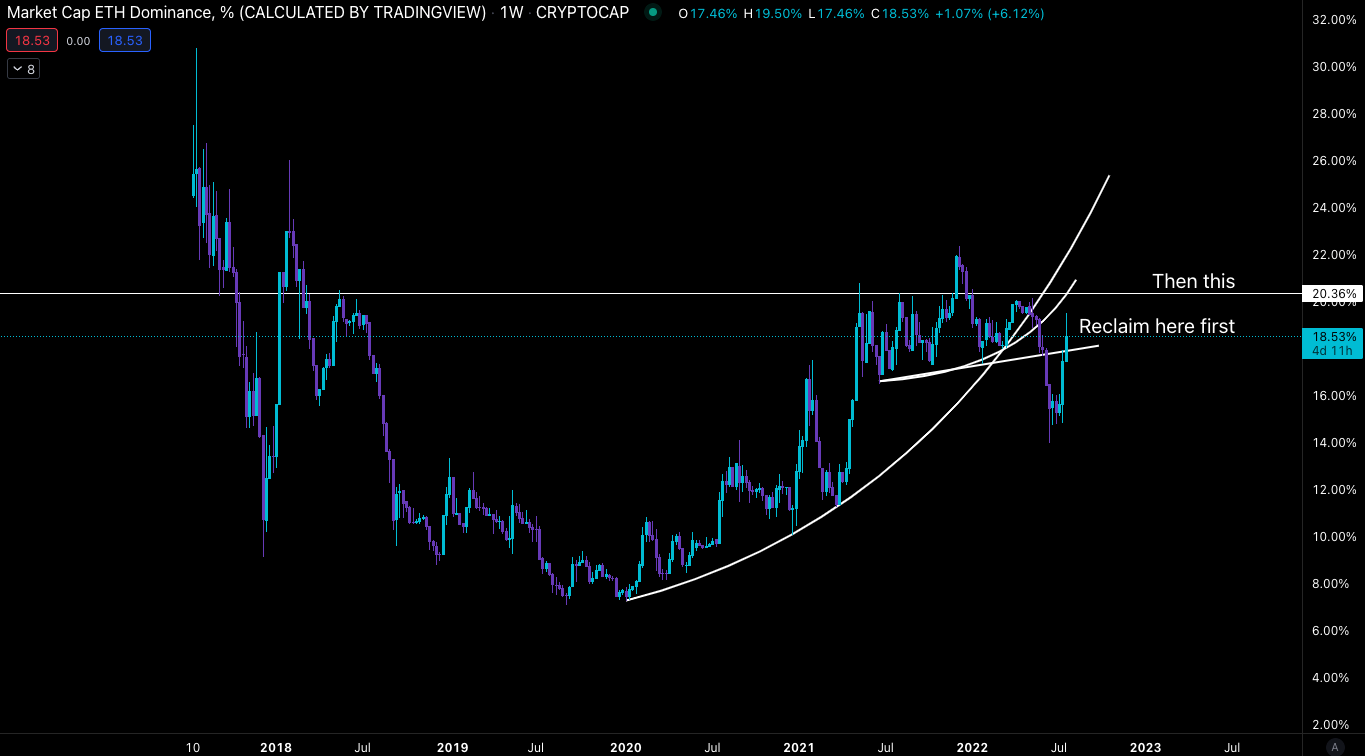
When it comes to ETH’s percent of the total crypto market cap, it failed two parabolas when forced selling unfolded. It now needs to reclaim a few areas (18% and 20.4%) before we can entertain “this time is different” narratives.
Until then, there are a few charts we can focus on. We will introduce them next week. But for now, we can look at one specifically. It gives us a glimpse of how the market looks in terms of gains over the last 15 days.
The chart below shows the percentage of coins with returns more than 30% over the last 15 days. As you can see, it does a great job with helping time profit taking. The current value suggests a bit more than 50% of tokens tracked by this metric have returns over 30% over the last 15 days.
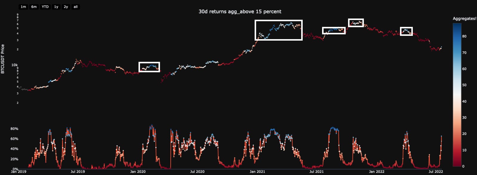
I introduce this chart to suggest that after these liquidity sweeps to the upside finish up, profit taking is suggested in the likely event we later test liquidity to the downside.
It is a bit too early to think we will simply start trending towards new highs just yet, even if Ethereum somehow decides that this time is in fact different.
Thanks for tuning in, until next time.
Your Pulse on Crypto,
Ben Lilly


