Where to Plunge
Market Update and a Jackson Hole Handbook

Mr. Arthur Hayes is on the phone…
That’s what a teammate said a few nights ago after reading Arthur’s latest issue.
The five to six individuals that contribute to Espresso, we meet one to two times per week. Typically the first call of the week is to simply discuss everybody’s take on the market. It can feel a bit stream of conscious to any newcomer as we are throwing anything and everything on the table.
It doesn’t matter if it’s right or wrong, we try to debate the merits of each market take.
By the end we tend to all somewhat agree on several points. These center on what factors are influencing the market, what needs to happen, and some possible scenarios that could unfold in the next week.
My main job for the group is to find the central theme of the conversation and patch it together into a semi-coherent market update.
What’s interesting is for the past month or so, it seems like half the time Arthur Hayes writes an essay on a topic we discuss on the call.
His most recent piece on how the quantity of dollars, not the price or rate of borrowing dollars, was driving markets was no different. Which is why a teammate joked that Hayes must be listening in on our calls.
But just like every piece he’s written, he does it best. Not to mention, he goes into things we hadn’t even considered. Often times when something takes place in the crypto market or I find myself wanting to source opinions, he’s the top name I hope covers it.
Anyways, the reason I bring this all up is that his recent essay helped spark a thought that I went ahead and followed. It brought me down into the various tools the FED is currently using to inject liquidity into the market in a somewhat under the radar manner. As well as the consequences of this liquidity injection.
Reason being, this is the primary tool being used to navigate the economy between a rock, a hard place, and what feels like a minefield of alternatives.
As you’ll see in a bit, the FED’s job quite literally be impossible. Not to mention, they are running out of time. This is the thesis I attempt to lay out in the text that follows… And essentially set the scene for the Jackson Hole speech.
In doing so, I hope we can better understand what direction the FED is going and what it means for crypto markets as time starts to run out.
But first, let’s do a crypto market update. It will be very quick and straight to the point here because we have a lot to cover. The update will act more like a follow up to last week’s “Bubbling Madness”.
Market Update
Getting to it, we have not seen whale buying show up with any consistency.
The ETH and BTC divergence charts are what we will look at to see whether whales are buying and / or if smaller wallets are buying. We always want to see red or orange to indicate larger trend setters (whales) are buying.
Instead, we got blue, indicating neither whales nor smaller retail wallets are buying.
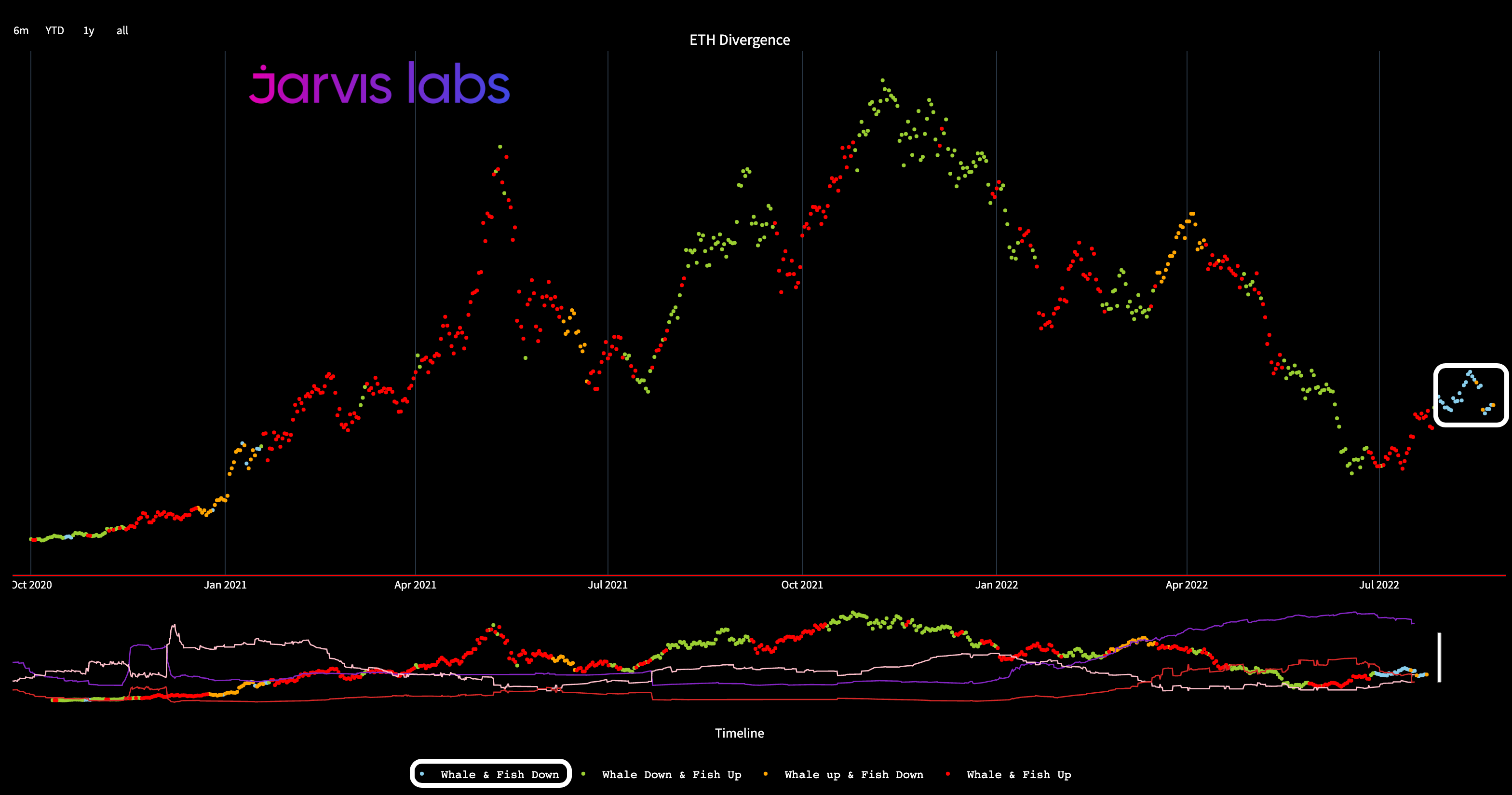
We did get red dots for the BTC divergence chart over the last two days. But I’d want to see at least a week to ten days of that activity before giving much credence to it. So for now, we will imply the market is on leaning towards the weaker side.
This forces our attention to the downside.
Two weeks ago we had our eyes honed in on the $1600 area for where price was likely to test. We got that only a few days after bringing it up, and price pierced into that liquidity pool. Here was the chart from ten days ago. Price was like magnet.
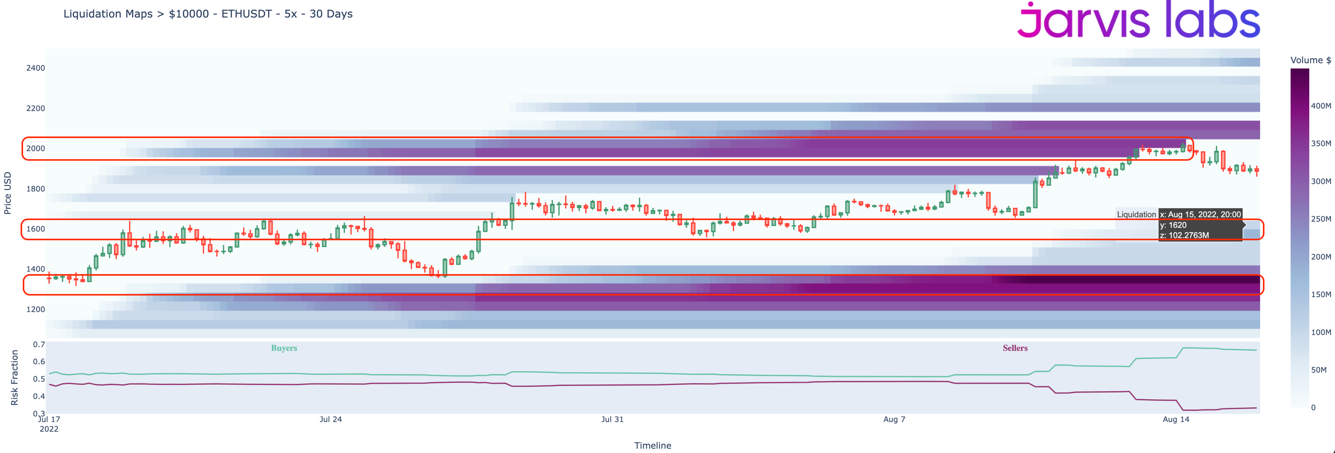
Below is the current version of the chart… Note: the color changes of the band are normal because the “Volume” legend on the right changes as well. The reason some of the purple bands in the above image changed to blue in the image below is because more liquidity has appeared at each $45 increment.
The biggest purple bands below the current price in the image below sit from $1400 to $1350.
Now, one reason in part to the lack of activity onchain - forcing us to look to liquidity to the downside - is that backwardation on ETH futures contracts have yet to subside.
We wrote about the backwardation in “Unknown Unknowns” - an essay where we touched on the popular position of: buy spot, short futures trade. This lets traders benefit from a second token being dropped without realizing a loss if ETH’s price were to drop. This popular trade led to backwardation in the futures market.
What we also hit on in that essay was that the accumulation trend we realized in July was sure to slow down due to the trade being saturated. Since then, accumulation nor whale buying has returned.
If December or futures contracts a month or two later were to once again rise above ETH’s current spot price - no longer in backwardation - there might be a case for spot buying activity to resume simply due to this trade.
For now, backwardation persists… And since ETH was driving the market for most of July, it is hard to get too excited for any upside prices.
For our team, we still have two other catalysts remaining on the table for spot buying to resume. The first is the Merge narrative around a potential second token…
With such strong and somewhat emotional discourse around censorship on ETH in light of Tornado Cash getting sanctioned by the U.S. government, there is lots of scrutiny around Ethereum as a Proof-of-Stake blockchain. Many state the architecture creates the ability for more censorship than if Ethereum stayed as Proof-of-Work.
I’m not here to discuss the merits of this heated topic, just merely pointing out that this is one example of a narrative that could emerge for a second token centered around PoW.
Now, one push back I hear on this is in regards to Ethereum Classic (ETC). Many state an alternative already exists, so a second coin is not needed.
To put that rational to rest… ETC’s top 10 holders have 34% of the supply. For ETH… that number is 23%, and those addresses are mostly ETH2 deposit address, wrapped ETH, CEXs, and bridges. To state plainly, the distribution of tokens is better if a second token emerges at the Merge… versus ETC somehow trying to gain a reason for existence.
So, getting back to the narrative… if a strong narrative does emerge as we approach The Merge, and that narrative coincides with whale buying or higher price… then expect that trend to gain momentum.
As far as the second catalyst… This is the one I’d like to spend a lot more attention on today, and that second catalyst is The Godfather of markets… Commander and Chief of Brrr… The Don of Banks… U.S. Federal Reserve Chairman Jerome Powell.
(Psst, be sure to subscribe to receive continued market drama commentary before continuing on.)
Jackson Hole
Getting back to what Mr. Hayes wrote about in his previous issue titled, “Teach Me Daddy”…
He discussed how the amount of dollars matters much more than the price of those dollars. To frame this in a different way…
If five people are in a room buying 10 NFTs, and each have $100… The market will find a price for those NFTs. And that price is somewhat constrained by the number of dollars in the room.
Inject more dollars into that room, and the price of NFTs go up.
This sort of cause and effect is very immediate.
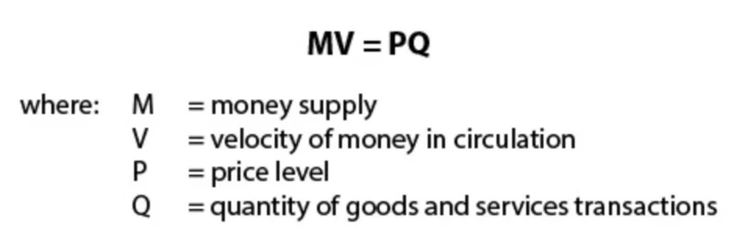
For readers of “Restoring Trust”, you might remember similar inflation talk. In the essay we dove into P = (MV)/Q.
Don’t worry, we won’t get all academic again on you. Just bringing it back up in case you recall…
Anyways, the M variable stands for the number / quantity of dollars, and as that value goes up while everything else remains unchanged, the price (P) of ‘stuff’ goes up.
Numba go up.
The quantity of dollars stands in constrast to the cost of money.
The cost of money explanation is a bit different as it tends to touch on productivity. As in, you borrow money to make more… And the more expensive money is, the more one needs to make. Otherwise, how will you even repay that original loan? For those sitting in that room buying and selling NFTs, this loan might go towards building a trading platform to facilitate the trades… Or perhaps design an accessory item to sell for the NFT holders.
Which is why for today’s breakdown into Hayes’ discussion on FED liquidity, we can somewhat table the cost of money discussion for a later date. And instead, simply go step by step on the “M” part or quantity of money, and how it impacts asset prices.
OK, with that out of the way, let’s bring up that FED liquidity chart. For those that did not ready Hayes’ article, he showcased a chart that acts as a gauge for the quantity of money in the market that is attributed to the FED.
But instead of showing it all at once, let’s go step by step. This way we can better understand WHY it acts as market liquidity… And also WHY the FED is truly stuck.
To start off, here is the U.S. Federal Reserve balance sheet in green compared to the SPX in white. This green line is essentially the top line of FED liquidity, and broadly speaking it influences asset prices.
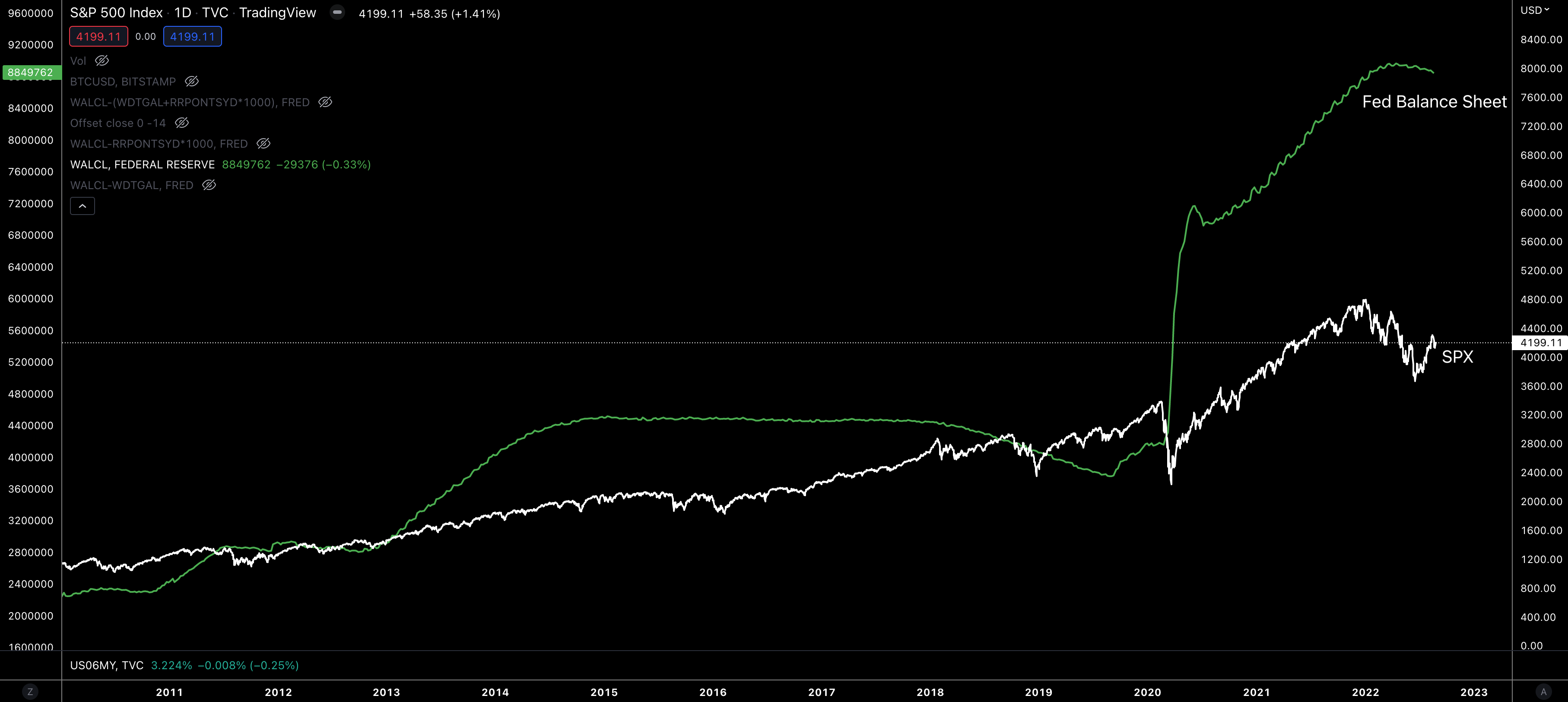
Digging into this balance sheet some more, we see some of it is actually the U.S. Treasury’s account. So as the Treasury issues more debt via U.S. Treasuries into the market with various durations from one month to 30 years, this account rises.
We can view it as a savings account that can then be used to fund expenses or legislative bills (such as the “fight inflation bill”) in order to boost economic output - theoretically.
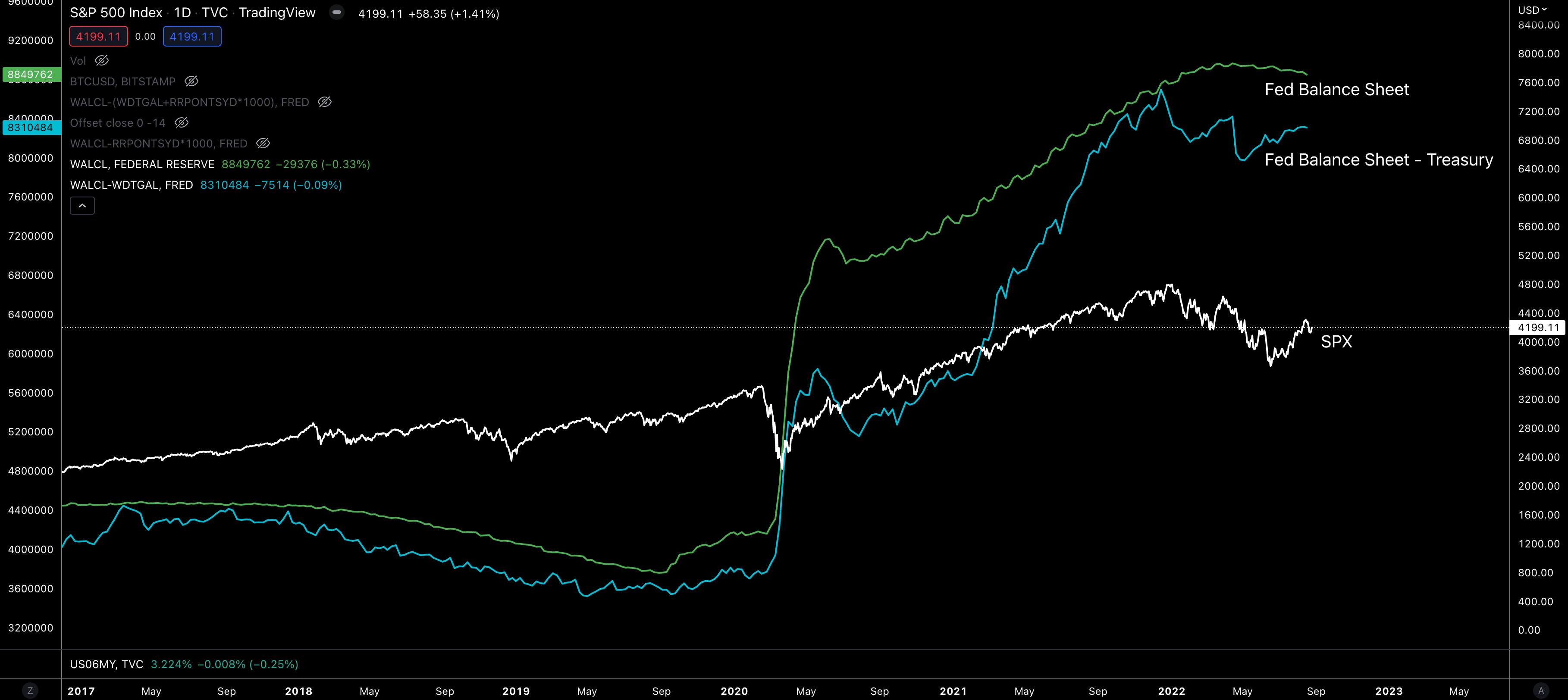
Anyways, the blue line below is the FED’s balance sheet minus this slush fund. You can think of the U.S. Treasury’s savings account total as the area in between the green and the blue - to think of it another way.
Next up is a more opaque part of finance. It’s the Reverse Repo (RRP) market. This is where very large banks can access the most pristine collateral in the market overnight.
If you are a large institution with $100 billion in cash and access to the RRP, you can get a little yield by parking the cash with the FED in exchange for pristine collateral like US Treasuries.
The area between the green and the yellow line is the total amount in RRP - to think of it differently.
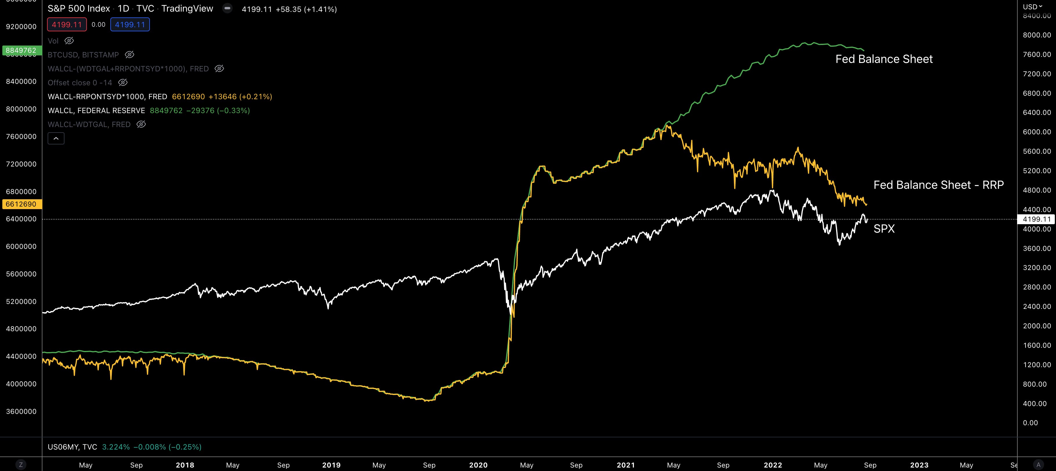
When you take the FED’s balance sheet and then subtract away the Treasury’s savings account and the capital held in RRP, you are essentially left with a “net” of the FED’s balance sheet.
Here’s what the final line looks like…
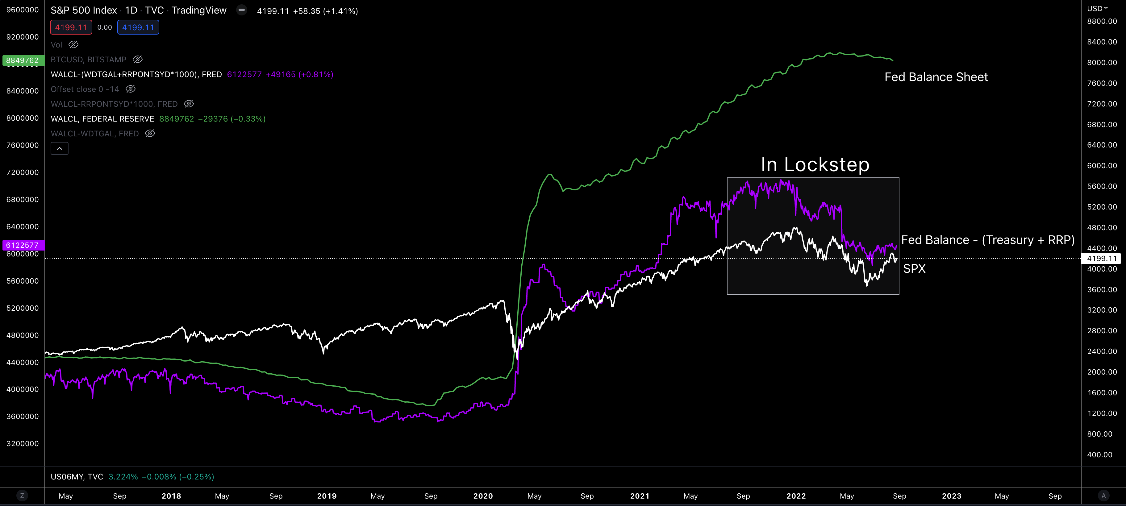
Pretty neat.
But I don’t want to stop there. Let’s keep pushing a little further. Because in doing so, you will better understand the battle the FED is fighting and why the Jackson Hole event is so important as Jerome takes the stand.
To motivate you just a little bit more through the dryness of this FED topic, let’s quickly get some Twitter relief. The tweet below is from Nick Timiraos. He tends to be what people allude to as the Federal Reserve’s media leak. They use him to prep markets on what the FED is likely to do.
He mentions Jackson Hole is an opportunity to do something more than just provide guidance for September… but isntead to lay out a grander strategy for the next 6, 12, or even 18 months.
"This doesn't seem like the forum for providing spot guidance for the next meeting. It's a bigger stage than that," says @NickTimiraos on Jackson Hole. "It feels like an opportunity to do something broader than just provide guidance for what they're going to do in 3-4 week."
— CNBCOvertime (@CNBCOvertime) 8:52 PM ∙ Aug 24, 2022
Which is a smoke signal that we might need to pay attention here.
OK, with that relief let’s get ready to really dig deep into this Net Liquidity aspect.
First question to address is how does this Treasury account and RRP balance lead to more money entering the financial markets… Or said differently, how do these things lead to a larger quantity of money in the markets - to come back to our earlier discussion.
To start off, only some of the largest institutions can access the service window at the FED’s RRP (among other select insiders).
For the rest that have cash on the books that need to scrap together some yield, they are forced to find the next best thing… Short-term treasuries (USTs).
The best of the bunch tends to be one month treasuries. Why? Nobody wants to hold long-term debt in a rising rate environment. If you can free up cash to get higher yield next month, that is ideal. This is why longer dated treasuries tend to not rise as rates rise.
OK, so the cash that isn’t privileged enough to make its way through the RRP window… It goes hunting for the next best thing. This relationship is important to understand.
To drive it home a bit more on this preliminary point, let’s see look at an interplay between the amount of capital in RPP, the rate at RPP, and 1mo USTs.
In the chart below we can see in the bottom portion a purplish line. That is the yield on 1mo USTs. The green line it converges with in the subplot is the RRP rate. When these two lines converge, capital began to flow into RRP. And shortly after once the green line ticked up, cash began flowing in full force into the FED’s windows as banks eagerly wanted the safest yield they could find. The FED was eager to mop up some of this excess liquidity as well.
Then in Q1 and Q2 of this year, we saw the next wave of capital flow into RRP as the RRP rate rose above those 1mo UST yields.
This is important to note because 1mo USTs were headed negative. And to avoid this, the FED stepped in and soaked nearly a trillion dollars worth of demand. This reduction in demand helped the 1mo UST rate to rise. You can see this in “Hikes” below.
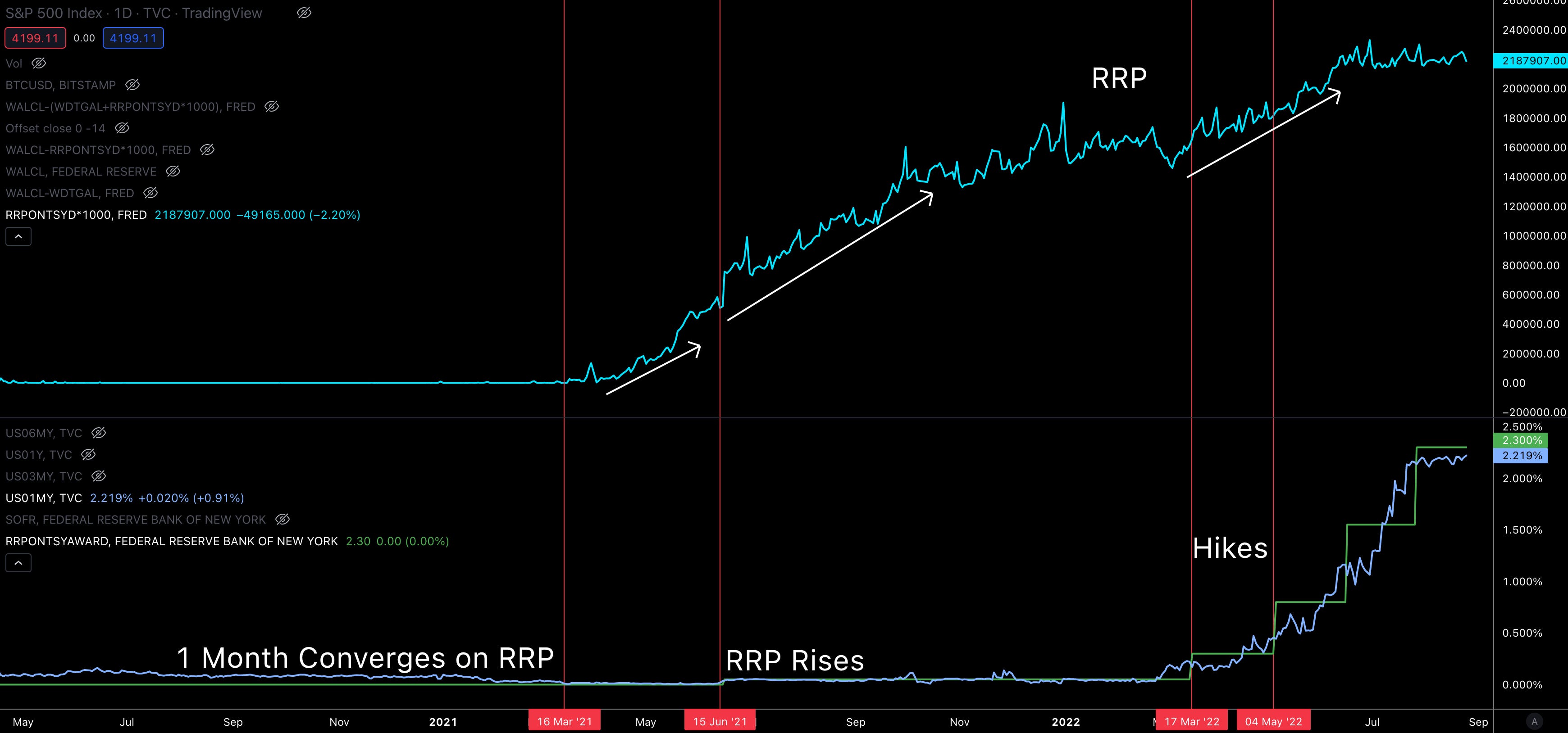
But this absorption of demand didn’t persist forever. Notice in the chart above the last two hikes that brought the green line or RRP rate above the purple line or 1mo USTs…
It currently is sitting below the RRP rate (light blue line) and not budging.
And it’s not like there is a shortage of cash for RRP to soak up. Commercial banks hold $3.5Tr. Which indicates the FED is likely turning down bankers at the window.
Why is that the case?
The rejection at the window means cash that is looking for a home starts a domino effect.
The cash seeking a new home then turns to 1mo USTs. Not as ideal as RRP, but still great.
This uptick in demand for USTs drives yields down once more - now below the “floor rate” of RRP.
If the FED was not turning down bankers, then 1mo USTs would not be sitting so low in comparison.
You can see this dynamic playing out below. I highlighted the instances where 1mo UST yields were below RRP rates.
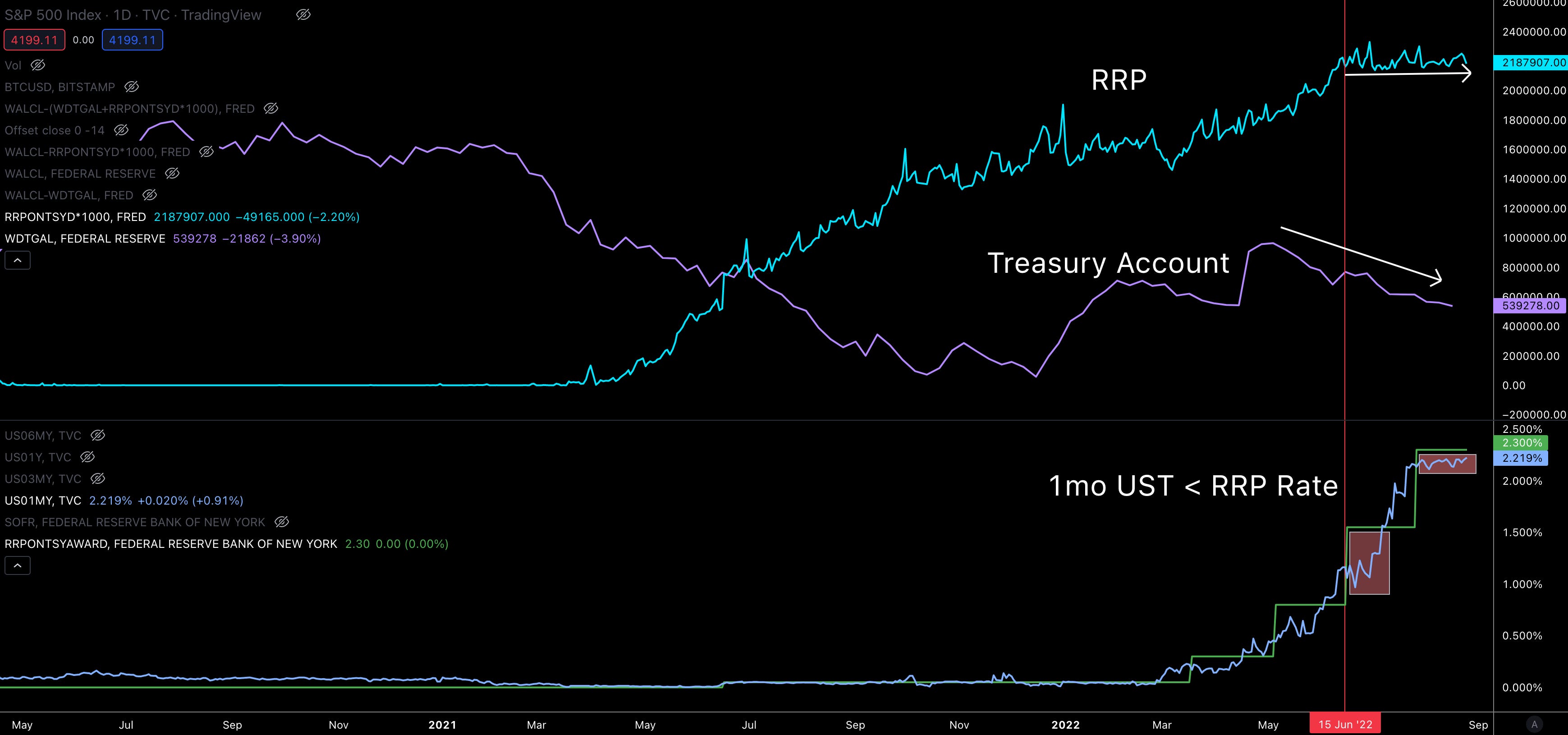
The market dislocation creates a bit of a cascade effect for cash.
Cash that can no longer use RRP needs to find the next best thing… Sending it down the risk curve.
Some of the cash that was buying 1mo USTs in turn may seek out similar rated corporate debt. Cash that seeks corporate debt could drop down a grade in terms of credit risk.
Similarly those that allocate cash to the blue chip companies earning great dividends may get pushed a notch down the risk curve to other stocks.
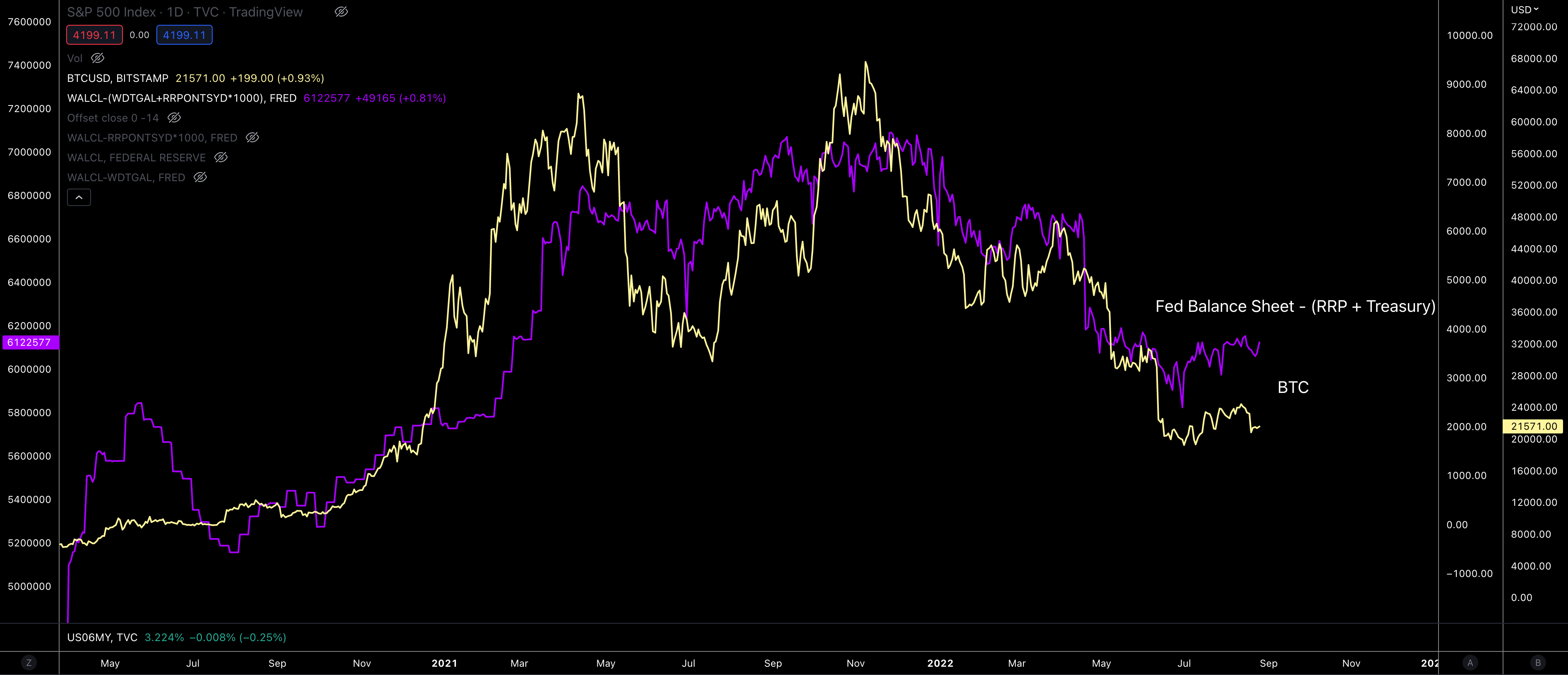
And as this plays out, more liquidity is moved throughout the markets… crypto included.
This is in part why crypto, stocks, DXY, and seemingly most of the financial system is moving in tandem. The quantity of dollars in the market is running the show.
I like to think of this action and reaction as a plunger. Jerome uses his plunger to push capital out into the markets and back into the FED as needed.
That is the end of how the FED liquidity chart influences markets. But we can do more.
Before we keep going let’s do a quick recap. This way you can keep trucking through this and be ready for Jackson Hole.
The recap: FED is able to inject liquidity in the markets by turning bankers away at the RRP window. This drives demand higher for the next best forms of collateral - Treasuries - and in turn drives down their yield. With more dollars entering the markets as they get turned down at the RRP window, cash flows down the risk curve. So as buyers are left without getting a bid filled, they go to the next best alternative… down the risk curve.
AKA, the FED’s net liquidity or the purple line helps us understand when more dollars are getting plunged into market.
OK, so getting to what I view as the ticking time bomb and the key aspect of what we need to focus on for tomorrow…
Which I will get to after you subscribe if you have not already…
Time is Ticking
For anybody who endured the Macro Cycles series, there is a piece called “Yield Atrophy”. In it, we discussed yield inversions using a chart similar to the one below.
Each Treasury (3mo, 6mo, 12mo, 2Yr… 30Yr) and its yield is plotted with the Federal Funds Rate (in white at the bottom). You can see the Nasdaq in there to help compare market movements.
First have a look at the chart before we discuss it as this is one of my favorite ones to look at for macro shifts.
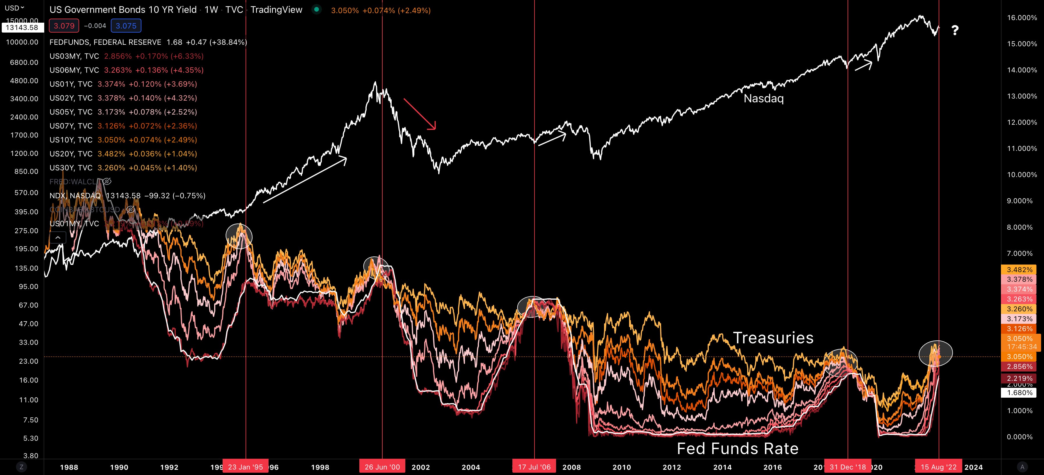
Your eyes are probably drawn to a few things. The one to take note of is the white circles. This is when yields of various Treasuries were all stacking up on one another.
In these circles one year treasuries are yielding the same as ten or even 30 year offerings. Intuitively this doesn’t make a lot of sense, and is why it tends to signal market stress.
In case you missed it, this stress signal is happening now.
Looking back at history, three of the four last time periods this occurred, the markets went on to reach new all-time highs in short order.
The instance near the dot-com bubble was not so lucky.
Now, to the markets credit, it is well positioned for big price moves to the downside - so I hear. And with the FED able to plunge liquidity into markets, we seem to be better prepared than we were two decades ago.
But here’s the thing…
Rates are not moving higher. They have quite literally stalled out. Which means if the FED keeps raising rates AND wants Treasury yields to rise, the U.S. government needs to issue a lot more Treasuries… OR the FED needs to raise RRP rates to reduce demand on Treasuries.
Now this runs into issues since the government is already paying a lot for its debt… And it’s an issue that is not getting better any time soon, especially as rates rise.
To put this into perspective, somebody shared a quote from Luke Gromen (which was taken from Rogoff & Reinhart)… It reads as, “Since 1991, all 18 other governments with deficits exceeding 11% of GDP and debt to GDP exceeding 110% defaulted within two years.”
The U.S. is above 120% and if rates rise another 75bps, the deficit would be about 11% of GDP.
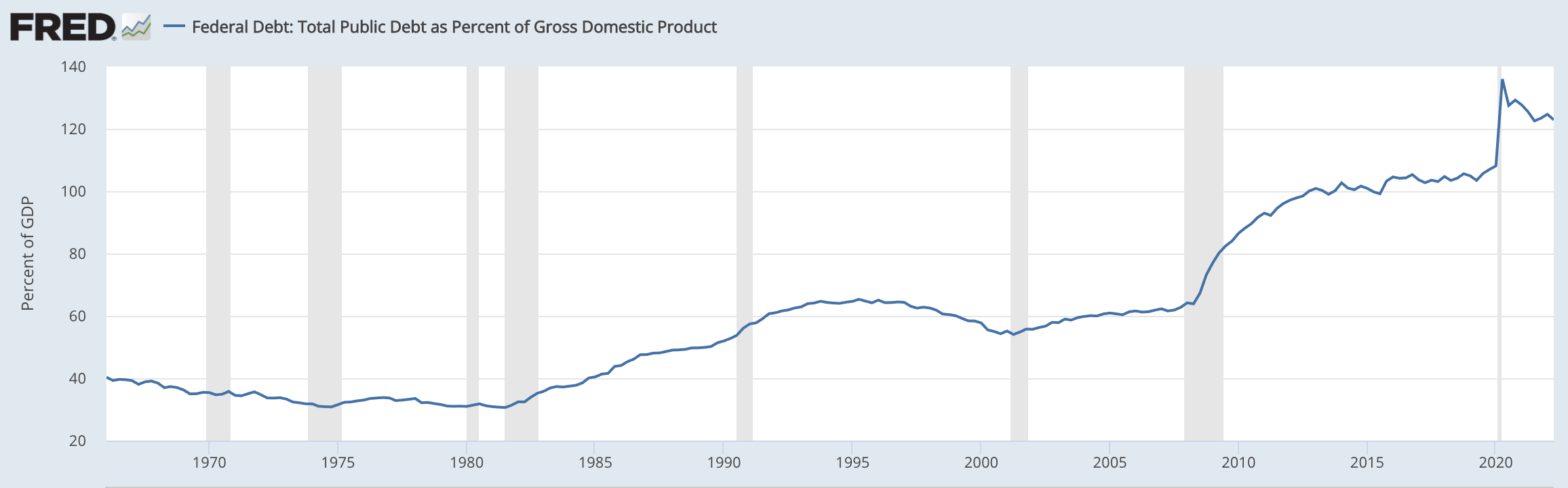
To me this indicates we may have 25 to 50bps left in the tank… Anything more than that means the FED is playing with fire.
To add on to this belief that we are topping out on rate hikes, the market is starting to price in rate cuts for the second half of 2023 (per Eurodollars).
This tells us the FED is running out of time to unload trillions of RRP liquidity… As it can’t just keep it.
And if it does unload the liquidity, yields will be even more bent out of shape.
So where will the FED unleash trillions of dollars of liquidity?
This is where we find out here is no good answer…
The U.S. government is becoming unsustainable in terms of its debt load. So issuing more Treasuries to absorb the capital is not a great option… unleashing it into markets will cause asset prices to go vertical, which flies in the face of JPow trying to calm markets to fight inflation… Not to mention unleashing it into the market will also crush yields and defeat the purpose of raising rates.
So now what?
One idea that is surfacing is to buy foreign debt. This would help bring the high price of the dollar down relative to other currencies and commodities. That’s a problem. JPow and Co. don’t want higher commodity prices as they fight inflation. That goes against some of the political issues in the homeland.
Not to mention this would cause gold to rise. And the last thing the U.S. likely wants is its arch nemesis Russia to benefit as their currency is now pegged to commodities.
At this point I’m nearly 4,000 words which is 4x more than I like to write and running out of ideas. Which is why I say use this liquidity discussion as a handbook on how to judge Jerome’s talk at Jackson Hole.
He will need to make a choice on which of the lesser evils he will walk down and point his plunger at. Hopefully he provides some guidance on this…
Otherwise, we sit and watch our FED liquidity meter to see when more capital flows into the market.
If we don’t reach out beforehand, enjoy the show. For subscribers of Jarvis AI, we will keep you informed as the day progresses.
Your Pulse on Crypto,
Ben Lilly
P.S. - On a bit of a side bar… I think the U.S. points the plunger at Japan and Europe like many others believe will happen. The reason being is the U.S. is running out of options in the global nation-state arena. The U.S. is also sending more government officials to Taiwan, which agitates China. Not to mention the U.S. is sending billions of dollars to Ukraine for weapons.
The U.S. does not seem to be backing down. Why? I think it’s in part because the FED is a bit stuck… And making political allies might be wise in their eyes in case they seek war as a solution to this financial mess.
If the U.S. does start buying foreign debt, this would likely result in the dollar falling and asset prices rising. Let’s see…


