Weekly ChainPulse Report
On-Chain is good, it's all about J-Pow

We are moving to a type of market condition that’s not for the faint-hearted. That’s what the head of dynamic markets at AMP Capital said yesterday. And I couldn’t agree more.
Yields are on the move. Many times when this occurs it can mean larger foundational shifts are underway.
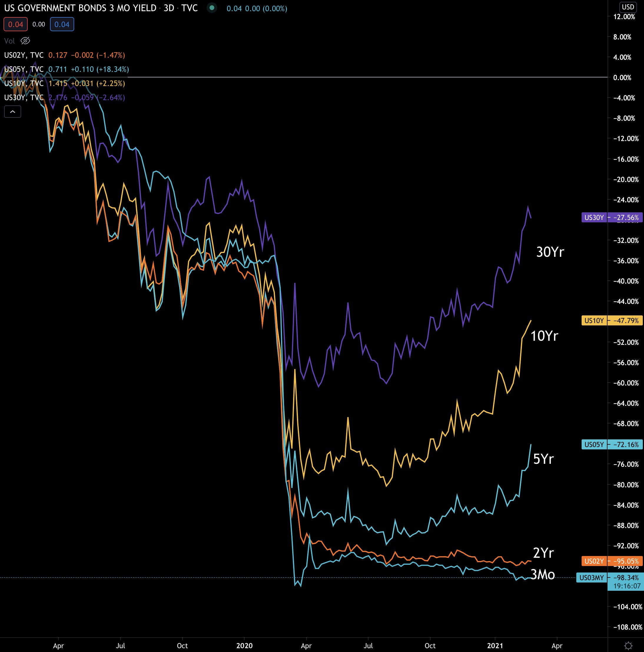
Here’s a chart showing just how big of a move we’re seeing. It’s a chart from the start of 2019 of all the major bonds (3 month, 2 year, 5 year, 10 year, 30 year). The major drop in the middle of the chart is early 2020. What we see is the 10 year and 30 year are almost at pre-pandemic levels. It’s why yields were the talk of the town late last week.
The reason everybody is getting all bent out of shape is because bond moves can result in major moves in the markets.
To see what I’m talking about, let’s look at a chart of 30 year yields and the S&P500 around the time of the March 2020 crash.
Yields dropped over 15% and equities rose nearly 10% before the bottom fell out.
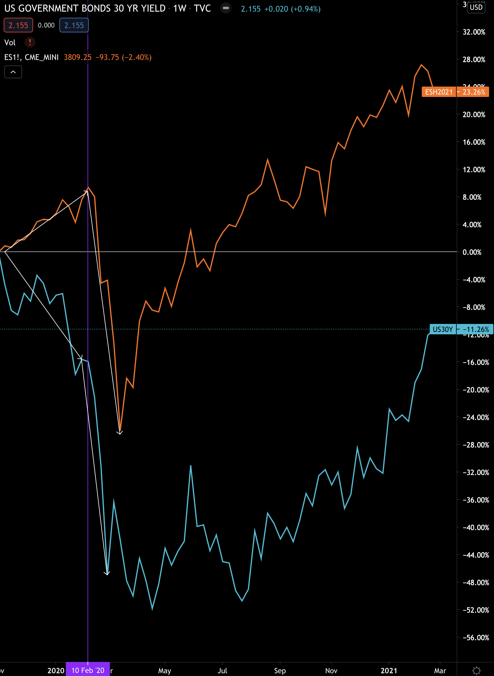
Once the rug began to be yanked out from underneath traders and investors, yields continued to fall while equities reversed and followed suit.
The U.S. Federal Reserve’s response to the market ripping wide open was a bazooka of quantitative easing measures. These measures are currently driving the market higher and capital into riskier assets.
It’s the type of cause and effect that can precede a market crash. Japan in the late 1980s was a great example of this.
Now, I bring this up merely to frame just how significant the Federal Reserve’s future actions are. If they play it right and can tamp out risk without creating a multi-year long recession, then hats off to them.
If they don’t play it well, which includes how they respond to questioning from journalists, then the market might have a knee-jerk reaction.
We got a taste of that late last week. If you’ve been reading Espresso for several weeks now, then you know one of the charts we’ve been following is the U.S. bond yields.
The charts were building momentum over the last few weeks and finally went on a run. It’s the type of move we were hinting at in the February 22nd and February 15th Monday Market Updates (bit of housecleaning, we will now call it Weekly ChainPulse Report).
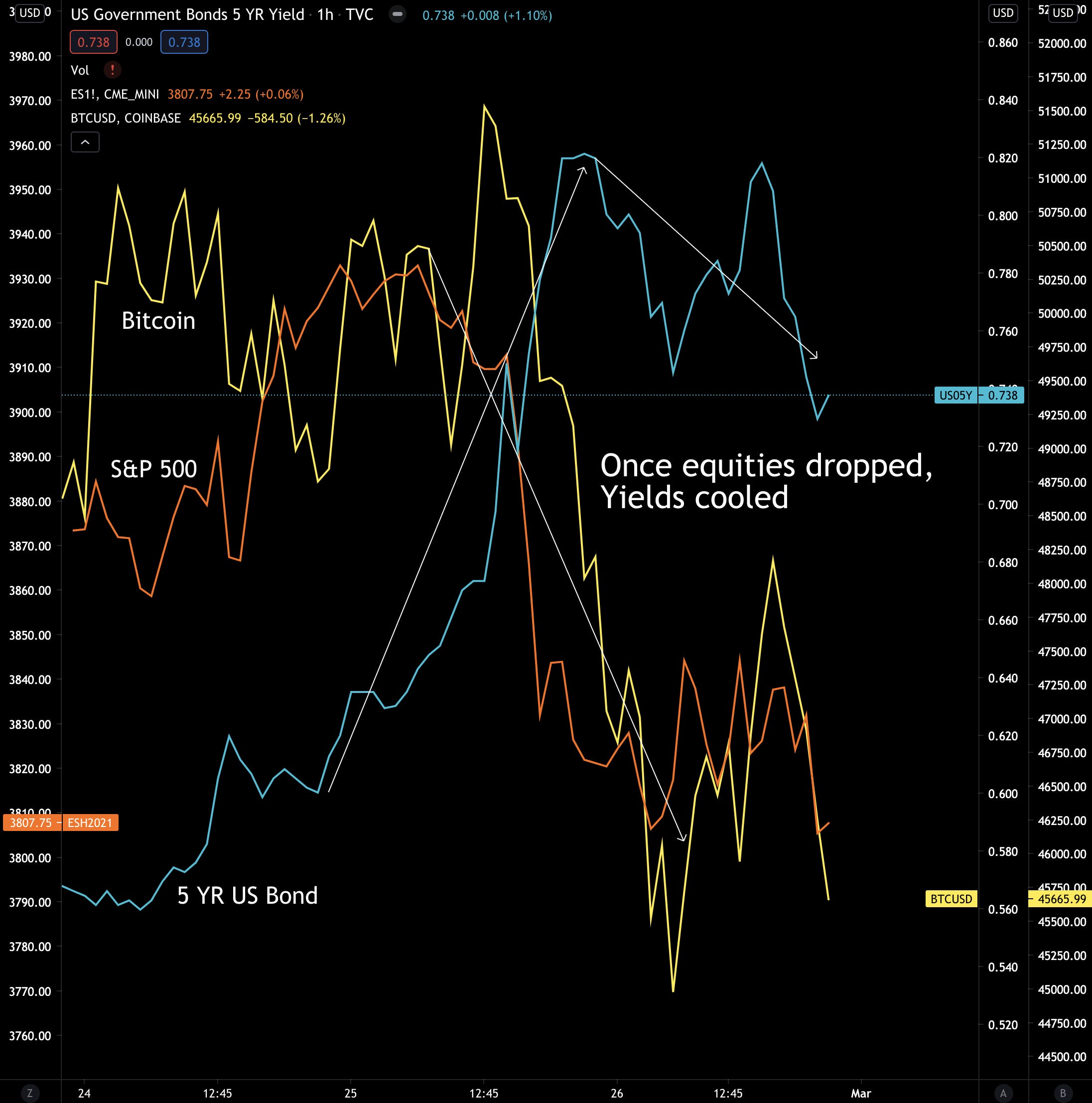
What we believed would happen, ended up taking place. Which is, money flowed away from stocks and crypto and into safer vehicles - bonds in this case. It’s a cause and effect market dynamic that can be seen in a chart of bond yield versus bitcoin and the S&P500.
Here’s a chart of the last few trading days.
As yields went on a run, bitcoin and stocks took a hit. Yields then begun to cool off a bit once the yield became attractive enough. You can see this since yields stop rising before equities and bitcoin stopped falling.
This type of quick market reaction is why traders are now watching yields so closely now.
But here’s the other reason why bonds and yields are in the spotlight…
If yields begin to get too high, the cost to service debt becomes higher. This can be very troubling in an economy that’s still operating at less than full capacity in light of COVID.
And quite frankly, if the cost of debt becomes too costly, then global financial markets are in serious trouble.
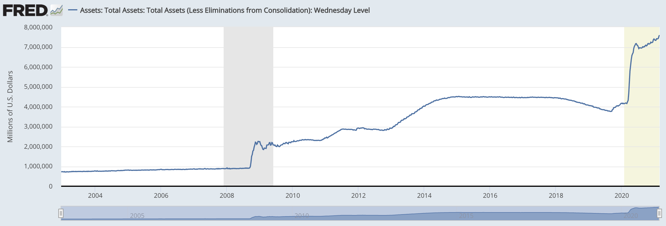
It’s why J-Pow and the Federal Reserve can’t sit idle. Let me rephrase that… It’s why they haven’t sat idle. They are already acting in the markets by purchasing U.S. debt (bonds). Here’s their balance sheet below.
Note the steady uptick of late. That’s J-Pow and Co. buying up U.S. debt.
But here’s the thing… It’s not just the U.S. Here’s the Bank of Japan’s total assets.
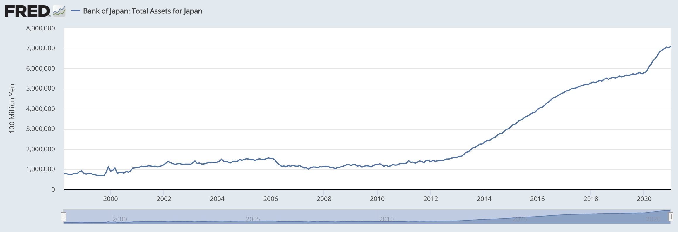
It’s rising steadily as well, and they just made news they are buying exchange traded funds on the market. Yes, the government is buying stocks. In the U.S. it’s a major party foul if the FED buys stocks. It’s why the FED needed Blackrock to help navigate the crisis last year. So we won’t necessarily see the FED be so open about buying stocks.
However, a central bank buying up assets on the open market is a bit of a worrisome sign. It means central banks cannot let markets cause widespread panic. Because if panic did unfold, then a bigger financial crisis would be here sooner than we think.
There’s simply too much at stake right now.
And to be straight forward about the reason for bringing up rising yields, the FED’s balance sheet, and how the FED will respond to rising yields…
It’s because this is THE macro influence shaping bitcoin’s trajectory in this bull cycle.
The more central banks around the world purchase assets, keep yields low, and continue to add more ink cartridges to the money printer, the more vertical this cycle might be.
However, if the FED decides to change course and tighten up, this can act as a major headwind for crypto. That’s because in such an environment capital will be less likely to flow into assets at the tail end of the risk curve… Aka crypto.
(no, I don’t think bitcoin is risky, but it’s about how new investors interpret the space.)
In terms of what is likely versus less likely, I think the FED will make it easier to service debt. Let’s face it, the world is addicted to cheap debt. And if the FED decides U.S. corporations need to go cold turkey, you can bet there would be some infighting.
The FED and Wall Street are joined at the hip. In fact, the two sectors have a revolving door between them. Neither side wants to be the one to end the party.
(If they do decide to end the party then it’s really to enforce rules and regulations that will benefit them in the long-run… Which is a topic for another day.)
So at the end of all this macro talk the question comes down to how the FED will keep the party going. If yields continue to go on a run then we can find out as soon as this week what the response will be . If we get a cool down or reversal in yields, then it’s a topic for another time. Regardless, it will come up at some point this year.
Now, in terms of how it effects crypto, it’s more about how long it takes for the FED to issue a comment on what’s happening in the markets. Meaning we need to be ready for a bit of short-term turbulence or uncertainty.
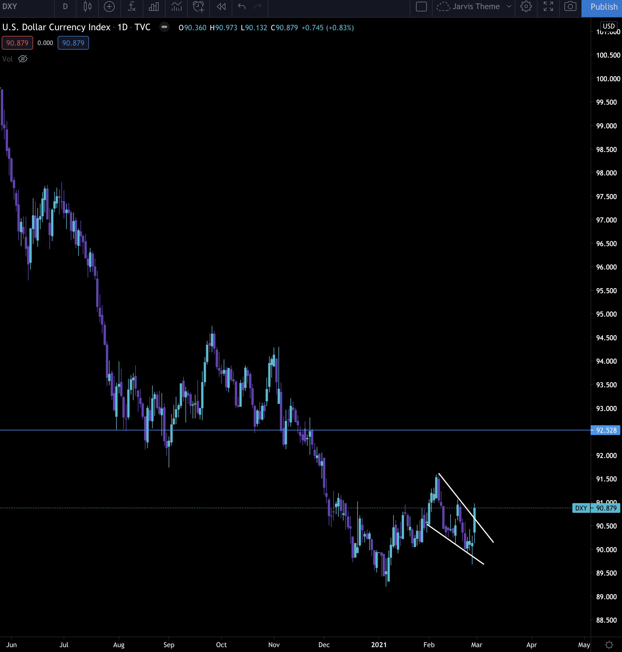
That's because as yields go on a run then money will flow into government bonds, which also means the U.S. Dollar Index (DXY). These two types of flows can hurt bitcoin and crypto as we saw late last week.
In fact, here’s the chart I showed you last week on the DXY. On Friday price broke upwards out of the wedge. While it’s a bit too early to decide if this price movement will continue, what’s clear is the next few candles on the daily time frame will be important. Any strong upward price action will be a headwind for bitcoin and crypto.
BUT if the FED reacts to yields by purchasing even more treasuries while the DXY soften, then the on-chain readings will likely turn bullish really fast.
So what we’re looking out for in the next week or two…
We’re watching yields and DXY.
For yields we want to see them continue to rise since it’ll force the FED to respond. They’ll likely respond through treasury purchases at the 10, 20 or 30 year bond since those rates can hurt corporations the most. And in the mid to long-term, this is great for bitcoin… At the expense of some short-term pain.
With DXY we want to watch for any quick price action higher. That’s because it’ll indicate investors wanting cash and safety. That’s not a good sign for bitcoin. Anything else should allow for bitcoin to progress higher if it gives it a try.
Crypto On-Chain
The on-chain environment is nothing to get too excited about for bitcoin and crypto… Just yet.
However, as you’ll see, the time to build your positions for another leg higher might be closer than we think.
Jarvis risk and fuel meters are neutral, meaning traders and capital aren’t piling into the market. This hints at more sideways price action.
Our notorious whale called “Pablo” who managed to sell bitcoin before the late-2018 price drop below $6k and before the March 2020 price crash moved 10k bitcoin to the exchange the past few days.
There’s no way to know if the bitcoin are still sitting on the exchange waiting to be sold or have already been sold. Based on the price action it seems likely some were sold.
There’s luckily a lot of bid support. Here’s a chart showing bid support on February 28th. The yellow and white lines indicate a full order book on the bid side. Something that wasn’t there a few days ago when the selling began.
Then when we pair these bits of information with a few on-chain indicators it’s suggesting the bottom is likely near or already in.
A few weeks ago our team published the Shakeout Chart. It was a way of viewing exchange flows as being “overextended”. Meaning the amount of coins entering an exchange were getting too extreme to the point that a price reversal was likely. You can read it here if you missed it.
Buy BTC in The Shakeout Zone 🧵👇
— Ben Lilly (@MrBenLilly) 4:09 PM ∙ Feb 12, 2021
1/ 5: The indicator used here is a seven day moving average of the # of bitcoin entering exchanges. Typically when large inflows happen it's a bearish indicator since bitcoin tend to flow to exchanges to be sold.
Chart: @cryptoquant_com
Here’s the newest addition to the Shakeout thread…
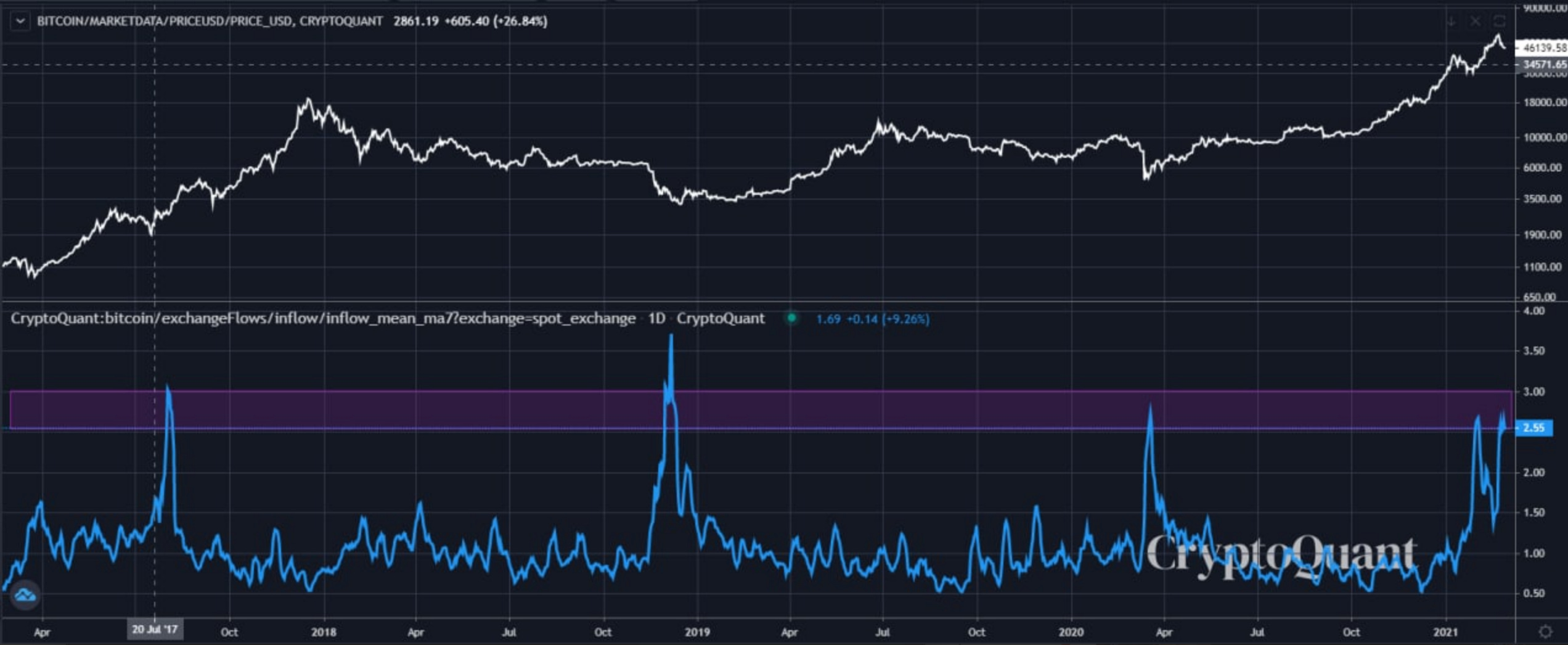
We just re-entered the Shakeout Zone (purple line… sorry, it was green last time!). This means the amount of bitcoin entering the exchange is reaching an extreme again, and price is likely to reverse, again. Historically this indicator helps time entries into the market.
Another indicator we mention frequently is the SOPR chart.
SOPR is a way to view the amount of bitcoin that are in profit. Whenever it dips below the white line in the chart below, then traders/investors are selling bitcoin at a loss on average.
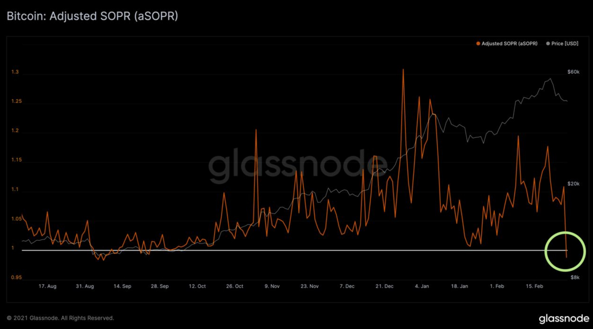
Historically this is a buy signal. Last time SOPR dipped below this white line (white line = 1) was early September 2020. Price went on a tear after. SOPR then almost dipped below in mid-January… And again, price ripped higher after.
Then there’s the Whale map. (Current subscribers already saw this in the Oculus chatroom - this chart is not updated.)
It’s the price of bitcoin with blue bubbles(Courtesy of whalemap). These blue bubbles can roughly be interpreted as whale transactions. Or said differently, areas of accumulation.
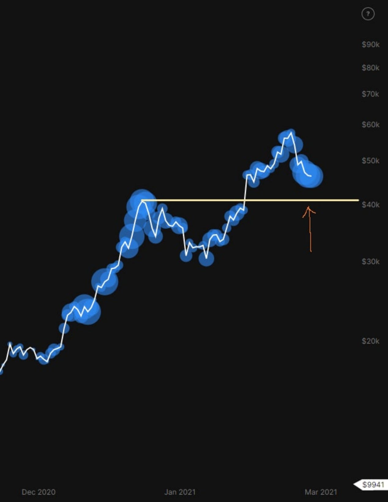
As you can see the accumulation is getting strong right now. And based upon previous accumulation this horizontal white line should serve as a support. That’s because if there is a breakdown at this white line, then the market structure is changing and these whales could be holding at a loss.
Because we’re still above this white line and seeing large blue bubbles forming, it’s a sign accumulation is likely taking place.
Here’s a chart that supports this theory.
It’s a chart of supply held by addresses with a BTC balance of 100-1k. You can see it’s rising. And in the 2017 bull run this figure was rising almost the entire price rise to $20k
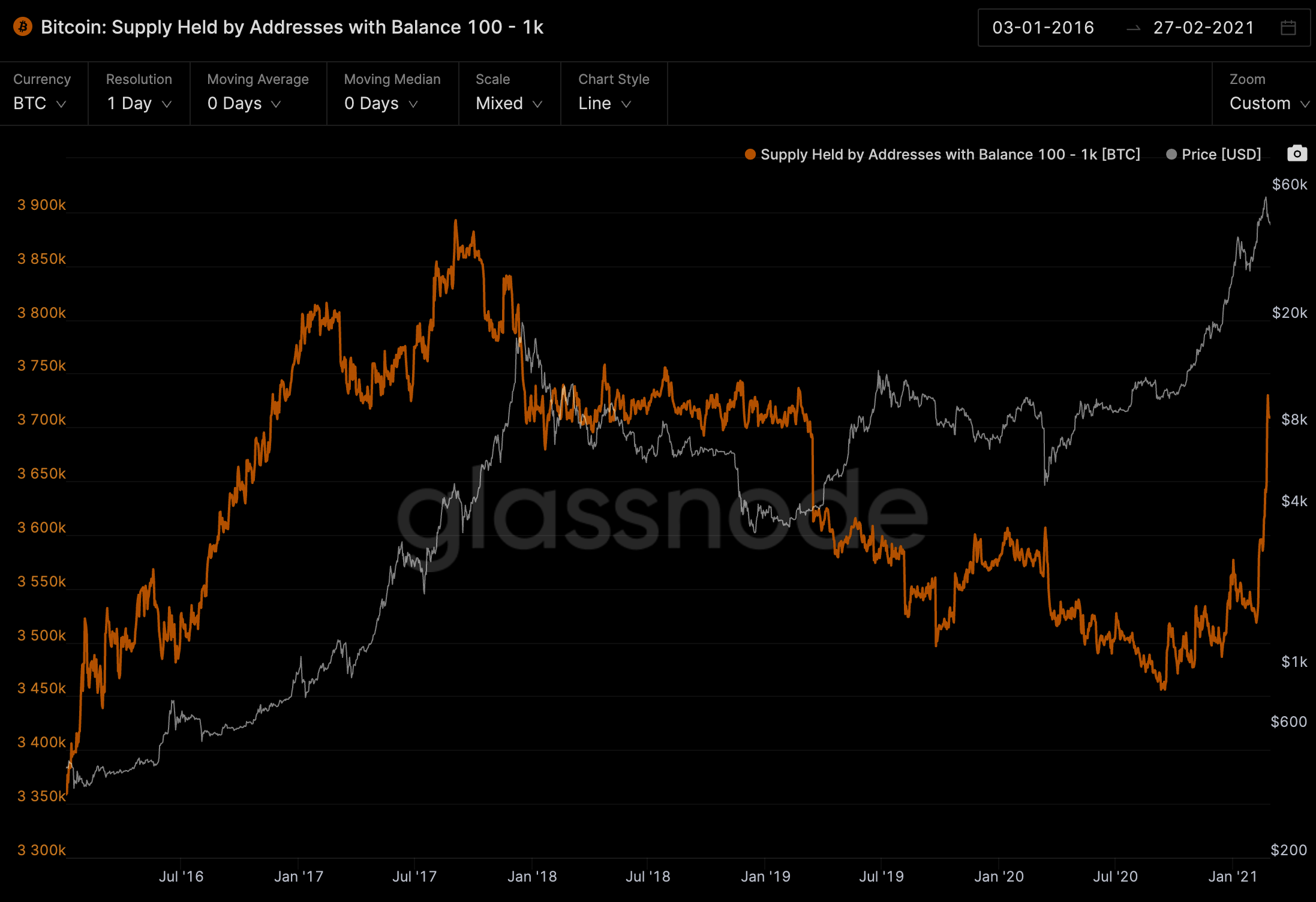
If we were to look at wallet balances above 1k it’s not a strong of an indicator since these wallets tend to sell way before a top. This 100-1k BTC range has worked best to day, and the current spike is a sign of accumulation.
All of these on-chain metrics are showing bitcoin is ready to rise higher. And the only overhand is really Pablo and the macro markets.
What we think will happen is that once the macro picture gains clarity we’ll see Tether announce a new round of USDT to be minted.
If we see that happen, then expect higher prices sooner rather than later.
Have a great week trading.
Your pulse on crypto,
B


