Monday Market Update
Still another week, but I'm already eyeing March.


February was a great month for bitcoin with the digital coin up almost 80%.
It also received a lot of fanfare around Elon and Saylor.
In crypto as a whole there was even a bit of talk surrounding Grayscale. We keep hearing about companies looking at ETHE and other altcoin based Trusts. This means Grayscale is helping institutions move further out into the crypto risk spectrum.
It’s a sign of increasing appetite for cryptos with potentially higher returns. We saw something like this happen in 2017 when the common crypto investor was able to access smaller cap cryptos via Binance… Before they walled out ip addresses from the U.S.
Easier access to altcoins meant capital was able to more easily move out to the fringes of crypto. Grayscale is the facilitator this time around. If you’re an altcoin holder, this is exactly what you want. To see the progress of this I’m eagerly awaiting the next Grayscale report for info on what these inflows look like.
Grayscale Update
Now, talking about Grayscale… The month of February followed through in terms of the Grayscale Effect. (If you are unsure what the Grayscale Effect is, read it here.)
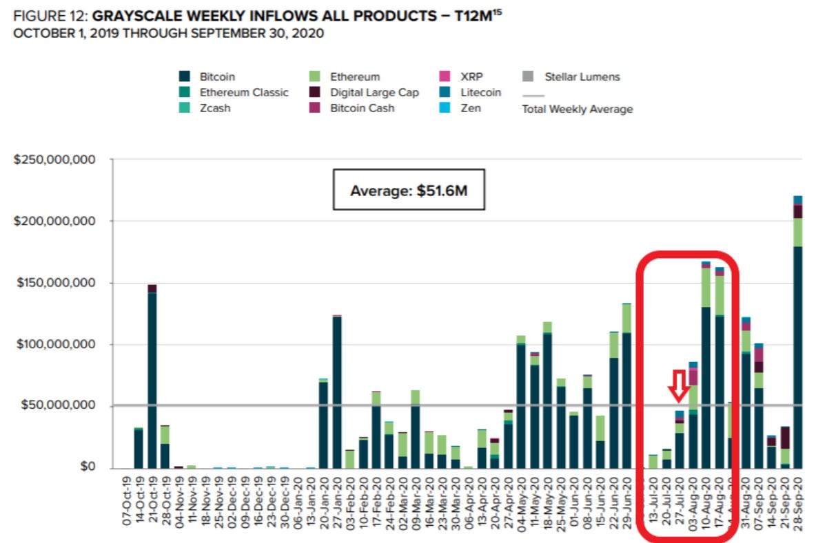
In late January we posted the chart below. It highlighted where we currently were in the unlocking schedule and the wave on unlockings ready to transpire for February.
To figure out the effect, you take the date of a major uptick in inflow and add 6 months to it. Using the chart above we can arrive at February 10th and 17th as good dates. Historically price tends to rise soon after these major upticks of inflows, and this time was no different.
It’s my belief that these unlockings were the main reason why bitcoin’s price was able to maintain strength even after Elon’s tweets and news drop of Tesla buying BTC.
Moving forward, I see some strength from the Grayscale Effect, but not as strong as we saw in early February.
The main reason is seen in the chart below. It’s Bybt.com’s grayscale BTC holdings. This shows the increase in BTC in the Trust over time by day. The chart you looked at previously was by week. Meaning the chart below is more granular.
The red arrow in the chart is six month prior to today. It’s approximately where we are on the unlocking schedule. We get a subtle increase until the end of the month. Not a major uptick like we had a couple weeks ago.
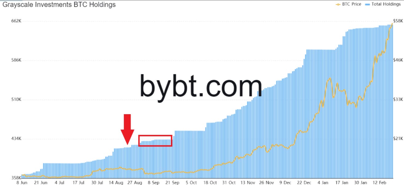
After the subtle uptick we get to the red box, which basically highlights a time period devoid of unlockings. If we translate this to price it means we can get a scenario similar to what we saw in mid-January where price consolidated. Only this time it’d be in mid-March.
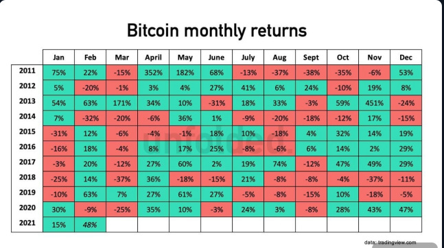
Adding to this perspective is the performance of bitcoin on a monthly basis. Over the past ten years bitcoin and March don’t get along. Eight of the last ten years were red. Based upon Grayscale it wouldn’t be surprising if we made it nine of the last eleven.
Macro Update
The macro trend also is setting up for a potential near term headwind and later term tailwind.
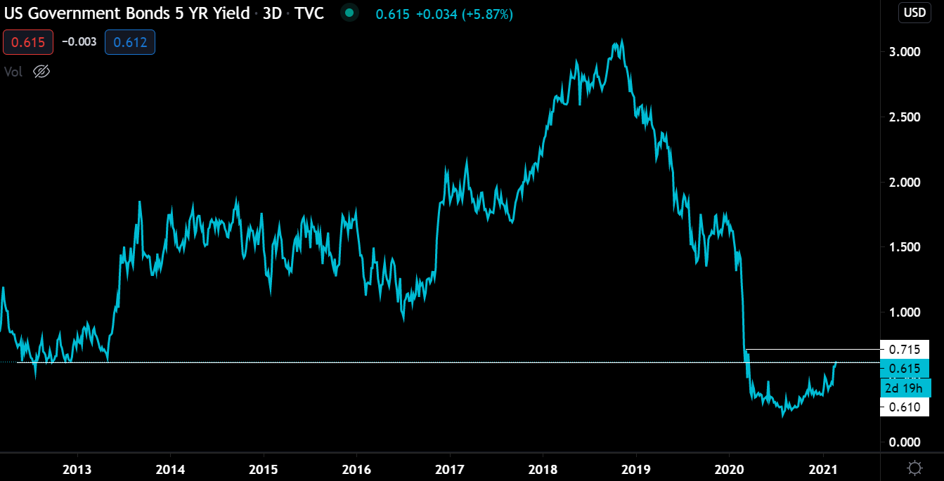
Below are two charts of bonds. Boring, I know. But the bond market normally helps us figure out what’s going on in the Macro market and how the FED might respond.
Yields are rising, and not showing any signs of slowing down.
5 Year
30 Year
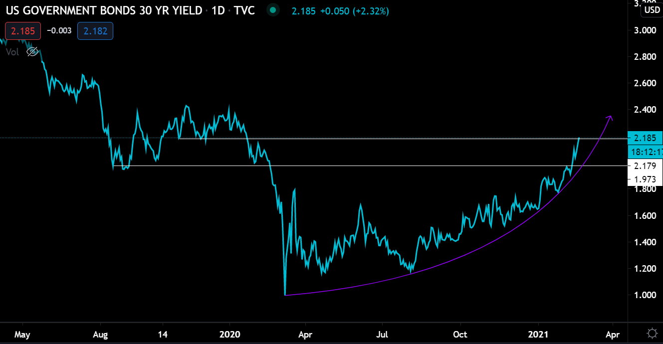
Typically, rising yields make it more attractive for money to flow out of riskier assets and into a vehicle earning a higher yield - Government bonds in this case. If yields start running higher they can act as a temporary hiccup to the equity and crypto bull markets in the very near term.
What’s really interesting here is while that’s the narrative, it hasn’t played out like this in the market.
Here’s bitcoin (teal) against 30 year yields (red) in the chart below. As you can see they are in lockstep.

Deciding if this is an anomaly or not, I reached for the Nasdaq futures chart and ran it with the same 30 year yield, but added some more time.
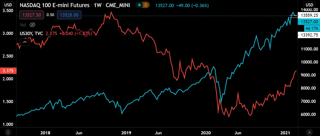
Yields are running in lockstep with the Nasdaq since the market nosedived in early 2020. But before that, there was less correlation than what we are seeing today, which is what we would expect.
In order to draw meaningful conclusions on what yields are saying, I need to pull in what the FED might or might not do regarding rates and treasury buying. I think soon they will be forced to buy up even more treasuries than they are already buying in order to keep yields in check.
If the FED does scale up their purchase of treasuries than this can be bullish for bitcoin.
But before we get too excited I think it might take a little bit longer to play out because there’s no issue in the market that’s forcing the FED to act. I find it hard to believe they would take any action before its necessary.
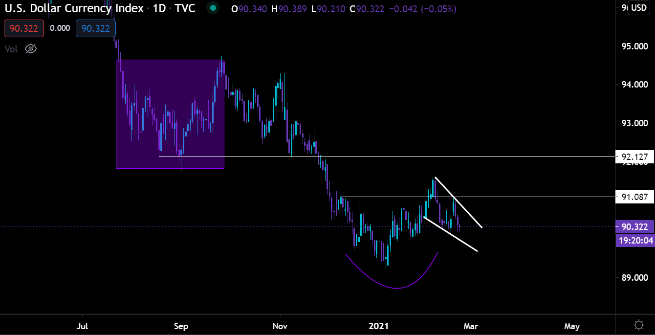
This opens the door up for a short-term reversal to play out for DXY (US dollar).
Taking a look at the chart the inverse head and shoulders pattern hasn’t given up. It’s now forming a bit of a wedge. A break here that rises above 91 is bound to have a little spill over into bitcoin and crypto. The results of which would mean capital is flowing into DXY, not crypto. And it’d be the headwind we mentioned earlier… But not for long.
It’s my opinion that if the dollar starts to gain strength and yields start rising then either the FED or more U.S. government stimulus will take place (early estimates are late March). If so, then it’s back to the races for bitcoin.
The timeline for this to play out would be nearly all of March.
Which, it that’s the case it’d pair up with what we know from before. Grayscale Effect will quiet down for mid-March, and pick up in April.
Timing like this would be what puts BTC on path for $100k.
Keep in mind, the near-term still has some strength. And assuming we don’t see that Saylor bought up $1 billion of BTC over the weekend, then we can expect some demand for BTC at these levels in the near term.
I know this was a bit long-winded, but there’s a lot to consider as bitcoin is nearly $60k. The question of who will buy at these levels is the most important question to ask yourself. And also, what reasons would there be for anybody to buy more. The former is institutions and the latter is fiscal and monetary policy.
This still looks great with some potential for mid-March to be a bit slow.
Your pulse on crypto,
B
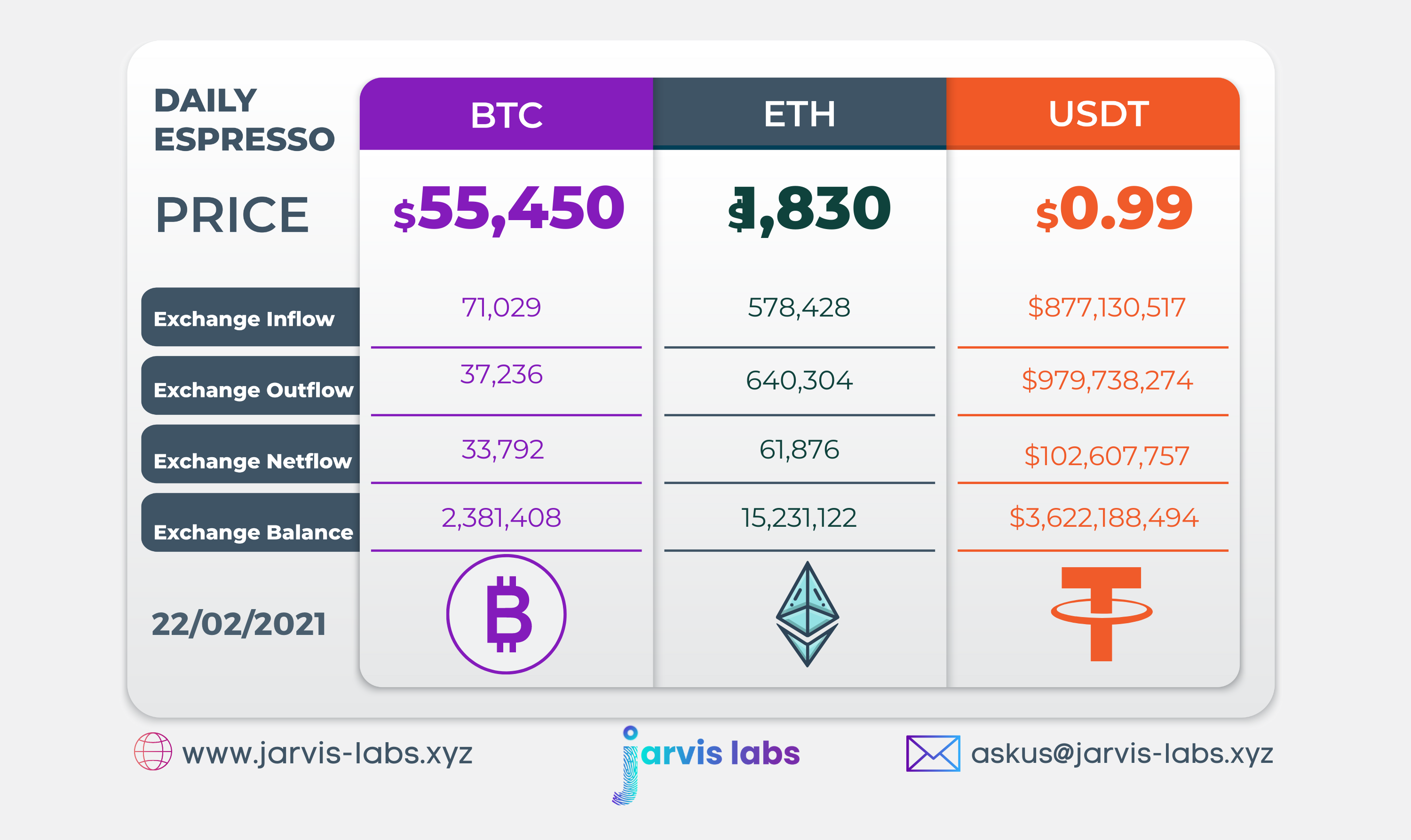
Below is our daily exchange flow data. This is a great gauge for understanding if BTC, ETH and USDT are flowing into exchange or leaving. If BTC and ETH are entering exchanges it can generally be viewed as bearish. The opposite scenario is bullish.
When USDT is flowing into exchanges it’s typically viewed as bullish. The opposite scenario is bearish.
This should only be used as a general gauge. Tagging the exact wallets these flows move into or out of helps improve the reliability of this data, which is what we do at Jarvis Labs. To date we have over 800 market mover wallets and 16 million wallets tagged all together. Consider us your on-chain trackers.
Note: The magical rise in exchange inflow overnight was due to a large inflow into Gemini wallet which later turned out to be one of their internal transfers.