Monday Market Update
The small wallets just sold to the whales

A feeling inside tells you the clock is about to strike midnight, but when you check the clock on the wall there are no numbers on its face.
How could you know the time is near if you can’t tell time?
The signals you might not even be fully aware of hint to you the time.
Maybe it was the fact the street lights went on a few hours ago.. Or was it a certain car that drives by on the nearby road who’s distinct muffler echoes through the night just before the clock strikes 12... Or does the stillness of the night grow thick just around then?
They are all subtle clues that nudge your consciousness about where you are in the day.
For us, we look to find these subtle clues that might not be apparent at first glance. By linking these clues to data we can get closer to predicting when the market is striking midnight.
Yesterday was a prime example of this.
Our team put together an in-house index that measures risk. This takes into account funding rates, flows, metrics, liquidity, and more.
The index was measuring 99 as bitcoin was flirting with $50,000. Funding rates, which we’ve been constantly bringing up all last week, were also off the charts. And just like the feeling that any moment we could hear the clock strike 12, it finally happened. Bitcoin dropped nearly $4,000.
In response some funding rates flipped to where shorts were paying traders going long. And the risk meter had a substantial drop. Our team all exhaled a sigh of relief to see a slight reset on the extreme derivatives market.
What’s interesting when looking at some of the data of the drop is who was buying the dip. Take a look at this chart to see the buyers. It’s probably a bit tough to see, but on the chart on the bottom half there’s a brown line that has a sizable spike during the drop near 3:00.
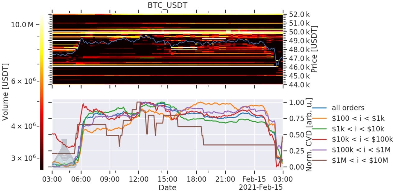
Chart source : Materialindicators.com
The brown line signifies orders between one and ten million dollars. Meaning whales were sitting there to absorb all the selling and buy it up.
Even more interesting is the orange line. It’s small retail orders. It was steadily rising until the bottom began to fall out on price.
This is significant when you take into consideration the chart on the top half. It’s a chart that indicates orders on the books. The closer the horizontal color is to yellow and white, the bigger the order. White signifies about ten million on the books, and it’s this color you can see forming the band near the $50k price area.
This tells me retail was hoping to push price past this major resistance level while the whales were waiting for price to dip. Meaning retail just sold their coins to whales.
The question now is, when price approaches this level again, will these sell walls still be present? We’ll soon find out.
Meanwhile, many of the on-chain indicators that describe where we are at in this bull cycle are still very much bullish. And some suggest we got a full reset of the market over the last few weeks. We plan to get into a few of these this week to show you what we mean.
For now, I’d like to post the Grayscale chart to show you where we currently are at.
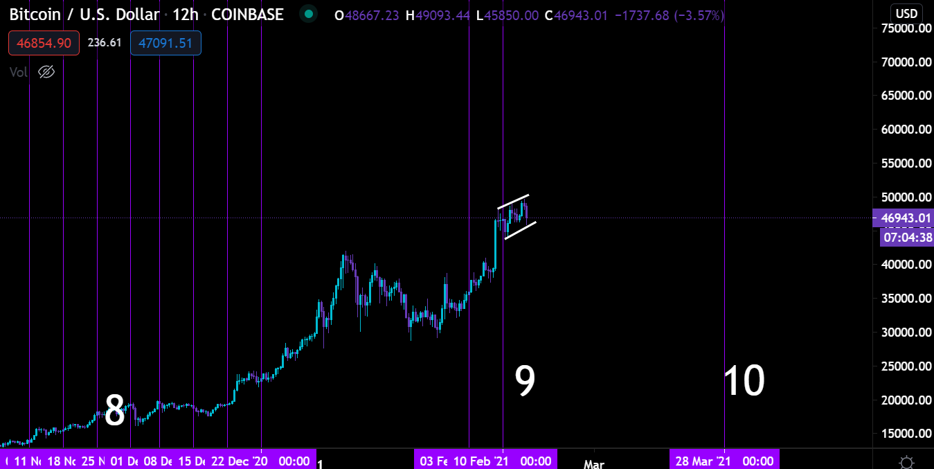
The Grayscale Effect, which is the bullish price action on spot prices after major unlocking of GBTC shares, is going through one of its cycles right now. Elon skewed the chart a bit, but as you can see the price is still following the pattern.
The real question is how strong this effect will play out this week. I’m thinking there’s a good chance we retest $50k by mid-week. If we break this level than a multi-week run can be in the cards. To find price points we can look at the options market for some help. But we won’t do that unless price does in fact break higher.
So where we right now in the market is this… On-chain indicators say this bull is still charging, funding rates are looking good, and the Grayscale Effect should be helping drive demand. All good stuff.
In terms of the macro side, DXY is literally lost in no man’s land without any notable direction being taken.
Yields on the other hand are creeping up a bit, but as of the futures open last night it’s not too worrisome yet.
If we see yields run a bit towards 2.5% on a 30Yr bond, then we can expect some of the speculative investments to cool down a bit. I’d be curious to see how bitcoin responds.
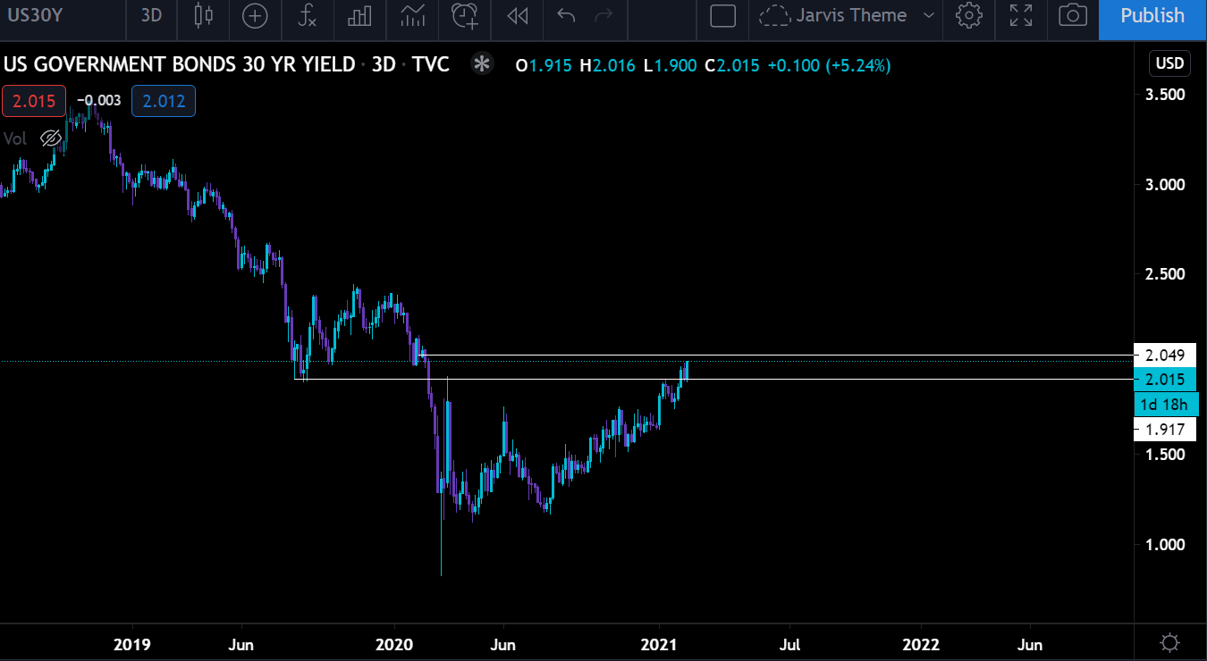
When yields rise higher many investors look to take advantage of the yield by taking some risk off the table. We haven’t seen that happen yet with equities very much in the green on the open.
Again, if yields break higher and go on a bit of a run I wouldn’t be surprised to see equities dip a bit. Not entirely sure how BTC will react… Looking at correlation as of late, BTC seems to run in tandem with yields. So a break to the upside might actually be beneficial to BTC.
OK, that’s about it from me.
Stay tuned for some on-chain indicators that we look to hit on more and more as this bull cycle rages on. The reason is we want to be ahead of the curve when it comes to finding the top and turn those unconscious feelings into data driven strategies.
Your pulse on crypto,
B
p.s. - If you enjoyed this issue, be sure to subscribe here to get it delivered to your inbox Monday through Friday.
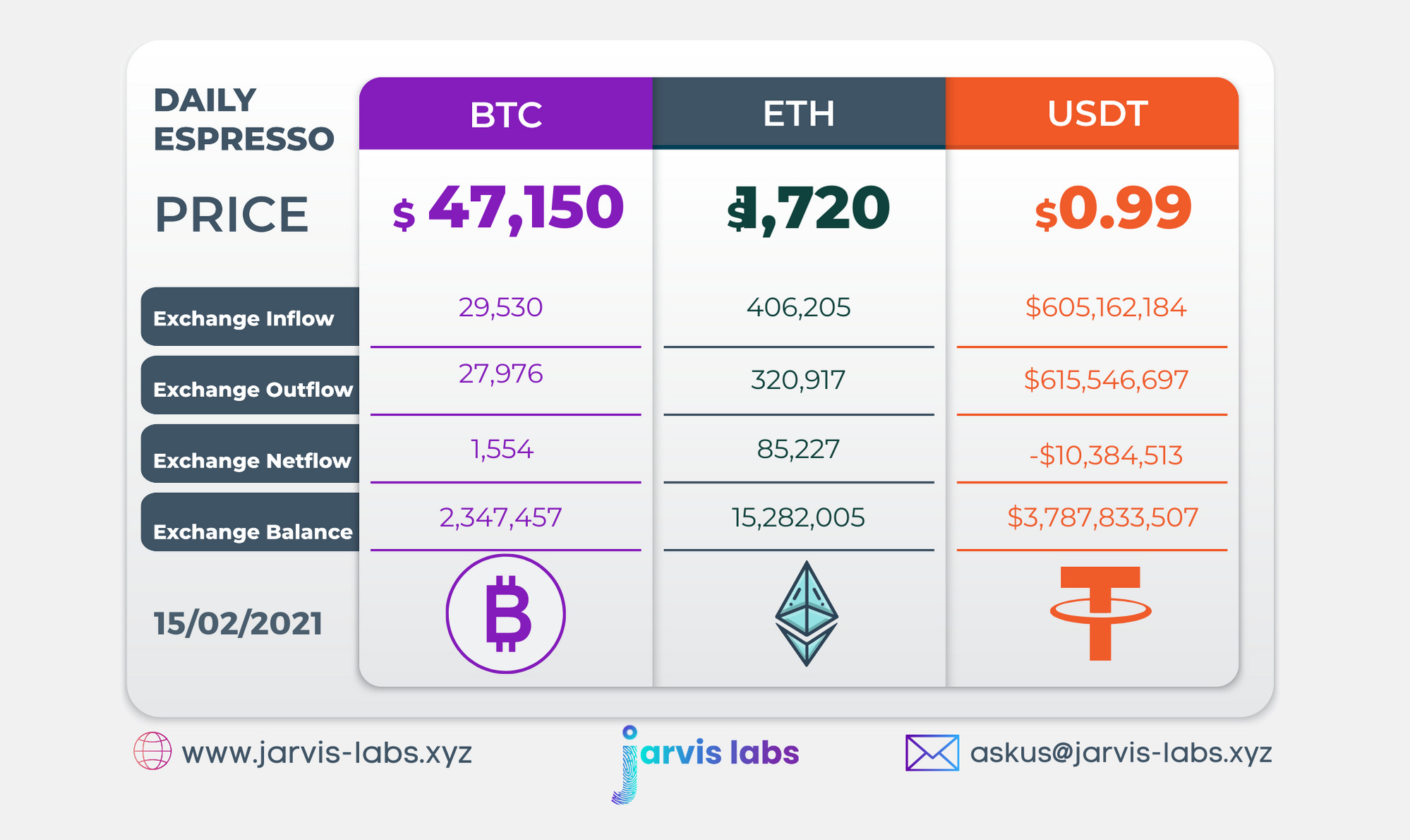
Below is our daily exchange flow data. This is a great gauge for understanding if BTC, ETH and USDT are flowing into exchange or leaving. If BTC and ETH are entering exchanges it can generally be viewed as bearish. The opposite scenario is bullish.
When USDT is flowing into exchanges it’s typically viewed as bullish. The opposite scenario is bearish.
This should only be used as a general gauge. Tagging the exact wallets these flows move into or out of helps improve the reliability of this data, which is what we do at Jarvis Labs. To date we have over 800 market mover wallets and 16 million wallets tagged all together. Consider us your on-chain trackers.