The FED Can't Reach You
Macro Update: 2023 Outlook


The bubble will be an absolute monster.
I paraphrase what I wrote a year ago. It was in reference to what was the start of the U.S. Federal Reserve (FED) moving to a period of raising rates.
Since then rates have climbed at a historic pace. In less than one year, rates went from 0% to a target rate between 4.25% and 4.5%.
This is the most aggressive FED in about four decades. Yet, I still see the bubble of all bubbles starting to form on the horizon.
To explain better, I wrote a series of essays a year ago on how markets respond to interest rate cycles. The cycle I’m referring to is where rates are historically low, the FED shifts to a period of raising rates, the FED pauses hikes, and then the FED cuts rates lower.
This cycle is broken down into four stages - “Restart,” “Lift off,” “The Meltup,” “It’s Over,” with some articulation on what each stage means.
If you don’t know what I’m talking about nor have the time to go back and read Macro Cycles, no worries. You don’t need to understand any of it today.
For those that do remember it, we find ourselves today at the later stages of “Lift off” where rates are still climbing and about to pause.
It might sound like based upon my self references that I was spot on predicting how 2022 was going to play out. I’ll be the first to admit I did not expect the market to be this ugly nor rates to rise at this rate. That’s because based on history, markets were typically “choppy / semi-bullish” when rates rose - “Lift off.”
This time around, it was not the case. While markets were choppy, there was next to nothing bullish about them. It was straight bear, dawn to dusk, all the time.
As to why, it was from a recurring move Federal Reserve Chairman Jerome Powell played out with precision. It was the under-promise, overdeliver act.
Throughout 2022, Jerome would talk one game, and deliver to the market something different. He would say 50bps, then follow through with 75bps.
There was a period of time where a hike of 75bps went from never entering the discussion… to being a discussion point, but not on the table… to suddenly the 75bps being the expectation by the market with a possibility of a 100bps hike.
This caused the market to never find solid footing. It had zero chance to gain any semblance of momentum in 2022. And any asset priced in U.S. dollars got walloped as the relative price of dollars went up due to the cost to borrow/create these dollars was now much higher - the effect higher rates have on dollars.
With 2022 in the rear-view mirror, all of us are wondering what is in store for 2023. In the lens of this macro cycle playbook where rates rise/pause/then fall, we can see the familiar cyclical pattern playing out as mentioned a year ago.
And with this familiar cyclical pattern, we know that the “pause” begins when the market starts to show cracks. The main difference this time is we haven’t seen them form as some have expected.
The reason here is that the FED is able to deploy its new weapon at will. When administered, it patches up any cracks with a fresh dose of liquidity spackling. This new weapon has allowed the FED to be more aggressive in its course of action. It can literally fill in any holes as they appear.
It’s a powerful tool the FED has not had in prior hike cycles.
So unlike times past, the FED is able to transition to a period of rates no longer rising without cracks starting to form with significance. In 2019, for instance, cracks were starting to form before the overnight lending market went haywire. Rates were already on pause before it hit.
This makes 2023 unique historically. And as I’ll show you shortly, the market will likely give the FED that chance to pause rate hikes in 2023. The impact is something the market is likely not expecting. An area of the market where the FED’s new weapon can’t reach as easily.
And if this area begins to fall into trouble, the next bubble is likely to form in 2024.
Read on to see what I mean…
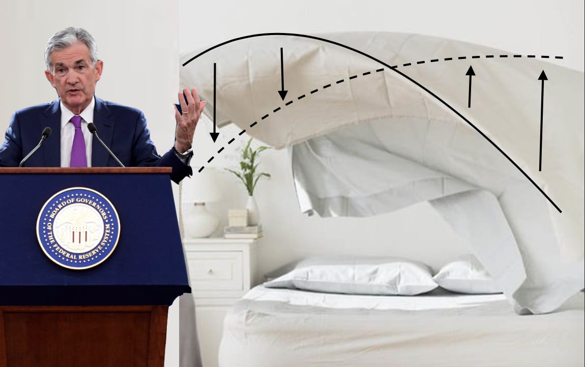
And also, how to make your bed like Jerome Powell.
Putting On Your Bed Sheets
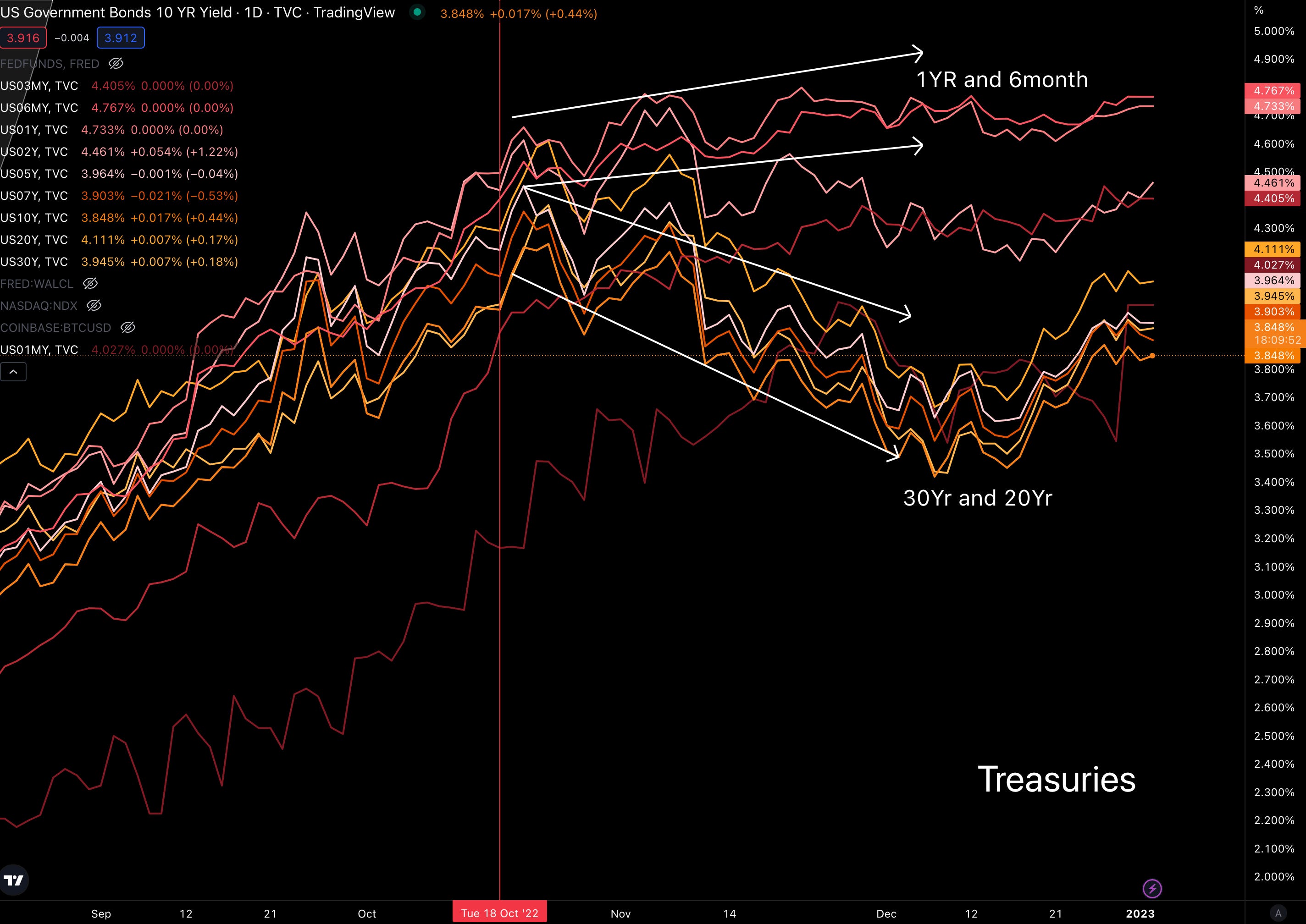
For much of 2022, every follower and onlooker of traditional finance was shouting about how jacked up yields on U.S. Treasuries were - and still are.
At one point, the 30-year Treasury was yielding 3.8% while the 6-month Treasury was yielding 4.7%.
If you take a step back and think about the logic here, it really is backwards. Investors are willing to lock up capital for 30 years in exchange for 3.8% while those that lock up for 1/60th of that time can almost earn an additional 1% points on their money.
The complete backwardness of the markets was really on display once the market started to price in a 75bps hike and an expectation that we might only be halfway through this hiking regime.
In the chart below, you can see just how out of balance yields got as late duration and short duration went completely separate ways in October - when the market began to price in a 75bps hike.
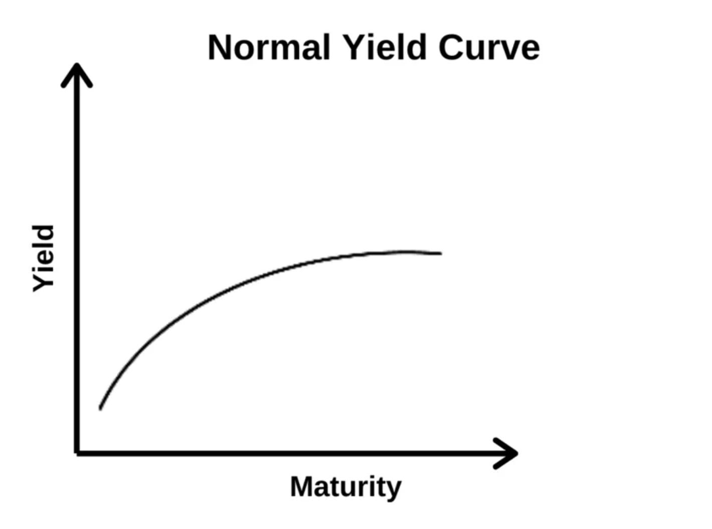
Now, if if everything is normal and you plot the time at which the treasury will expire on an x-axis and the yield paid on the treasury on a y-axis, it will look like this curve below.
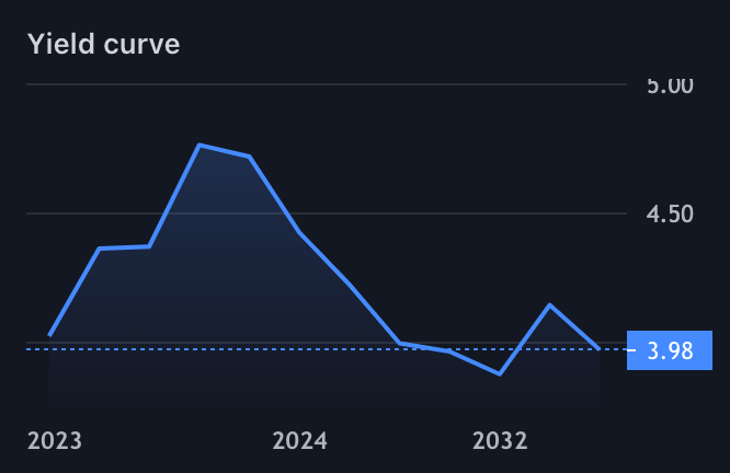
With that understanding, here is how the yield curve looks today…
It’s a byproduct of an aggressive FED. When the federal funds rate rises, many rates across the board move along with it. It acts as a benchmark. And with it, the FED ensures these rates act as a floor (a term I use loosely here).
In the chart below, you can see how one- and three-month Treasuries (pink and blue lines) move alongside the various rates set by the FED to help create the benchmark rates that the market works from.
Think of this as the rates that banks use to figure out their borrowing terms from interest rate payments to savings accounts and CD yields. It sets the tone for finance.
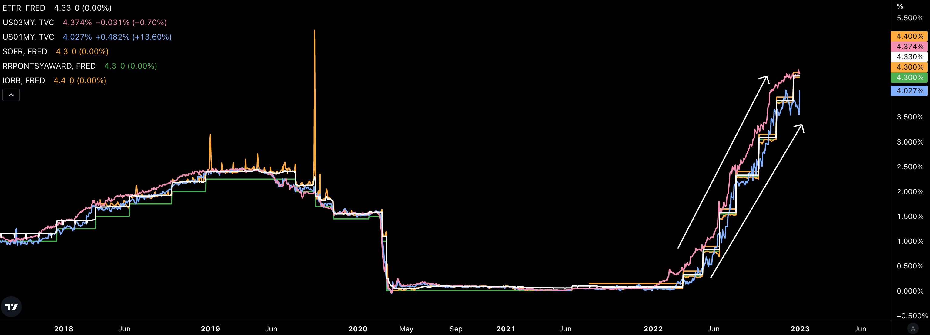
These rates are the lifeblood of the market.
And when it comes to how these rates move up and down in relation to one another (i.e. - 1-year versus 30-year Treasury), I like to think of this process as putting a top sheet on your mattress.
You know the move… You unfold the sheet on the bed. Then once it’s close to being unraveled, you fling it up into the air to try and lay it out flat on the bed. You do this a few times until the sheet falls in a similar fashion to the normal yield curve.
It’s a process. And it’s one that at the start requires you to raise the part closest to you higher than the rest of the sheet in order to get the entire sheet up in the air. This part closest to you is like the shorter duration Treasuries on the yield curve. As these yields or sheet is lifted high enough, the rest of the sheet drifts up to meet that elevation. And of course, the more aggressive you do this, the better your success.
With that Martha Stewart moment, here is 2023 in a nutshell…
As you bring the area of the bed sheet you are holding back down, I mean, the yield curve on the 1-month side back down… the curve normalizes. This unfolds with the FED adjusting rates ever so slightly down - remember from the chart before, the short 1-month to 3-month Treasuries are closely aligned with the rate set by the FED.
If you are a bit unsure of this analogy, I asked Jerome to do me a solid and demonstrate how this works using his bed sheet at his latest press conference.
You can see below the solid black curve is more akin to what we see in the market now (6-month and 1-year expires with the highest yields)… And as we stop raising rates and possibly cut rates slightly, the later durations will float higher so that the yield curve is similar to that dotted line - a normal yield curve.
What is interesting about this dynamic is that we can already see this process being priced into the market. We will get to that more in a moment.
But first, let’s just wrap up this section on Treasuries to help us later on in this essay…
Investors know rates are climbing. This incentivizes them to buy short-term Treasuries because they can buy within a month or so at a higher/more attractive yield. This reduces the incentive to buy long-term debt.
The secondary effect of the government not able to sell a lot of long-term debt…
(I tried to get this stat, and the closest I came was seeing the average time to maturity for the government came down from 70+ months to somewhere in the mid-60s. If anybody has this stat, I would love to dive into it as it will provide some insight into debt maintenance in the years to come.)
Is the government is selling a lot of short-term debt for now. (Again, if anybody has the data here, would love to see this.) Eventually, it will pivot to longer-term debt as rates stabilize, and investors will be looking to lock in higher rates for the long-term. And in turn, the government will likely be locking in debt with longer maturity at a higher rate.
This causes some issues with the government just paying the cost to borrow over time… An issue that is solved from productivity - which we know the government is not the best at.
Regardless, this yield curve normalization the FED is so hellbent on attaining looks to be unfolding in the market. Let me show you…
Terminal Rate
The discussions are already happening around when the FED will reach their terminal rate. Which is to say, when they’ll be satisfied that the rates are high enough.
To determine what the market thinks, we can reference Eurodollar Futures. It’s “GE” on your TradingView app. The contracts are priced oddly, but make sense after you look at them a few times. You take 100 and subtract the price (i.e. - 95) to get what the market believes the FED’s rates will be when that specific contract expires.
The chart below shows all the contracts from January 2023 to December 2024. The oranger lines are contracts in 2024, signaling the market thinks rates will be lower than what we will see in 2023. And the highest rates will reach is around 5 to 5.25% right now.
The last bit of info we can distill here is this terminal rate is expected to happen around September 2023 or late Q2-early Q3.
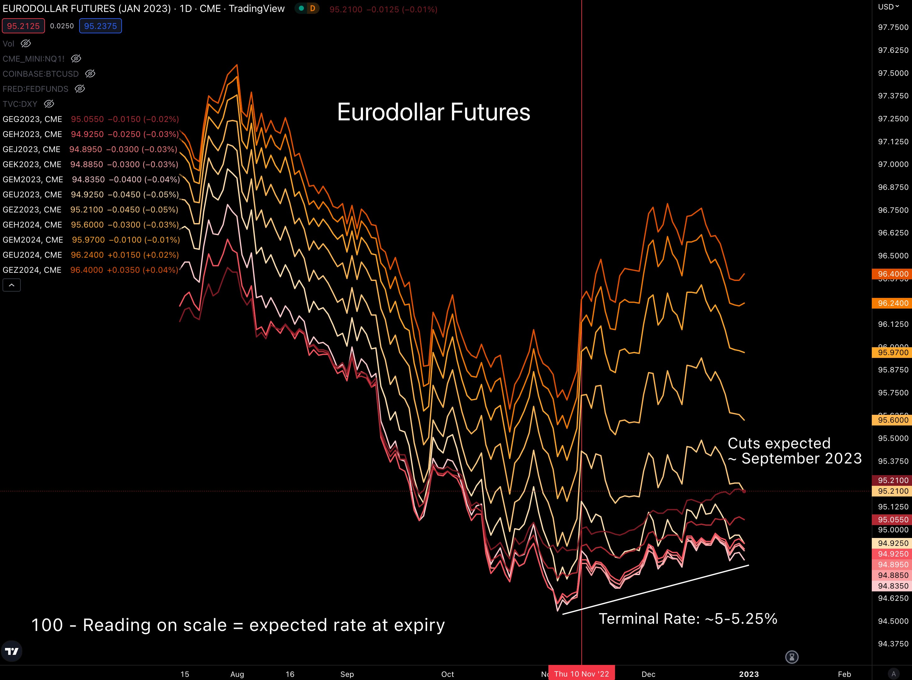
Again, I know these Eurodollar charts are rather confusing. And when they start inverting like this, it only gets more difficult.
So to give another example of what I’m saying, here’s the CME FedWatch tool. Focus on the blue squares since it’s saying similar things as the lines above. The blue squares signal what rates are most likely to be at certain meeting dates.
The difference here is the CME is expecting the terminal rate to hit in June, and then come back down… Flip the sheet up, and then bring it down slowly as the rest of it drifts up… It’s enough to make the cover of Home & Garden magazine.
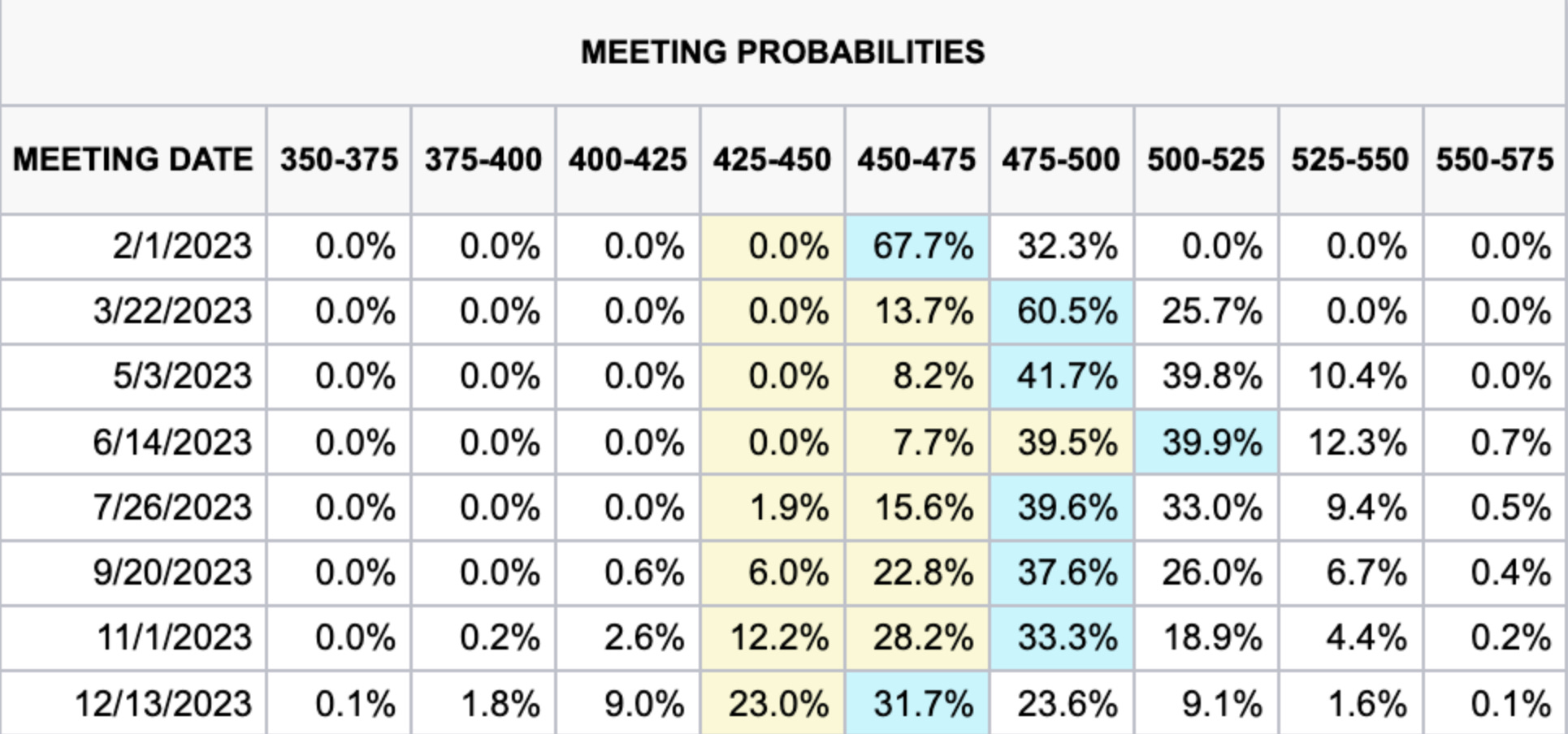
So to sum it up, terminal rates will take place between June and September next year per the market. Then rates will drop a bit before the end of the year.
Important to note, I keep writing “the market is saying.” That’s because nothing ever plays out according to plan. What we see now will be different in a month. So view this as a framework to help better understand changes that happen in 2023.
How perfectly this lines up with the months is not as important as the fact that this timing lines up very well with inflation expectations.
If you recall Jackson Hole in 2022, Jerome declared the number one enemy to be inflation. It was a short and direct speech. If anybody recalls the essay “You Are The Problem,” I drew light to the fact the FED called this “rational inattention.” It is the theory that his short, direct, and repetitive speech was intended to permeate the idea of combating inflation to every media outlook across the board.
Jerome wanted the person who only reads headlines when it comes to finance to know JPow wants no diggity, no doubt when it comes to the FED’s role on reducing inflation… Just like his bed sheet folds.
What has changed from that Jackson Hole speech to now is various inflation stats that are showing signs of cooling in the first half of 2023.
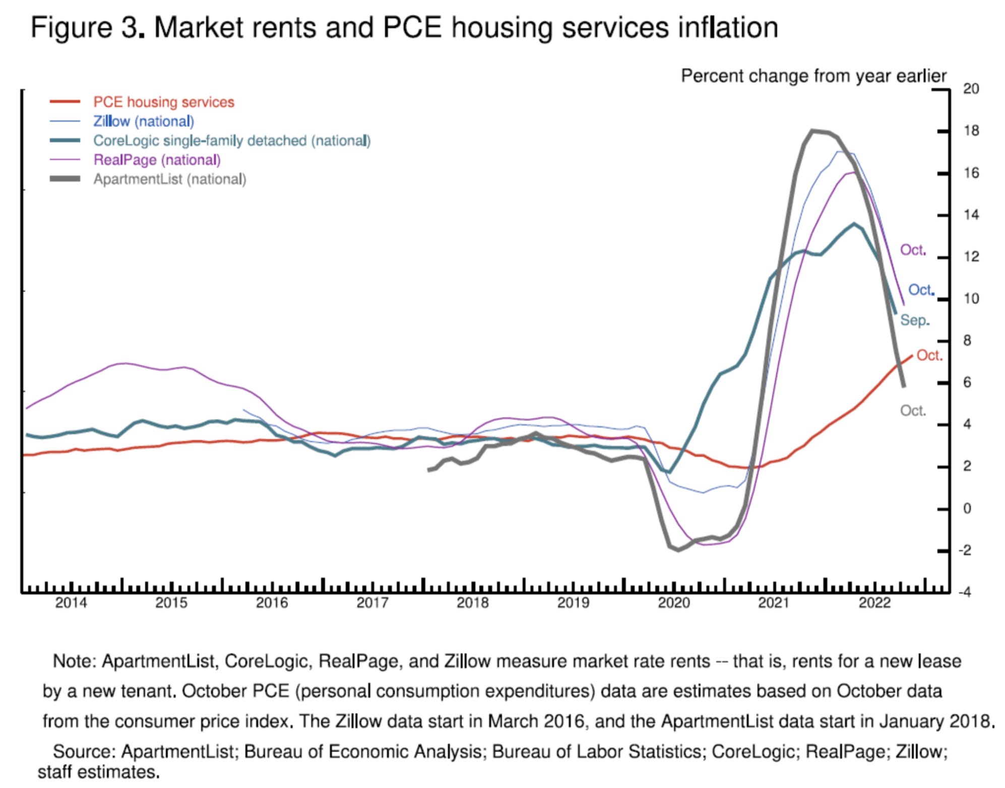
To see what I mean, I dug up some charts from Powell’s transcript back from his November 2022 presser. It was showcasing inflation, and in particular, three areas of inflation. They are core goods, housing services, and core services.
As you can see, housing services was still running hot.
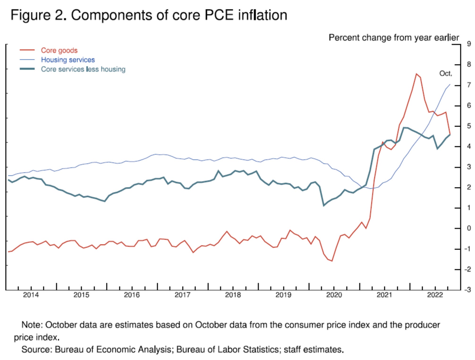
The interesting part here is that’s a lagging indicator.
JPow didn’t disappoint his throw pillow fans… He added in some metrics that tend to precede movements in his lagging housing services inflation stat.
As you can see below, these metrics that tend to predict housing services inflation are all on a significant decline… The red line below is the same housing services inflation line from above.
This tells us with these readings topping out around mid-2022, we can expect to see housing services showing a similar move down in Q2 of this year. Coincidence?
Again, this lines up with the Eurodollar charts from earlier… And as JPow said in Jackson Hole, the FED will be hawkish until inflation tames.
To drive home the point around inflation a bit more as I only touched on one stat… Here is the one-month percent change of inflation. It is already coming back to just above zero.
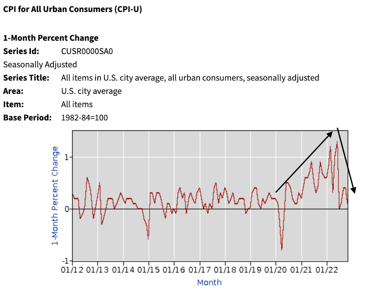
If you are like me and hate the one-month change chart from above that government representatives spitting one-liners like to reference, here’s another way to look at it…
The rate of change of CPI was going parabolic until about June of last year.
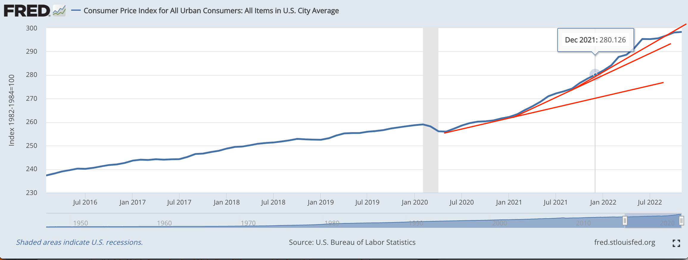
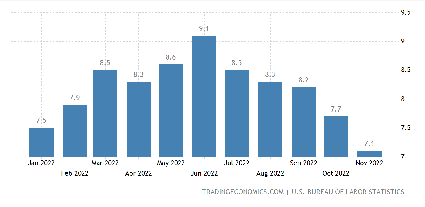
We are no longer on that same parabola. CPI is now trending sideways from month-to-month. The timing of that “June” growth lines up with peak inflation in 2022. In the bar chart below, you’ll see since then we have trended lower.
So when it comes to the FED trying to time terminal rates in 2023, along with declaring success on inflation being beaten down, this is the outlook for 2023.
This is “good.” The positive. The dovish and bullish parts for 2023 that we can look forward to.
But not everything goes perfect. Which is why we should probably now get to what the FED is likely to be fighting in 2023 as they attempt the normal yield curve maneuver.
The Productivity Dilemma
Productivity is a bitch.
We all wish we had more of it - this holds true for every nation-state.
Now, I do want to take a moment to first say… I hate the fact we talk about the U.S. financial system so much. But the truth is, the U.S. dollar is the main global reserve asset. We trade against the U.S. dollar when it comes to nearly every asset across the globe.
So we are forced to take this U.S.-centric view. We don’t like it, but that’s the hand we are dealt.
Getting back to it… Rates are high. The cost of money is expensive. This tightening has reduced demand from consumers in the economy, which in turn means less goods and services are purchased.
This translates to lower GDP… Don’t worry, I’ll tie this back to the bed sheet tutorial soon… And if lower GDP happens for long enough (not sure if still true - I joke here) we have a recession.
Many believe we’ve been in a recession. Some say it’s imminent. Whatever you believe, here’s the data showing it’s ugly. The chart below is the Purchasing Managers Index. It’s a glimpse into how much activity is taking place with those who make things. The lower it is, the less “stuff” being made.
And as less stuff is made, the less output an economy tends to have… meaning lower GDP.
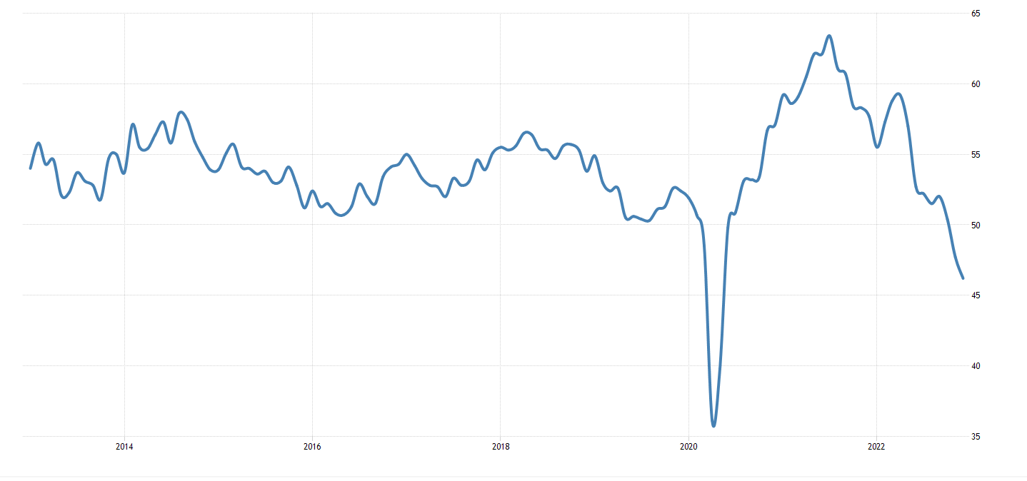
This makes sense as the goods made in the U.S. are now more expensive relative to other countries. We can thank the U.S. dollar going parabolic relative to other currencies. Not to mention, demand in the U.S. economy is also lower from rates rising.
So with the economy already slowing and likely headed into a recession… wouldn’t the cost to take out more debt begin to rise? You would expect Treasury yields to go much higher. Meaning the plans to normalize the yield curve would be ruined.
Also, with GDP trending lower, and likely businesses experiencing lower revenues… how we expect the market to remain unscathed… Is a market crash imminent?
The Ace Up the Sleeve
2023 is an experiment in liquidity for the FED.
Liquidity is their ace up the sleeve, their new tool… It’s the plunger we referenced in “Where To Plunge.”
To explain it quickly, the FED is sitting on $2.2 trillion of liquidity. This is money that is “locked up” at the FED. The FED provides guaranteed yield on the money… Making it a preferred destination.
You can see just how attractive this lending facility is with the chart below. It’s the amount of money sitting in the Overnight Reverse Repurchase Agreements vehicle.
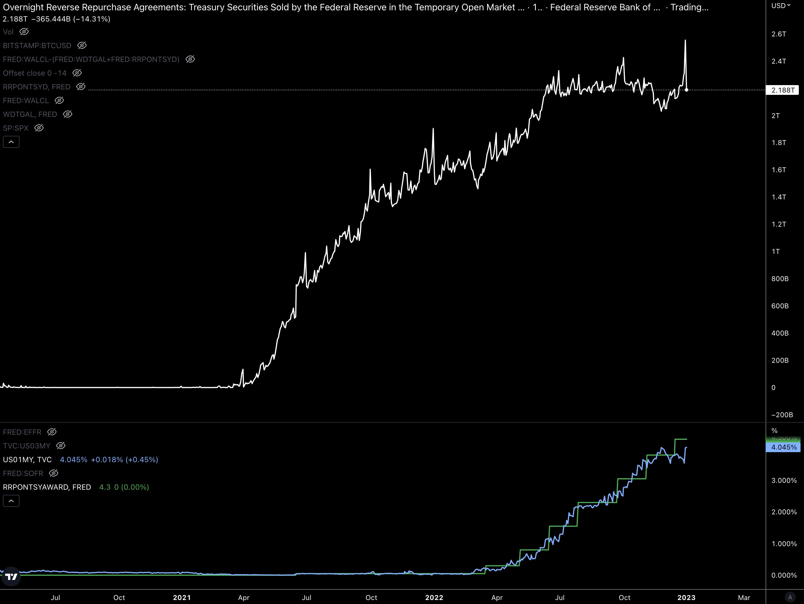
With the U.S. money stock as measured by M2 around $21.5 trillion, this is a massive stash. If we ran that same percent of how much the Repo market represents to money in circulation… But in terms of Bitcoin… It would be nearly 2 million BTC. That’s massive considering there are less than 20 million coins in circulation.
It’s also 3x larger than the first round of stimulus in 2020 of $700 billion. The $2.2 trillion represents a massive rainy day fund that the FED hasn’t had on hand before.
Which means when cracks form in the market, in the form of wide corporate bond spreads or low demand in the Treasury market… the FED can just tell some of the money in this vehicle to “go somewhere else.”
Where will it go? It’ll act like spackle to any cracks forming in the market. It puts the FED in a strong position to implement their normalization efforts.
But here’s the thing…
When global demand is trending down…
Businesses are laying off workers due to less revenue…
What issues is liquidity less able to solve?
Paying Later
The place for you to look at is in your billfold. It’s that piece of plastic you enjoy swiping each day… The one that allowed you to buy that $500 watch instead of the $100 watch.
Or said another way…
It’s the tool that lets consumer buy things that cannot be repossessed. What bank is going to repossess that Sony PlayStation or $500 watch that was purchased on the credit card?
The stats are beginning to stack up on this, which I’ll show in a moment.
What I’m more concerned is what I can’t show.
To highlight what I mean, at the end of November during Black Friday and Cyber Monday, the use of Buy Now, Pay Later solutions jumped over 70%.
It is so significant that Walmart is trying to push its own solution for BNPL tech into the market.
Buy Now, Pay Later or BNPL is a way for consumers to buy items without running a credit check. And they aren’t charged interest for the payment. It’s an easy way to afford a more expensive TV… It’s 0% interest… In a world where cash is worth 4-5%.
What could go wrong?
We have consumers loaded up on these BNPL agreements… Just as the economy trends towards lower productivity.
Not good.
What’s worse is we don’t even know how much money is tied up into BNPL agreements. Does anybody else shudder when we don’t have transparency into leverage?
What we CAN see is how much credit card debt there already is in the market. And what you’ll see is that ever since the government stopped handing out stimulus checks, the debt has gone parabolic. This was at the end of 2021.
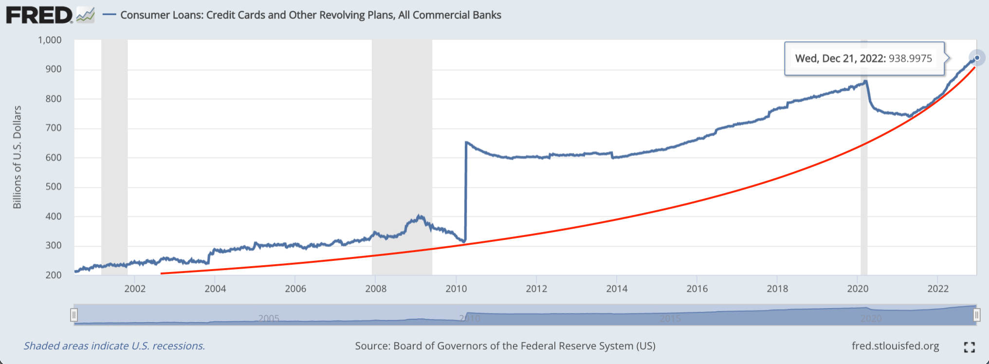
The chart above goes back to 2000 and highlights just how fast debt is climbing today versus times prior. It’s an issue that is likely to compound as rates remain high, GDP trends lower, businesses make fewer goods, and finally what Powell wants more than anything… labor conditions get tighter aka more layoffs.
This area of the market is one that liquidity from the FED is far removed from. It’ll take government stimulus to solve.
And as we learned recently, free and cheap money created the inflation problem we are currently unwinding from.
What it also did was create a massive asset bubble in the market. Is this the setup to the meltup that some people have been alluding to? I’m starting to lean toward this if we see this corner of the market become a bigger problem.
Whether this consumer issue unfolds in late 2023 or in 2024, it looks to be coming. The government will keep markets orderly with their liquidity on hand. But the real issue looks to spring up where their liquidity cannot reach.
It’ll be more stimulus checks to reduce the downstream impact to banks…
If this unfolds, I’ll be ready to ride a meltup.
Happy New Year, this is going to be the start of another wild ride.
Your Pulse on Crypto,
Ben Lilly


