The Double-Bounce Effect
Why the Dollar's Weakness Results in Major Moves Higher


An elixir of adrenaline and butterflies surface.
Your vision narrows as you become hyper-sensitive to your surroundings.
The g-forces pull at your cheeks as you near the ground. Your shoulders droop. The mesh below your feet stretches as it catches your momentum…
And just as the g-forces top out, another force enters… Your friend.
It’s the double bounce moment.
As a child, this double bounce maneuver is how you learned to defy gravity.
When jumping alone on a trampoline, there was a limit on how high you could go. The rhythmic ups and downs, while exciting, were short-lived.
But when your friend entered the picture, the fun would start. As your friend comes hurtling down to hit the mesh, you would catapult unhinged into the air. Childhood volatility at its finest.
As far as the adult version…
Well, we look to the markets. And when it comes to the way in which the U.S. dollar is behaving, it’s acting as that second force in the double bounce… Your friend.
It’s the force that can send asset prices soaring, unhinged from gravity.
Not sure what I mean?
Well, I’d like to introduce you to this double bounce happening through the lens of two forces. One is the global growth in money supply. Its persistent growth creates the moment ripe for…
The other force, the dollar, to launch asset prices.
But before I show you, I want to make a quick mention of something happening at The Lab:
Next week, we unveil our order execution management system (OEMS) to our clients.

While the beta launch will be invite only, we are very eager to share progress with you in the weeks and months to come because the OEMS is part of a much larger project spun out of Jarvis Labs: PANDA Terminal.
Now, what the OEMS does is allow users to make use of our proprietary and more sophisticated trade strategies for entries and exits.
The system even enables users to automate their Tradingview signals to make trades based upon the buy/sell signals straight from their TView account.
Here is a sneak peek of the system:
A few highlights of the system is that we no longer need to handle api keys thanks to a backend solution that does not use a storage database. This improves security for user accounts.
What’s even more is that the system is globally distributed (for improved reliability) with dynamic scalability (for faster execution).
Further, this prepares us to soon bring sub millisecond execution via FPGAs. You can think of FPGAs like you do ASICs when mining tokens. But with FPGAs, they level up your trading by providing ultra low latency.
And finally, the OEMS can initially be used with Binance spot/future, Bybit, bitmex, and deribit. More added soon.
OK, we understand you all are probably not nearly as excited as we are, we just share this in the hopes to earn your business soon by providing you with the best data, metrics, and trading solutions in the market.
Now back to the essay!
Stacking Them Up
Before we go country by country and look into their money supply growth, let’s first see who we should be looking at.
To decide who matters in this analysis, we can view GDP by country to get an idea of the impact each country’s printing press has on global liquidity. The bigger the productivity of a country, the more impactful each unit of currency is on the global stage.
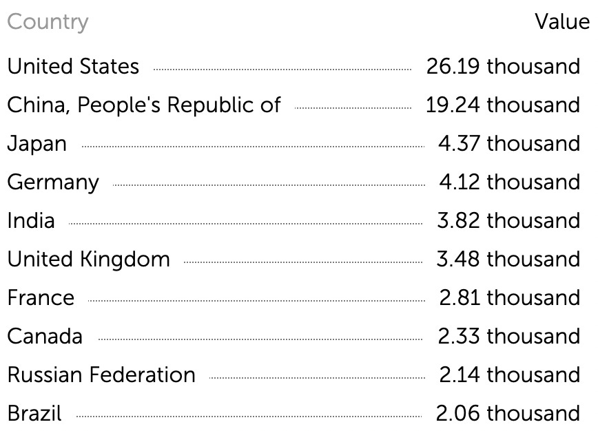
Here are the top 10 countries in terms of expected GDP for 2023 by the International Monetary Fund. Figures are in billions, so 26.19 thousand is $26.19 trillion. I know, weird, but it actually makes sense once you get into the sub-trillion dollar economies.
To make this a bit more digestible, let’s break this list into four buckets.
We have the United States and China in the first two given their massive economies.
Then we can combine BRIC countries into another if we take out China from that basket. Let’s call this BRI-C. This bucket gives us Brazil, Russia, and India who account for just over $8 trillion of GDP.
We are then left with the last bucket, consisting of Japan, Canada, the U.K., France, and Germany. This group makes up $17.11 trillion. We can call this the “Just Cuz U Fudgin’ Gotta” group for lack of a better name.
To recap, we got:
- U.S.: $26.19 trillion
- China: $19.24 trillion
- JCUF’G: $17.11 trillion
- BRICs (minus China): $8.02 trillion
This gives the group a 2023 GDP outlook for $70.56 trillion. These 10 countries produce twice the amount of the rest of the world’s 227 countries tallied in the economic outlook dataset.
So while it’s not a holistic view, it should give us a general understanding of liquidity trends via money supply growth.
But before we check out all the liquidity sloshing around, why do we care about liquidity from central banks in the first place? Is it really that important?
The Liquidity Addiction
Once you’ve had it, you’ll want more. That’s how liquidity markets itself to the financial system.
The dose of liquidity injected into the COVID-riddled veins of 2020 was a rush. It was enough to make everybody hooked.
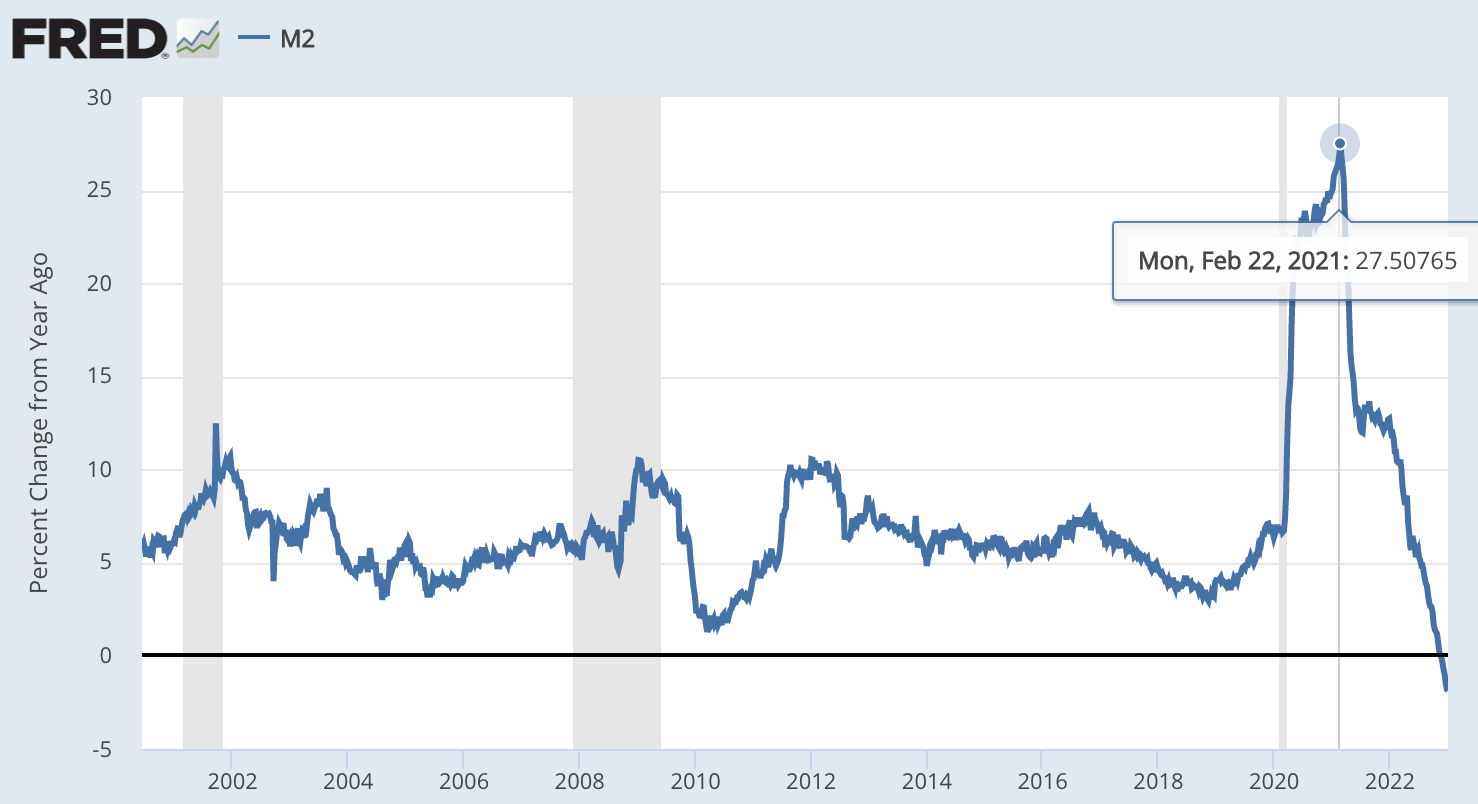
At one point, the annual change of money supply as measured by M2 was up 27.5%. You can see the monumental heap of liquidity doled out in 2020-2021 below.
And as markets ripped in turn, the financial system became addicted.
This liquidity shock is pretty well-known by now. But what most aren’t aware of is that central bankers are starting to call this “liquidity dependence.”
In August 2022 in preparation for the Jackson Hole meeting, academics submitted papers on topics that were to be discussed during the multi-day conference.
The one that stood out at the time — but didn’t necessarily fit the inflation theme of the day — was a paper titled, “Liquidity Dependence: Why Shrinking Central Bank Balance Sheets is an Uphill Task.”
To diagnose a problem, you first need to label it.
The paper was tagged with institutional names such as the Hoover Institute (Stanford Univ.), Booth School (Chicago Univ.), NYU, Frankfurt School, and Germany’s Ministry for Economic Affairs and Energy. This made it a joint effort between top U.S. think tanks and Germany.
While the backers are interesting, what is most important here is a line within the abstract that summed up the paper:
The past expansion of the Fed’s balance sheet left the financial sector more sensitive to potential liquidity shocks when the Fed started shrinking it, necessitating Fed liquidity provision in September 2019 and again in March 2020. If the past repeats, the shrinkage of the central bank balance sheet is not likely to be an entirely benign process.
The issue of liquidity dependency is now well-known by bankers. And it’s in part the central theme in their fight in keeping financial markets intact. If liquidity is good, markets are good.
In the U.S. markets, the FED combats this dependency problem with its $2 trillion repo market. This facility allows the FED to add liquidity into financial markets without needing to fire up the printer. We wrote about this back in August ahead of the Jackson Hole meeting.
It’s been their secret weapon in keeping Treasury yields in check.
Whether you think it’s right, wrong, immoral… it’s a savvy move by the FED.
They can release liquidity into the markets in a way that reduces their balance sheet and does not get reflected in the amount of money in circulation (M2). Impressive arsenal at their disposal.
And what this all showcases to the financial world is that the FED is making a bet. That bet: Liquidity is the key to their success.
Thus far, that bet is winning.
Now, when it comes to understanding how much liquidity is in the system, we can see from the FED’s repo market that there are subtle nuances to this liquidity measure called M2. So keep that in mind as it is our best measure for what we are about to do here…
Which is to look at our four buckets laid out earlier and see what the general trend of liquidity across the globe is doing. Why that’s important is this liquidity acts as kinetic energy in asset prices, and the dollar is the trigger.
Here’s the breakdown.
The Liquidity Buckets
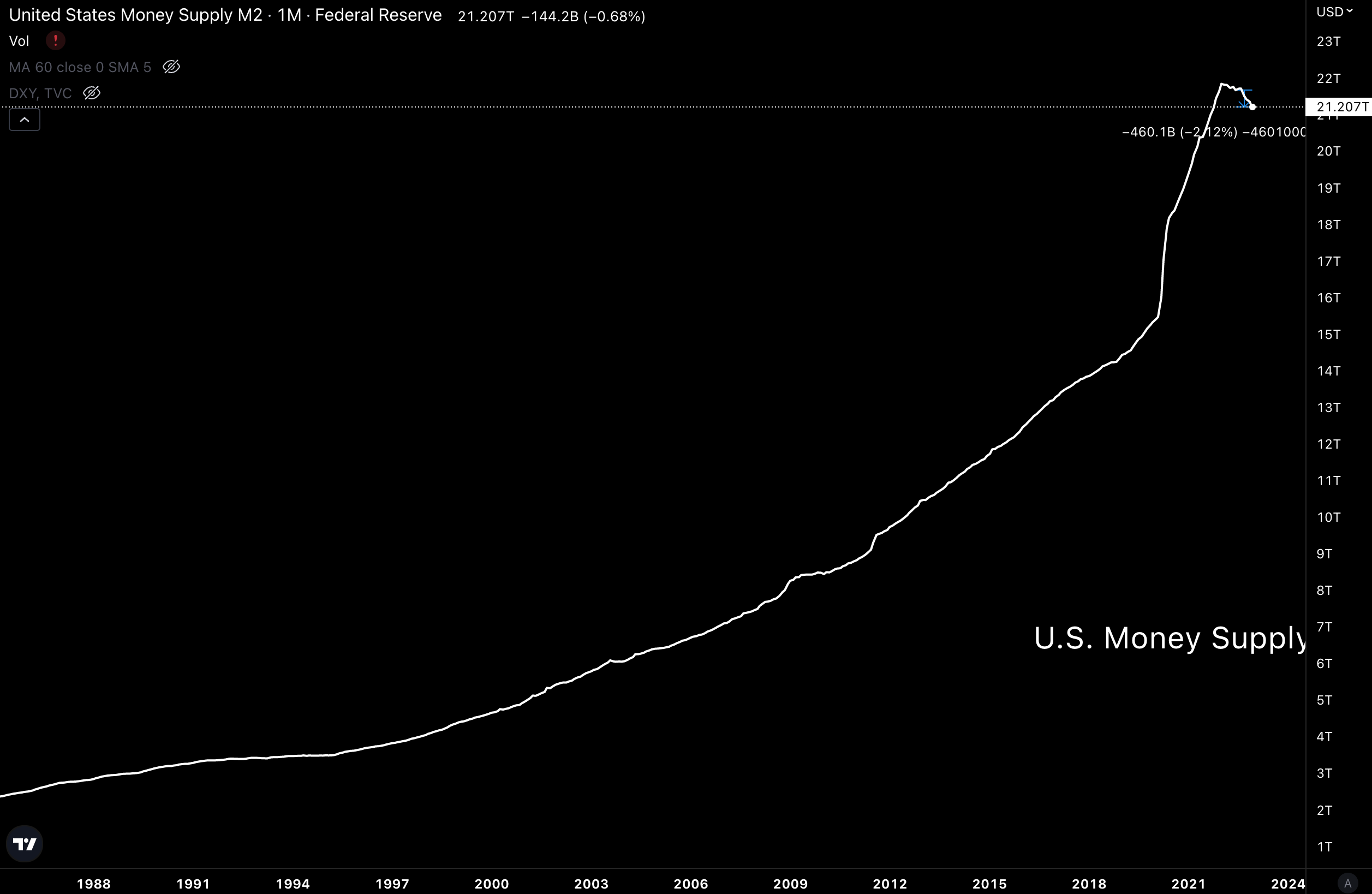
United States, -2.12%
To understand what the trend in liquidity looks like, let’s pull up the current money supply of each of those buckets.
Here is the United States and its money supply as measured by M2. As you can see, it is down about $270 billion over the last six months. OK, no need to dwell on this as we have a lot to cover…
Next up,
China, +3.21%
The money supply in China is rising when looking at its native units. There is nothing hinting at a change of trend here. If anything, we look to see its money printer ramp back up in Q1/Q2 if this parabola persists.
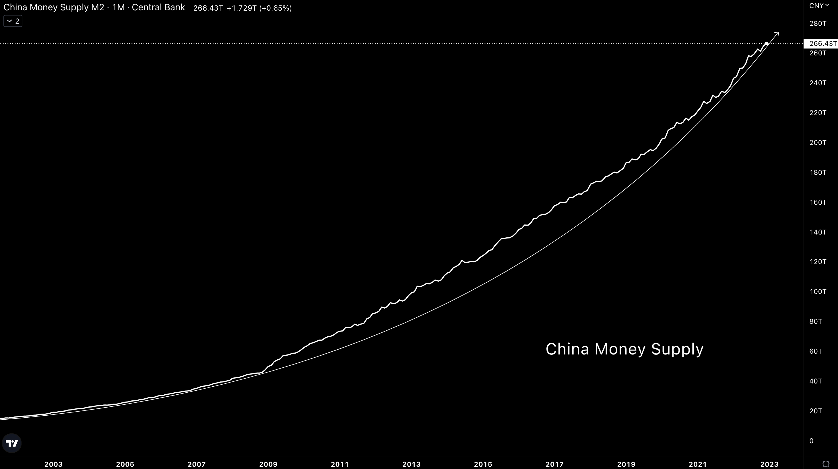
Over the last six months of reported M2, money supply is up 3.21%.
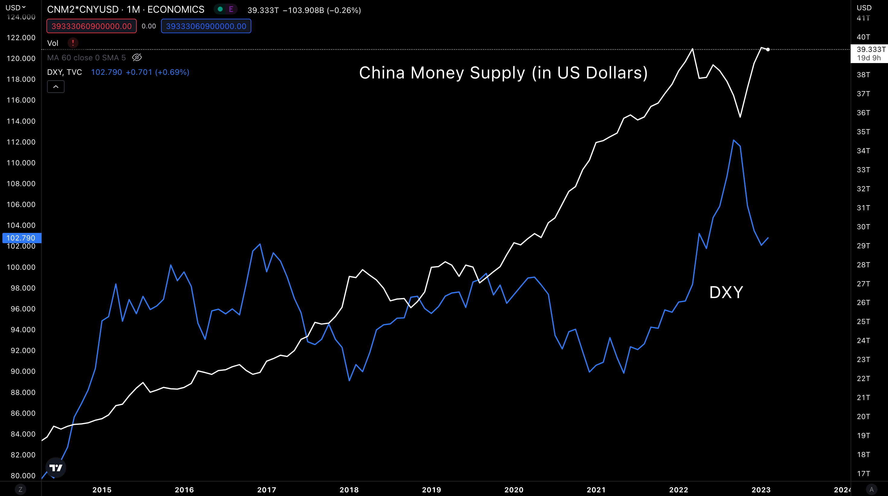
If we take this chart and dive into it in terms of U.S. dollars, we get the chart below. This is an important reading to note because we see many analysts reporting China is turning off its printer, and this is why.
Here, we see clearly the change in the U.S. dollar’s strength (as measured by the U.S. Dollar Index, or DXY) over the last year makes it appear like China’s money supply was on the decline for 2022.
But keep in mind…
If the Chinese were taking their currency and exchanging it immediately for U.S. dollars, this denomination in U.S. dollars would be important. But my impression is that yield farming is not a common practice in China. Meaning more money supply in Chinese Yuan terms = more supply in general. And if anything, the impact of those added Yuan grow if the dollar weakens.
So far, we have taken a dive into the U.S. and China’s money supplies in native units. China is up much more than the U.S., but the U.S. economy is much larger. Meaning each $1 printed in the U.S. creates more economic output than China.
We know this because when we convert the Chinese yuan to U.S. dollars, the economy has $39.3 trillion worth of currency in the market (compared to the U.S.’s $21.2 trillion). And China is producing about $7 trillion less in GDP with that currency.
Based on this, we can cancel out the two countries to say global net liquidity from the two behemoths are yielding no change (ignoring the repo market for a moment).
Let’s keep going then…
JCUF’G
This group is a bit more difficult since it has France and Germany in it, which are part of the Euro. So I’ll break this section down into Japan, Canada, U.K, and the Eurozone.
Again, we are not trying to measure doses by the milliliter, just trying to get an overall idea of which way liquidity is flowing.
Japan, +0.37%
Looking at Japan first, we see the familiar up-and-to-the-right parabola forming. Only difference here is Japan slowed its money printing in Q4 2022. And similar to China, if the parabola holds true, the printing press will turn back on in Q2 of 2023.
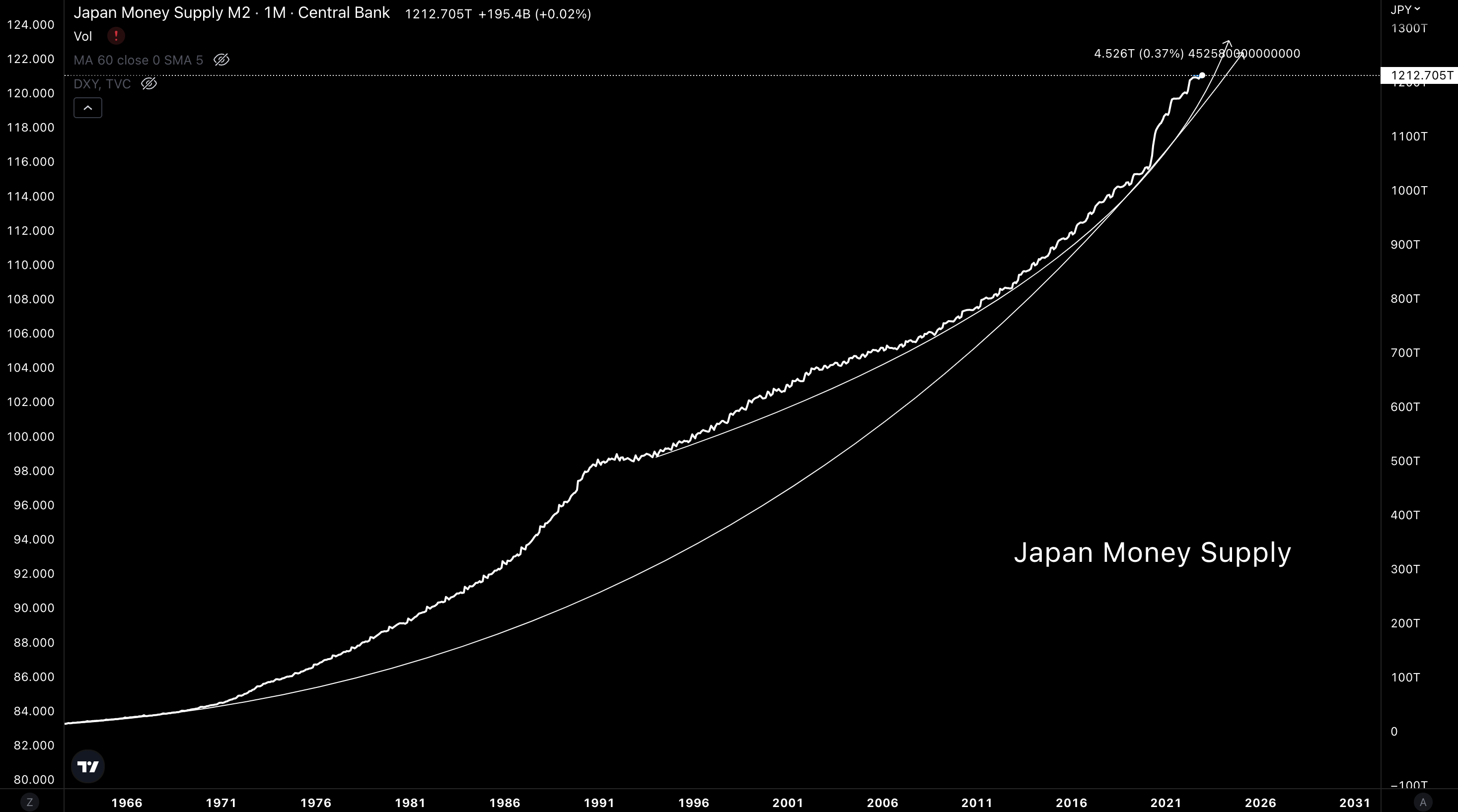
Then when we convert this supply into USD, here’s what we get. Similar findings to China where the move in DXY is creating major swings in money supply. From June to December, this created what looks to be a 12% drop in money supply.
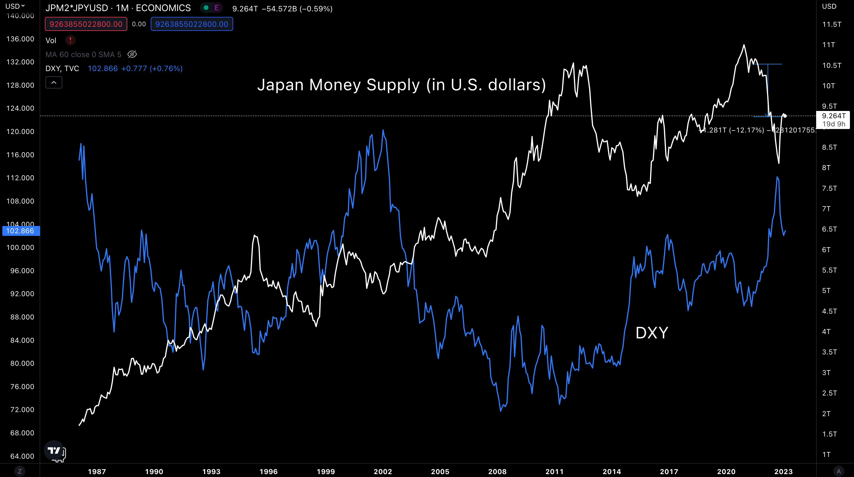
Already, you should start to see where we are going here… The conversion of money supply into USD is creating the impression that global liquidity was shut off in 2022, and is now being turned back on in 2023.
An early look at the double bounce effect...
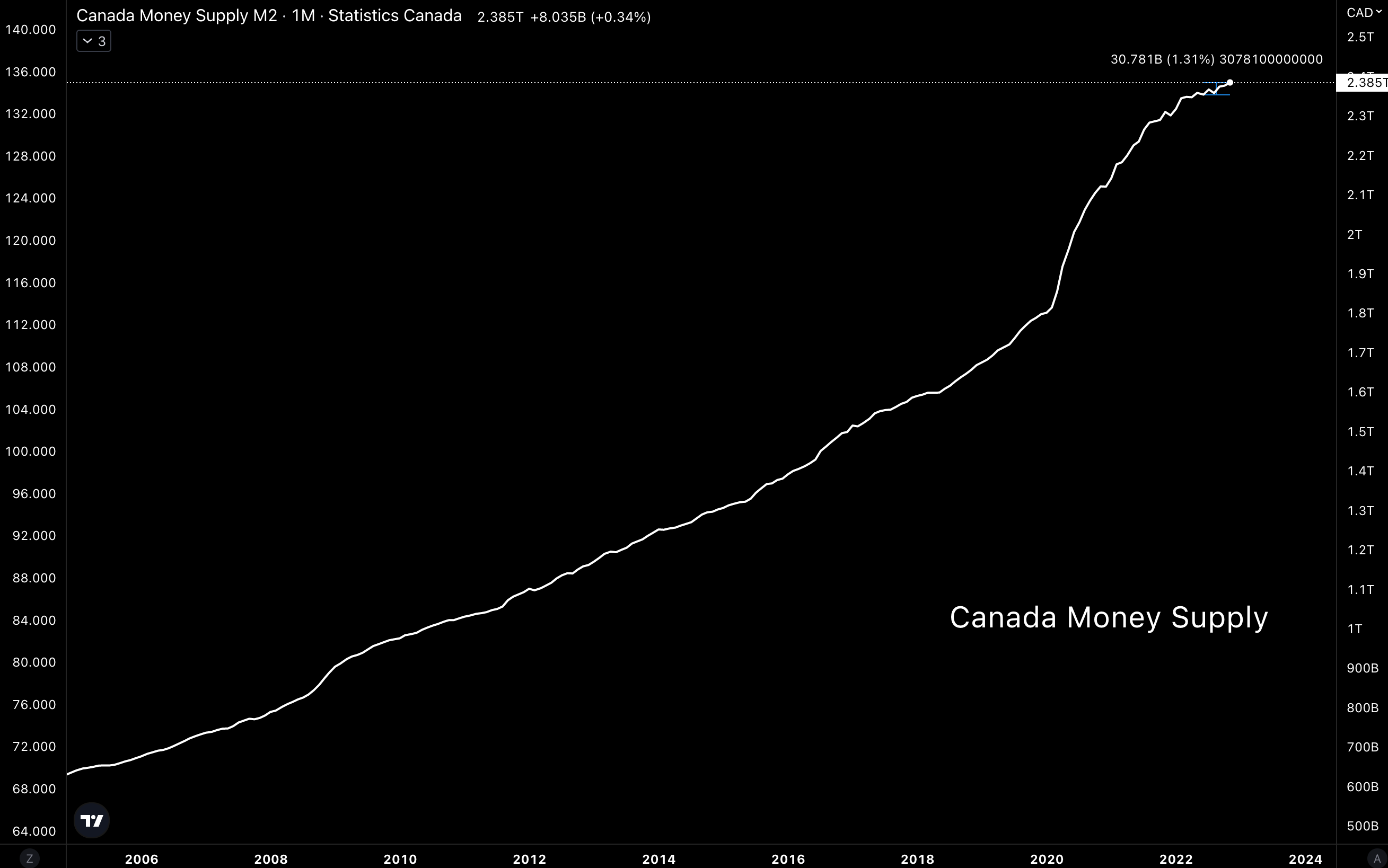
Canada, +1.31%
Similar story here, supply in native units is up over the last six months.
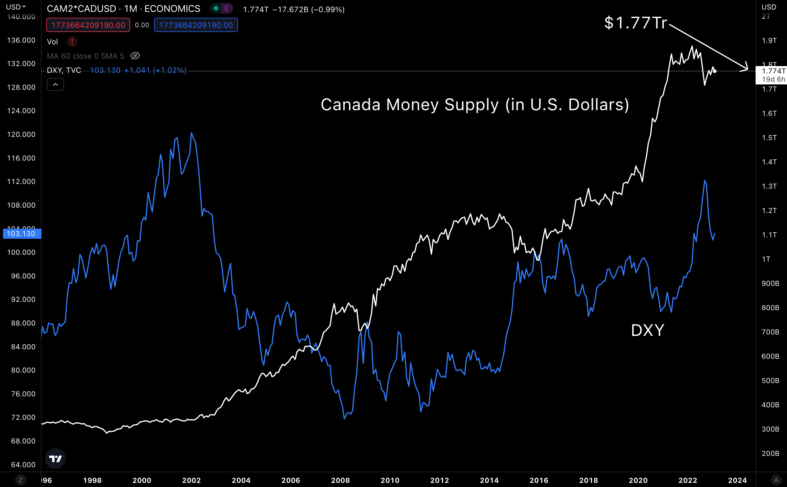
Here is the supply converted into U.S. dollars. Note the amount of $1.77 trillion. These figures are getting rather small compared to the other countries.
But when we add it to the others within this bucket (i.e. - Japan at more than $9 trillion), we start to approach something of size. For those of us keeping track, the JCUF’G is about $11 trillion so far.
United Kingdom, -0.13%
This supply is down over the last six months, and more importantly, had a pullback in Q4. Overall trend is still up and to the right. This is likely a small deviation from the norm.
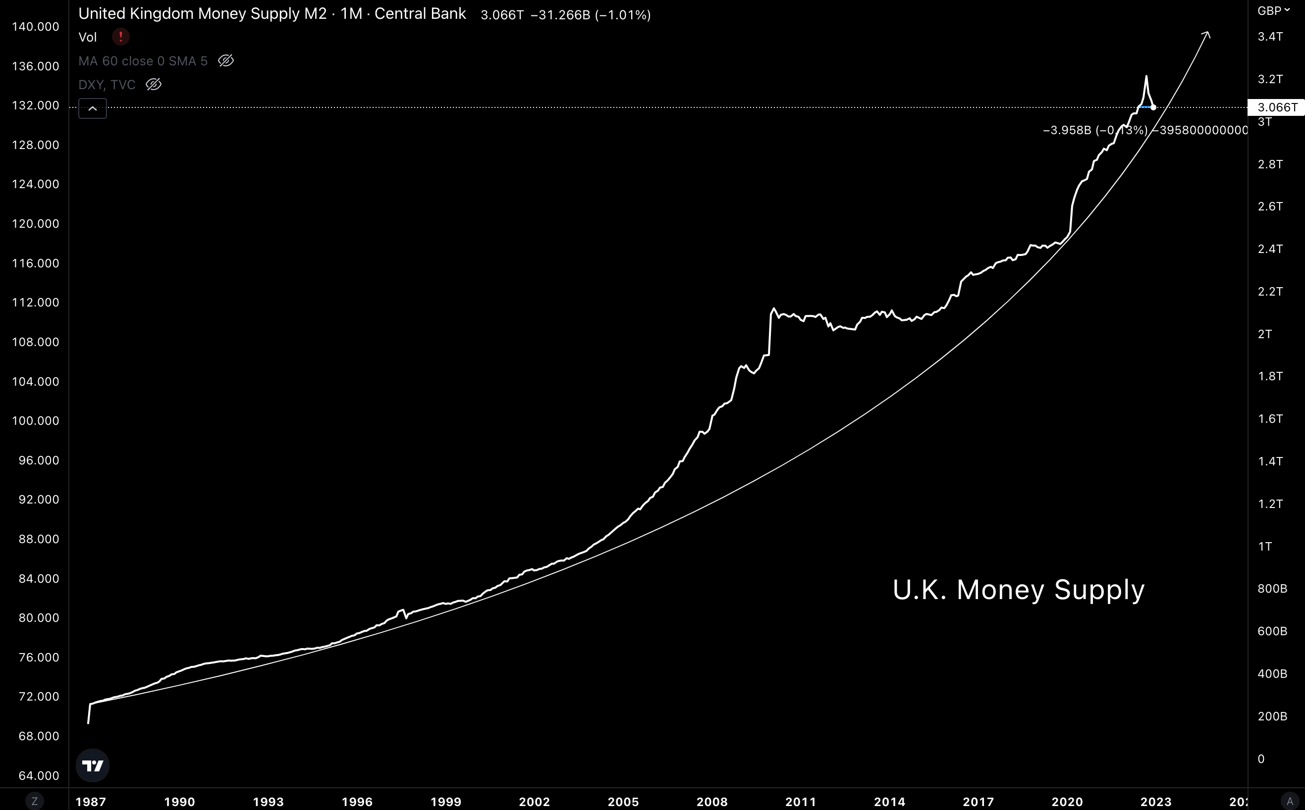
The money supply in USD terms is not surprising as the British pound to USD has gotten hit, and this is highly variable with DXY like many other currencies. What is important here is the amount of supply in USD comes to $3.7 trillion, which is about $0.3 trillion less than six months ago.
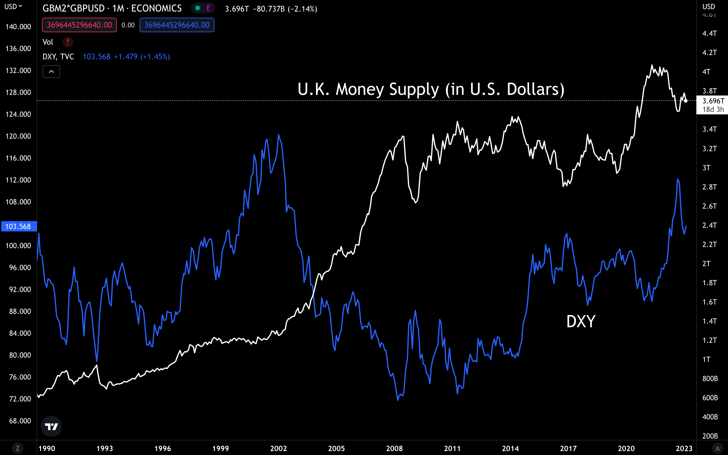
So if the dollar loses strength and the money supply starts to rise again, we have a strong double dose of liquidity happening here → more supply + more strength per unit of currency.
Eurozone (France, Germany), +1.34%
Here we have more of the same. Supply has a small dip, but overall trend is unlikely to change.
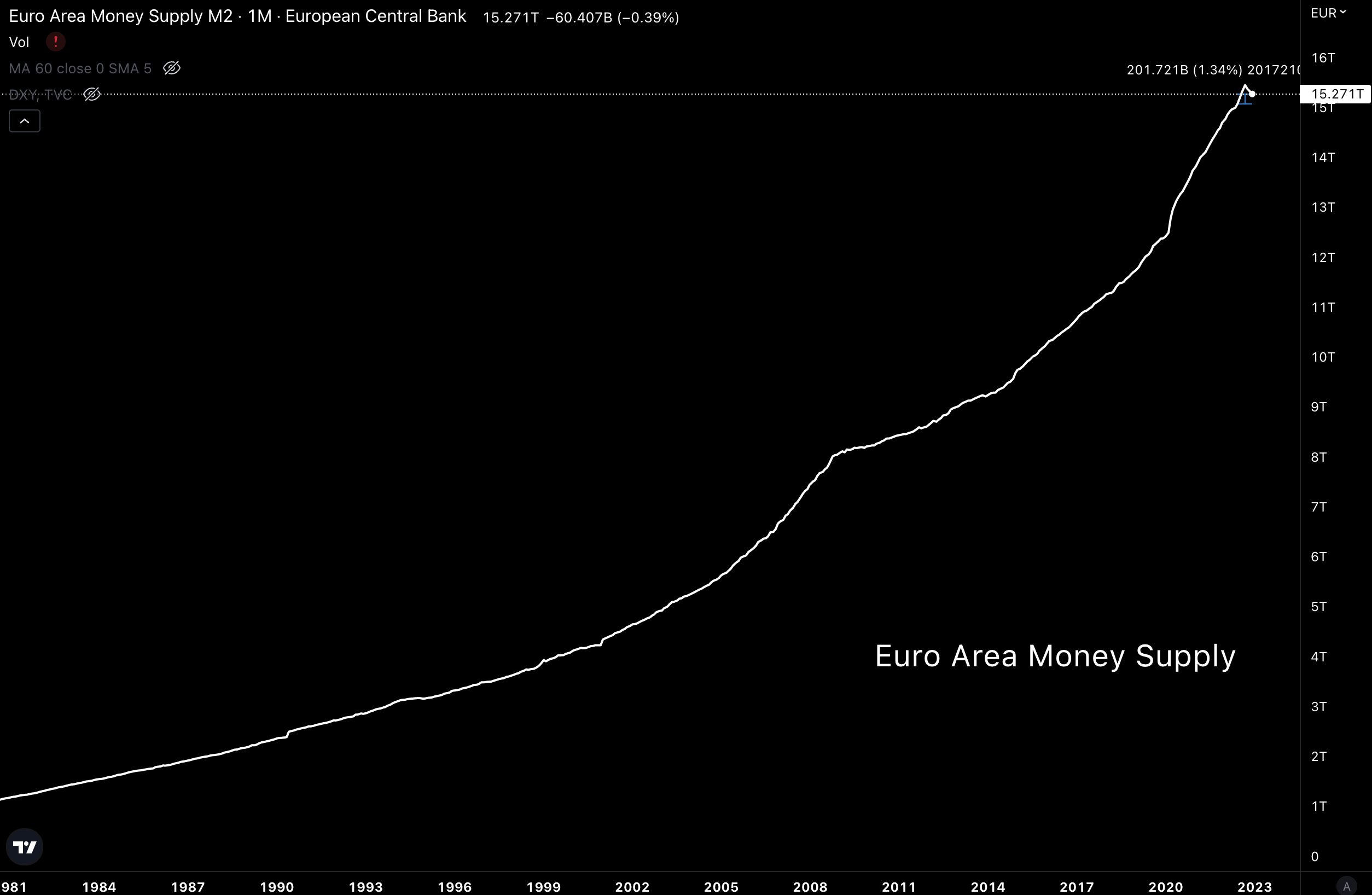
This amount of money supply represents $16.4 trillion in USD. We want to keep an eye on this bucket, especially if the supply in native currency terms begins to rise again.
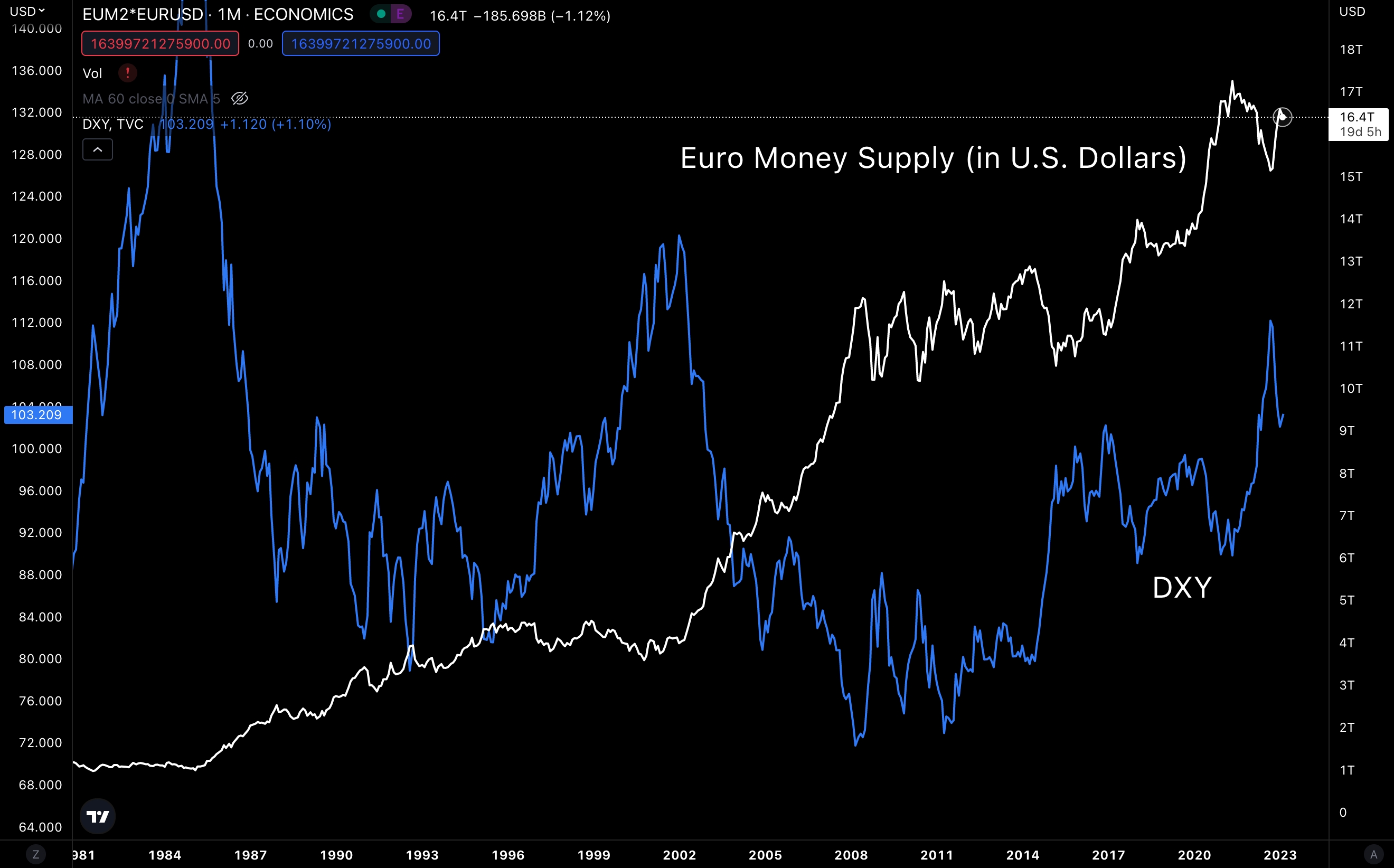
Overall, this bucket is showing that overall trends are up. But we have small subtle dips in money supply growth. When these supplies resume their normal trajectory, we will get outsized movements in the supply as measured by USD if the U.S. dollar continues to lose strength.
Now, let’s dive into our last bucket…
BRI-C (BRICs minus China)
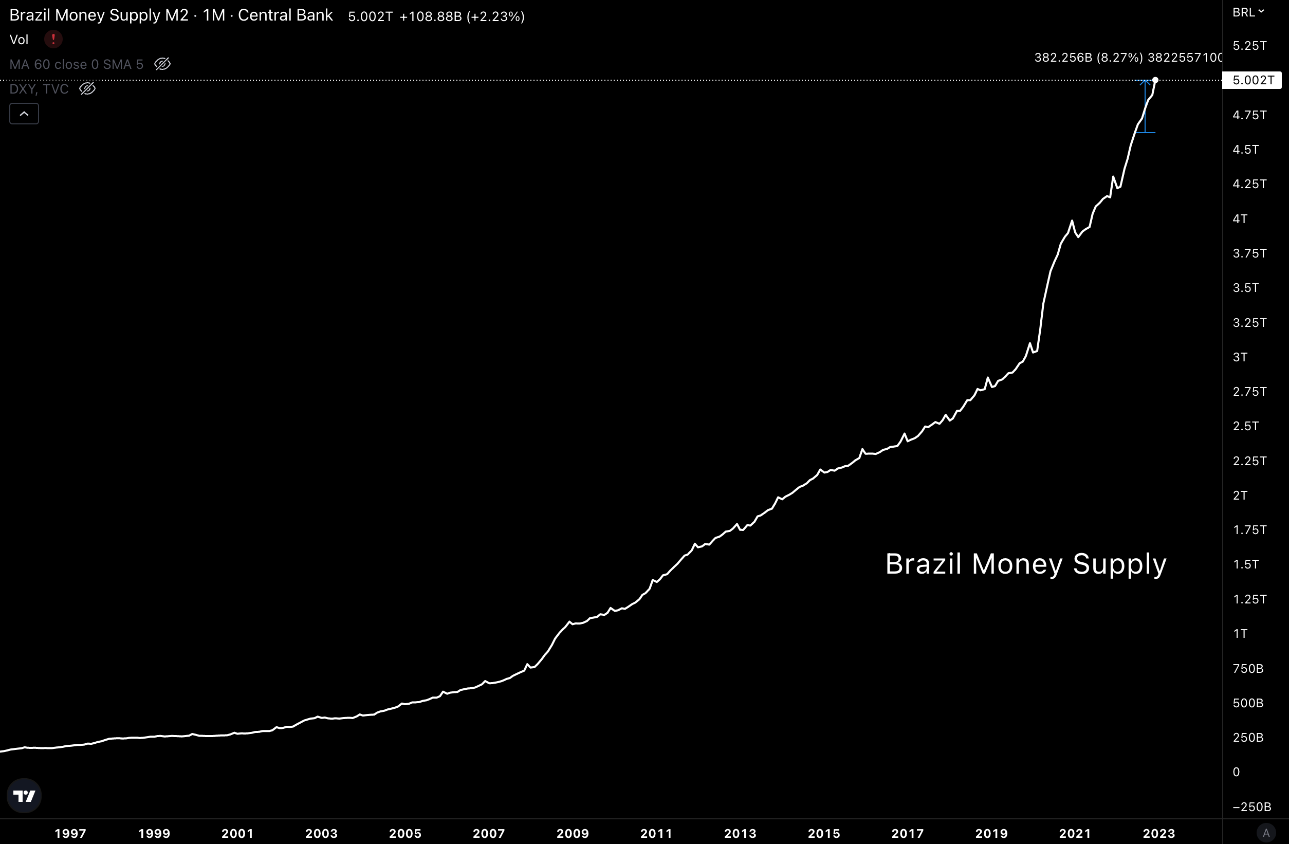
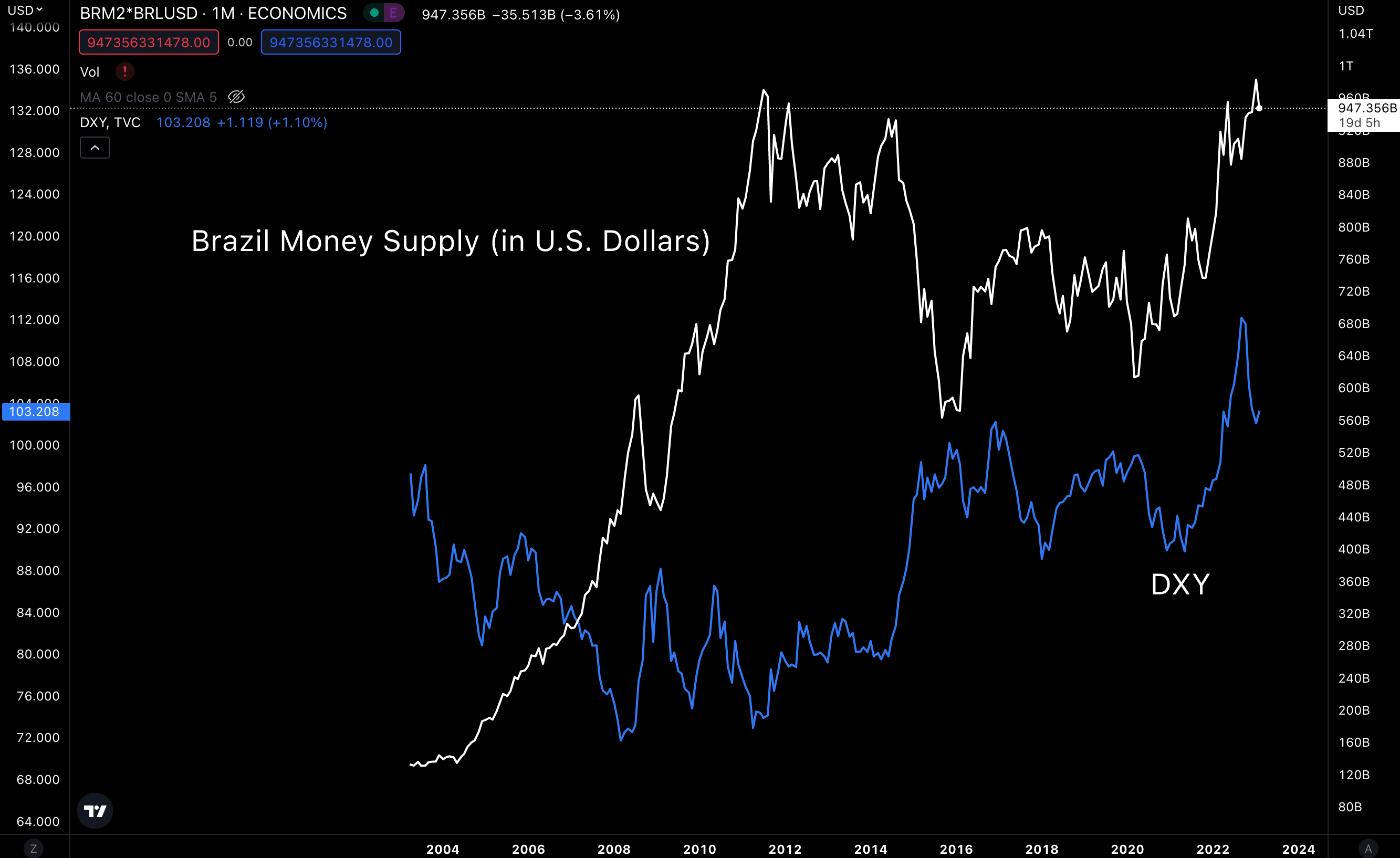
Brazil, +8.27%
Presented without comment.
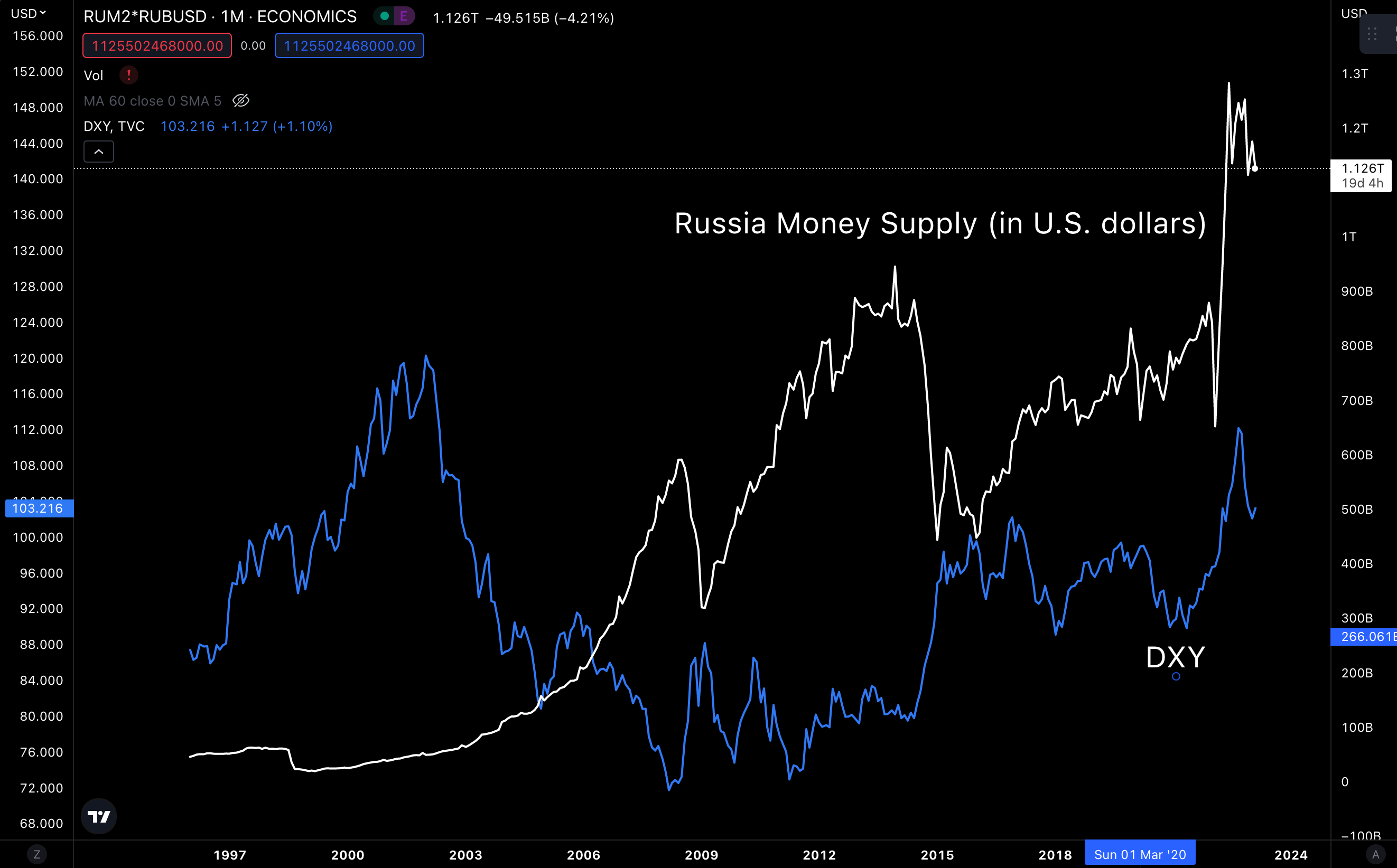
The interesting part, the ruble is rising AS the U.S. dollar strengthened.
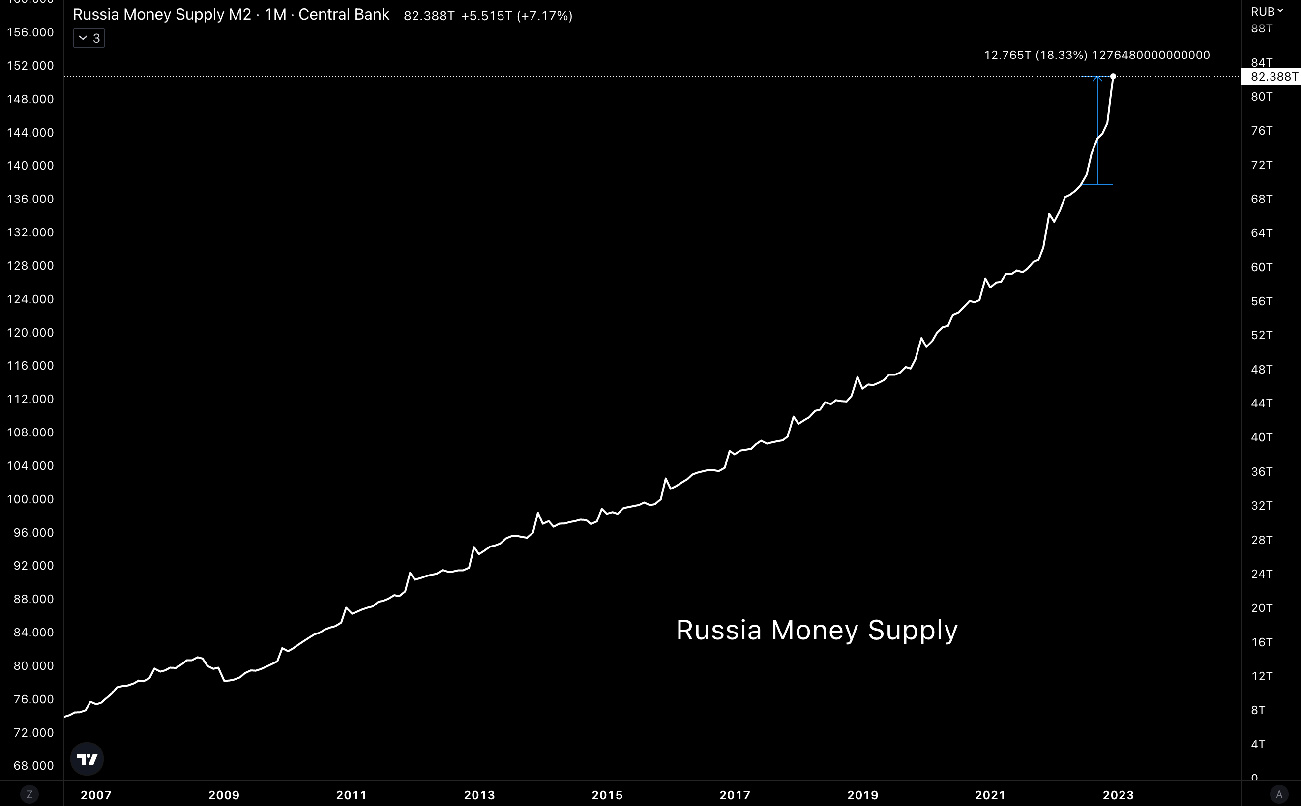
Russia, 18.3%
More of the same.
While volatility is one hell of a drug… This currency also rose as the U.S. dollar gained strength.
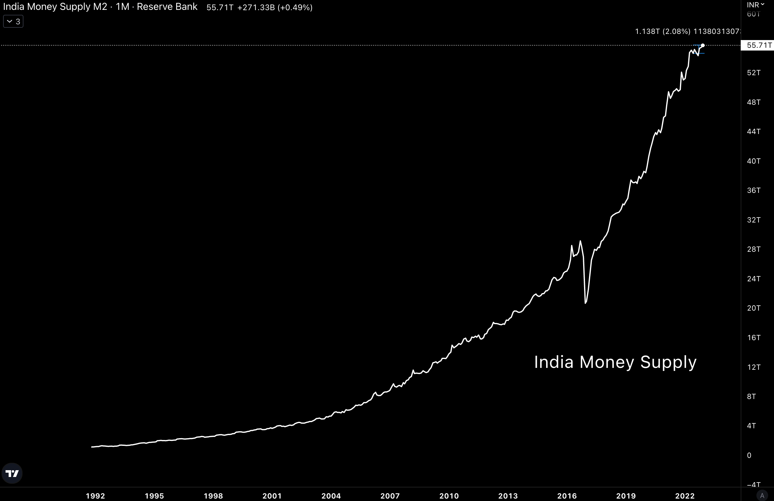
India, +2.1%
More parabolas. Will it stop? Likely no. Up only.
And again, another interesting trend in these charts. Here is the supply relative to USD. Rising even as the USD strengthens.
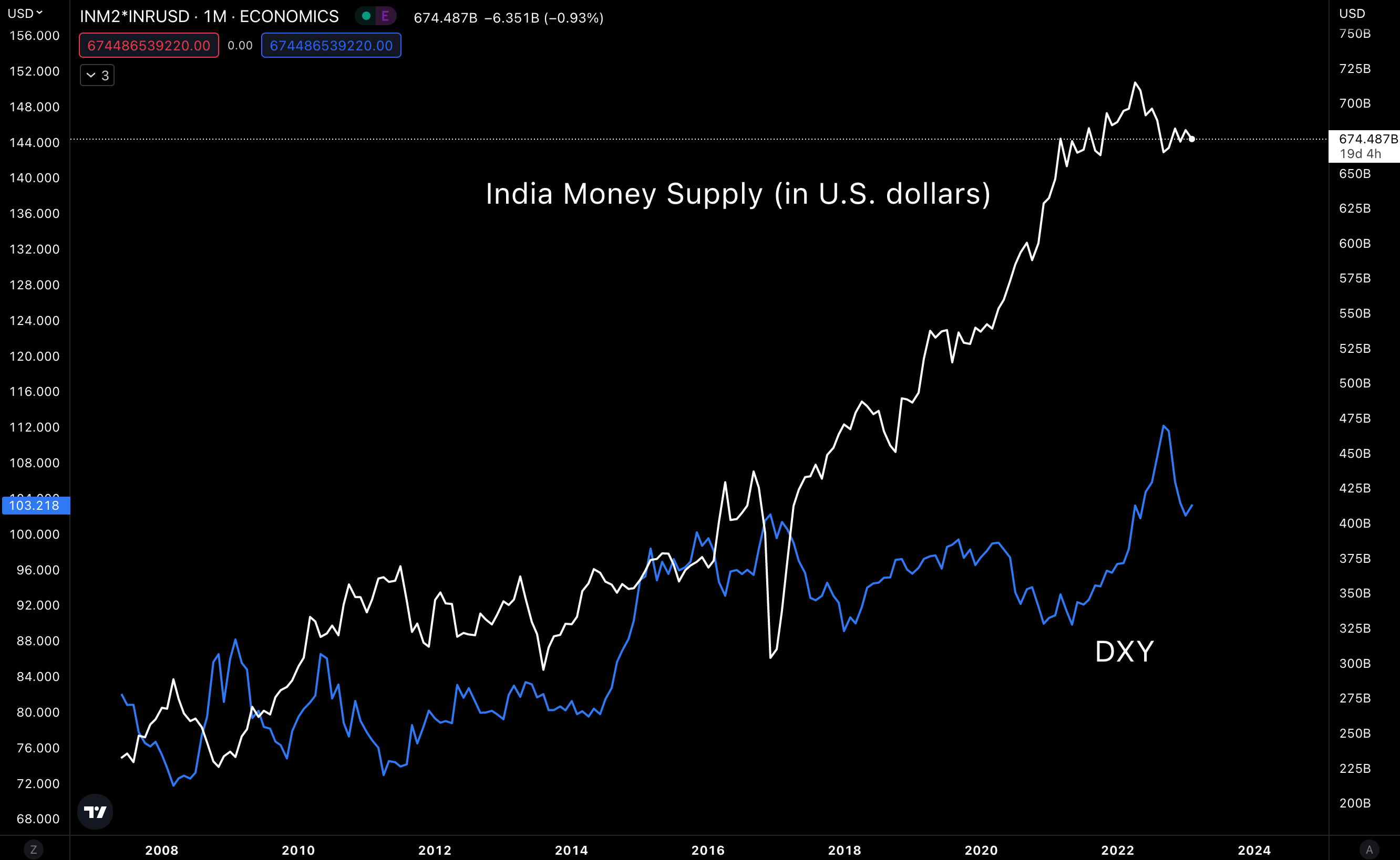
Why is this happening? Because the country’s GDP is strong.
What’s important here is that each additional unit of currency printed is having more impact on liquidity as it gains ground on the U.S. dollar.
Another way to view this is that each unit of currency helps facilitate more economic activity. It acts as a lubricant to a machine by improving its output.
Adding more currency is not acting as stimulus to create short-term spending behavior.
This type of printing is more sustainable than anything else we see here.
And so, this last group (the BRI-C) is one of the more interesting groups. They all have significant growth for money supply. And are also rising in USD terms. This is true even if we add China back in.
Which means from BRICs, we see a lot of money growth taking place. And as the U.S. dollar loses its strength, these economies and their rising liquidity will have greater impacts in the marketplace. This represents a $42 trillion chunk of global liquidity. Nothing to ignore.
But even more important, the only country where liquidity is decreasing with any sort of significance is the U.S.
Which is really negated by its $2 trillion repo market that can add liquidity when needed without impacting M2.
M2 is literally up across the board here.
The Net
So what does this all really mean?
To sum it all up, let’s take a look at all of this money supply in U.S. dollars. We can aggregate a lot of it into one chart.
Below is that chart compared to the price of Bitcoin in yellow. Note how swings up and down in terms of M2 (in USD) are associated with the price of Bitcoin.
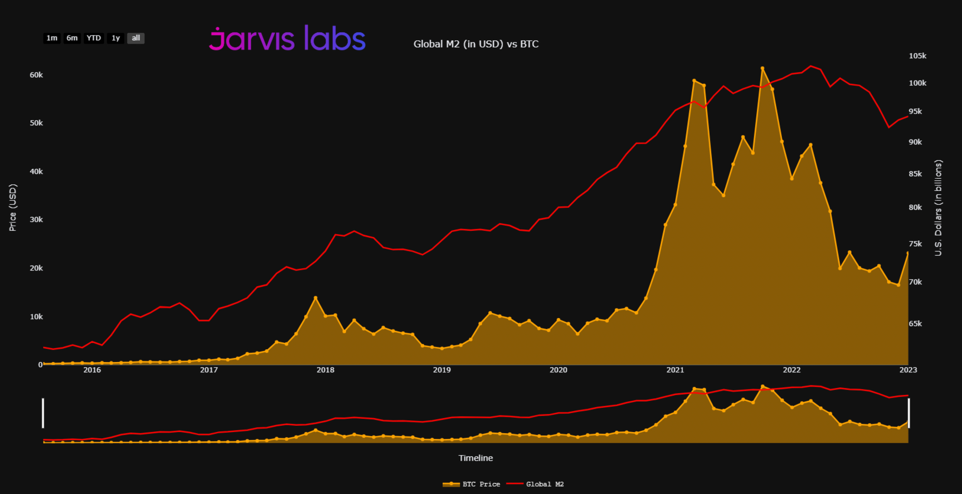
We know that the trend globally for liquidity is rising, constantly. This is essentially a given. And it’s why liquidity in terms of USD grew from about $65 trillion in this chart to almost $80 trillion in the span of 2017 to 2018. This happened while the DXY dropped around 12%.
Meanwhile, Bitcoin went wild, moving from about $1,000 to $20,000 in that time… The double bounce effect.
We saw it again in 2020 to 2021. Global M2 (in USD) went from less than $75 trillion to more than $100 trillion on this chart. Meanwhile, the DXY was down 9.5%. Bigger moves higher in M2 (in USD) from each move lower in the dollar.
Bitcoin went on to breach $60,000.
The constant printing across the globe is creating massive pools of liquidity that are creating major swings in asset prices.
And whenever the dollar loses strength, this liquidity acts with twice the amount of force in the market.
Look for this trend to only continue.
Your Pulse on Crypto,
Ben Lilly
P.S. With the move in BRICs… A move that is capturing outsized upside… We can learn a lesson. Economies that are less dependent on the U.S. economy appear to be capturing the double bounce effect the most. Other economies that we can look at are token economies… As these economies are starting to see business take root and transact more and more in the network’s native currencies. This is likely to experience more upside than most other commodities. Crypto’s will benefit from this trend’s continuation amount others (which TD looks to cover in a few weeks).