Pablo is back
Midweek ChainPulse update


Another 5k BTC got sent to the exchange yesterday from Pablo.
For those unfamiliar with Pablo, here’s a story “Who Crashed the Market” that’s a bit of a fun read.
It’s important to note we don’t actually know the name of the entity behind the wallet. The fact we named it Pablo was a result of some in-house banter that stuck. Essentially, we’re showing you just how nerdy we are about the blockchain because this right here is our version of a Telenovela.
I will note that this is a great example of highlighting what we do. We track wallets that show correlation to price.
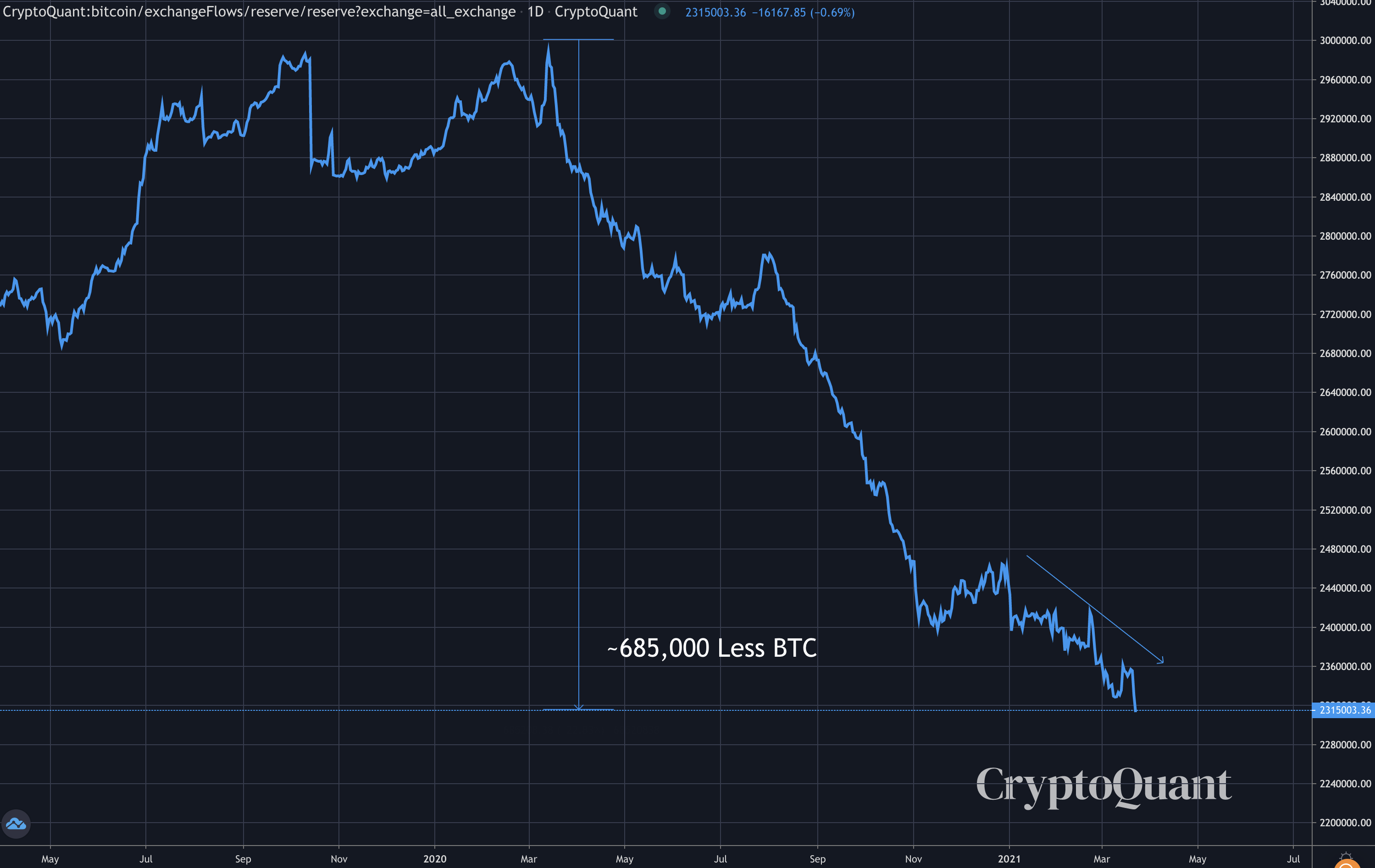
This is important to note because recent exchange flows are highlighting that more BTC are leaving exchanges than entering on average, which is generally a bullish indicator.
Occasionally there will be a transaction or two that stick out that our artificial intelligence system, Jarvis AI, is able to pick up that translates to future price action.
This transactions is one that generates an alert in our trading system, assuming it meets other thresholds.
Now, we tend to get caught up in Pablo’s past price activity in March 2020 as it can make you a bit weak in the knees. So in order to not alarm you, here’s a chart that shows what happened last time he moved.
As you can see the last transaction was back on February 26th. The timing wasn’t Da Vinci like as we saw in March 2020. After price pushed up a bit we witnessed price make its final leg lower before bitcoin went on to notch a new all-time high.
If anything, this is the type of transaction you’d see laughed at on Crypto Twitter. And it wouldn’t be surprising if we see it again… A slight push higher before a quick sweep lower.
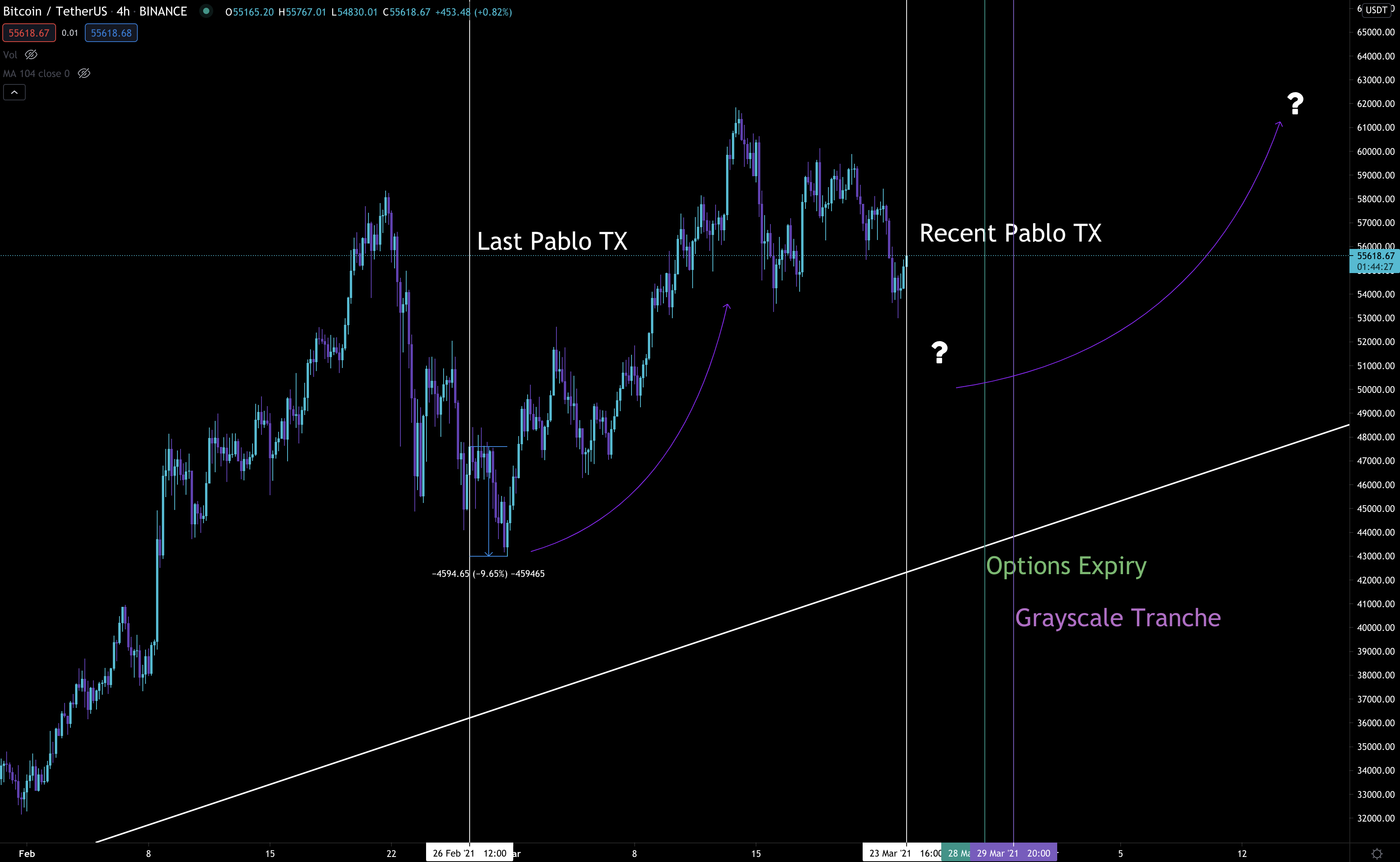
When we pair Pablo’s last TX with our Chart of the Week from Monday’s ChainPulse issue, we can see there’s a lot of things starting to line up.
Maybe I’m painting this picture in the same way a teenager might gossip about what might happen in the next episode of their favorite reality tv show… Regardless, it’s not easy to dismiss.
If price moves a bit lower here it’ll come closer to an area called “max pain”, which is currently at $48k.
Max pain is a calculation that shows at which strike price in the options market the least amount of capital is owed to option buyers by option sellers. AKA it’s the point at which options buyers experience the maximum amount of pain.
It’s something that’s interesting to be aware of with only a few days left until a massive expiration date passes.
The other two things we can pair this up with is the next Grayscale Tranche coming up. For those that are new, you can read more about The Grayscale Effect here…
And bitcoin’s impending Liquidity Crisis as BTC are still exiting exchanges per the chart below.
There’s almost too much lining up where I’m beginning to doubt myself to the point where I feel like I’m missing a bearish signal - I’m human, it’s happened to me plenty of times.
So I’m going to try to KISS (Keep It Simple Stupid) this issue, and send it off. Consider looking for some entries if this drama unfolds.
Your Pulse on Crypto,
B
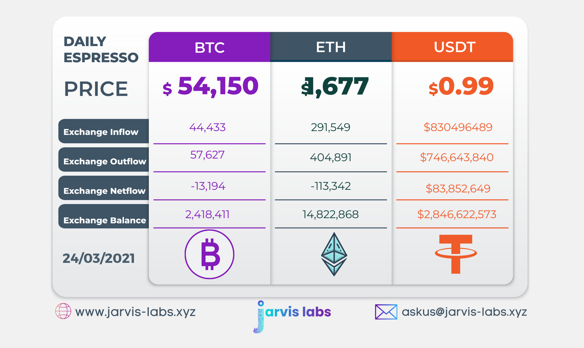
Below is our daily exchange flow data. This is a great gauge for understanding if BTC, ETH and USDt are flowing into exchange or leaving. If BTC and ETH are entering exchanges it can generally be viewed as bearish. The opposite scenario is bullish.
When USDt is flowing into exchanges it’s typically viewed as bullish. The opposite scenario is bearish.
This should only be used as a general gauge. Tagging the exact wallets these flows move into or out of helps improve the reliability of this data, which is what we do at Jarvis Labs. To date we have over 800 market mover wallets and 16 million wallets tagged all together. Consider us your on-chain trackers.