It's All Lining Up for Bitcoin
The Chart of the Week Shows How it's All Coming Together


This week is likely to set the stage for the next month.
Jerome Powell is preparing to talk today at the Bank of Int’l Settlements Innovation Summit. It’s a gathering of major central bankers. His topic on the day touches on progressing with the digital age.
With such a who’s who of bankers involved it’ll be important to see if any mentions of bitcoin or crypto surface. That’s because it’s not just libertarian minded cypherpunks pushing the narrative for these digital assets in the face of negligent monetary policy.
It’s corporations and Wall Street now.
With more entities joining it’s becoming clear that there’s a leak forming in the government’s currency system, and bankers/policy makers don’t act soon, then the exodus will get out of control.
Essentially, all the Central Bankers gathering at the summit are grappling with their own issues of trying to instill confidence in their financial system while simultaneously devaluing their currencies WHILE encouraging more debt.
It’s not a job I’d willingly sign up for.
Regardless, these bankers have one set of tools available to them that bitcoin adopters don’t.
An army with guns.
At the end of the day these bankers can force you to use their currency if you like it or not. But obviously this sows the seeds for upheaval at some point later on, which acts as a deterrent. It’s why the methods that are eventually chosen for having them get their way will be much less forceful or abrupt.
Ray Dalio, founder of the world’s largest hedge fund, hints at this as well in saying “[Governments] could very well impose prohibitions against capital movements to other assets (e.g. gold, bitcoin) and other locations. These tax changes could be more shocking than expected.”
It’s the type of thing that might have you look up the time when the U.S. government confiscated gold back in 1934. If you happened to take an extra minute and look at yields during that time period you might see a similarity… Practically zero (blue line in the chart below is 3-6 month Treasuries).
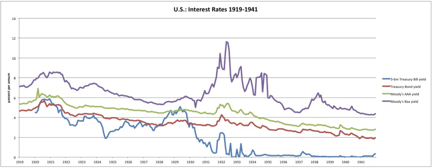
Source: New World Economics
I’ve heard some analysts talk about something like this happening with gold again. However, I think bitcoin is the threat for policy makers in terms of where does capital go when government’s currency/financial system experience capital flight? Aka when people lose trust in your currency, where do they go?
Bitcoin has properties that gold can’t compete with, and it’s why bitcoin gets my vote.
However, I don’t think an all out confiscation or prohibition is in the cards. Perhaps something that Dalio alludes to… which comes back to the guess of the reactions from the government is not an all out ban.
Regardless, that’s getting into conspiracy theories. And it’s not something we need to waste our time with right now because it’s not the type of thing to help us know which way prices will move tomorrow.
In order to help us determine which way prices will move, we’ll be taking notes on the summit Powell is attending today in case anything is said that impacts bitcoin or crypto. If something that comes up hints at what Dalio mentions, then we’ll start digging deeper into it at that time.
Now, the summit is Powell’s first appearance of the week.
After that he’s slated to testify before Congress twice this week. There will also be a cameo from Janet Yellen, the Secretary of the Treasury. And a dozen other Fed officials will be making the rounds throughout the week.
This is one of those weeks where you don’t skip reading the Wall Street Journal, Bloomberg or the Financial Times.
We’ll be sure to keep you up to date this week on these public relation dog and pony shows just in case something might impact crypto.
In the meantime let’s get into our regular Weekly ChainPulse Report.
For those that are new, I’d like to first say welcome!
Every Monday our team at Jarvis Labs puts together our Weekly ChainPulse Reports. In the report we touch on macro markets, on-chain data, and anything else that’s likely to impact prices this week.
We view today’s issue as the Rand McNally map we’ll be referencing throughout the week. And we hope it acts as a guide for you as well.
For a bit of guidance we start the issue off with a view of the global financial system (Macro), then focus upon crypto using a 10,000ft view (On-Chain Macro Beat), and then zoom in on the near-term pulse of the market (ChainPulse).
Now that we got that out of the way, let’s get to it.
Macro
Today we hit on the majority of the macro discussion above so today will be pretty light.
The chart I’m watching this week is the U.S. 30yr Bond yields.
As you can see below, yields are parabolic. This sudden rise was no surprise to our readers as we’ve been hitting on it well before mainstream media started to sell market fears.
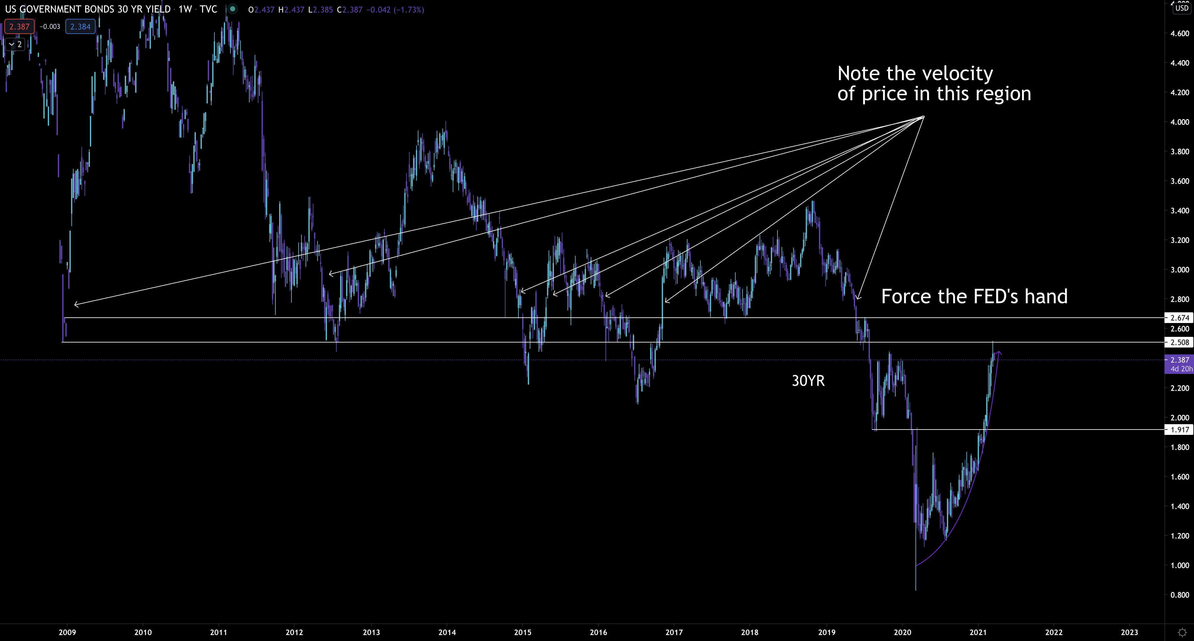
Now, last week in his pubic appearance Powell sidestepped a discussion on tamping down yields.
Which means we’re now forced to speculate on the “when” will Powell mention something about tamping down yields… AKA when will the market force the FED to react.
Looking at the chart above I believe the FED will react once yields move into an area where the speed at which yields rise might be too fast for comfort.
I used white arrows to show when price moved quickly before. If yields get to that range I see no reason it doesn’t happen again. Assuming it does, that’s when I think we’ll see the FED step up their buying of government issued bonds - this is how the FED keeps yields low.
Or they’ll do a one-two punch of reinstating some bank policy that’s set to expire at the end of the month that encourages banks to buy government debt AND step up bond purchases.
The timeline of this playing out could very well be this week if FED representatives don’t explicitly say anything in the first few public appearances.
If none of this happens and yields run… Which I view as a very low chance… Then buckle up because things will get wild.
This week it’s about the FED, yields and perhaps some central bank digital currency talk.
Moving onto bitcoin’s macro picture…
On-Chain Macro Beat
This section is your birds eye view on bitcoin’s current bull cycle. We tend to use on-chain charts to help you visualize what inning we’re in and what’ll happen next.
For today, we can check back at a chart we originally looked at on February 9th. For those who missed it you can read, “When Will Bitcoin’s Top Happen”.
In it there’s a chart that looks at the percent of bitcoin last active 1+ years ago. It’s a helpful chart when deciding how close we are to a market top. Every peak of bitcoin’s past market cycles have occurred just before the orange line below bottoms out.
And in the February 9th I wrote, “if subjective analysis can be used based upon only two data points (we can also look at 2011’s high, which was 30%), my feeling is price will top out when this statistic is near 47-48%.
Looking at the chart below this statistic is currently 56%. Meaning we have a ways to go before the top is in.
Also, you’ll notice there’s a data point that’s being shown from August 2017. That’s approximately where I think we currently are if this cycle were to be the same as the last bull cycle. Meaning this cycle has more room to push higher.
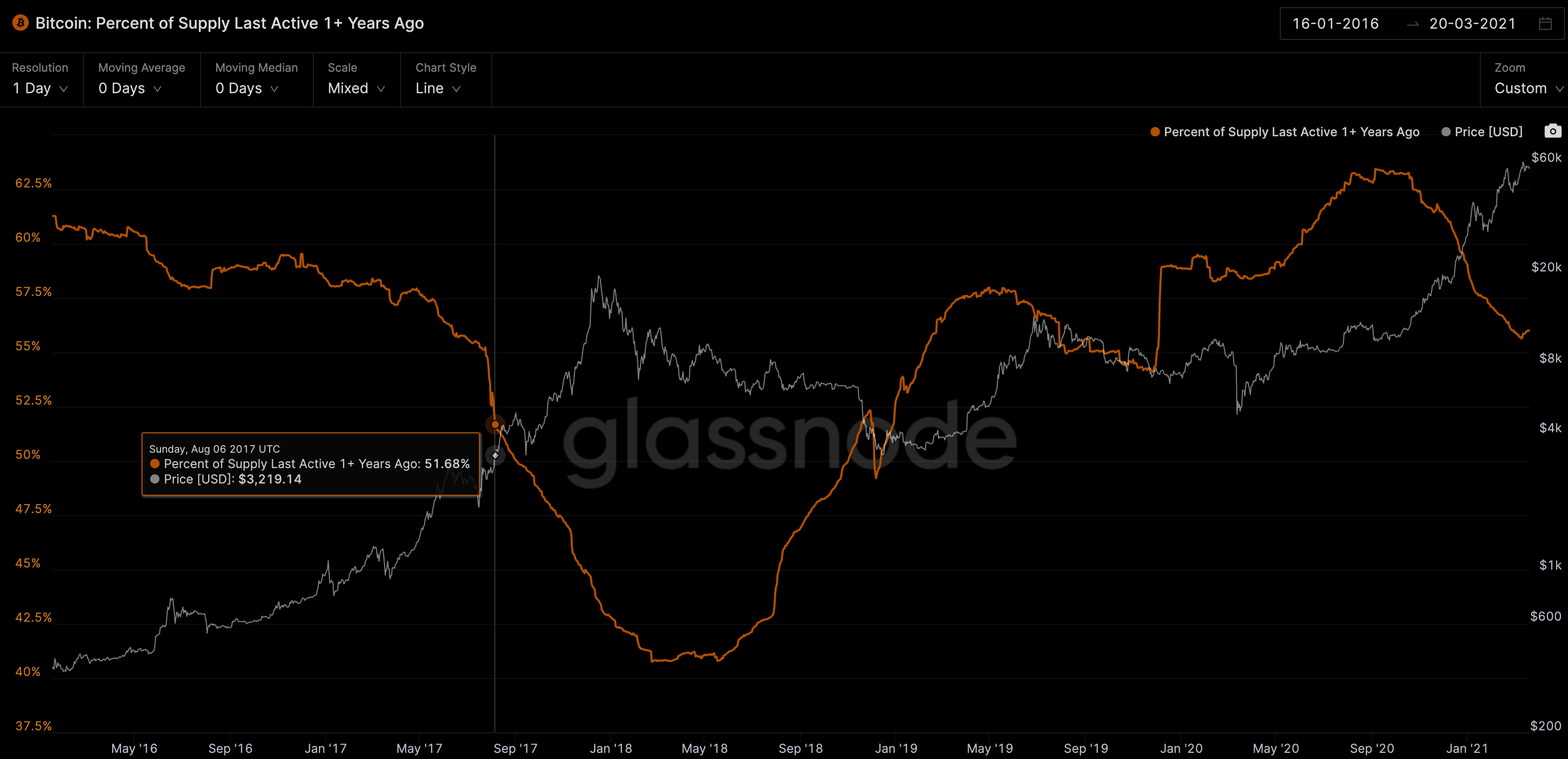
Now, the August 2017 isn’t set in stone by any means (remember, 2017’s top was December 2020).
In fact, I think there’s a case for a later date. That’s because in the chart below, we’re seeing some data suggest we’re likely nearing the start of the final stage of the cycle.
The chart below is the number of bitcoin addresses accumulating. These are wallets where more than two transactions took place that were not “dust” or the wallet isn’t viewed as an exchange wallet.
Looking at the chart below the white circles show this accumulation pattern goes parabolic before the top is in. It’s what we see happening right now.
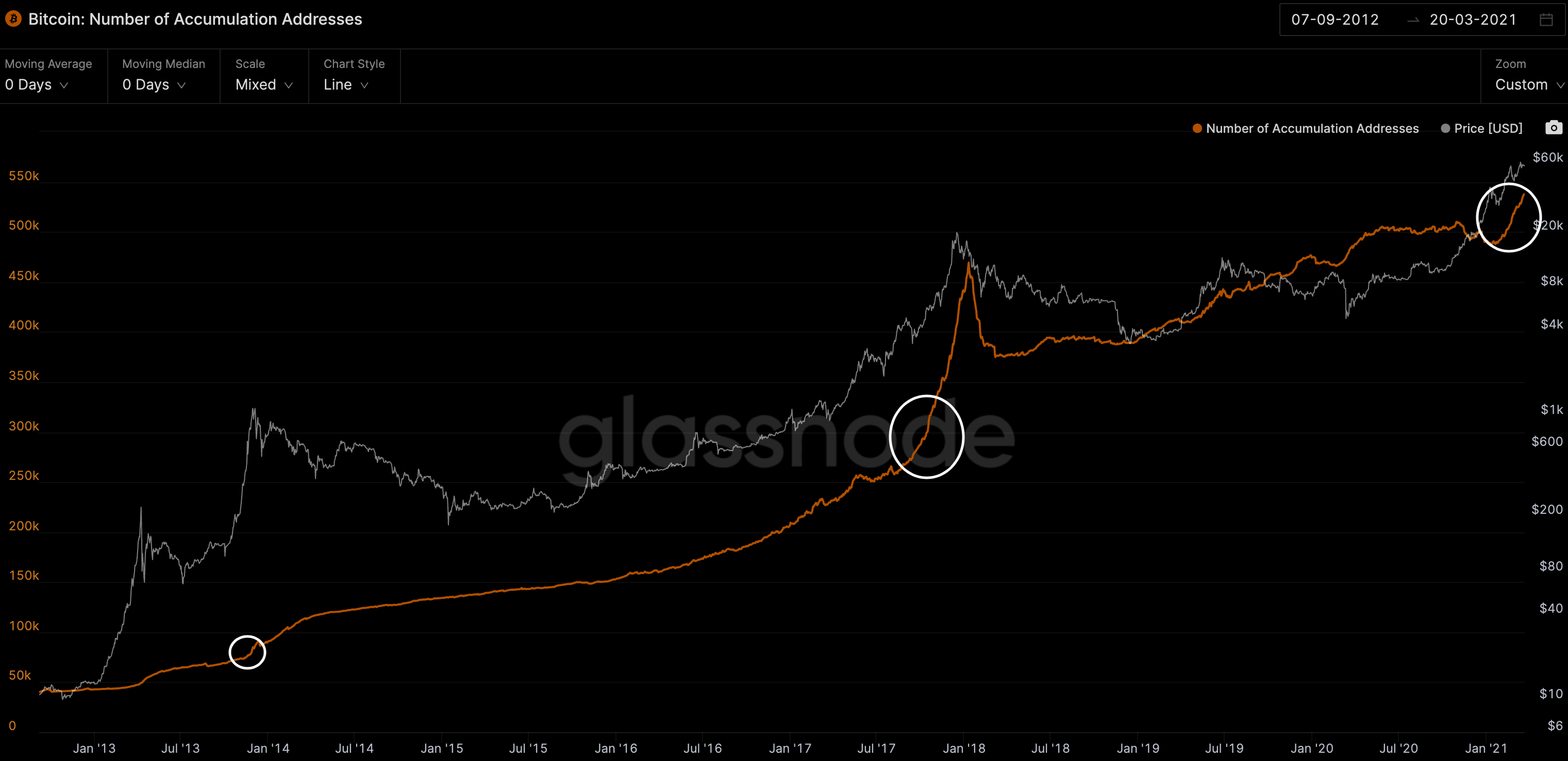
If the last time this happened is any indication of how long this can unfold, then we see the month of October enters the picture. Meaning we might have just a few months of this cycle left.
I see both timelines as having merits. In terms of what I think will happen, I’d rather not take any guess right now. There are a few things I’m waiting to see develop before I come to any primary conclusions. One of which is the speed of the next rise in price.
Regardless, both of these charts are hinting to us that bitcoin is poised to notch higher highs.
In terms of when does this start, we’ll need to zoom in a bit…
ChainPulse
This section is what we call ChainPulse. In it we show you what the pulse of the market is right now in an up close and micro level. On Wednesday and Friday we look to update you on what the pulse is. You can also subscribe to our Telegram channel for a more day to day read on the market’s Pulse.
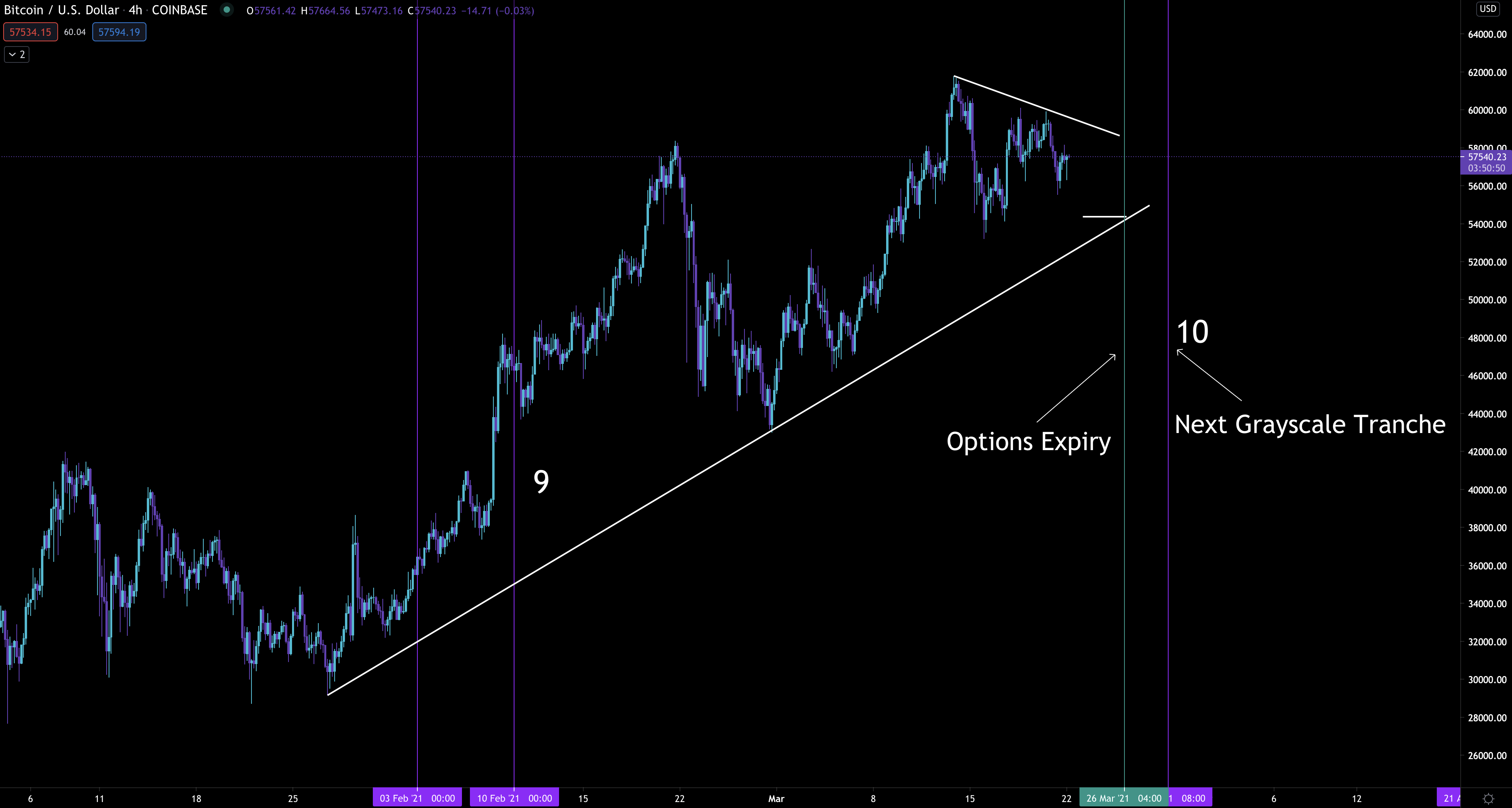
For this week we’re watching the March 26th expiration in the options market. It’s a massive expiration date in comparison to the surrounding weeks.
Here’s the amount of contracts for the upcoming expirations… As you can see, nothing is close.
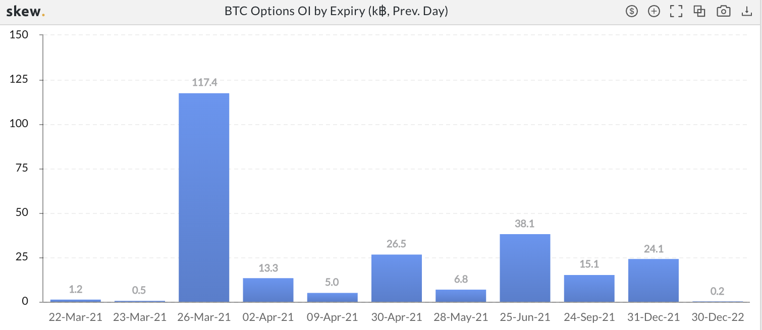
It’s important since market makers are likely to preserve their profits, and market movers aren’t likely to open any big positions until the date passes.
Two things that can disrupt this before the expiration takes place… the FED saying something that’s very bearish or bullish… OR the amount of dry powder in the market starts to move in unison in one direction.
That’s because there’s over $2.5 billion of dry powder sitting on exchanges. One billion of which was recently printed.
Here’s the amount of USDt ready to rock on the various exchanges.
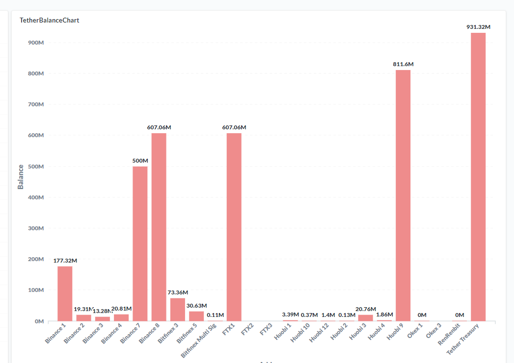
Meanwhile, the funding rates aren’t crazy by any means. This means traders aren’t opening up illogical positions, and price has room to run if it starts to go in one direction or the other.
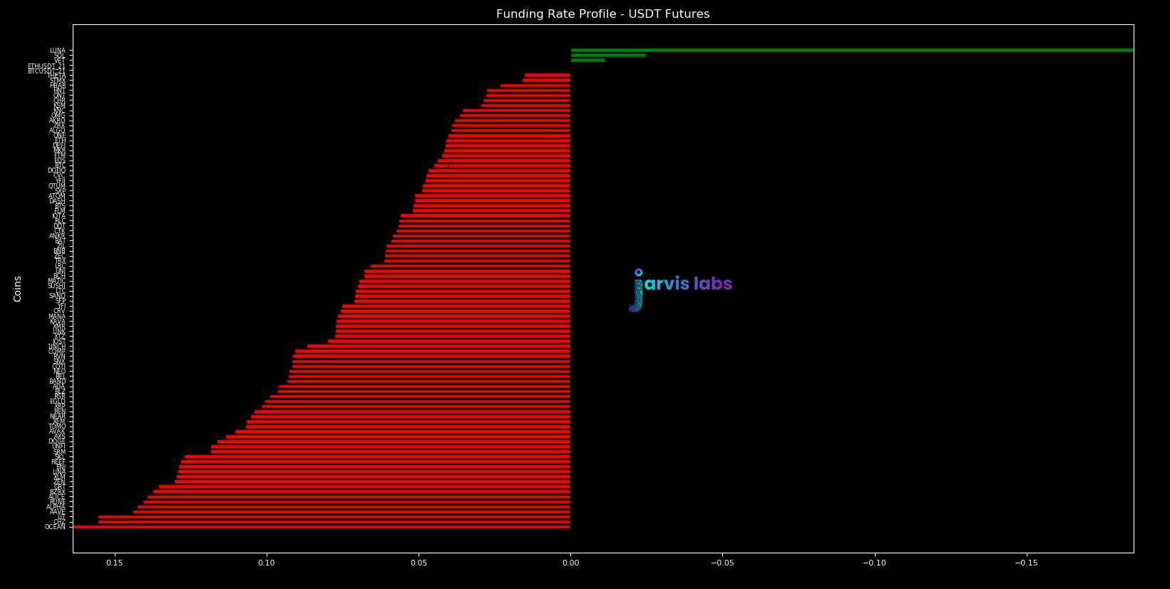
Also, the amount of risk is low while the amount of fuel is obviously sitting at a healthy reading per the amount of USDt sitting on exchanges from earlier. This is again another healthy sign that price can hit higher highs if the trend begins to take hold in that direction.
Which leads us to our last chart, and most important one of the week, one that indicates several things are lining up together…
Chart of the Week
It’s the bitcoin chart. Specifically, the one with the major Grayscale tranche unlockings.
You’ve probably seen it before. If you haven’t, go have a look on tradingview here.
It references the Grayscale Effect, which essentially is major upticks in unlockings tend to create an upwards effect on spot prices.
Per the Grayscale Effect report, tranche 10 is coming up around March 28, meaning that’s likely to happen on Monday, March 29th (Inflow date + 6months… then the next Monday).
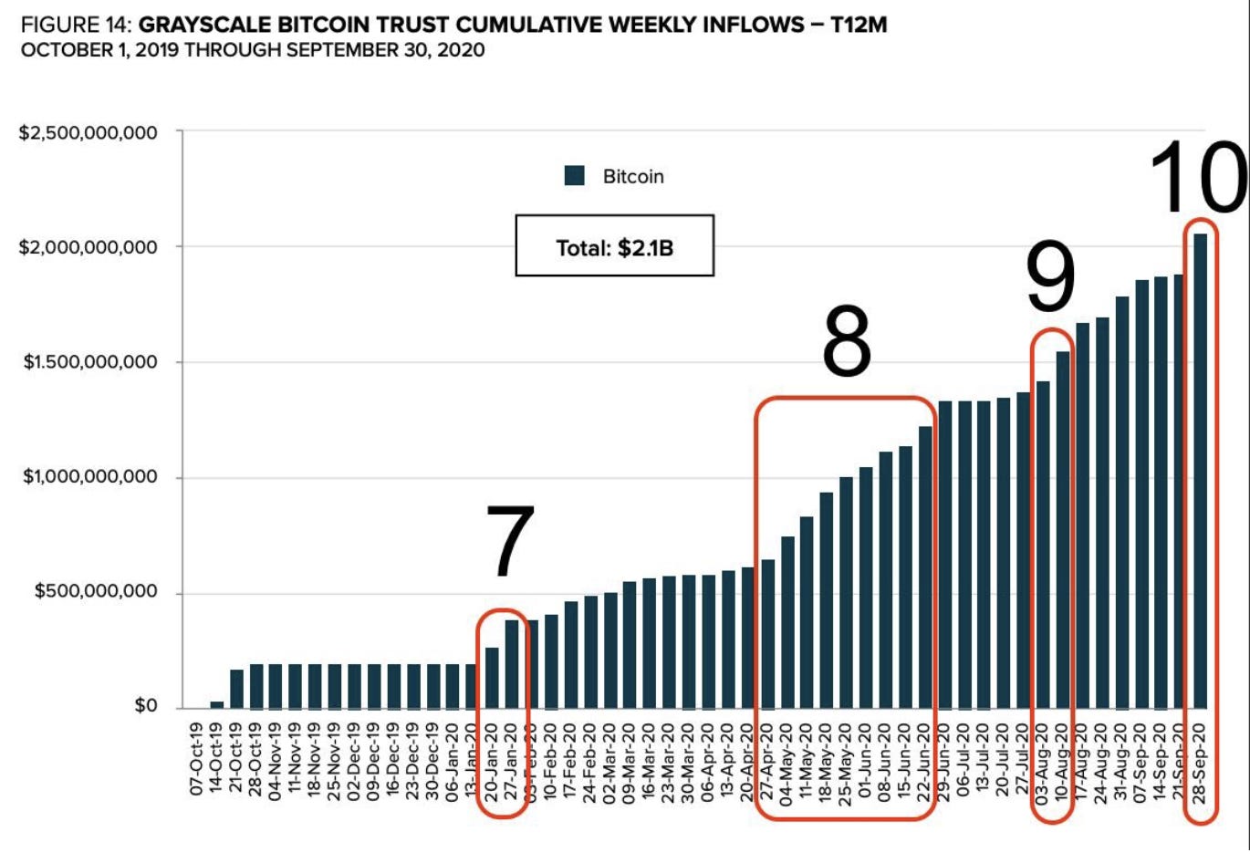
Oddly enough, this pairs up nicely with the major options expiry this week.
(Side note: I wouldn’t be surprised if we revisit $54k before an attempt at higher highs.)
So here’s the chart I’m watching… on it you’ll see options expiry, next grayscale tranche, and some support line that might be relevant.
Let’s see what unfolds this week… which is a week with so much at play in the cards… We have Powell and co., major options expiry, billions of USDt locked and load, and Grayscale in waiting.
Never a dull moment.
Your Pulse on Crypto,
B
P.S. - Many have asked if we have a paid newsletter. We don’t. However, we want to move in that direction in the coming weeks because there is a ton of information we’d like to pass along to you. But a free format is not an ideal environment for releasing it.
That’s because the alpha is likely to get diluted too much… while the alpha we dish out here in our free letter isn’t likely to get diluted.
In order for us consider opening up a paid newsletter we need more subscribers. Based upon the current amount of Espresso subscribers, and the amount we think will become paid members, we don’t believe we’re ready. So if you want us to hurry up and create a paid publication, you can help by spreading our name. Click the share button below and help us get more subscribers.
To give you some roadmap, when we hit 10,000 free subscribers we will roll out a paid service (in addition to the free Espresso everyday without the change in alpha that is shared now). How’s that? As always, let us know your thoughts!
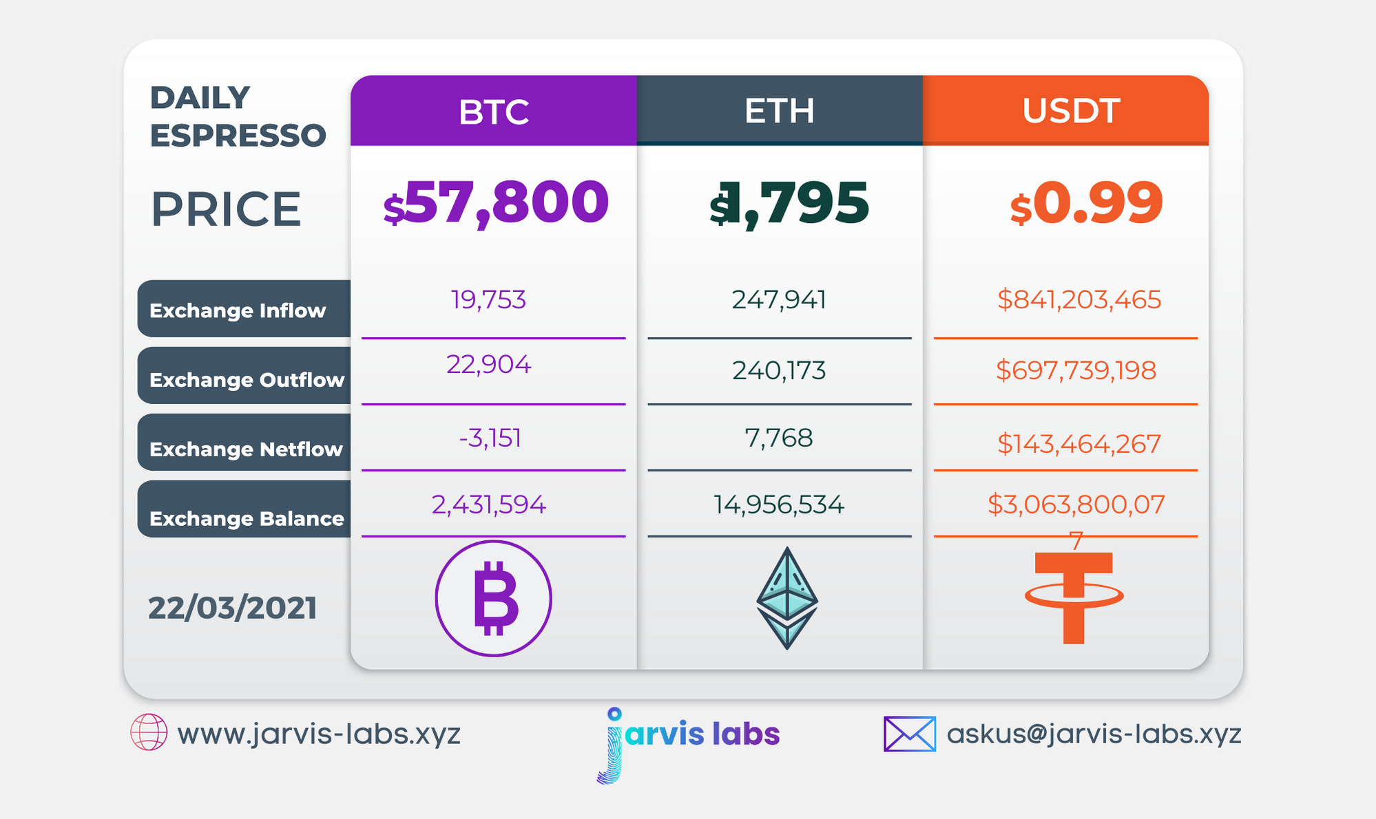
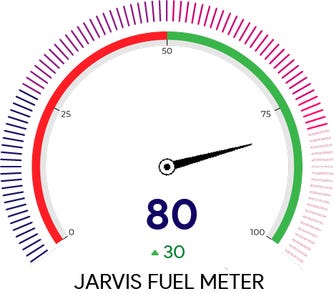
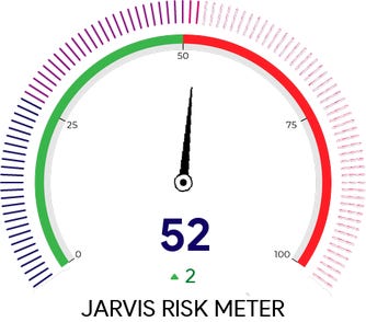
Below is our daily exchange flow data. This is a great gauge for understanding if BTC, ETH and USDt are flowing into exchange or leaving. If BTC and ETH are entering exchanges it can generally be viewed as bearish. The opposite scenario is bullish.
When USDt is flowing into exchanges it’s typically viewed as bullish. The opposite scenario is bearish.
This should only be used as a general gauge. Tagging the exact wallets these flows move into or out of helps improve the reliability of this data, which is what we do at Jarvis Labs. To date we have over 800 market mover wallets and 16 million wallets tagged all together. Consider us your on-chain trackers.