Market Update
Quick update as BTC breaches $52k

Let’s hit on an indicator to help explain the market today.
CVD.
Cumulative Volume Delta… yawn… Stay with me. I promise to share some great visuals to get you through the denseness of the next few sentences.
CVD is an indicator that reflects the volume of the asset you’re looking at. It does this by discerning the transaction taking place.
If buyers are gobbling up all the asks on the order book, CVD goes up. Likewise, if sellers are simply taking the highest bid on the book, CVD goes down.
CVD going up can be interpreted as bullish, down is bearish.
In this way we can break down the volume of a specific asset in more detail.
So here’s BTC/USDT on Binance earlier this week from our Monday Market Update.
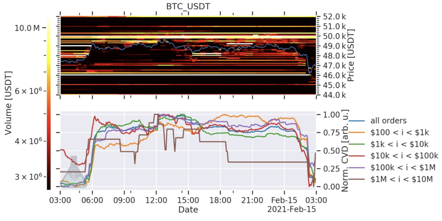
On the bottom half is the CVD. See how the brown line - Whales - were reflecting a negative CVD before the drop.
Then right after the drop, Whales were the first to step up. It’s a tell tale sign of what’s going on. Whales were forcing price to stall out thanks to their sell walls at $50k, $51k, and $52k helped, and waiting to buy the dip.
Here was the CVD and order book yesterday just after price broke $52k. Sell walls lifted and replaced with a buy wall just a tad below $51k.
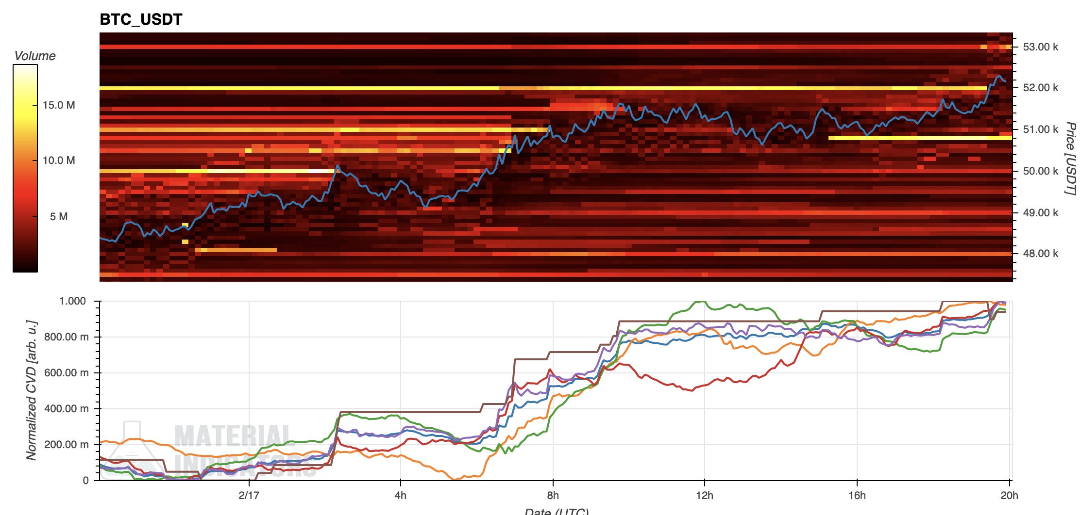
Once again, the whales led the charge on the CVD. Note: whales are the brown line on the indicator at the bottom half of the image.
Whales like to use their sell walls to accumulate, but with institutions taking orders like patrons at a meat counter, these walls will be less effective moving forward.
These charts are called FireCharts. Material Indicators makes them, very good tool. It visualizes the type of game being played in the market in real time. I’ll be using these a lot moving forward since they help visualize the “changing of the guard” taking place in the market.
Looking forward into the weekend if BTC can confidently stay above $50k then altcoins will enjoy more time in the sun.
The only concern is funding rates. These continue to be a great indicator. Look at the pink line on the bottom half of this chart.
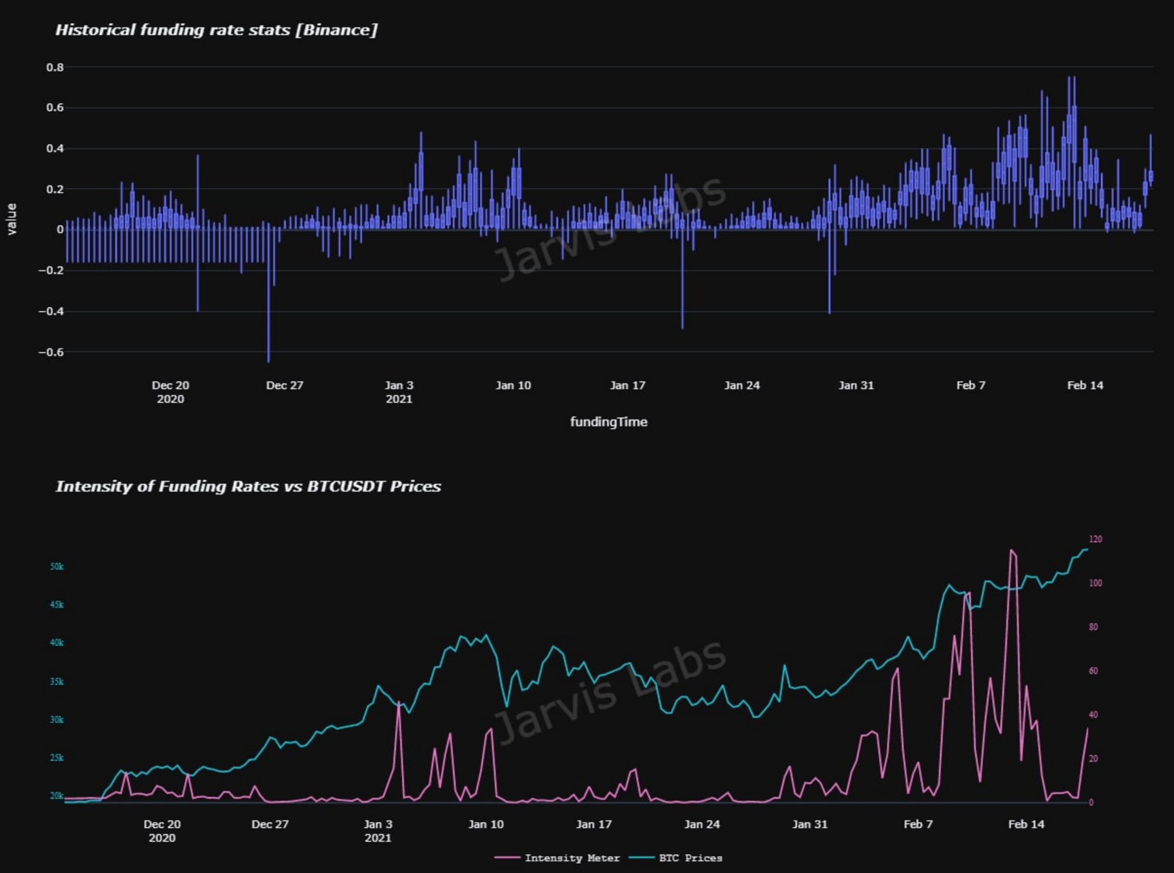
When the line goes flat the intensity of funding rates are low, and during a bull run its proving to be a good time to buy. Options tend to be the best derivative for this type of indicator.
Ever since BTC broke $50k we can see the intensity (pink line) and also the purple box plot (top half) begin to rise again. It’s not alarming yet, just something to note as we head into the weekend.
The reason it’s not alarming is BUSD and USDC are printing everyday. As more stablecoins get minted, that means more fuel in the market to push prices higher.
Benjamin, the smarter of the two of us at Jarvis Labs, believes we’ll see some more USDT get minted. This only means more fuel, which is another good sign.
On-chain looks good for the time being. And while prices seem to be high and traders low on fear, I would normally be skeptical. But you need to take it day by day, on-chain helps with this.
Looking forward there are some interesting “pins” in the options market. Our friend “PS”, a commodity options expert, is lending some of his wisdom so we can build more options algorithms. We have a few, but we want an arsenal for Jarvis AI.
Now, pins are really like magnets in the options world. The bigger the volume, the more likely it’ll act like a magnet for price. And the more call volume there is, the more likely market makers need to buy BTC on spot as price approaches a pin. This is done to hedge the options they sell.
We will get into the “why” more at a later date. Just know when you see price approaching a big green volume bar and the expiration date isn’t too far off, then that’s a pin to take note of.
Here’s the end of March for BTC… The $60k area is one place to look at. We will keep an eye on this expiry.
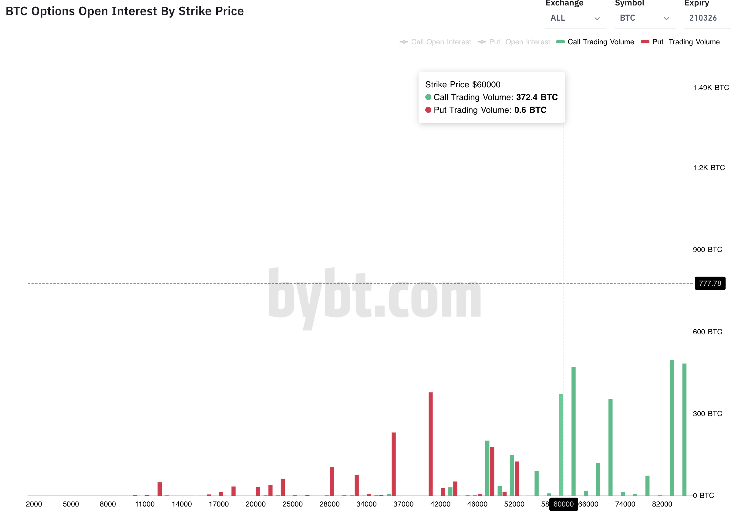
As for February, there’s a bundle in the $54-58k region. But the March chart stuck out to me more.
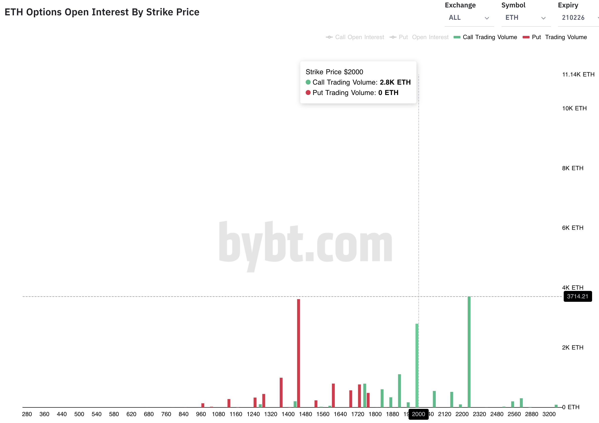
As for ETH, it’s a bit more interesting.
Here’s the upcoming end of the month options expiry for ETH. Notice two large green bars at $2,000 and $2,240. These are of particular interest. Let’s see what happens over the coming days. I wouldn’t be surprised to see $2,240 by the end of the month.
FireCharts, whale games of old, funding rates, and pins in the options market… That was a lot for one day.
Hopefully it wasn’t too much at once. Believe it or not, writing these updates help form my opinion of the market.
What we see now is the sell orders are being lifted asset by asset. On-chain is bullish and the funding rates were “okay” as of late. And significant pins exist at higher prices for BTC and ETH.
These are favorable conditions for more bullishness ahead.
Your pulse on crypto,
B
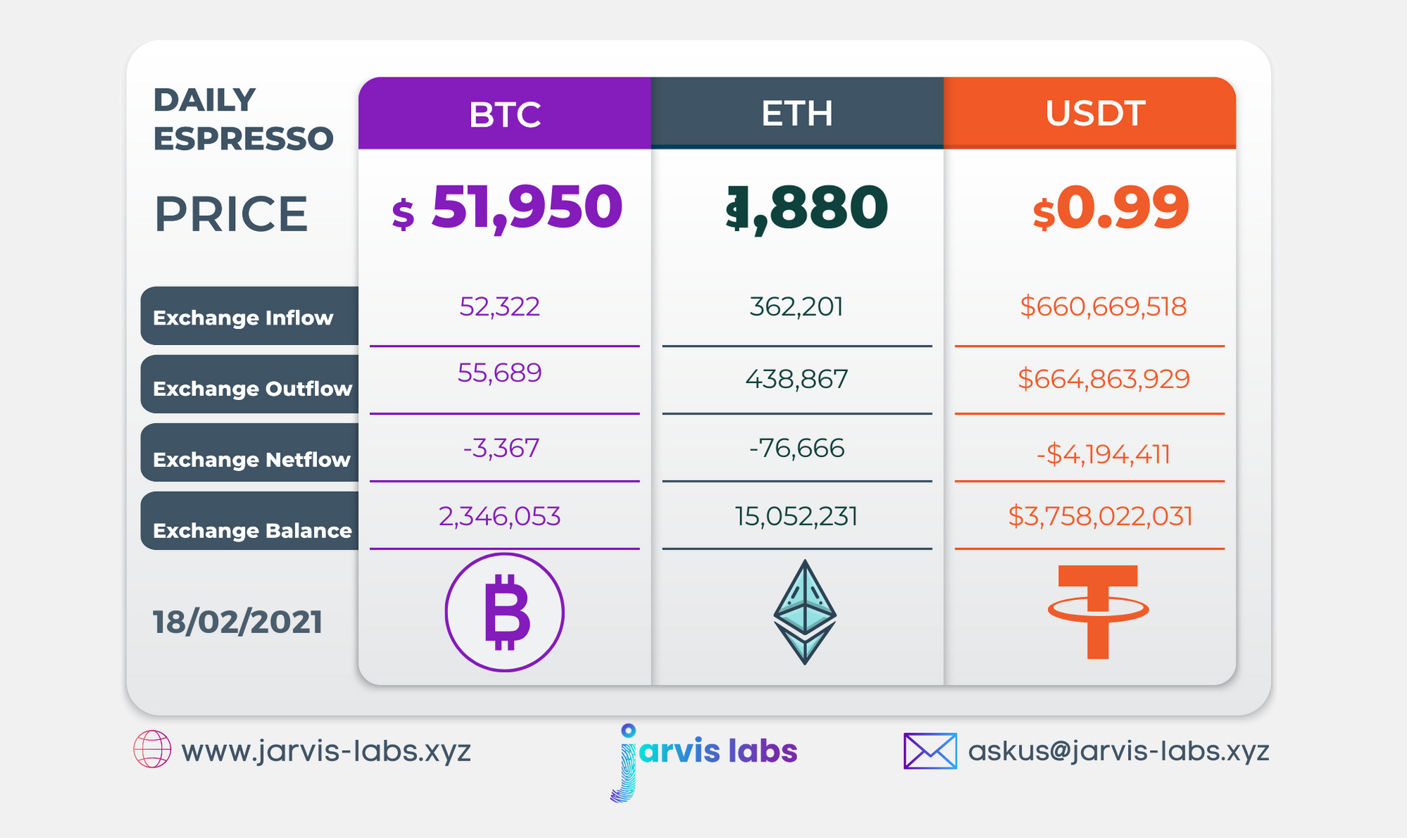
Below is our daily exchange flow data. This is a great gauge for understanding if BTC, ETH and USDT are flowing into exchange or leaving. If BTC and ETH are entering exchanges it can generally be viewed as bearish. The opposite scenario is bullish.
When USDT is flowing into exchanges it’s typically viewed as bullish. The opposite scenario is bearish.
This should only be used as a general gauge. Tagging the exact wallets these flows move into or out of helps improve the reliability of this data, which is what we do at Jarvis Labs. To date we have over 800 market mover wallets and 16 million wallets tagged all together. Consider us your on-chain trackers.