Healthy Rise
Market Update

Did you sense the disbelief?
We last spoke about ten days ago. In the essay “Prepare Now” I mentioned how this is my favorite moment in the market. A time period where the market separates the winners from the losers without compromise.
For those on the wrong side it is a painful ride.
And don’t let Crypto Twitter fool you, there are a lot of traders on the wrong side of this freight train market move.
Here’s what I mean… In the chart below you can see since the last essay $4.5 billion in open interest was added in the futures market.
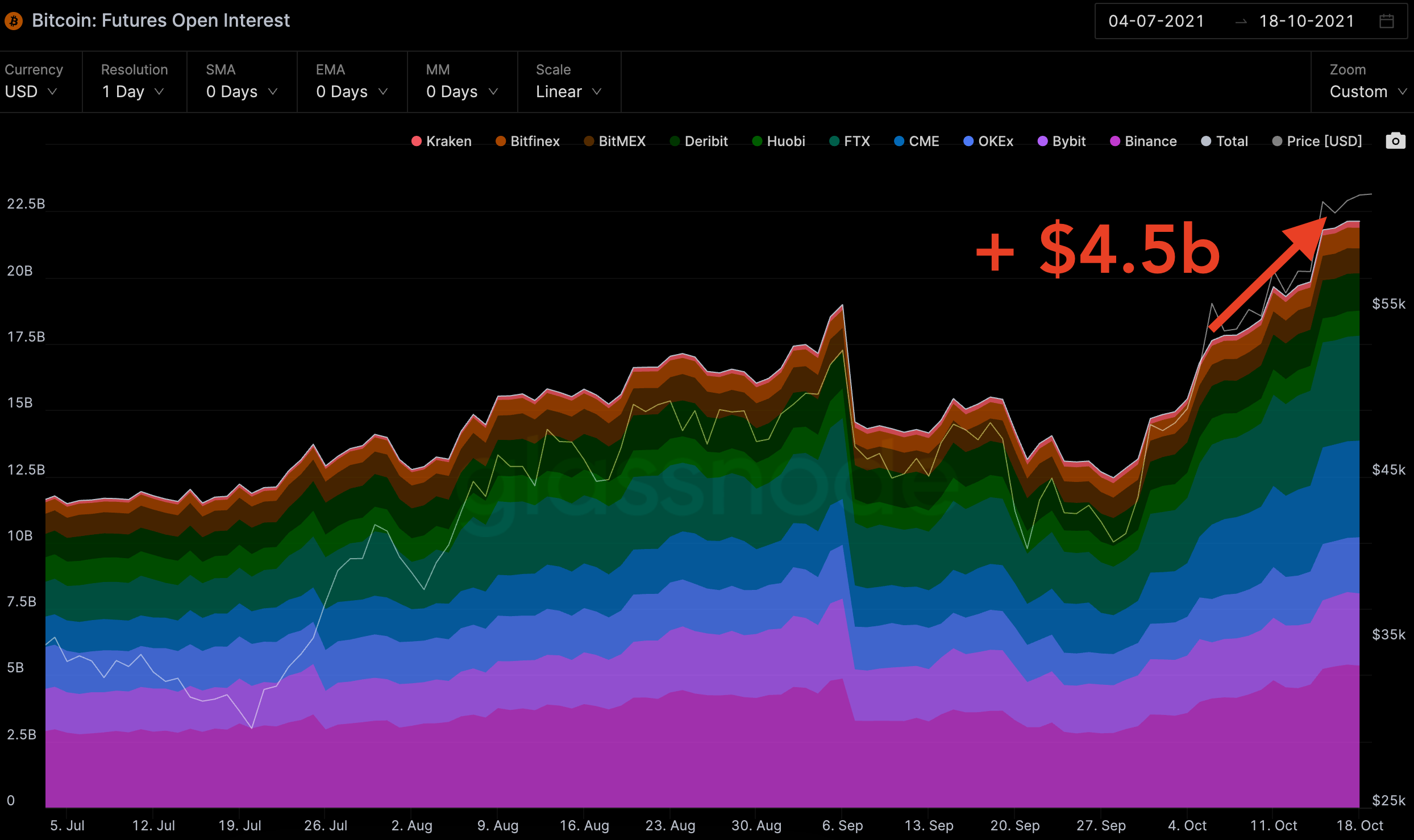
Price rose up to 15% for BTC during that span.
Meanwhile, funding rates have yet to get out of whack.
Here is what funding rates look like. The white line is the mean, which is sitting right around the standard level of 0.01%.

Which tells us traders are not over leveraging themselves and not piling into the same side of the trade. This market has two sides right now and one is getting whipped.
To highlight this here is some carnage as the market sliced through short positions with horns on its way to $60k.
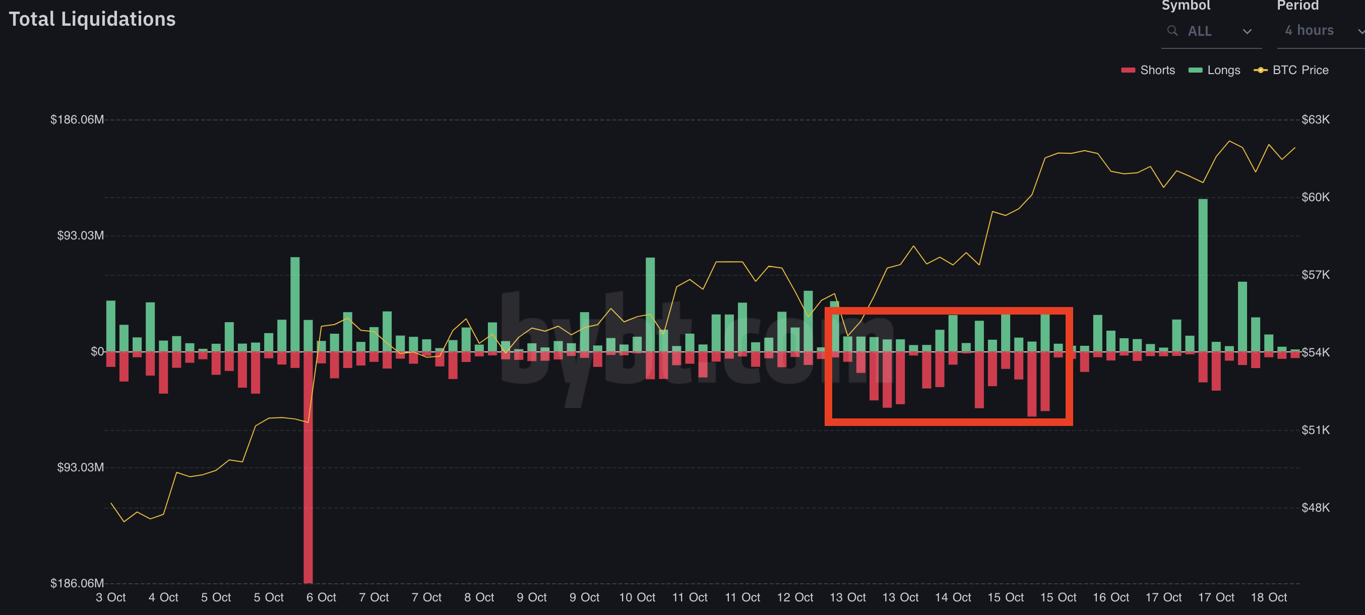
The disbelief crowd was literal fuel for the move.
Now, while longs were making bank and excitement around bitcoin grew, what is important to note is derivatives were and are not the main driver.
If they were the main driver than funding rates would be overheated and a rising open interest would have minimal impact on price.
Instead, what we see is price is rising with a lot of help from non-leveraged spot buying.
A sign of a healthy trend.
Here’s what I mean…
To explain how we see demand rising, let’s bring back the 24hr HODL demographic we introduced in “Party Like It’s October 2017”. The takeaway from that September essay was two pronged.
The first was that the market’s supply characteristics resembled May 2018 - a time period where price bled for the rest of 2018.
But all hope was not lost…
The second takeaway, and ultimately the more important of the two: demand was more important than supply.
And if we saw demand begin to climb, then the market was similar to October 2017. This was the moment before bitcoin ran higher to $10k and $20k.
The reason why is drawn out below.
If the price is trending lower (red arrow) and 24hr HODL rate jumps, then we are likely to see a selloff or capitulation. Which is to say demand for bitcoin is low. This was May 2018.
If price is trending up (green arrow) and 24hr HODL rate jumps, then we are likely to see the trend continue due to rising demand.
(My idiot self forgot to include that time period for some reason, so you’ll need to trust me that it was there.)
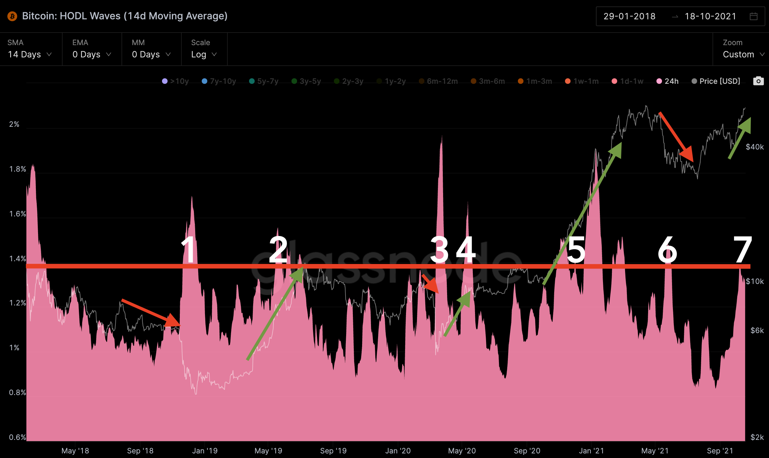
What this shows us is demand can drive prices to new highs. And even overcome any potential issues we see in supply - like we see now.
This is ultimately a main factor for why price is going up.
But the real question is… Will this healthy trend continue and notch new all-time highs?
We sit on the yes side. For most who have been following us for the last three weeks this won’t come as a surprise.
Instead, the bigger question on most minds today is likely related to the ETF listing. Does the ETF listing impact prices this week and into the monthly close?
Unfortunately, I have no concrete answer. And for kicks, here’s what my poll on Twitter is showing…
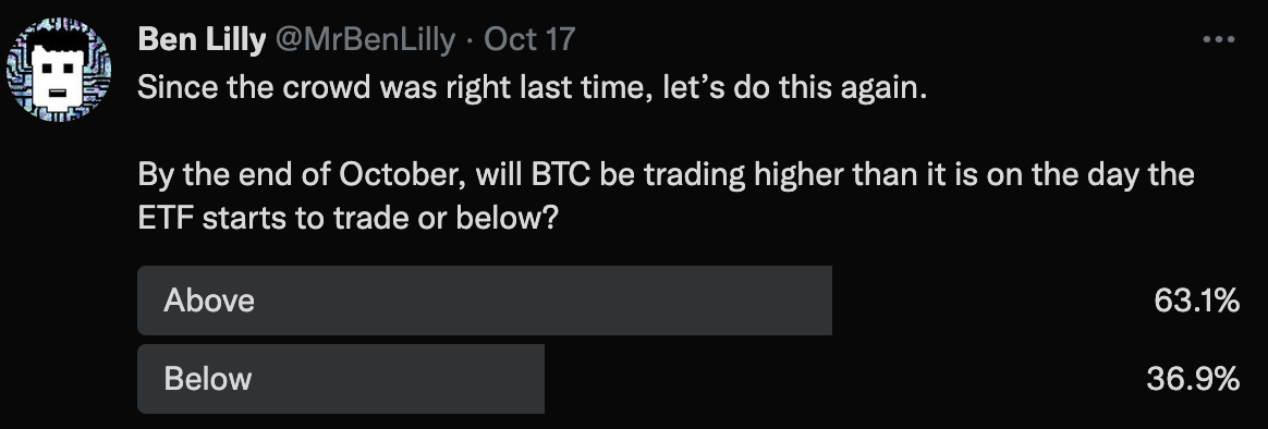
We’ll see if the wisdom of the crowd prevails.
In the meantime, just because I don’t have a simple yes or no to offer doesn’t mean I can’t talk about what the market is showing and how we can prepare ourselves…
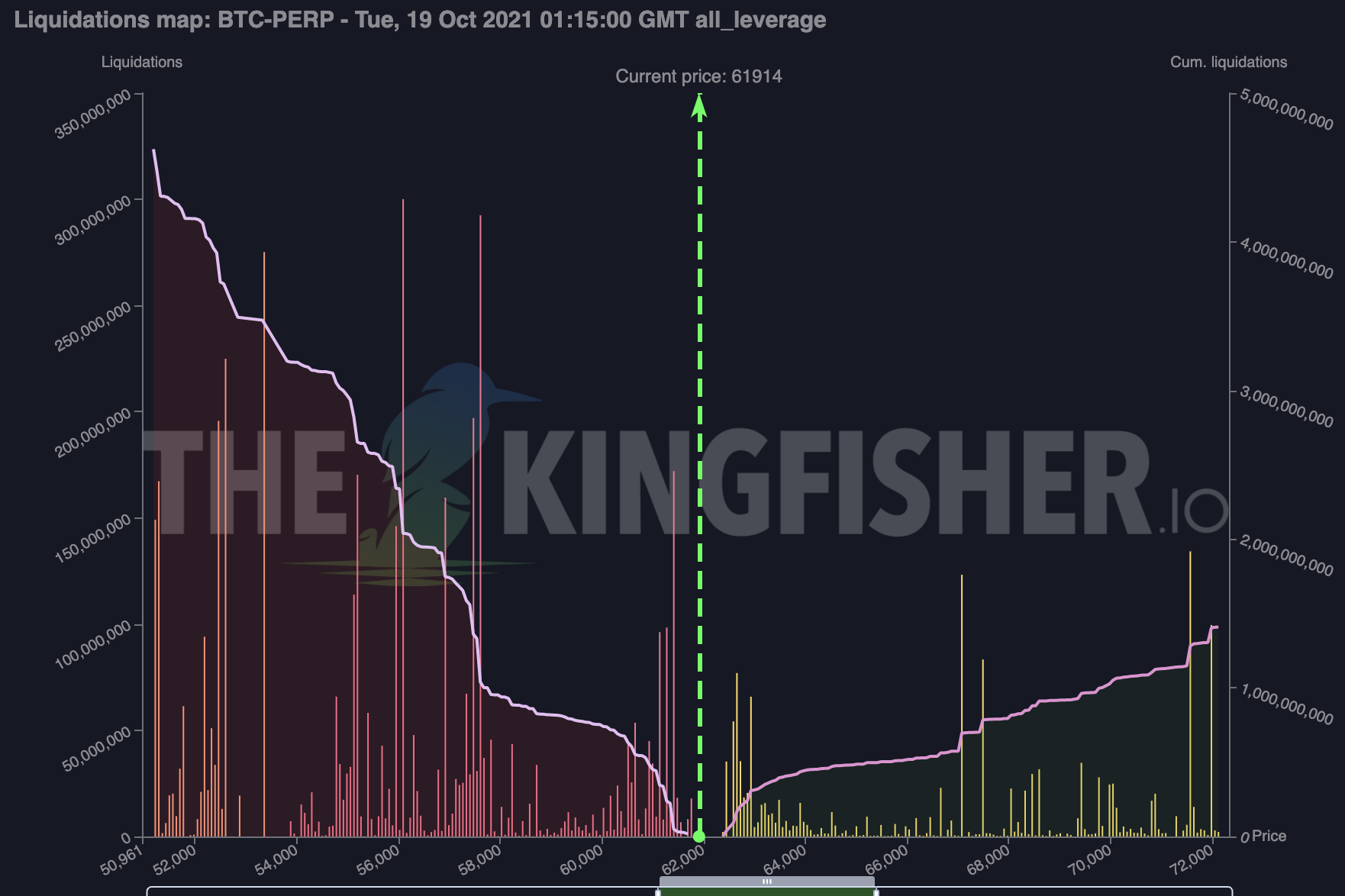
To start, here’s a chart from Thekingfisher.io showing liquidity pools. (Here’s an essay that explains what a liquidity pool is.) The higher the bars the greater the potential liquidations that can unfold as price draws near it.
Moving into ETF listing day there is more liquidity to the downside. This is something to consider in the event price starts to trade sideways this week. If price begins to go sideways these pools will become more important and likely grow. And it’ll be then that we want to see how this chart changed over time.
(P.S. - I never got the chance to write about GEX. But for those that are interested in the liquidity maps offered by TheKingfisher.io, I managed to get a 20% discount if you are interested. Here is the link to get your discount. Note: I do not receive a kickback, this is all for Espresso subscribers.)
As far as onchain activity…
Clear skies overhead. Here is a heatmap of onchain movement. Without giving away too much of the secret sauce, simply view the teal/yellow shades as support and resistances.
Above the current price there is little to no resistance…
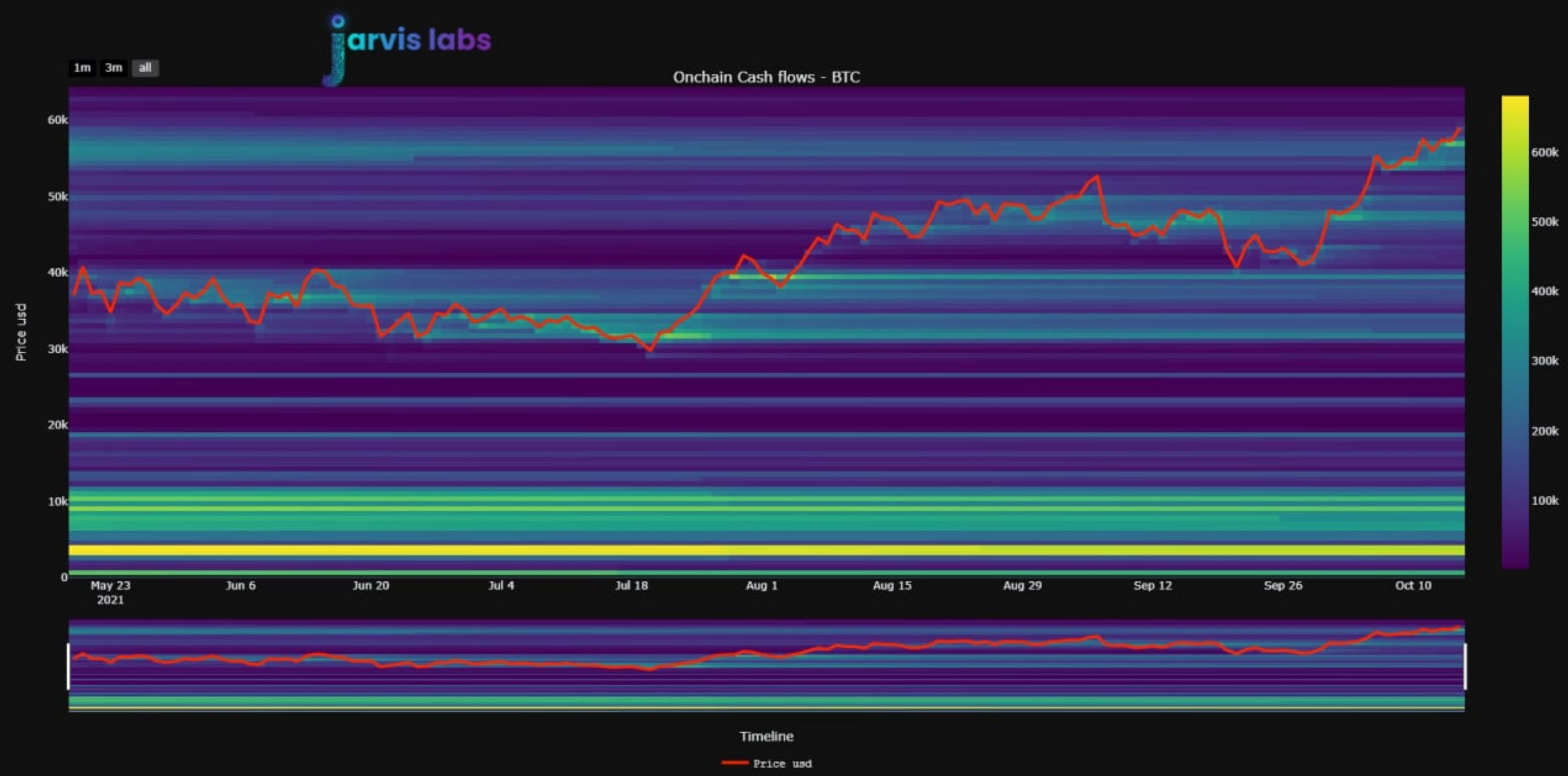
Which should be obvious since price hasn’t spent much time above $60k.
Meaning bitcoin could hit price discovery mode if it gets a chance to rip above its all-time high.
Simultaneously, the onchain flows are not hinting at excessive profit taking.
If we pair this information up with the fact that funding rates are not getting excessive, we don’t have a market environment that is getting ahead of itself.
Also, don’t forget that the demand on spot is also healthy.
So knowing this, I believe it is more important to focus on when to act.
More precisely, for the person sitting out in the cold wondering if now is the time to get back in - you are the one I want to address real quick.
For you, I have two things that might help in making a decision.
First, here is an internal metric we use that can help traders either add or enter new positions. It is the MVRV Ratio with a 30 day average.
While the metric itself can be a bit confusing, the way we can interpret the ratio is… As the ratio gets high enough, traders tend to take profit.
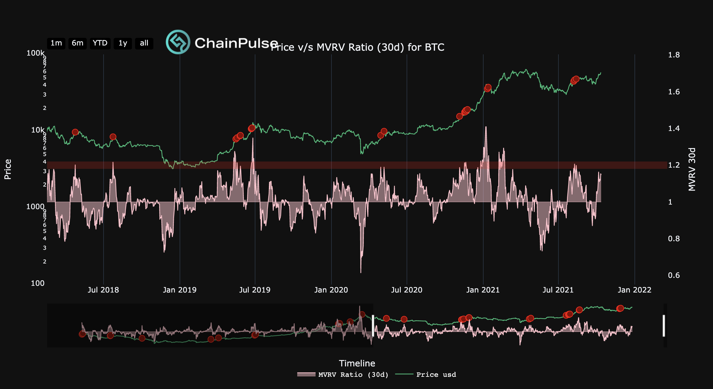
This is not a metric that times tops.
Instead, it helps in deciding when to enter new positions or add to existing.
When it enters the red band or around the 1.2 level, it tends to revert back to 1. Once it reverts back, price tends to provide a nice entry.
Which allows me to quickly hit on what Jarvis Labs and soon ChainPulse does... We take data and turn it into signals so you don’t have to sort through all the various data feeds and platforms.
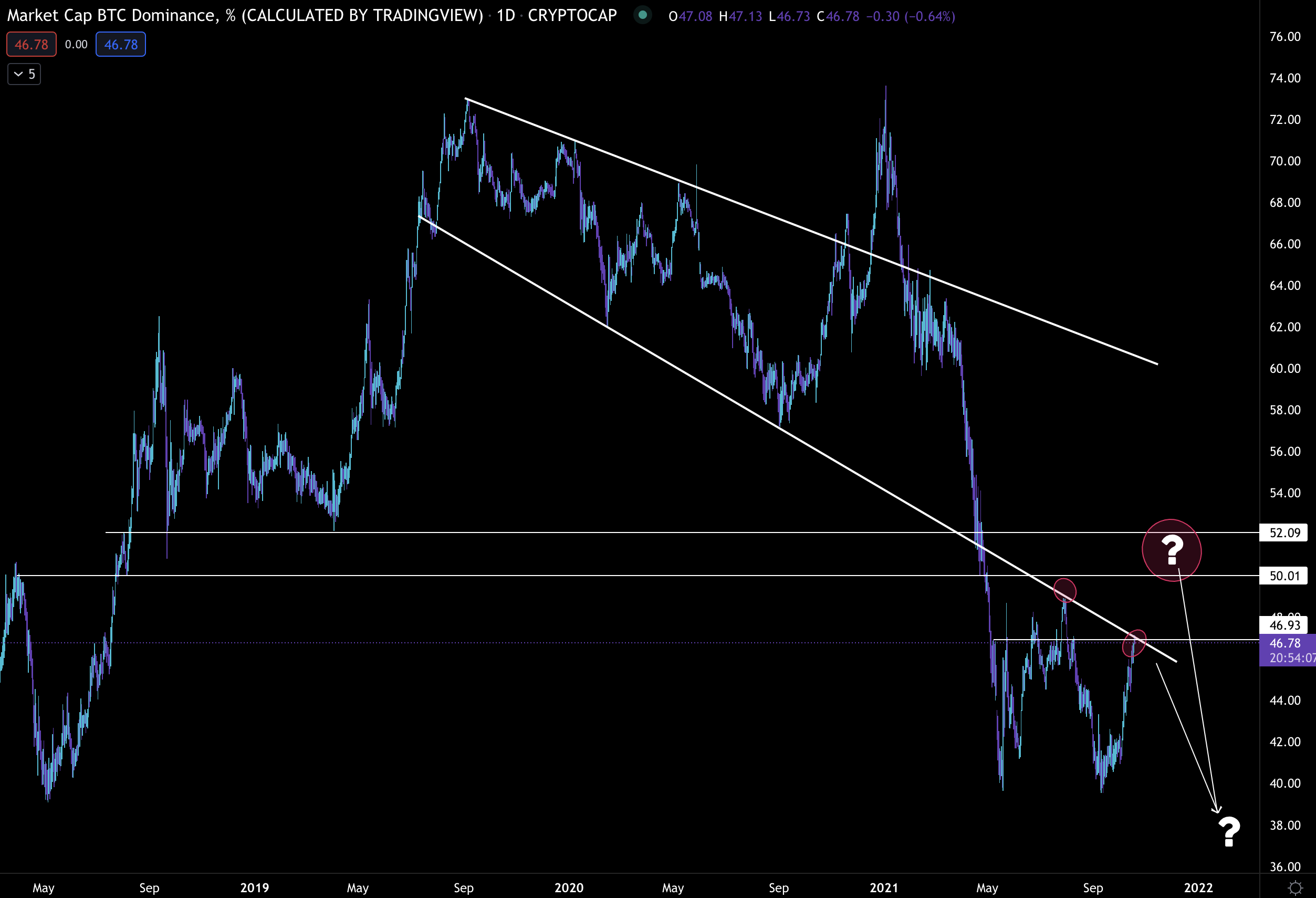
Now, the second tidbit that can help is from the bitcoin dominance chart. This chart tells us what percentage of the crypto market is made up of bitcoin’s market cap.
This chart is important because most traders in crypto understand that bitcoin can steal the show for extended periods. And once it has its time in the limelight, the rest of the market plays catchup.
If you can time this chart right, then you can time your entry into other areas of the market with greater success.
When BTC.d trends upwards, you want to be in bitcoin. And as it slows down or hints at a potential reversal, that is the time to move a bit into ETH and other large cap altcoins.
Then as the trend begins to turn bearish, it is time to move further out on the risk curve.
And as the bearish trend starts to exhaust itself, it is time to move towards larger cap assets and/or stablecoins.
That’s the rough idea behind BTC.d.
And what it is showing us today is bitcoin is pitted up next to a potential reversal (red circle) area.
Now, I don’t have much confidence that bitcoin will in fact reverse here because the ETF is arriving like the Koolaide man to a party already taking place.
Which is why I believe bitcoin outpaces the market and BTC.d goes on to rip a bit higher.
And in the event we witness a pullback I still think BTC.d rises - this happens when bitcoin doesn’t drop as much as the rest of the market.
Either way that question mark and red circle near 50-52% is an area I have my eye on. We’ll see in the next few weeks if we get it.
In the meantime, for those feeling indecisive, this is a piece of my playbook for where to allocate capital.
It is in part why I wrote that last essay “Prepare Now”. Because now is the time to decide what large caps, mid caps, and risky small caps you want to flow capital into when it is time.
You are not late to what might unfold. There obviously is no guarantee, but based upon the data we look at, this is what we believe is coming.
And when bitcoin starts to rip and command a daily spot on CNBC and Bloomberg, you’ll know what your next move is and not feel left behind.
Then as we move further out on the risk curve we will have an eye on how euphoric the market is on any given day to know when to tamp down on risk and begin seeking out safer assets.
I mention this because when everyone is making money and there is no wrong bet, you don’t want to give back your winnings.
Be smart. Manage risk. And don’t get too greedy.
Your Pulse on Crypto,
Ben Lilly


