Party Like it's October 2017
Onchain + Options + Regulatory FUD Perps


Is it May 2018 or October 2017?
Whenever I look at onchain metrics and charts this is what I ask myself.
If you pull up a chart of bitcoin and the cryptocurrency market as a whole right now, you’ll quickly realize the importance of these two dates.
In fact, I urge you to do this so you can join me in this internal struggle.
Because either we are about to rip higher to attain new highs or spiral into another Crypto Winter as we saw in late 2018.
And once you realize this you’ll suddenly see people via newsletters and Crypto Twitter drawing their line in the sand.
And if you think I’m about to do the same, I’m here to disappoint.
There is no clarity.
Anybody who claims everything is clear as day is failing to view alternative scenarios.
I’ll detail the upcoming onchain analysis you’ll be reading today in something I’m calling The ChainPulse Papers (you can subscribe for free here). Think of ChainPulse Papers as a way to form an investment thesis for various tokens in crypto. It differs from what we discuss in Espresso which targets market structure using onchain analysis, wallet tracking, and technicals.
TLDR: Espresso focuses on what will happen tomorrow.
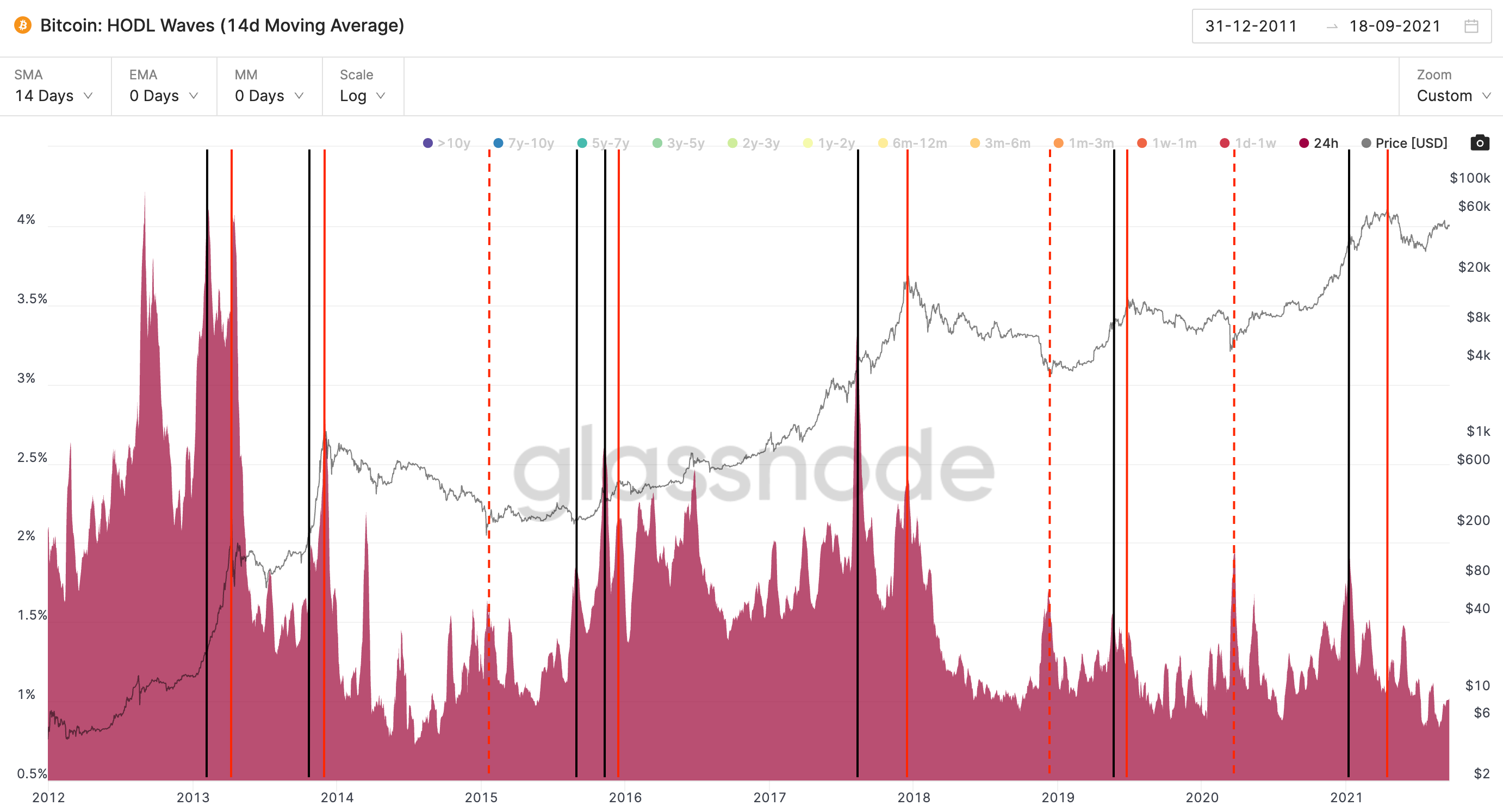
Now, below I outline the analysis I’ll detail at a later date in the Papers. It is something called HODL waves. It tracks what I like to call “Crypto Cohorts”. When euphoria unfolds there is a wave of new investors. And as time progresses you can see these new entrants evolve into HODLers.
You can see their progression in the chart below. There is one cohort from 2011, two from 2013, and two cohorts that have since blended into one from 2017, and one which was birthed at the start of 2021.
The red dot at the bottom is 24hr HODL activity, and as time progresses these unmoved coins get represented in the bands that lay higher. The purple ban in the upper left corner are coins that haven’t moved in over 10 years.
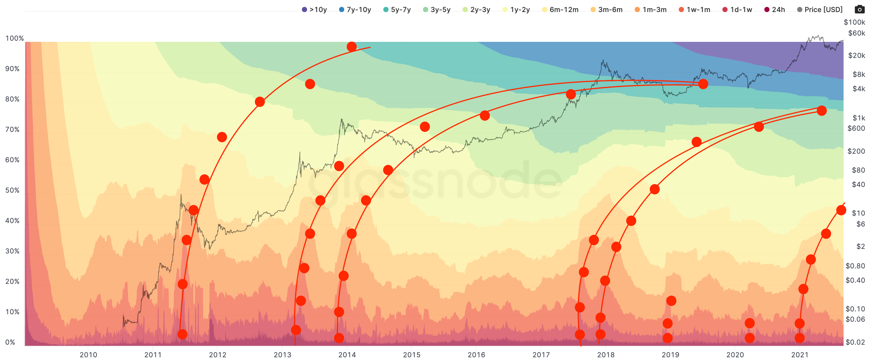
As you can see in the chart above, there really is nothing there to help us decide when a market top is in. It just looks pretty cool.
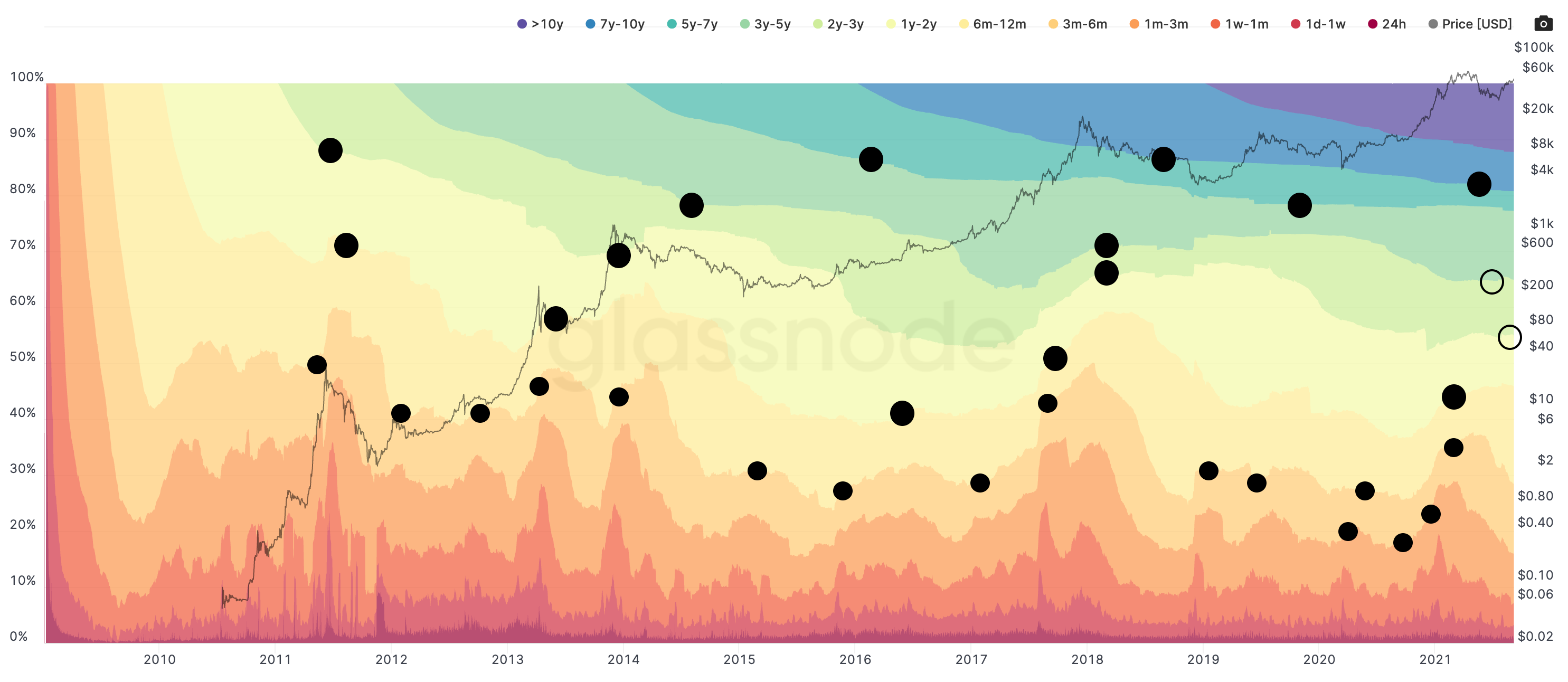
BUT, if we look at when a HODLer cohort “unHODLs” or when these bands become smaller, we get the chart shown below.
It is a period of time when the demographics become the smallest. (FYI: Demographics are bitcoiners that have HODLed for a period of time seen in the color based legend at the top of the chart.)
Focusing in a bit more we see that the black dots associated with the 1yr-2yr and 2yr-3yr demographics tend to line up with market tops.
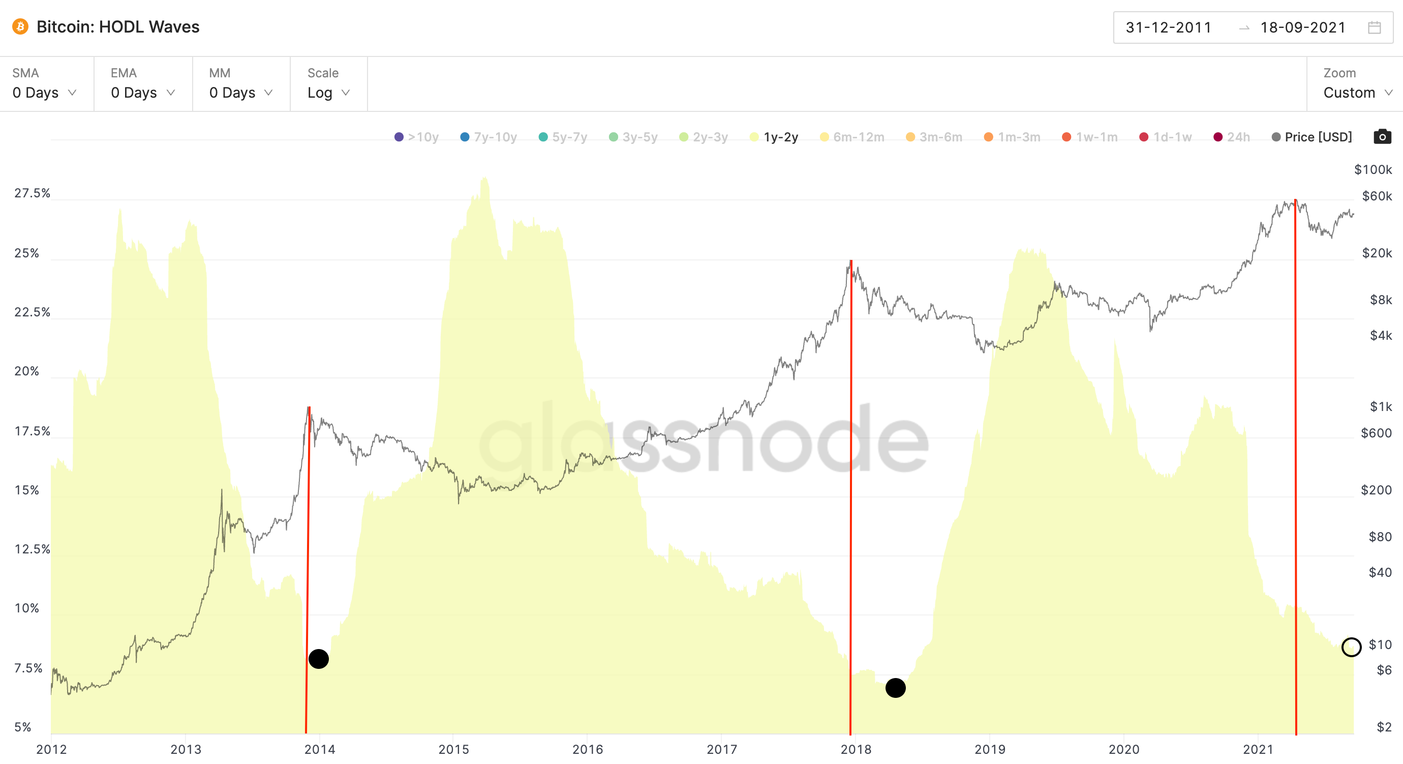
Pulling away the other groups this is what we are left with. Here’s the 1y - 2yr group. It pairs up with market tops fairly well. And note how the recent $65k top lines up in a similar way as the prior two market tops.
Flashes of May 2018 enter the brain...
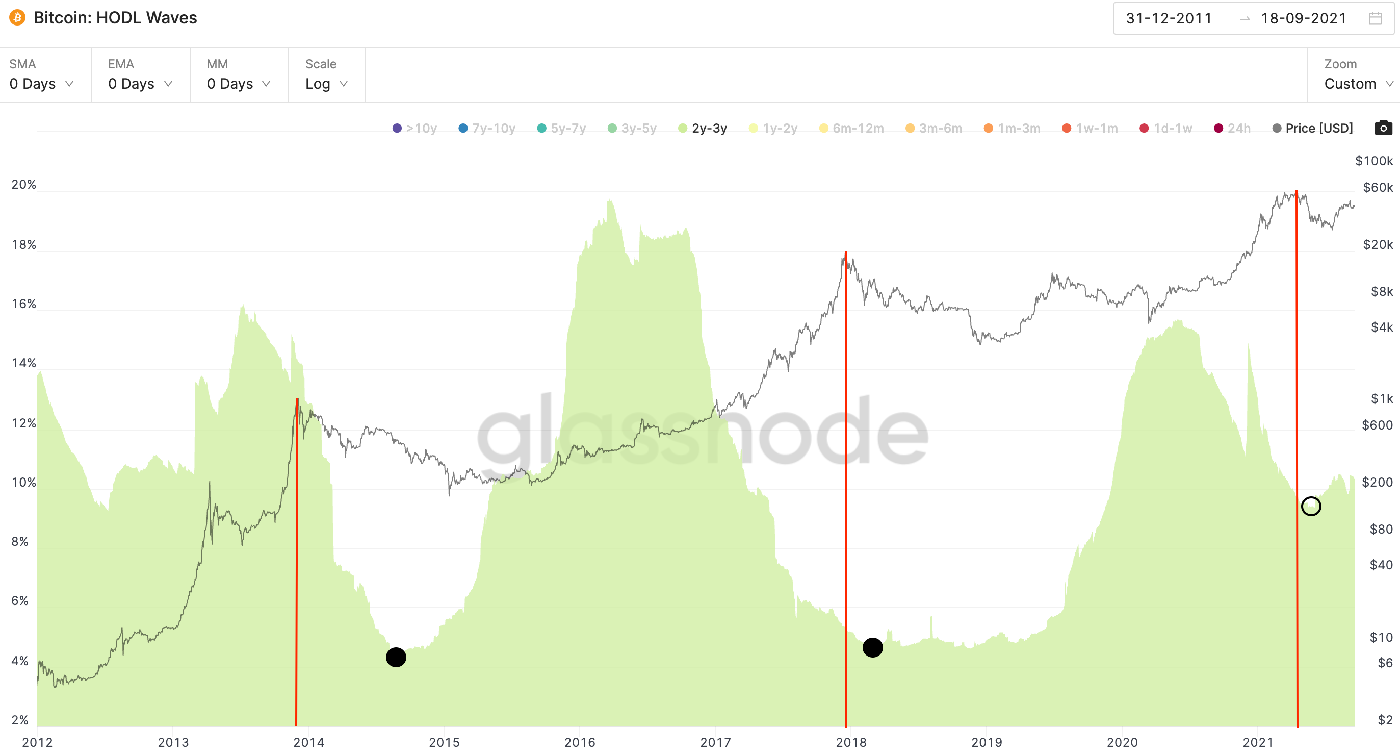
Then the 2yr - 3yr demographic.
Less clarity on this one. Maybe we hit a bottom, maybe we didn’t. The bottoms are not as closely paired up with market tops as expected.
In 2013 the 2y-3yr group sold after the top while the 2017 top, they sold beforehand.
This time around we’re somewhere in between. An argument for late-2017?
Maybe.
But here’s the thing.
This is the supply side of onchain. Anybody who has studied markets understand that supply is only half the equation. And in reality, or at least in my opinion, supply is the half that matters less.
Because think about it this way…
If the “smart money” or the 1yr-3yr group sold their bitcoin, why is price destined to go down? I understand it means there is a massive influx of coins in the market that need to be absorbed, but what if a new wave of buyers show up?
This forces us to ask, have we seen high moments of demand that somehow translated to a push higher in prices?
Yes.
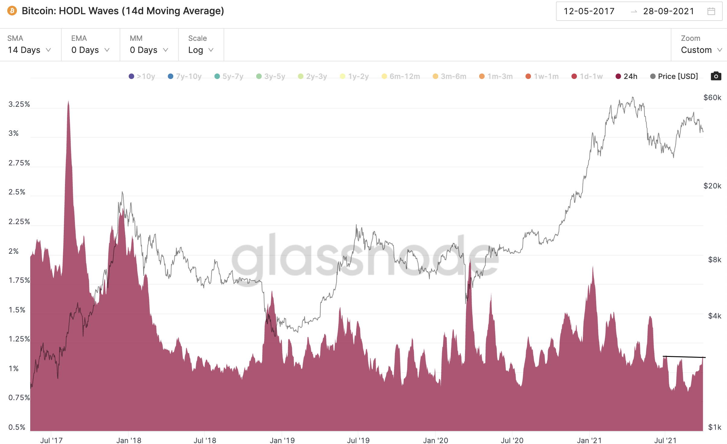
Here’s how demand can be viewed using onchain HODL waves. I personally look at the 24hr group for this.
I smoothed the data out over a 14 day period because this helps uncover momentum in demand.
The black lines represent spikes AFTER a period of steady growth in 24hr HODLers AND a period of increasing price.
Weird stat, I know… But this dual necessity translates into momentum in demand. The Red line is the market tops that follow these periods.
Remember, both rising 24hr HODLers AND rising price.
Here’s why this dual necessity is important…
Look at the dashed red lines. These are market bottoms where the 24hr HODLer metric grew/spiked. In these instances price was already declining. These tend to represent market capitulation moments. Pretty significant.
With all that laid out, if the momentum were to grow today I do not believe we would be nearing a moment of capitulation. 2015 and late-2018 were market bottoms. Price is not forming new lows today.
MAYBE if we see that later, but that’s something we can discuss if the situation begins to present itself. I think it if fair to ignore the capitulation idea for now.
Now, a bit of a surprise here, these pictures were taken nearly a month ago.
Let’s refresh the chart…
Meh, bit of a downer. There is some mild momentum, but nothing to be considered true momentum until we form some local highs near the 1.25% level in my opinion.
But here’s the thing, demand can switch in a moment.
And if we do see price climbing higher while onchain metrics like 24hr HODLer start to rise, the current demographics we showed earlier speak to a unique market environment.
Remember, the 1yr-2yr group has already sold.
The 2yr-3yr group already half sold.
These two groups historically unload about 30% of supply into a rising price. They have only a few more bullets in the chamber.
Very unique.
So what this means is if demand were to continue rising and price starts to climb, the price move might be faster than what people expect.
To decide what might happen here, let’s pull up some more timely data that switches away from onchain and moves towards the options market and news cycle.
To start, let me post an off the cuff remark about options yesterday.
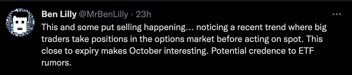
I’d like to add a bit of color on this.
Before the run up in late-2020 we noticed a hedge fund posting their deep out the money call options expiring at the end of the year.
This same group deposited over a billion dollars worth of bitcoin into the Grayscale Trust at the end of the year. Meaning they were likely purchasing the bitcoin into the yearly close - which pairs up with their options.
Then more recently another group conducted some market making activity by sourcing bitcoin in the market to fulfill a large order.
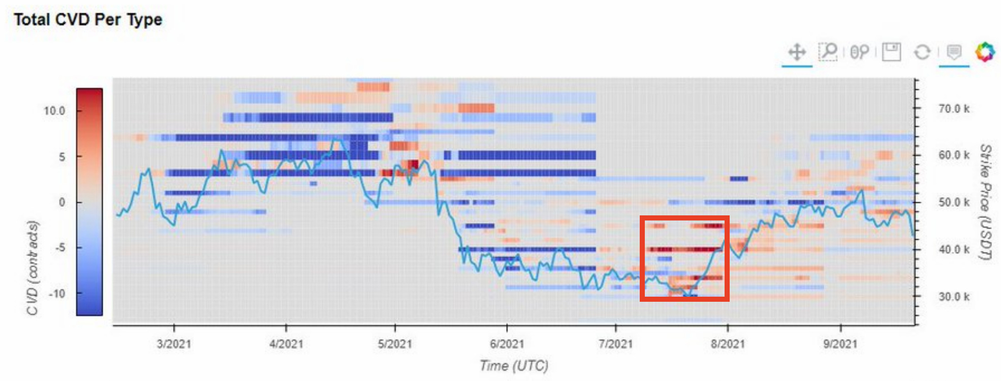
Call options were loaded up on prior to this activity happening, which can be seen on a chart from Fred over at Material Indicators.
Don’t get too caught up here. Red just indicates more call buying versus put buying, and the timing was right before the recent rally that unfolded in August.
The way I like to frame these two examples are a way to capture overflowing alpha via the options market.
If you know you’ll be conducting sizable moves on spot that will move price, position yourself in a way to capture this movement while you keep the underlying relatively quiet.
It is a way to maximize on one’s future activities.
And today, we see some interesting tidbits hitting Twitter.
Here’s a tweet from our friends over at Variant Research using some solid data from Laevitas (both are relatively unknown research “Chads”). Indicates a bit of an uptick in options activity unfolding.
Option flows for the last 24 hours. 👀
— Variant Research (@ResearchVariant) 4:14 PM ∙ Sep 29, 2021
-50k Call going bid
-Large number of put sellers 40-ish range
-IV still relatively subdued 👇
Charts: @laevitas1
Yesterday was put selling. Today is abnormal call buying.
And if we pair this information up with how orderbooks look we start to get an interesting view of the current market structure.
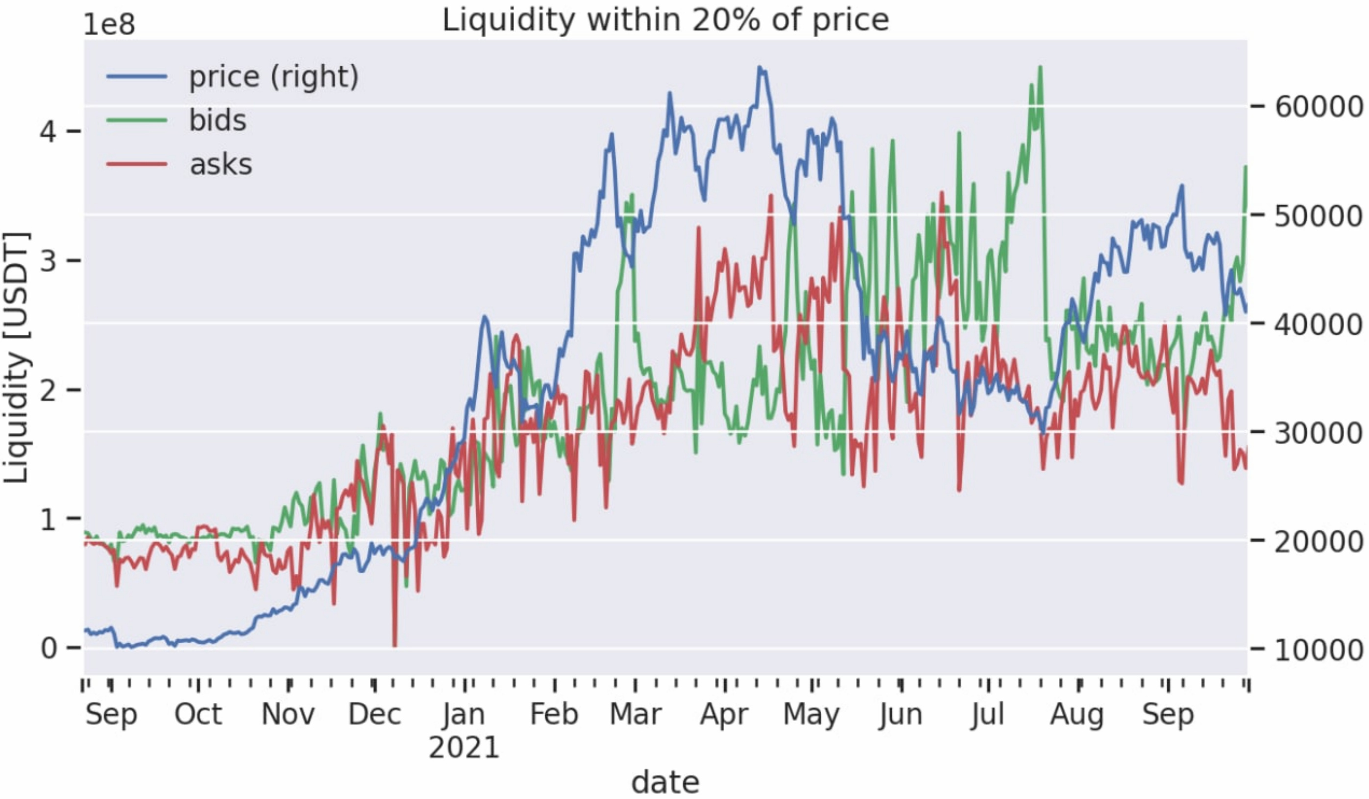
Here’s another Fred metric showing the rising bid liquidity compared to ask liquidity. Green rising indicates more bids - note we saw this before August’s rally.
Asks on the other hand have declined a bit.
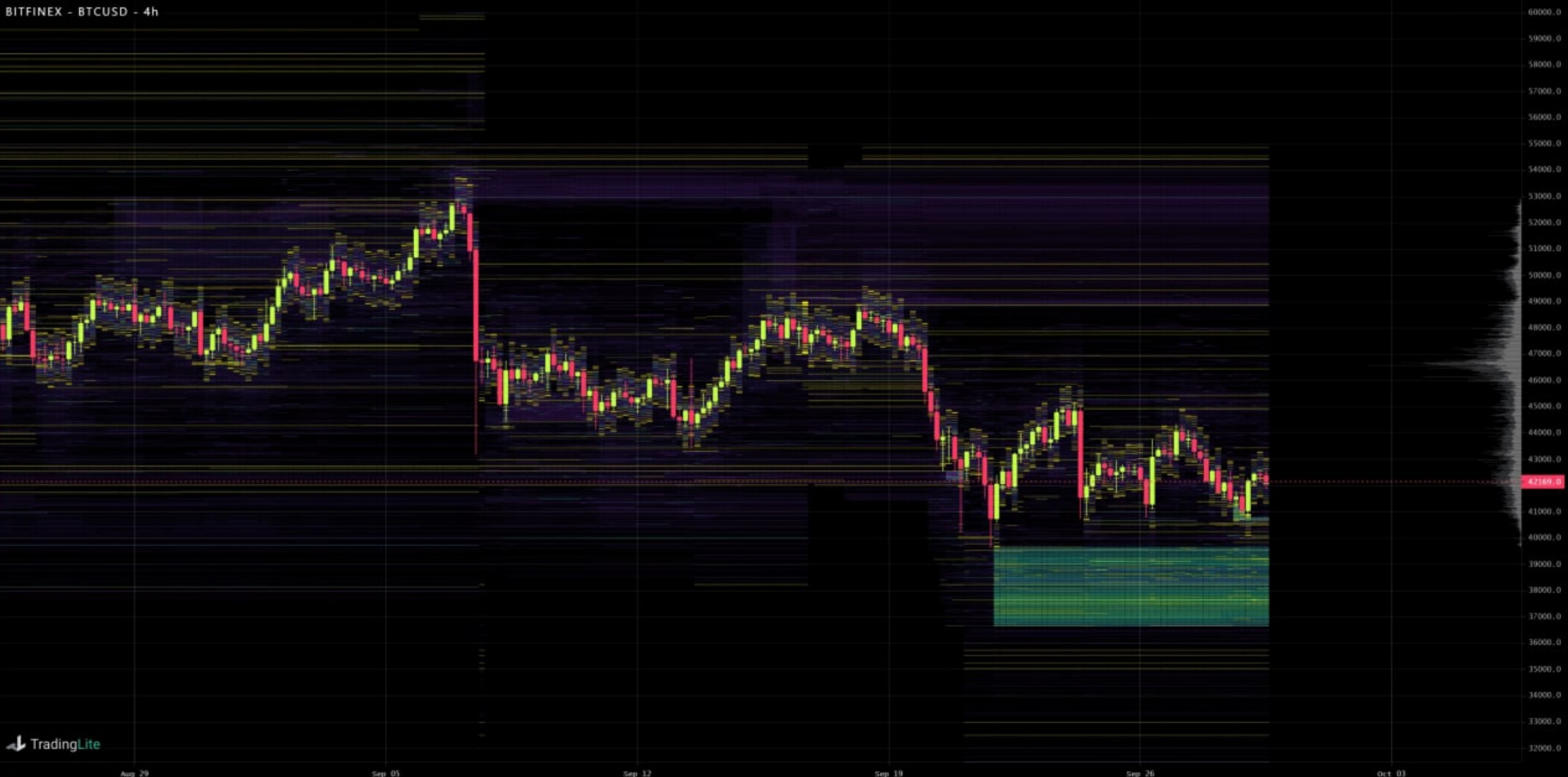
Here’s the order book at Bitfinex visualizing this same phenomenon using Tradinglite.
So this forces us to ask… Is this the demand we are talking about?
Perhaps. Or perhaps it is enough to spark the demand the market would need for higher prices.
If we get a spark, the supply side is relatively weak. Which again, points to fast price action higher.
To pile on to this fast price action I’ll touch on the topic of the regulatory climate.
To put it bluntly, the regulatory climate really sucks.
In fact, we’re literally watching Ryan Selkis the founder of Messari.io falling into a depressed state of mind as he pushes forward on the regulatory from - please message him on twitter and keep him motivated by saying thank you, keep it up.
But here’s the thing, while all seems doom and gloom entities like Kraken are getting hit with a chump change $1 million fine. I personally know most of my readers can handle that. So to an exchange like Kraken this is couch cushion money as Travis Kling from Ikigai Asset Management stated.
And then Ripple comes out and decides to attract NFT development on its platform… While it’s being investigated by the SEC.
Seems to me they are not too concerned here.
The regulatory FUD in the U.S. and China is full throttle.
If I could place this type of regulatory sentiment on a perpetual futures market I guarantee the shorts would be paying longs right now. It would be a negative funding environment. In the futures market we would probably be witnessing backwardation (I double checked my spelling this time!) if this market existed.
Meaning, we are getting overly bearish.
Thus, if there is any positive news that transpires, it can serve as jet fuel. And maybe, just maybe, this activity we see in the options market is hinting to us what might happen. If so, I would expect the onchain analysis we started off today’s issue discussing to reflect rising demand amidst rising prices as we move closer to the end of 2021.
If we get it, let’s party like it’s October 2017 again.
Your Pulse on Crypto,
Ben Lilly


