The Market's Risk Appetite is Growing
The Weekly ChainPulse Report
My team made it to the final showdown.
It was a rollercoaster of emotion type of season. Games came down to the wire, players were forced to step up in light of injuries, and miracle moments were peppered throughout.
If the season ended before the last game even began, I would have been satisfied.
It’s in part why the championship felt more like a celebration than a showdown.
Six hours before the starting whistle the bathrooms already had a waiting line similar to a theme park. I wasn’t alone in my celebratory mood.
Now, a few hours before the game I heard a phrase that has stuck with me to this day.
It came from a fan of the opposing side.
“Act like you’ve been here.”
My thinking at the time was to view the emotions exuded by my team’s fanbase as sure, we’re a little excited. And in reality, we’re just happy to be here. It was a long season and that was enough to celebrate.
Here’s the thing. This feeling is something I see in bitcoin investors a lot right now. Especially the newcomers. And I don’t blame them one bit. It’s exciting to see charts go parabolic.
And while I’ll be the first to tell people it’s important to have fun along the way. I encourage you to never lose focus on where we are at any point in time. This applies to traders, HODLers, investors or business owners in the space.
Because each one can benefit from knowing where we are at in the current cycle.
If you talk to any market participant that’s been around for a cycle or two, you’ll quickly learn how laser focused they are right now.
Similar to how my team bounced back the next year with laser focus to hoist the championship trophy, that’s how crypto investors behave who’ve been around long enough.
It’s in part why we created Jarvis Labs.
We provide insights, services and data to help you make the most out of the market. Espresso is one of those tools. It’s designed to help you decide where we are at in the market in order to make decisions that help you achieve your goals.
Today is no different. Below you’ll find topics ranging from macro markets, on-chain data, and more. Each one is a driver of the market today and in the months to come. So follow us along as we give you the Rand McNally Map for crypto.
For a bit of guidance we start of with a view of the global financial system, then focus upon crypto at a 10,000ft view, and finally zoom in on the near-term pulse of the market. By the end of this article you’ll know where we stand and can check in on our short write ups during the week to see if we’re still on course.
Zooming out…
Macro
In our Macro section we follow what’s happening in the global financial system to gain perspective in terms of how bitcoin fits into this beautiful mess. Topics can range from treasury purchases, bond yields, FOREX markets, commodities, central bank policy and more. That’s because Bitcoin is becoming a major macro asset. So to be informed on the market requires a global viewpoint.
Let’s get to it…
A wall of money is coming like we haven’t seen since the second world war.
That’s what the head of equities at Lombard Odier Investment Management stated last week. This was in response to the stimulus bill passed in the U.S. and the European Central Bank’s pledge to increase the pace of its bond-buying program.
Here’s the German 10yr Bund yield responding to the European Central Bank’s buying.
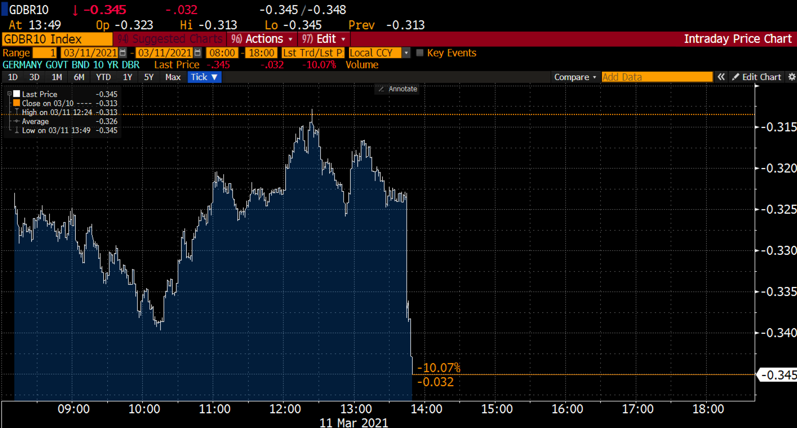
Yes, that’s a negative yield.
Money is flowing out of every government orifice. And it’s unlikely to stop soon.
This is one of bitcoin’s strongest investment cases for 2021. It’s in part why corporations and Wall Street execs are turning to bitcoin by the week.
If money is being printed left and right, yields are turning negative, and debt is getting unsustainable, what do you do? You find a currency that isn’t in the same boat, which is bitcoin.
Case in point of why bitcoin is offering a shelter to the upcoming storm, the U.S. President is stating every US adult would be eligible for a Covid-19 vaccination by May 1. This means by summertime the U.S. economy will have a giant “We’re Open for Business” sign.
What does this have to do with bitcoin you might be asking?
Inflation.
As the surplus of cash injected into the economy begins to flow to businesses, business owners, employees, and down the supply chain there’s more cash fighting for the same amount of resources.
This might seem odd at first, but I find it easier to view inflation from the viewpoint of demand.
Here’s what I mean… If there’s ten people with $100 in their pocket bidding for a stick of Normandy butter versus ten people with $500 in their pocket bidding… The scenario where there’s more cash ready to go will result in the butter selling at a higher price.
When it comes to this happening across the economy, the result is inflation.
It’s the issue with having so much extra cash in the system. Prices will creep up and each dollar is essentially worth less than before.
Understanding that these market effects are coming and central banks around the world are continuing to prop up the bond market, we’re highly tuned into how the FED acts and what it says.
It’ll be no different when Jerome Powell addresses jittery listeners on Wednesday.
Be prepared to watch yields, risky stocks, DXY, gold and BTC around this event.
Once thing I find interesting right now is the gold chart. The asset has been beaten down as of late. It offers a similar store of value narrative as bitcoin if DXY loses value. And I wouldn’t be surprised to see it start to build strength in the coming week.
This would be a nice barometer for bitcoin moving forward since it holds a similar investment thesis as gold, but with more upside.
Moving towards the macro view of crypto…
On-chain Macro Beat
This section is your birds eye view on the current bull cycle. We tend to use on-chain charts to help you visualize what inning we’re in and what’ll happen next.
What you’ll see today is we’re not yet wondering if the top is near in this bull cycle.
Additionally, the liquidity crisis we originally discussed last month is still taking place.
Bitcoin are moving off exchanges as seen in the chart below. This trend shows no signs of slowing down yet.
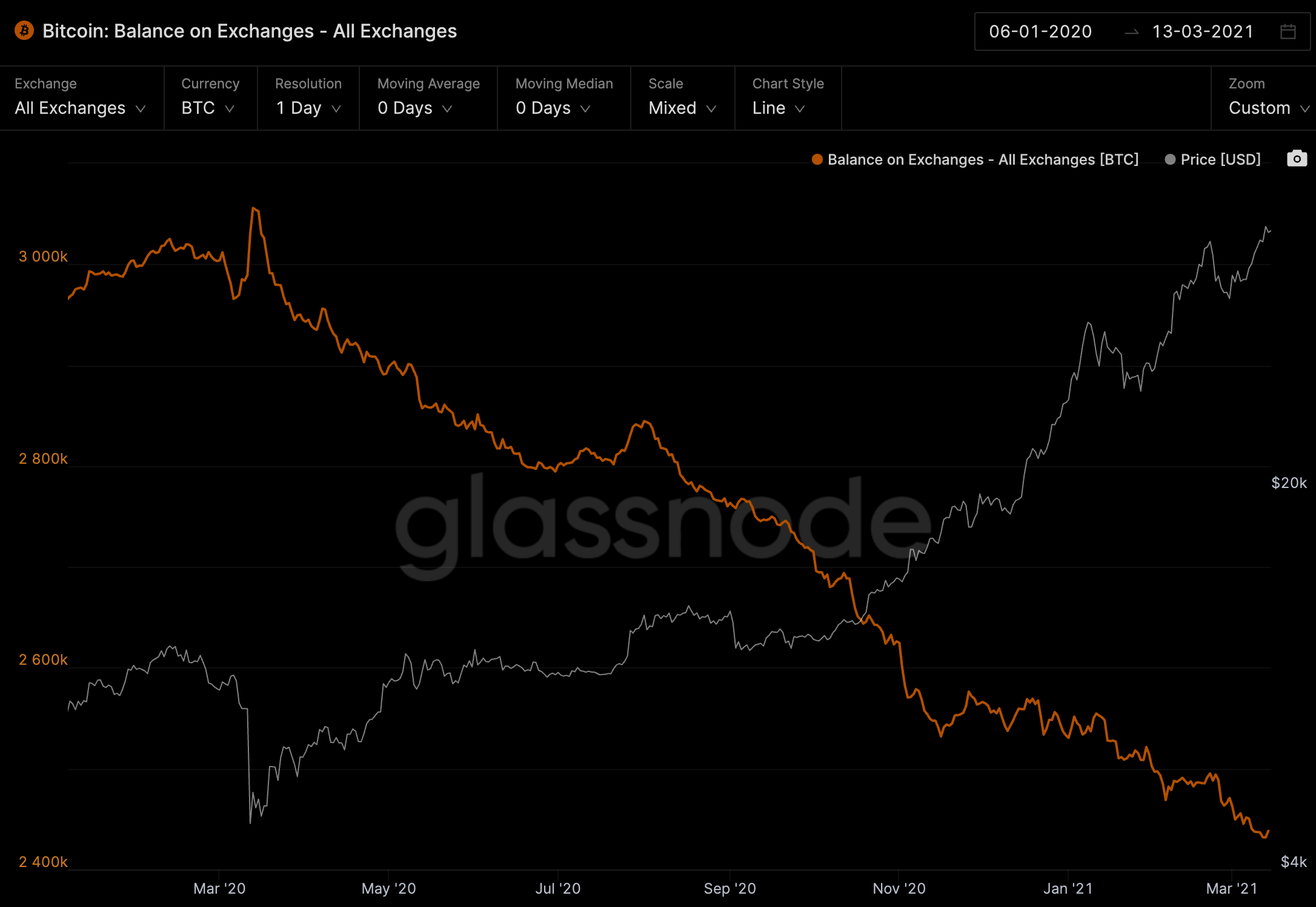
In terms of where bitcoin are going…
Grayscale to date absorbed almost 50k BTC, the new Canadian ETF just north of 13k, and all the other investment vehicles are too small to care about. (Which is another reason why I think the Grayscale premium returns in about two to three months. But that’s a topic for another day.)
On-chain we can see over 150k are residing on Ethereum. This trend is still intact, and with Cosmos and Polkadot preparing to place BTC on on-chain, these areas that represent more ways for BTC to exit exchanges.
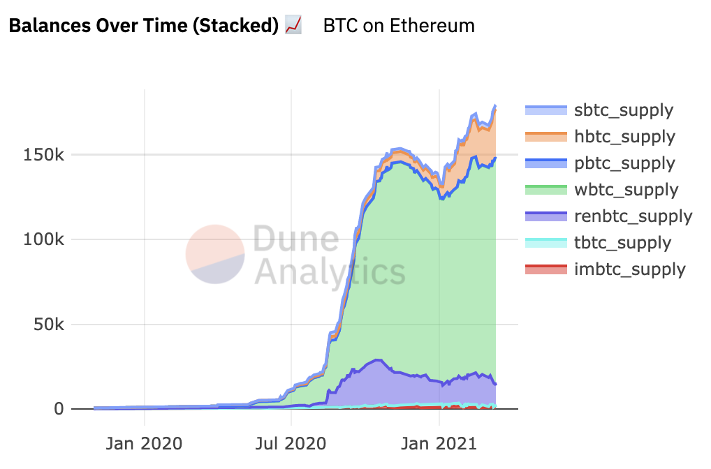
There’s also about 25k BTC sitting on Binance Chain, an area many are discounting.
This is fascinating since it’s more than renBTC, the ETF and other institutional products. It’s nothing to gloss over as it means nearly 200k BTC sit off its own native network.
The predominately went to Corporations.
Now, this is important because we haven’t realized this happen in prior bull cycles. So when the top is near it’ll be interesting to see how fast price can move when there’s a literal lack of BTC to sell.
In terms of if that top is near… it’s not.
Here’s a Glassnode chart called Realized Cap HODL Waves. It’s more than just cool looking colors. It’s a graph that depicts the type of HODLer in terms of length of time BTC are held and weight for price.
It’s a good way to compare investor activity during price moves. Take note of the peaks show by the red arrow. The one furthest to the right is the current bull market and is nowhere near the prior to cycles.
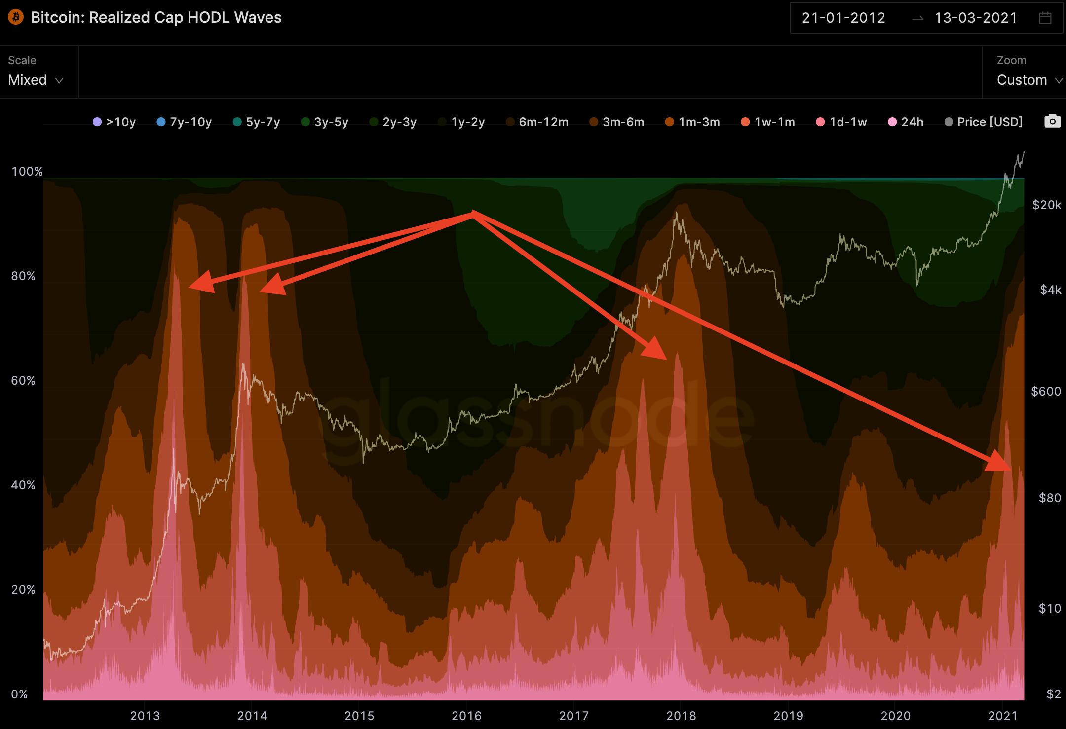
However, during the next strong push in price it’s wise to analyze this chart among others.
This tells us the current market is not near a top when compared to prior cycles and the lack of BTC on exchanges might create some really fast price action soon.
In terms of what we are looking at for the next week or so, let’s dive into the micro level…
ChainPulse
We give you ChainPulse updates every Monday, Wednesday, and Friday. In these updates we show you what the pulse of the market is right now in an up close and micro level.
If funding rates are looking extreme, new USDt got minted or anything can influence short-term price action then it’s likely to appear in ChainPulse.
This past Friday was a case in point.
Price began to approach the all-time high and traders were starting to take their positions. Friday’s ChainPulse highlighted how the bulls were edging out. This created a case for a new all-time high to take place over the weekend.
After we shared some of our accumulation and Tether data hinting at this possible outcome, BTC rose 9.8%. That’s the helpfulness of ChainPulse.
Today, our data isn’t deviating much. It’s still hinting at more bullishness ahead.
The past two weeks we’ve witnessed about 800 million Tether created. We’ve seen about 600 million of this deployed. Some traders will quickly discount the effectiveness of these signals.
If you’re sitting in the non-believer camp on the Tether signals, here’s us on February 26th saying, “We’re expecting Tether to mint new USDT at some point soon. When it happens this is a good indicator that buying pressure is imminent.” Four days later on March 2nd we got our wish.
Our response the next days was, “Tether is here. There's not much more you need to know…”
Bitcoin is up 40% since.
We follow the signal and Tether is one of them. Their actions have not slowed and are even taking place on their original Omni chain. We haven’t seen movements take place on Omni since December. Seeing it come back into action is a good signal, so for the time being we continue to let Tether guide us on decision making.
It’s in part why our Fuel Meter sits at 72. This is a healthy sign for the market in terms of enough capital sloshing around in the markets to keep pushing prices higher.
Another metric we tend to look at is risk. This can be tricky when we’re in a full blown bull market with FOMO oozing in through every nook and cranny. Luckily for us, our Risk Meter is only at 66. We’ve seen it sit at 99 during this cycle.
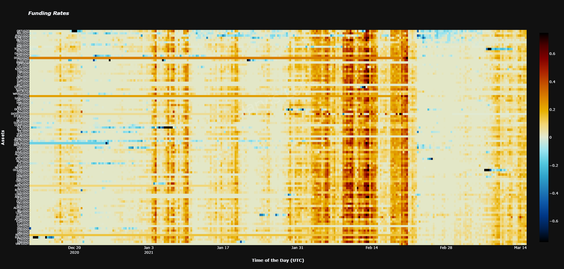
Funding rates are slightly elevated to high positive values now, especially alts. You can see our ChainPulse Heatmap below. Red means there’s excessive FOMO and irrational traders opening up very costly leveraged positions. Blue means there’s excessive fear. White is what we like… A mini dip to cool off could come early in the week before a price hike across the board.
Last piece for today is our chart that shows investors are moving further out on the risk curve…
Chart of the Week
Last week U.S. regulators “allegedly” fired a shot across the bow at Binance. I say allegedly since nothing really came of it from regulators so far.
In response to the U.S. saying it’s investigating Binance, the markets suffered a minor amount of whiplash and investors appear unphased from it since BTC is hitting new highs.
We’re not entirely sure what this means in the coming weeks to months for Binance, but the question of “why now” might be answered by checking out this next chart.
Binance is best known for access to coins further out on the risk curve. Call them shitcoins, call them alts, call them whatever you want. To gain access to the most widespread and liquid markets in crypto, you’re heading to Binance.
This means if we’re trying to gain a reading on where investors are going, we can look at web traffic. The Block publishes a chart on Cryptocurrency Exchange web traffic relative to others. As you can see below, Binance gained 6% of the market over the last month.
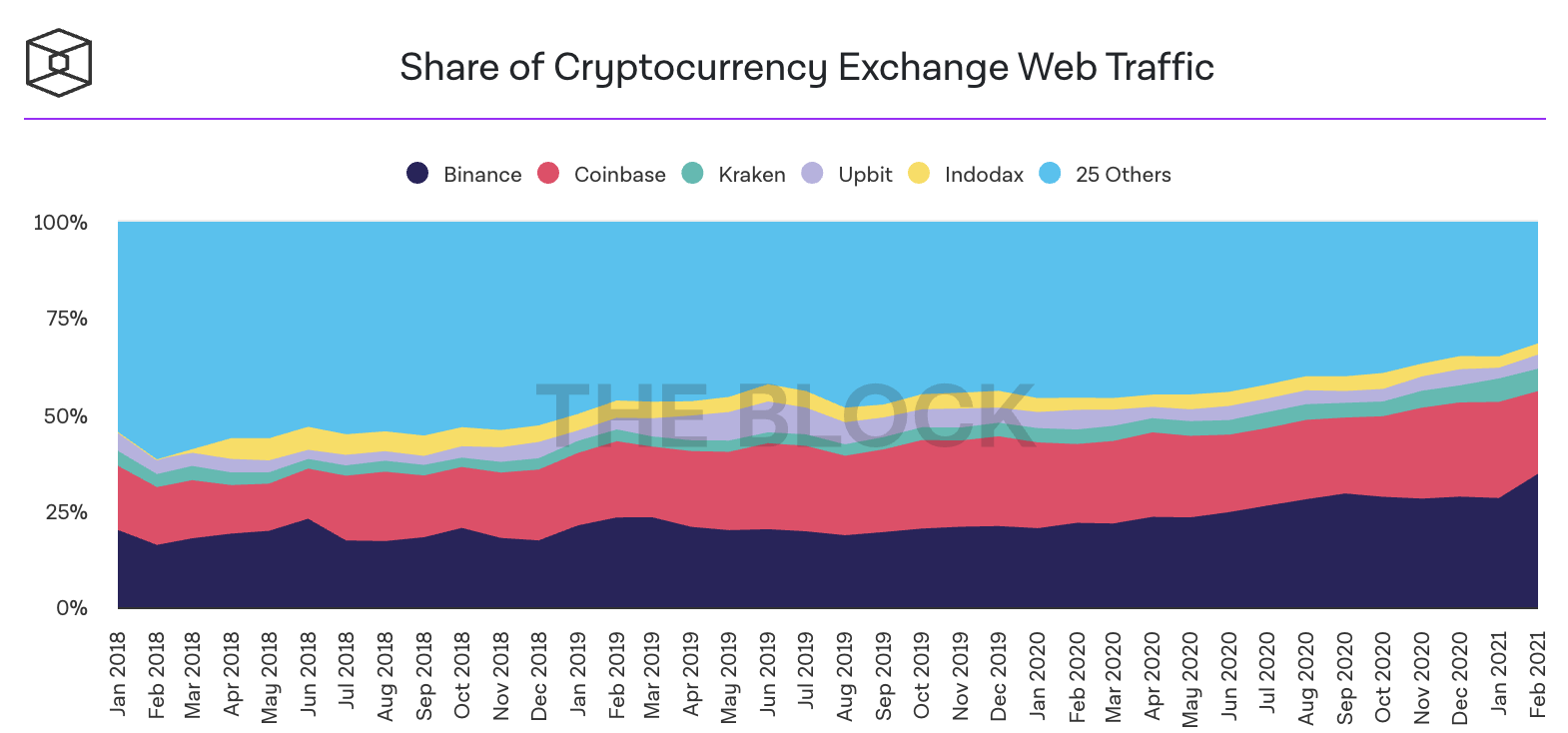
This tells me investors are looking for higher upside since Binance can deliver. After bitcoin goes through its next major leg I wouldn’t be surprised to see altcoins go bananas.
The appetite for risk is growing, altcoins can satiate.
The market continues to heat up and its the place to be. We’ll talk more this week…
Your Pulse on Crypto,
B
P.S. - We have a special announcement for you later this week. So if you’re not already following us on Telegram please follow us on Telegram so you don’t miss out!


