Institutions Are Busy
Here's how you can find their activity using on-chain data


Anxiety among traders is building up.
This is in part due to prices inching higher while whalebot sends a wave of pings indicating large swathes of BTC moving to and from exchanges.
Then like nails to a chalkboard for a trader, many of these transactions are between unknown wallets. The uncertainty becomes almost unbearable.
So who is behind these massive transaction… Are these transactions by retail traders… Or does it come from institutions or miners?
These are the questions we want to address today by shedding some light on the Fund Flow Ratio. By tracking the Fund Flow Ratio we can get a better idea in terms of the entity at play.
Let’s see how this works....
First, the Fund Flow Ratio is the transaction volume on all exchanges divided by the number of tokens transferred not on exchanges. The part about tokens not transacted on exchanges is better viewed as the amount of bitcoin transferred on the network.
In terms of how to interpret it, when the Fund Flow Ratio is decreasing while the number of tokens transferred on the network is rising, it implies most transactions are happening outside the exchanges.
And since most activity on the network is attached to speculation, this typically tells us more Over The Counter (OTC) deals are happening.
Now, in terms of using this for our benefit it’s important to note historically, Fund Flow Ratios has had a low reading in 2 scenarios: Bull run dips and market bottoms.
In the chart below you’ll gain a clearer understanding.
During most of 2016, the Fund Flow Ratio (30 day Moving Average) had a low reading (in the green box). And tokens transferred (blue indicator) saw multiple spikes in activity. These spikes are highlighted by a purple box on the blue line.
When both of these criteria were met then exchanges were playing a minor role during the accumulation period while the OTC market saw more activity.
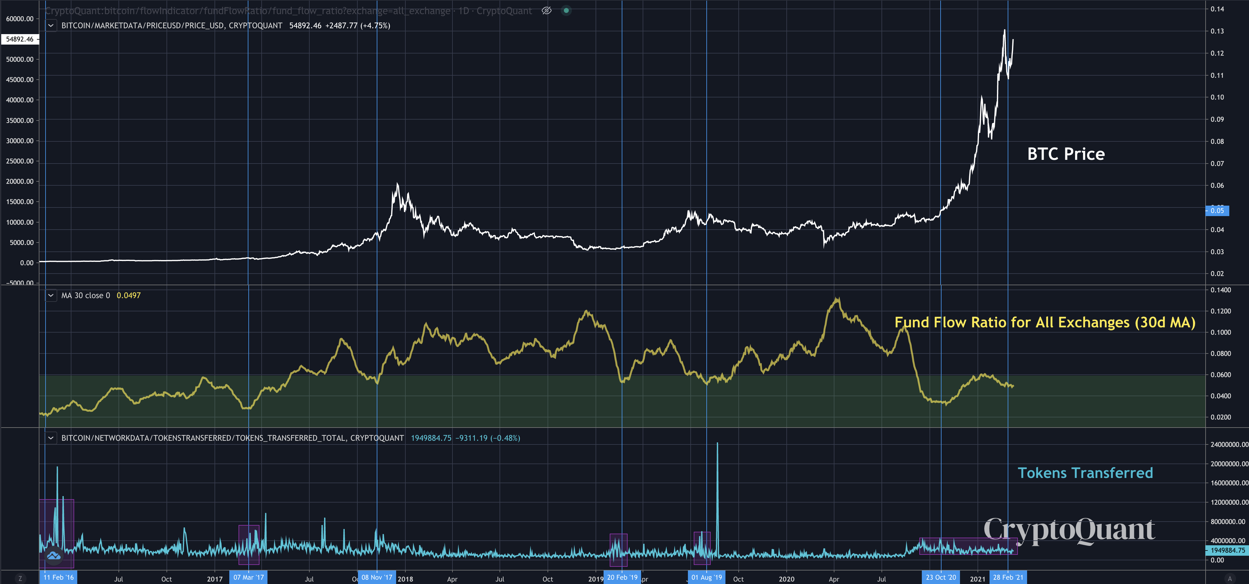
We also saw in Q1 2019 a significant bottoming out and accumulation unfold where the Fund Flow Ratio dipped down into the green zone as the amount of tokens transferred expanded.
Then in October 2020, we saw a massive decrease in Fund Flow Ratio again while tokens transferred expanded. Prices began to rally hard when this took place.
It’s important to note this was also the time when institutional investors such as ‘Microstrategy’ began to make their bitcoin investments more public.
Most recently we’re seeing it again just after BTC made an all time high of $58,000. As seen in the chart below the Fund Flow Ratio is back in the green zone with tokens transferred still sizable. In fact, we haven’t really witnessed tokens transferred drop much.
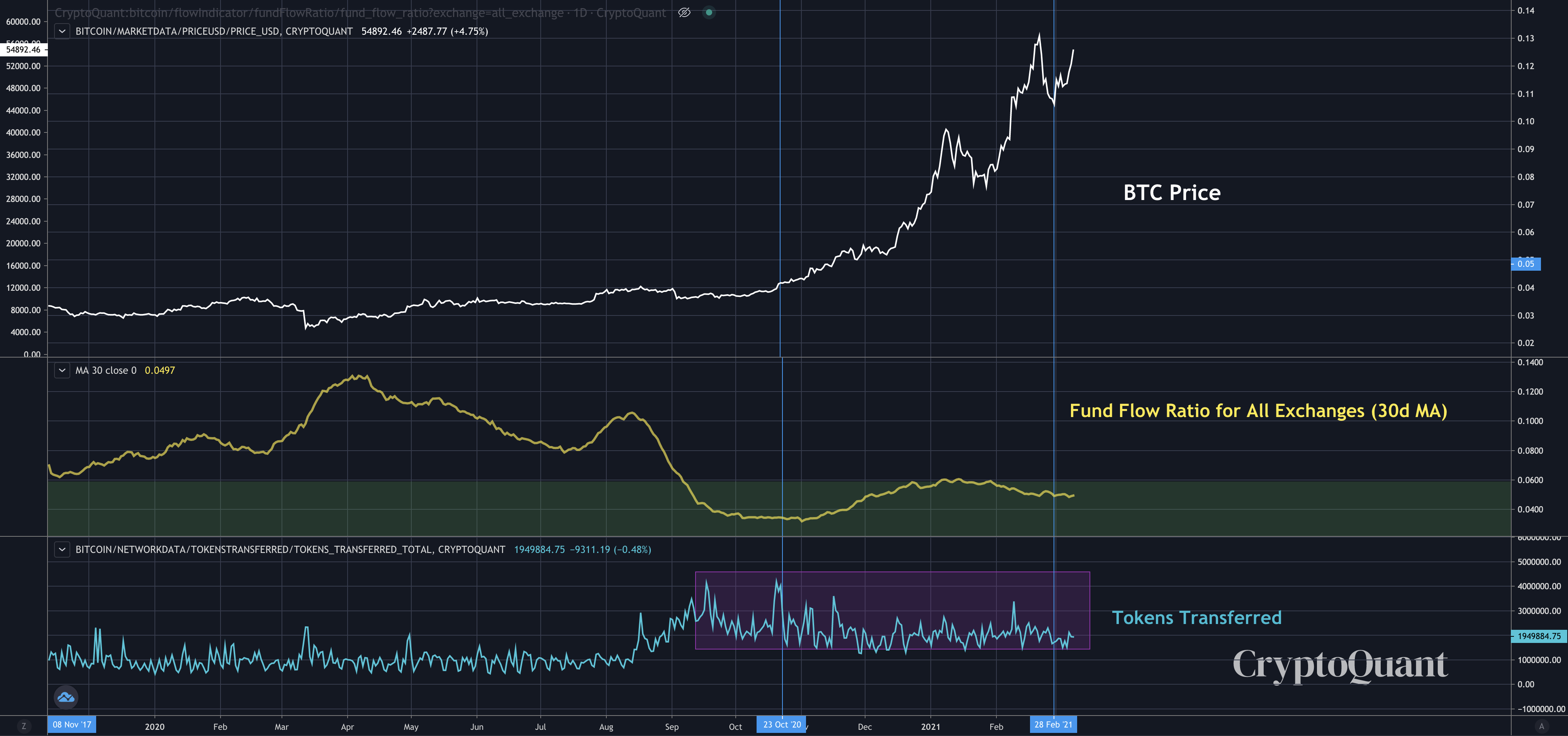
Now, if we see an even larger spike on tokens transferred while the Fund Flow Ratio remains low, then this indicates it’s likely even more OTC deals are taking place.
Remember, most activity on the bitcoin network is speculative, which is why we can make such assumptions.
When we combine this knowledge with the netflow discussion on Tuesday (here), we begin building a case showing BTC is preparing to see new highs in the coming months.
Analysis like this helps us build conviction on knowing where we are in the market and that this is in fact still a bull market. Hold tight.
Your Pulse on Crypto,
B
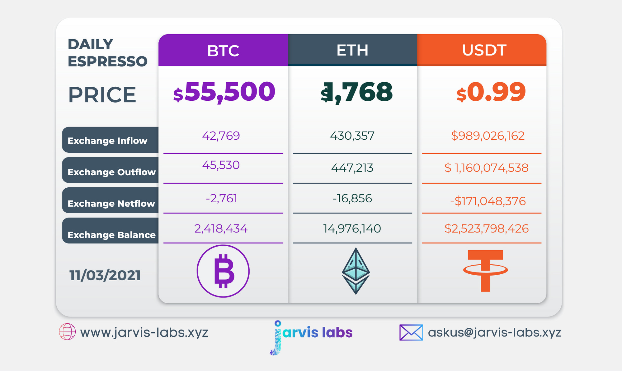
Below is our daily exchange flow data. This is a great gauge for understanding if BTC, ETH and USDT are flowing into exchange or leaving. If BTC and ETH are entering exchanges it can generally be viewed as bearish. The opposite scenario is bullish.
When USDT is flowing into exchanges it’s typically viewed as bullish. The opposite scenario is bearish.
This should only be used as a general gauge. Tagging the exact wallets these flows move into or out of helps improve the reliability of this data, which is what we do at Jarvis Labs. To date we have over 800 market mover wallets and 16 million wallets tagged all together. Consider us your on-chain trackers.