Get Ready For The Snap Back
Market Update: This Might Give Bitcoin the Energy It Needs


The weekend is near.
And markets are full of fear.
With that in mind, let’s just get right to it today.
Just Out of Reach
The main metric we are watching is still cumulative volume delta (CVD) of spot Bitcoin (BTC). (For an explanation of CVD, check out the last market update here.)
In our last update, we highlighted the downward trend in CVD for spot markets. It led us to wonder how low price may drop. So we went ahead and brought up a liquidity pool chart. I copied/pasted the chart below for reference.
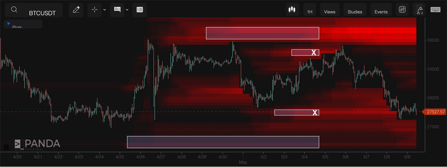
As a reminder, the red lines in the chart below indicate the amount of positions built up (short/long) at certain levels. The brighter the red, the bigger they are — and the more they attract price to that level.
The white boxes are left over from an update last week. The “X”s are liquidity that was taken out.
With liquidity getting taken out at $27,500, it was apparent that liquidity was quickly starting to build up at $27,000.
Well, since we shared the chart above on Tuesday, price went ahead and took out the liquidity at $27,000, printing a low of $26,800. The reason we reference it is to showcase that much of the liquidity to the downside on this timeframe is wiped out.
Now, to get to where liquidity sits today, we need to change our liquidity pool settings a bit… That’s because much of the shorter-term liquidity has been wiped out to the downside. We now need to view liquidity through a medium-term lens, which means expanding the price range in our chart.
That gives us the chart below. What we see is that liquidity is starting to build up at even higher levels. That $32,500 level looks very attractive.
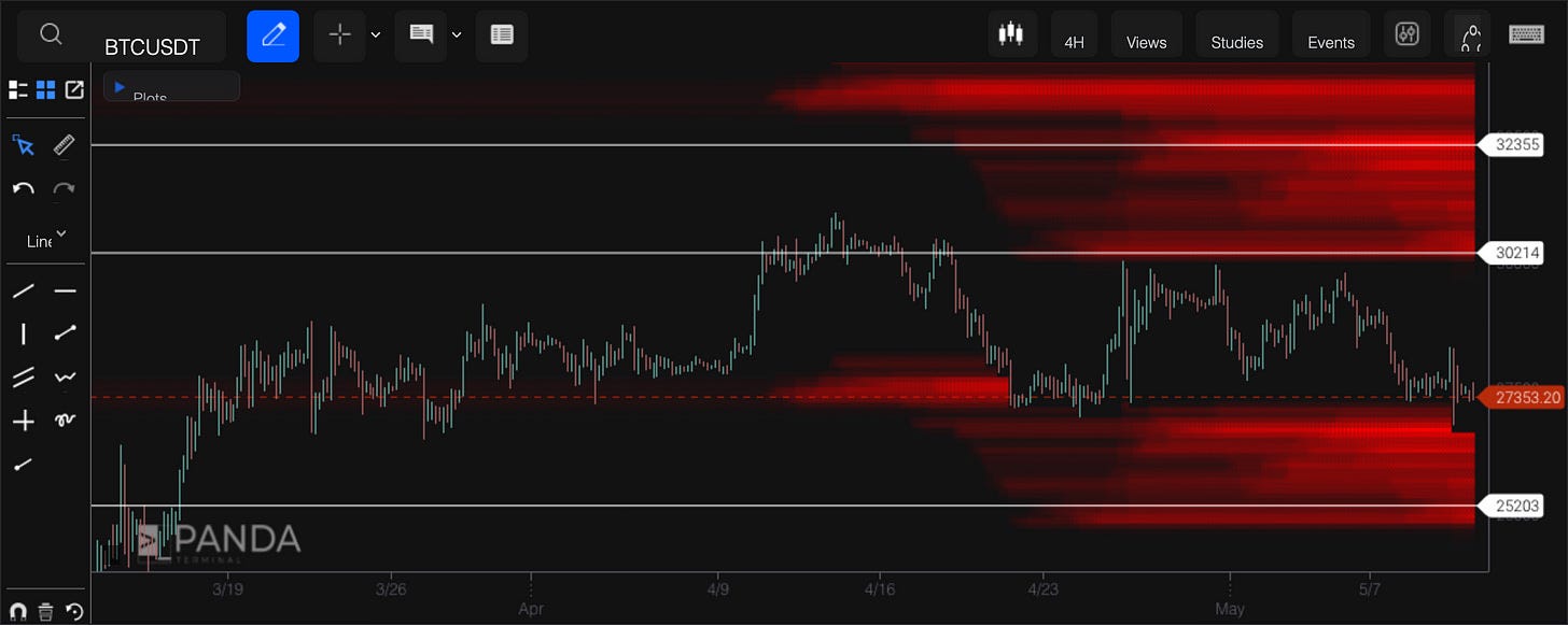
But nothing is hinting to us that we are ready to go and attack it. We need more energy, to use the analogy from Tuesday.
How does a market find new energy?
It can do this with a V-shaped sweep lower and quick recovery. This is where price takes a quick drop, causing many traders to jump into short positions and get caught offside. Then, price retraces the entire move, and returns to levels seen just prior to the drop.
Finding Energy
If this V-shaped scenario does unfold, then the metric to keep an eye on is funding rates. Specifically, the percentage of assets with funding rates below negative-0.01. When this spikes, it tends to help us identify market lows.
In the chart below, we can see how this marked the bottom two months ago (red circle).
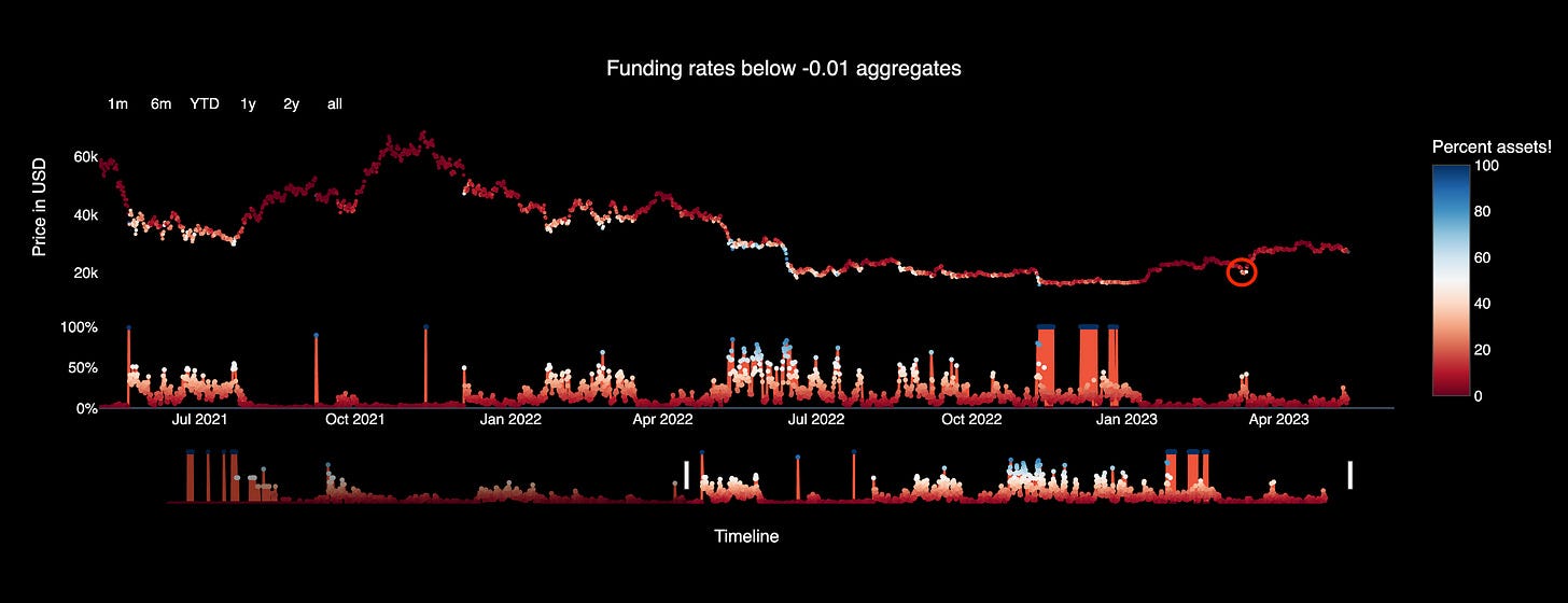
The reason for why this works is that negative funding rates help us identify the rubber band effect. Traders typically pay interest to hold a long position, not a short position. If funding rates go negative, it means lots of traders are shorting and paying to hold a position open – which is abnormal.
The chart above measures the percent of assets that have a negative funding rate. It acts as a way to measure if the market is overly stretched to the bearish side.
To correct itself, the market springs back the other way. It now generates the energy it needs to spring to higher levels.
Again, this exact type of scenario took place two months ago.
Now, if this playbook does not pan out, then we need to revisit CVD to see if a new trend is underway.
For now, any bullish price action might just be a short-term bounce to attract more liquidity to the downside.
That’s it for today, short and sweet. Enjoy your weekend!
Your Pulse on Crypto,
The Bens
P.S. - If you would like to sponsor Espresso, reach out to us at askus@jarvis-labs.xyz


