The Calm Before the Storm
Market Update: Volatility, Spot Demand, and Some Hopium


Yin and yang. Light and dark. Peace and chaos.
Harnessing the energy of two opposing forces can result in max gain with minimal effort, no matter your domain.
In the world of crypto, one of these forces is calmness, which is unfolding right now.
Which means to take advantage, we should look to its opposing force: volatility.

For those who have been looking for a new exchange, consider checking out ByBit.
They operate in 160 countries. They have more than 270 assets trading on spot and over 200 perpetual and quarterly futures contracts. They even offer options contracts and NFT trading.
Simply put, ByBit has a lot to offer any trader. And right now, they are offering a $10 welcome bonus if you open a new account and complete some introductory tasks. They also have additional ways for you to earn.
If you are looking for a new platform to trade on, consider ByBit today by clicking here. Also, if you simply want to support Espresso and the Jarvis Labs team, consider giving a click.

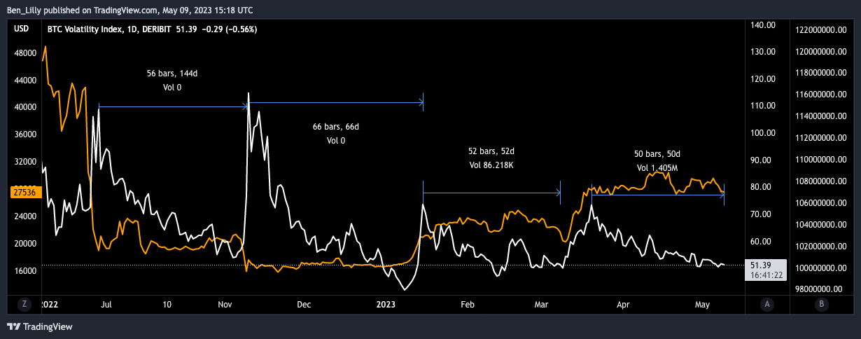
To show you what I’m referring to, here is a chart of Deribit’s volatility index (DVOL on TradingView). Over the last 50 days, markets have become less volatile — represented as the line going down.
In the chart, I went ahead and measured the amount of days from a volatility spike to a low in volatility. Disregarding the current period, the last three instances averaged about 58 days from peak to trough.
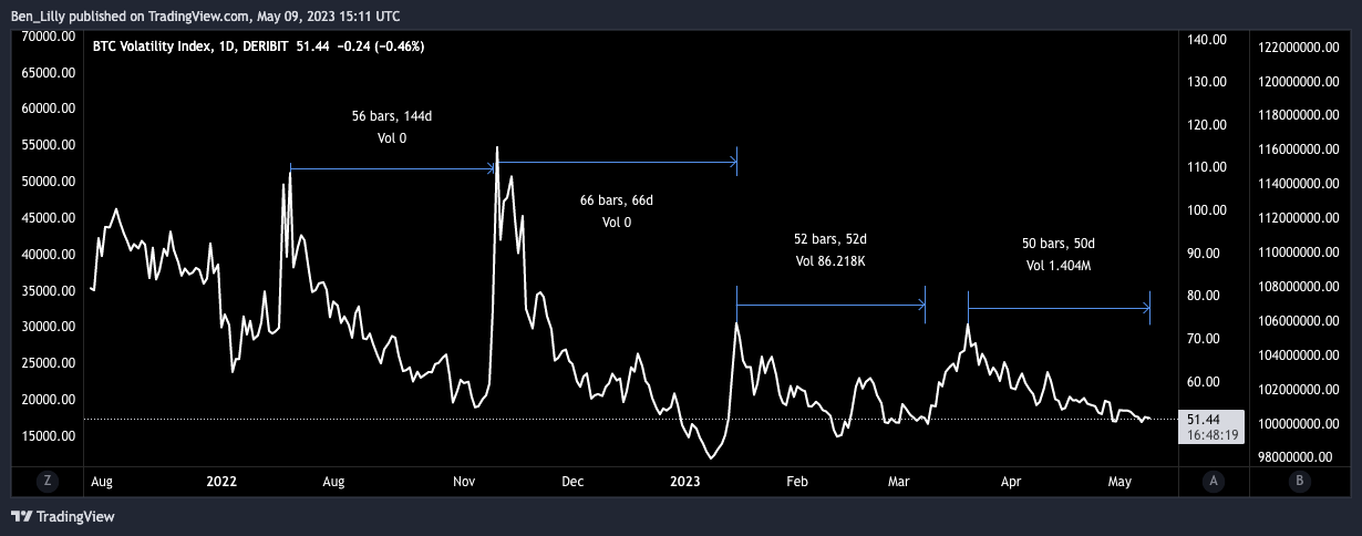
We are at day 50 of the current compression period. And when this compression ends, the markets will be full of energy.
The question then becomes: What kind of energy, bullish or bearish?
When we layer in a price chart of Bitcoin, we don’t get many clues as to what direction it’s going next. That’s because upticks in volatility here can mean price is either dropping or rising, just with a lot more velocity. The last two volatility spikes were major swings upward.
The clues are limited here, which means to help us decide which way this explosion in volatility might happen, we need to dive into some other charts.
But before we get to the “alpha du jour,” it’d be good to quickly recap the current thesis as it has been playing out for a couple months now.
What’s Working
The last few weeks we have been discussing spot demand versus derivatives. It’s a pretty significant difference in the market.
To sum it up, I basically think of it like a car powered by gasoline versus a soapbox car. Spot demand is the car with gasoline that has fuel to power itself to new areas. It can break out of any trading range and find new levels.
This has been the market for much of Q1 this year. It’s how we powered out of the late 2022 market lows.
Derivatives, on the other hand, are like the soapbox car. It’s reliant upon gravity. There is no engine. It can’t go traverse new territories. Or visit our analyst Kodi in the mountainsides of Spain.
This soapbox is what we’ve seen lately in the market. Sure, price can move quickly within a trading range, but it doesn’t have the momentum to find new highs. Instead, it finds new energy by grinding price lower… Or in soapbox terms, finding a new hill.
We’ve been driving home this difference by looking at the cumulative volume delta (CVD) of spot versus futures. CVD is a metric that tells us if buyers or sellers are more aggressive.
In the chart below, we can see how spot CVD (middle subplot) is translating to price trends more so than futures CVD (bottom subplot).
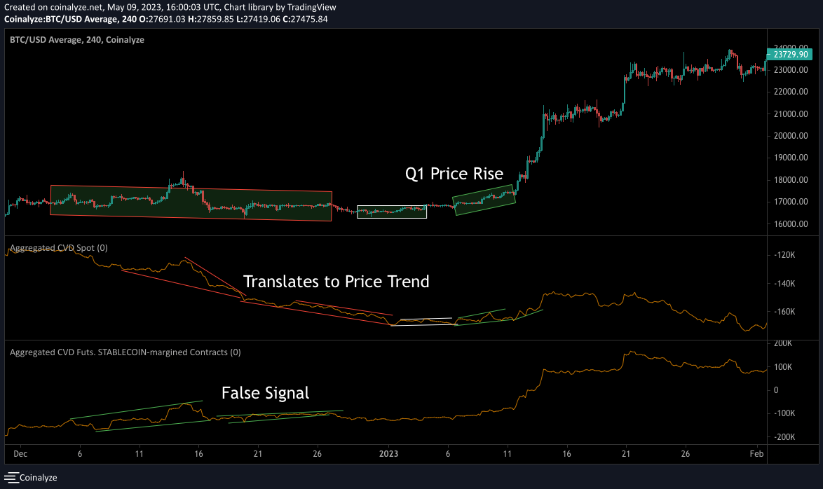
For 2023, this demand is instrumental in telling us where price is going, even for the last few weeks.
Here is a chart showcasing the various trends over the last 45 days. What is very interesting here is that when CVD spot is bullish and trending higher, and futures CVD is bearish, price doesn’t do much until futures CVD flips to bullish. Price then rallies hard.
You can see that in the time periods leading up to the vertical blue lines.
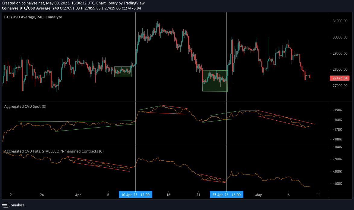
Right now, we have both forms of CVD falling, which is why last week in “The Next Phase of the Macro Cycle,” we thought JPow would trigger a price sweep lower.
It didn’t happen right after FOMC like we thought. Instead, it took place in the days that followed.
As you can see in the chart above, not much has really changed in terms of CVD spot. Things still look rather ugly moving forward, unless we get a quick change here in the second half of the week.
In our chart from last week that showcased liquidity pools, you can see price went ahead and took out the pool at $29,500 before pivoting to the price at the downside. It then swept liquidity at the $27,500 level as we predicted in our last update.
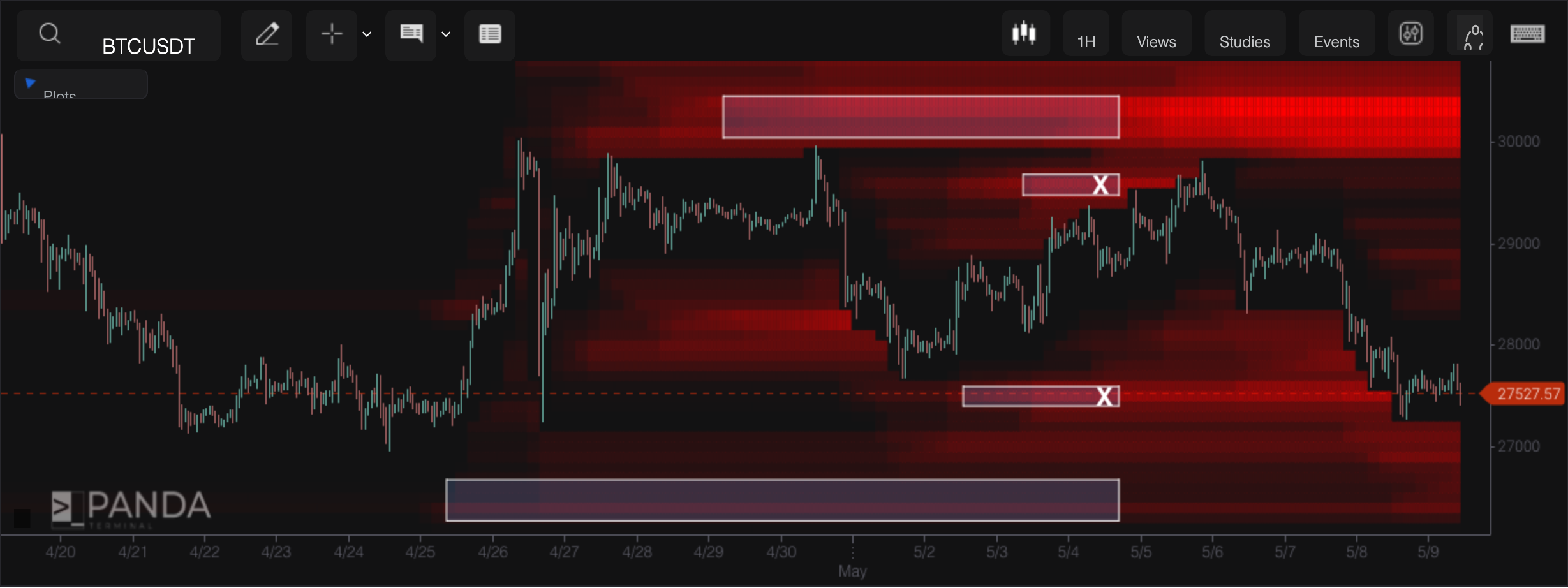
Right now, liquidity is piling up at $27,000 for Bitcoin. It’s also stacking up a lot at $30,000.
It is hard to imagine the market has enough firepower to get to that $30,000 level right now. It’ll need a significant change in spot demand this week to have enough fuel to get there.
This period of calmness is also understandable given the 30-day returns for Bitcoin. That’s what the chart below shows, with BTC price in pink and 30-day returns represented by the multicolored line below.
We are having a bit of a reset as returns were nearing 50% on April 11. Price tends to reverse or at least consolidate whenever returns get between 25-50%.
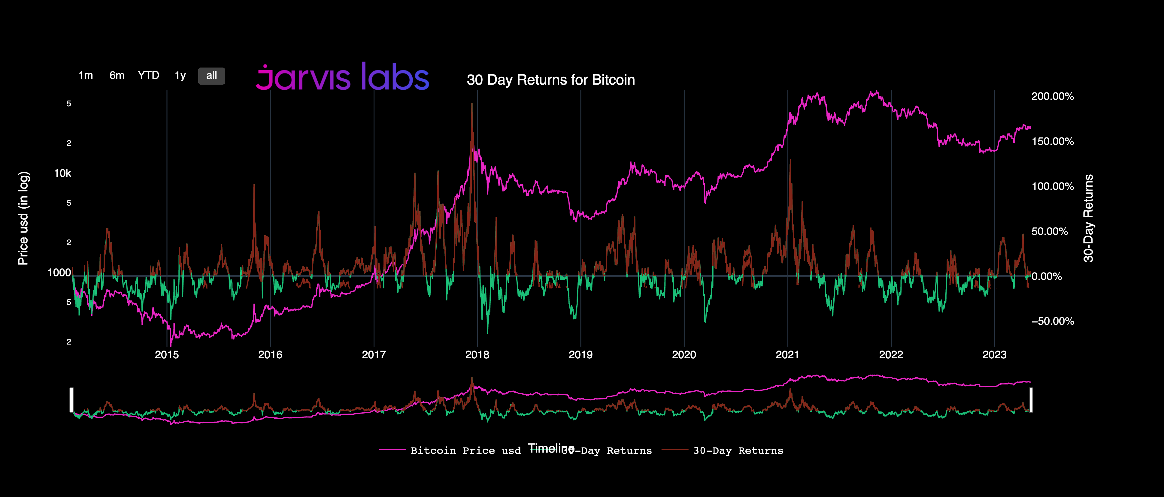
Meaning if we pair up this reset with the calmness in volatility, then we should expect things to change within the next 7-10 days. Which is why right now, we need to watch how demand and liquidity form for the rest of the week before considering the next move.
Thank you for reading Espresso. This post is public so feel free to share it.
Forward Looking
Now, before I leave you all to it for the day… I’d like to bring up an interesting trend unfolding as we grind sideways for nearly two months: accumulation patterns.
Earlier, we mentioned spot demand looks lackluster. This doesn’t give us the feel-goods.
But one nice thing we do see unfolding is there does seem to be whale interest with Bitcoin.
The chart below shows both whale and fish buying. When looking for whale interest, we want to see red or orange dots, and right now, we have lots of red dots forming.
This is significant, since whales’ activity tends to foreshadow price movements higher.
I’m not suggesting that this indicates price will move higher when volatility breaks. More along the lines of, if volatility breaks and price moves lower, then this participant is still active in the background. Consider it a deepwater current that can impact longer periods of time.
We saw this behavior in October 2020 as well, just before price got rejected off the $20,000 level — which it went on to break through shortly after before reaching all-time highs.
That’s all for today.
Your Pulse on Crypto,
The Bens
This newsletter is sponsored by Bybit. Be sure to try out the exchange here, and take advantage of all they have to offer today.


