Falling Dominos
Notes from The Lab: A Chart on the Options Market

WHAM!
The sound of metal hitting brick echoes so loudly that it overpowers my Walkman’s headphones.
Frightened and startled, I recognize this thunder as coming from The Lab’s backdoor.
Unclipping my Walkman I pause “The Safety Dance” as ominous thoughts fill my head…
What’s going on… Did somebody break in.... Was there a car accident...
Will I see Orthis again?
Armed with my Prolux Heavy-Duty floor buffer and several gallons of industrial grade bleach I walked closer to the source of the sound. As I calm my nerves and prepare for violence, I realize I should have known.
It was my beloved boss, the eccentric Mr. Lilly!
He was so lost in thought as he hurried to his office at The Lab that I don’t even think he heard me call out, let alone noticed me holding my floor buffer like a weapon.
Large cup of coffee in one hand, briefcase in the other, he maneuvered down freshly waxed hallways and straight into his room with the style and grace of an Olympic speedskater.
In his hurry, the chart below fell out of his briefcase.
It is the open interest (OI liked we talked about last week!) for Ethereum options contracts across all expiration dates.
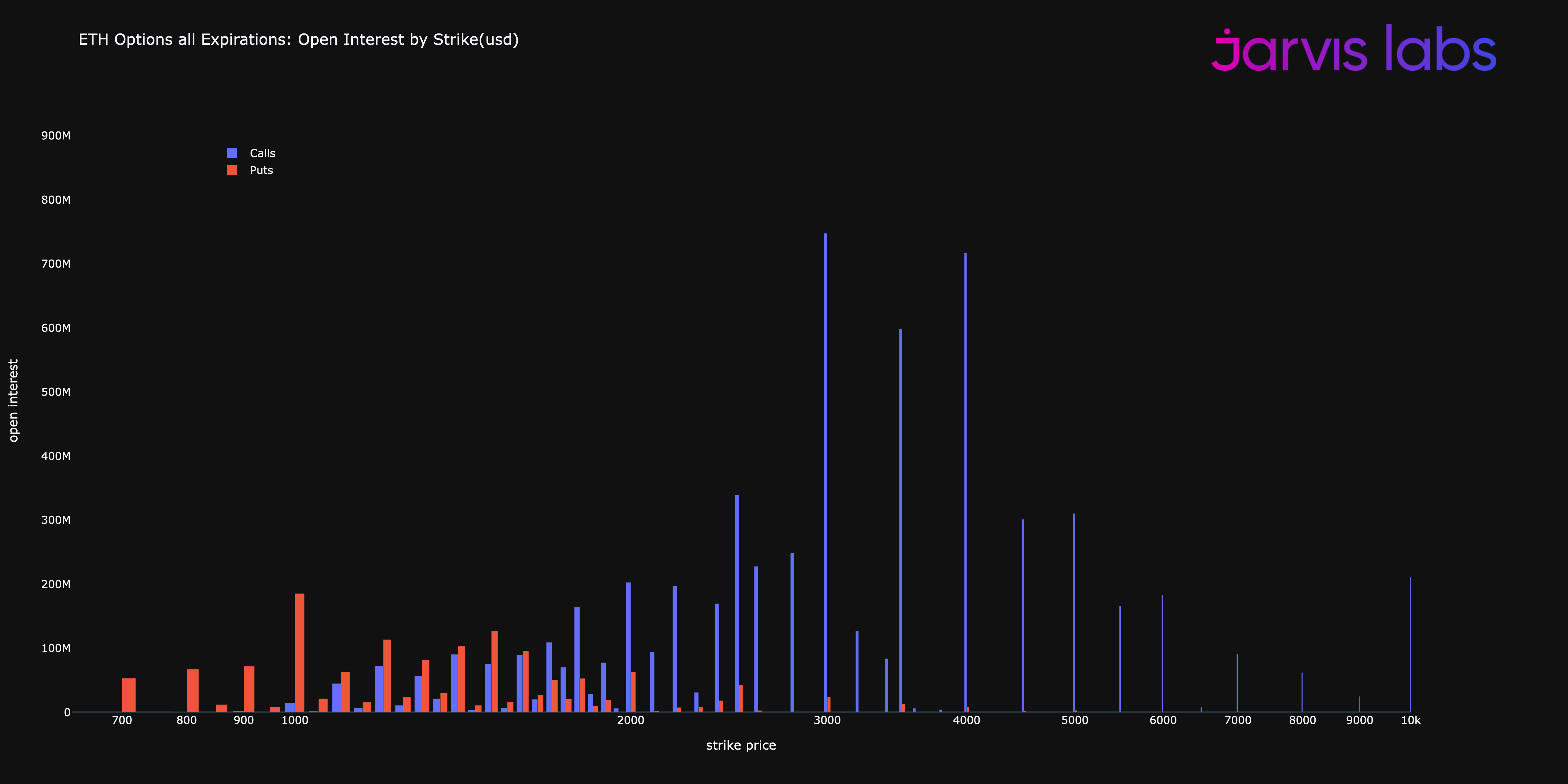
The X-axis shows us the strike price while the Y-axis shows us how many dollars worth of contracts in circulation exist at each strike price. Orange bars indicate puts contracts and the blue calls. (If anybody needs a resource for better understanding what an option is after my attempt at explaining this chart, this “Options 101” Mr. Lilly wrote might help)
When I first look at the chart, I couldn’t figure out its importance. So I folded it up, slipped it into the front pocket of my denim overalls, and went back about my night cleaning duties.
Before I left I entered Mr Benjamin’s office and found the book “Options Pricing and Volatility” written by Sheldon Natenberg.
Welp, Mr Lilly is still in the writing room and I’m not allowed to leave until everyone else is gone
— JJ (@JLabsJanitor) 3:39 AM ∙ Aug 10, 2022
Luckily I found this cool old book to help pass the time, written by some guy Sheldon Natenberg
I want to read more at home so I think I’ll use the scanner to copy all 592 pages
Digging into the first few pages I found it so fascinating, and the next two days I read all 592 xeroxed pages.
I would’ve finished sooner but halfway through the book, the chart Mr. Lilly dropped began to make sense. And instead of finishing Natenberg’s book, I wanted to write this note to you all. That’s what this week’s piece is all about - Why that options chart above is not normal.
Hi everyone, my name is JJ - the night shift janitor here at Jarvis Labs.
Once I started working here I noticed the professors of Jarvis Labs frequently leaving up charts, reports, and even equations on the whiteboard once they finally left in the middle of the night. The stuff seemed pretty important, so I started interpreting these things for myself.
It wasn’t long before I realized it was like trading cheat codes. And lucky for you, my friend is sick of hearing me talk about it.
Every week I will try to share the coolest and most exciting thing I find laying around the halls of Jarvis Labs. I hope you like it because if I get 1,000 followers on Twitter (@JLabsJanitor) my friend will buy me a pizza.
So be sure to click the subscribe button below to get a weekly “Notes from The Lab” sent to your email.
Thanks,
JJ
The Effect
To understand how the options market is effecting ETH prices and the overall structure, we must go through a few boring details, so bare with me.
I promise the end insight it will be worth it.
For starters every open options position has a counter-party or somebody on the other side. Which means it’s what we call, zero sum. Zero sum means: buyer’s losses = seller’s gains and visa versa. This is in contrast to a game of black jack where the house wins.
To use an example, let’s assume somebody spent $200 and bought an ETH call option with a $2K strike price that expires on September 30th. If ETH’s price is below $2k on September 30th then the option is worthless.
This means the person who sold the option keeps the $200 paid by the buyer.
On the flipside, if the price of one ETH is $3,000 at expiration, then the buyer’s option is worth something. In terms of how much, it’s worth $1,000. And since the buyer paid $200 for the contract, they pocketed $800 in profit - at the expense of the seller. ($3k expiration price -$2k strike price -$200 premium paid = $800).
Now what I find interesting here is that the buyer’s risk is defined (cost of premium = $200 per contract) while the seller’s risk is technically unlimited.
This difference helps us break down that chart from earlier because the seller is not trying to go bankrupt… In the face of virtually unlimited loss, the seller hedges their sold contracts.
While there are several ways a seller can do this, the simplest method is buying ETH.
So if a seller sold 1000 Ethereum call options with a $2k strike, he would now need to buy 1000 ETH (~$1.9 million worth) to be fully hedged.
What’s really interesting here is that if a lot of sellers need to do this at the same time it creates what’s known as a “gamma squeeze”. The Options books describes Gamma in a pretty jargon heavy way, but it’s essentially the rate at which that seller needs to hedge their option with unlimited risk.
The hedging is fascinating because it can become a hyper-reflexive feedback loop if call options sellers need to hedge by purchasing ETH on the spot market. Meaning the act of hedging only increases the need to hedge more! Because this action unintentionally drives price higher.
There are great historical examples of this like the Hunt Brothers doing this in the Silver market or with Gamestop’s stock in early 2021. Both are great topics to Google more on.
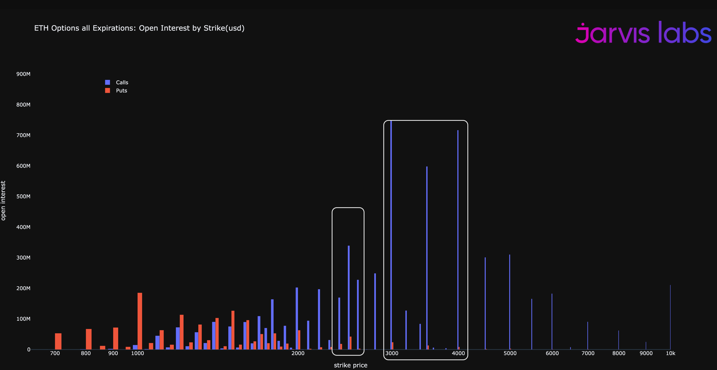
Anyways, in my notated version of Mr Lilly’s lost chart below, I tried to map out the interesting piece I saw related to this Gamma effect.
To start, what I’m calling the first domino, fell when ETH rallied into the $1375 range in mid to late-July. At the time there was some Gamma at play thanks to some outsized buyer of ETH calls at $1,300 to $1,500.
That event then led to the domino we saw tumbled over this past week as ETH rallied to over $1,900 at time of writing.
The Dominos
We can think of buying options in the same way we think of betting against the house in a casino. Odds of success for buyers, especially at these elevated levels are extremely low.
But outlier events where the house (sellers) becomes too greedy and loses do happen. These extreme instances are rare, but not unprecedented. If they do fully unfold they expand price ranges in an almost unfathomable fashion.
In fact, taking another look at the chart below the blue call option lines below do look a bit like increasingly larger dominoes getting knocked down one by one. And as you can see, they are fairly outsized compared to other srike prices… Which really sets the table for the feedback loop of hedging activity buying ETH on the market… Making price keep rising.
I’m not sure how likely that is or how price can get to those ranges, but maybe the things Mr. Lilly mentioned in Unknown Unknowns could lead to it? I’m not sure, but I hope he sheds more light on this when he gives his weekly updates.
One last thing we should remember… Which is a lesson I keep hearing throughout The Lab… If it’s possible, plan for it.
What do you all think?
Please comment here or let me know on Twitter… You can fin me @JlabsJanitor.
I have a feeling the end to summer will be interesting no matter what plans out (:
Your friend,
JJ


