Your Friend Just Called
Send them this chart


It feels too late.
You’ve heard it before. It’s a phrase many crypto investors are prone to hear as bitcoin starts to make popular media headlines on account of its price running like a rocket.
It’s from that individual you bored to death discussing unethical monetary policy a year ago.
Yet here they are, sitting there awaiting for you to signal the green light. It’s nothing new… you’ve seen this before. Price rips for a few weeks, then we consolidate for a month or so before making another go higher.
Only at this point in time as opposed to a year ago, you’re less likely to spend as much time with them in explaining how to make 8.6% on funny money (USD) or snag a bit of yield on wBTC.
Yet here they are, asking to hear more. It might be a family member, a friend, a colleague, or even an investor. So what do you do?
One thing I tend to frown upon is telling somebody to just set up an account and buy it.
Instead I’ll gauge their interest. Send them a link to where they can sign up. Then tell them to load up their account, and to let me know when it’s cleared. Once it’s cleared, let’s see what the market is doing.
In the meantime, if there are any questions about the technology, how it works, what DeFi is, or anything regarding fundamentals, I’m all ears.
But don’t mention price.
The day I implemented that practice is the first time I realized how to sort out the FOMO from the genuine investor. More importantly, I’m able to save myself from any grimacing call or text that accuses me for poor market timing.
Which is where the second part of my plan comes in. Give them a chart or piece of information they need to digest before making a decision to buy. This empowers them and makes them beholden to their decision, not me.
In an asset class where you need to be your own bank, there’s a certain amount of responsibility that needs to met. There is no free passes or second tries here.
To clear this essentially ankle high hurdle, I’m recommending this chart below. It’s the Bitcoin Mayer Multiple Bands chart.
We’ve covered the Mayer Multiple before, so this shouldn’t be entirely new to frequent Espresso readers. But for those that are new…
The Mayer Multiple was created by Trace Mayer, and it was designed to analyze bitcoin price action from the seat of a long-term investor.
When we say long-term here, think years.
The multiple is composed of two parts. The current price of bitcoin and the 200 day moving average (dMA) of bitcoin.
In the chart below you’ll see the price of bitcoin (black) with a red line on it. That red line is the 200dMA. On the bottom third is the Mayer Multiple ratio.
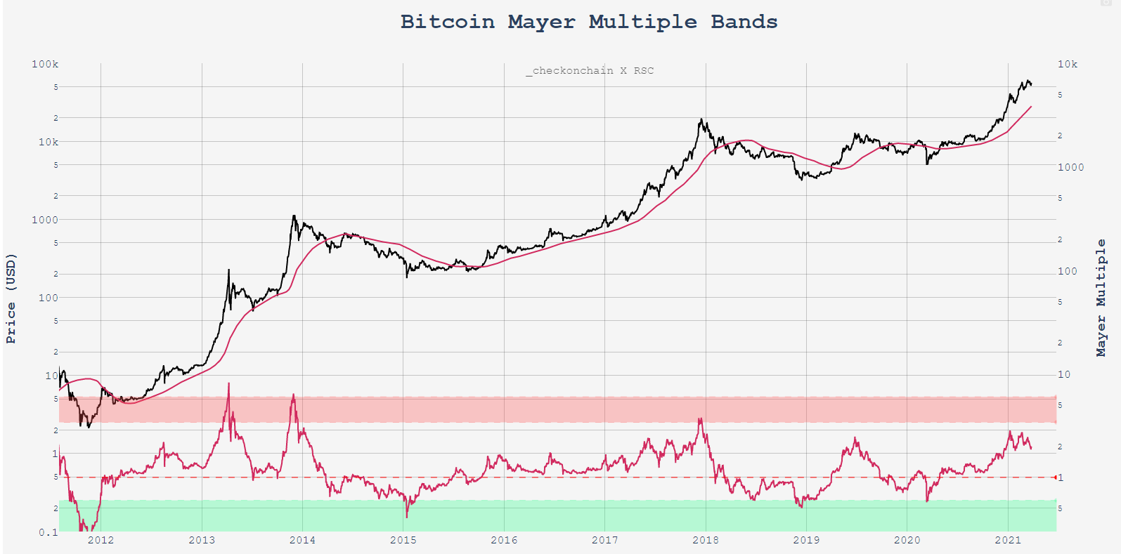
When the ratio (pinkish hue) enters the red band it signifies bitcoin is overextended while the green band signals a great buying opportunity.
It’s a nice way to visualize the common question of “am I too late”.
The benefit in doing this is the responses you’ll get in return will vary quite a bit. And if you’re lucky, it can lead to an educated discussion on price, technology and where bitcoin stands in relation to other macro assets.
It’s an ideal scenario.
For our purposes, the Mayer Multiple is a simple guide for long-term viewing. There’s a real case that we don’t touch either band again after this cycle since bitcoin will be a much larger market cap.
In turn this will lessen volatility and make these bands harder to touch. Nonetheless, it’s a very helpful chart to spur a conversation.
For our purposes here if the multiple crosses into the red in this cycle, which I do think is a high likelihood, it’ll be wise to take note since many other traders will be taking note as well.
Consider it one of those fulfilling charts where if a lot of people are watching it, then a portion of the market will act on it.
Until next time…
Your Pulse on Crypto,
B
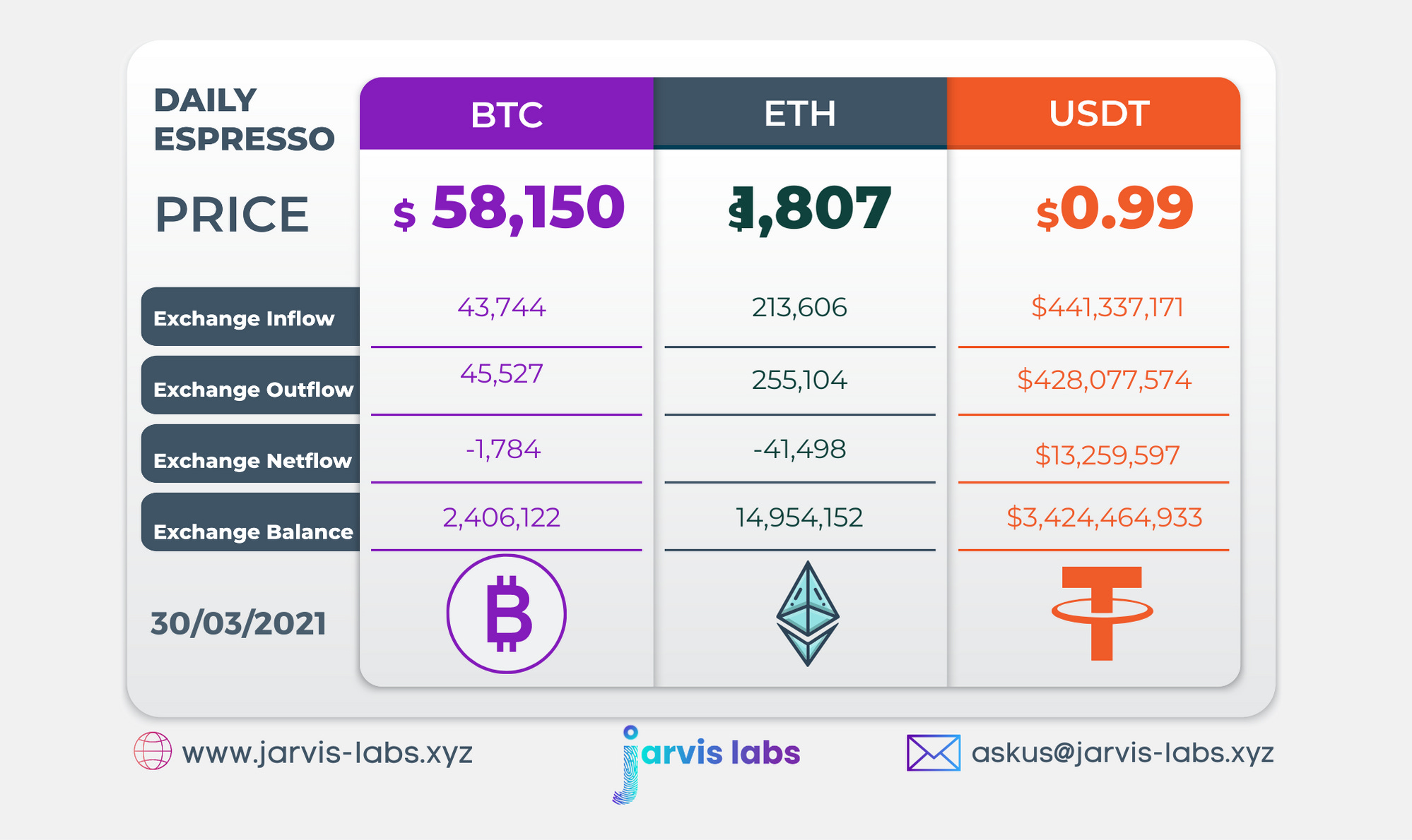
Below is our daily exchange flow data. This is a great gauge for understanding if BTC, ETH and USDt are flowing into exchange or leaving. If BTC and ETH are entering exchanges it can generally be viewed as bearish. The opposite scenario is bullish.
When USDt is flowing into exchanges it’s typically viewed as bullish. The opposite scenario is bearish.
This should only be used as a general gauge. Tagging the exact wallets these flows move into or out of helps improve the reliability of this data, which is what we do at Jarvis Labs. To date we have over 800 market mover wallets and 16 million wallets tagged all together. Consider us your on-chain trackers.