Yield Atrophy
Macro Cycles Part Two: Treasury Yields

When Jerome Powell speaks, traders get weak in the knees.
His presence paralyzes the thought process of the most seasoned veterans.
Everywhere I turn it’s Jerome this, Powell that.
It’s clear that market gossip is the hot take of the day.
What was once a discussion about tether flows or exchange flows is now a discussion about inflation, yields, and the amount of rate hikes Wall Street expects.
Meanwhile, JPow has yet to even start raising rates.
The market has been acting this way for over a month now, and quite honestly it feels like we have overdone it.
To decide if we are in fact overdoing it, I decided to do a three part series on the macro economy. In this series we look at Eurodollars, treasuries, inflation, and the federal funds rate through time.
The goal is simple… Is this time really that much different? Are there similarities to borrow from history? Can we create a framework to help guide us through the JPow gossip columns of Twitter?
Answering these questions is how we gain a leg up in the market. And today in Part-two we look at Treasuries through time to answer these questions.
For those that missed Part-One: The Market’s Next Phase I highly recommend you start there. While not essential reading, I will be borrowing the template we laid out in that analysis to dissect the treasury market today.
Then after today we should have a nice framework in place for how markets react in the face of rate hikes. Then in Part Three we can see if the framework breaks down… Because that’s where I think everything starts to get pear shaped.
OK, so before we begin let’s quickly refresh ourselves on what the template looked like from Part One:
- Futures expanding and rates at zero → Steadily bullish off lows / Easy Street
- Futures contracting and rates rising off zero → choppy / semi-bullish market
- Futures expanding with plateauing rates → very bullish / meltup incoming
- Futures expanding with rates dropping → it’s over
Now the main difference this time is we will substitute the word futures with treasuries. After all, we are looking at the yield on U.S. Government treasuries.
These treasuries have a payback term from as little as one month to thirty years, and in the charts below we plot these yields all on the same chart. This stacked representation of yields lets us see them respond as a group over time to changes in the Federal Funds Rate. This Federal Funds Rate is what changes when the market discusses rate hikes by JPow on Company.
And for our purposes. we will keep this analysis fairly rudimentary. No talk of flattening and steepening, nor the bearish and bullish varieties.
Instead, let’s view how these yields contract and expand in relation to one another just like we saw with Eurodollar futures. And in this way we can compare it to the Federal Funds Rate and the Nasdaq to see if there are any patterns here.
Let’s get started…
First up, let’s look back to the post dot-com bubble.
In the wake of the dot-com bubble rates dropped to nearly zero in short order. The response in the treasury market is shown below with yields expanding. That can be seen on the left-hand side of the chart below.
When I say expand I mean the colorful lines are spread apart.
When rates were low, yields fully expanded. And the market went on to march higher with low volatility. Using our template from earlier this is known as this “Restart” or Easy Street.
- Treasuries expanding and rates at zero → Steadily bullish off lows / Easy Street
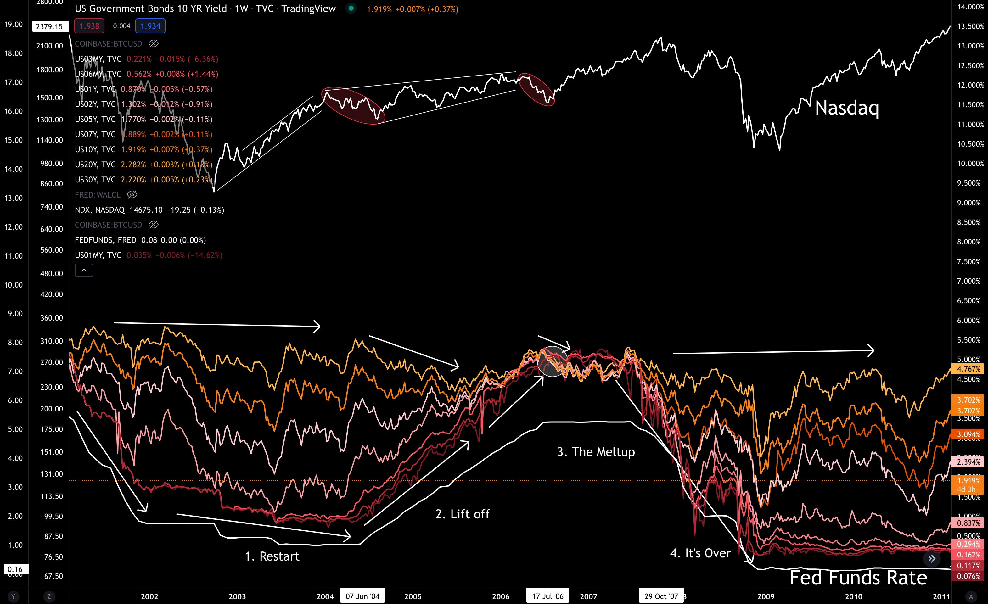
In 2004, the market began to expect higher rates.
As the market started to expect higher rates, the Nasdaq got soft. That’s the first vertical white line above. This is a situation much like we see today.
But once we finally saw rates actually rise… Meaning JPow is no longer just talking the talk, but walking the walk… yields transitioned from an expansion period to contracting. This is labeled as “Lift off” in the chart above - rates began to rise.
This period of rates rising and yields compressing was not great for passive Nasdaq holders. It was a stock pickers market as well. And indicated a preference for realizing profits when earned. To use our framework:
- Treasuries contracting and rates rising off zero → choppy / semi-bullish market
Once yields were fully compressed and actually started to cross over one another, rates stopped hiking. The market responded to this pause in rate hikes with bullishness. The market ripped higher in the period labeled as “The Meltup”. When the end of the meltup phase was nearing an end we saw:
- Treasuries expanding with plateauing rates → very bullish / meltup incoming
The final stage was when the Federal Reserve dropped rates, yields fully expanded, and the floor came out of the market.
- Treasuries expanding with rates dropping → it’s over
This represented a full cycle from low rates to raising rates and back down to zero rates. And in short order the cycle reset and we were back at it…
Here now is the post-2008 time period.
In 2009 yields fully expanded. Initially returns were simple during the “Restart” phase.
Moving into “Lift Off” yields began to compress with the Nasdaq turning soft just prior. Soon after the market returned to its semi-bullish trajectory, but with higher volatility.
Once yields fully compressed the meltup began as rates stopped rising. This is when the yields started to expand again.
Then the final stage ended with rates dropping and yields expanding again.
You can view this pattern in the chart below.
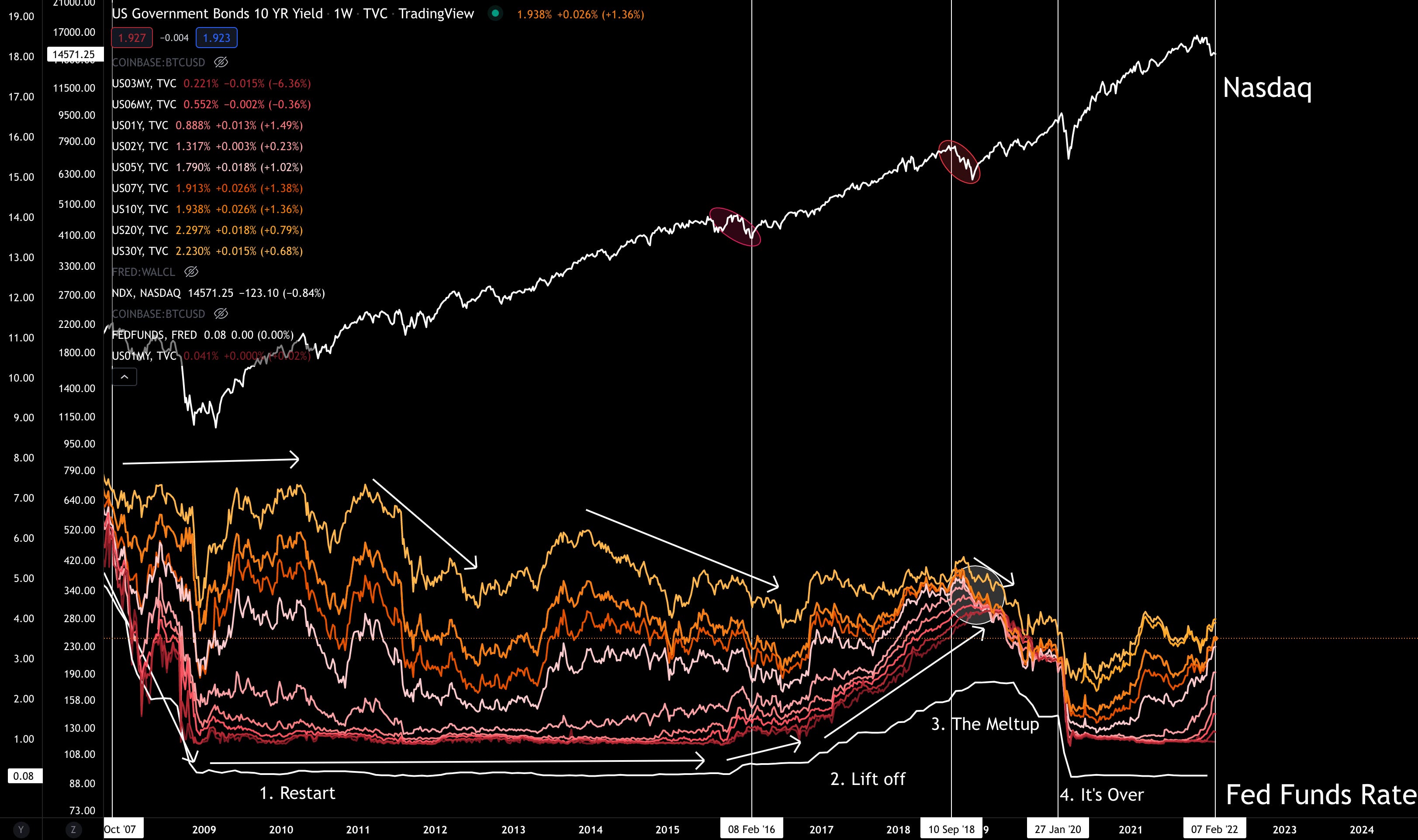
Again, we say this type of sequence with Eurodollars as well in Part One’s issue. When the futures were fully expanded, returns were better. And as things contracted, there was more volatility. And once the curves begin to overlap and look messy, things went haywire.
Moving the analysis with an eye towards today, we can see where we are in the cycle. We are at “Lift Off”.
Yields are starting to anticipate higher rates in the coming month. This results in yields contracting and volatility being higher.
I don’t think you need me to tell you that volatility is up since this lift off began.
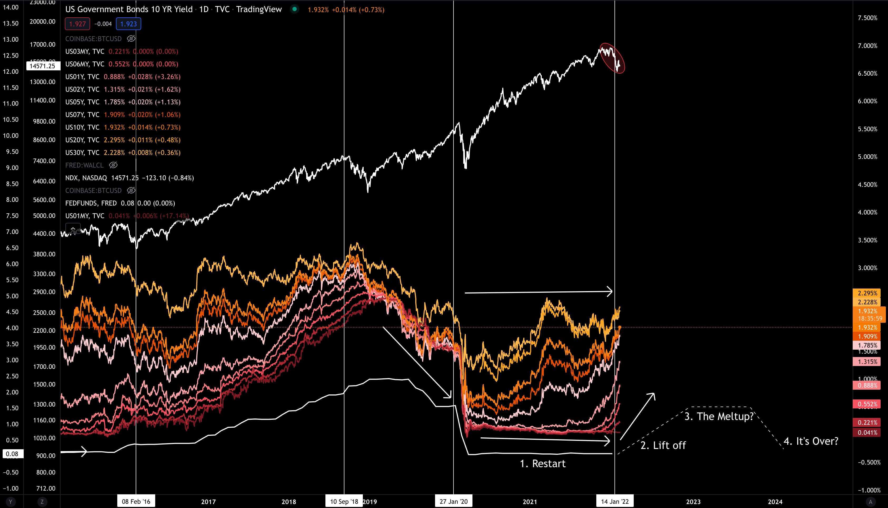
It’s important to know that looking back to prior instances, this softness can take place with some growth ahead. Assuming the initial overreaction is now out of the way, the market will dust itself off and reallocate capital to Nasdaq / crypto opportunities.
But here’s the thing…
Notice how the yellow line at the top acts as a resistance for the rest of the yields. Treasuries with maturities less than 30-year periods were never really able to push beyond the yield the market gave for 30-year maturities.
Intuitively this makes sense… Why lend out capital at 3% for 30-years when you can do it for 2-year? What is the incentive to tie myself to the longer maturity?
That’s why the 30-year yield line acts as resistance. But here’s the thing… 30-year yields are trending lower and lower. They are making lower highs historically. Here’s a chart showing 30-year yields since the 1980’s in comparison to the Federal Funds Rate.
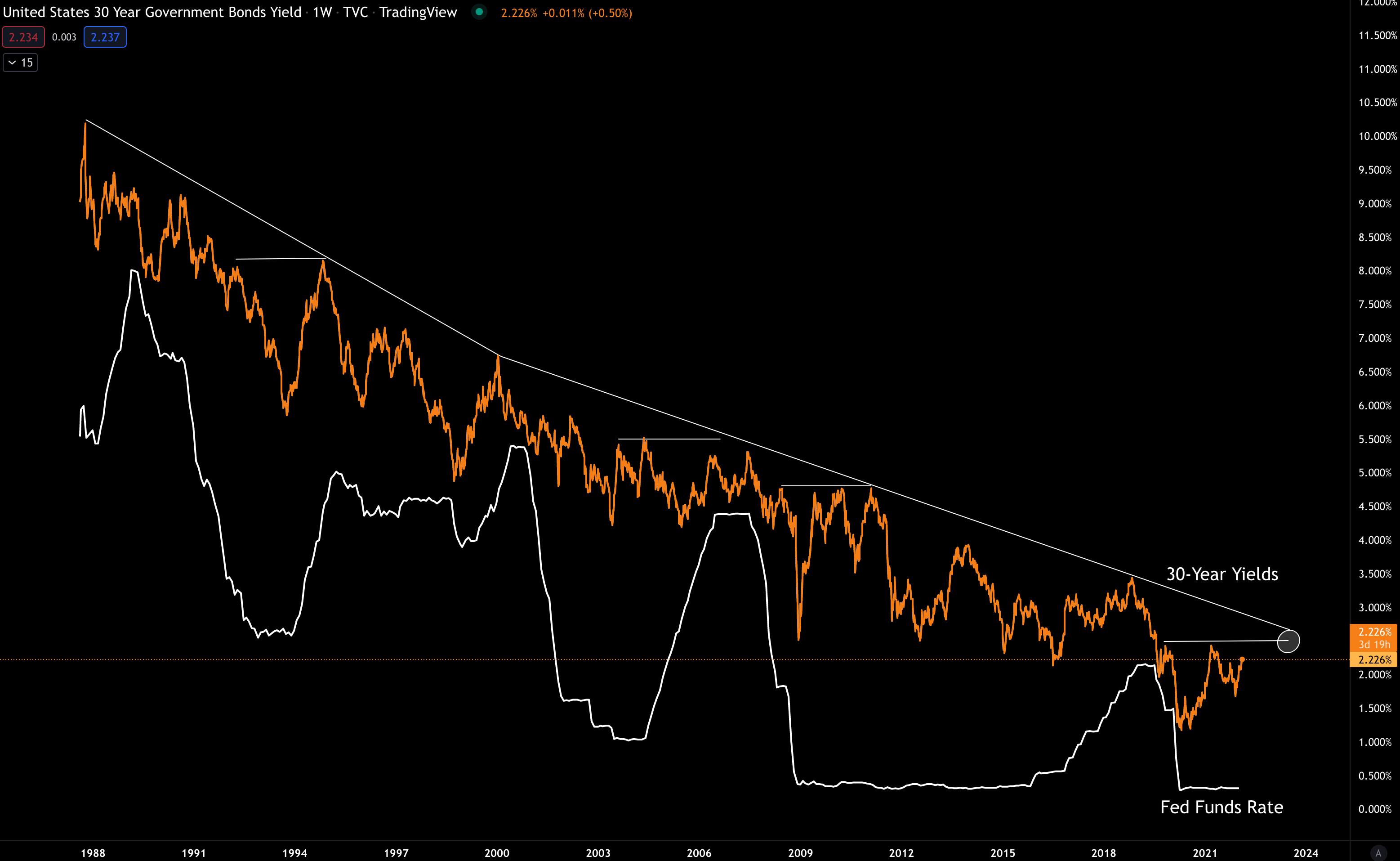
This is very important in evaluating how long this next cycle will last. Because historically the Federal Reserve needs the 30-year yields to rise to avoid “things breaking”.
That’s because of what we saw earlier. When yields compress, “It’s Over” phase quickly unfolds.
And based upon the pattern in the chart above there is little chance of exceeding 2.5%. 30-year yields are showing atrophy. Meaning rates on treasuries are deteriorating overtime. They lack strength.
Translating this into how it impacts the Federal Reserve, they will stop hiking rates in short order. They simply don’t have much room before yields contract to the point where things get wonky.
This is the main issue we need to grapple with in the coming cycle. And it’s something that will be a subject for Part Three.
But for now… Before I leave I’d like to distill this analysis even further.
If we take the Nasdaq chart and compare it these expansions and contractions on yields, along with the current trend in yields, we can break down macro cycles into two distinct categories.
First is the growth stage where prices in growth related assets rise. The second is the stage where asset prices retreat.
Rise and retreat. Or said another way, when to buy and when to sell.
In the chart below the two red lines signal the “It’s Over” stage seen previously. It’s when yields begin their process of expanding after having a period of extreme contraction. These extreme periods are highlighted with white circles.
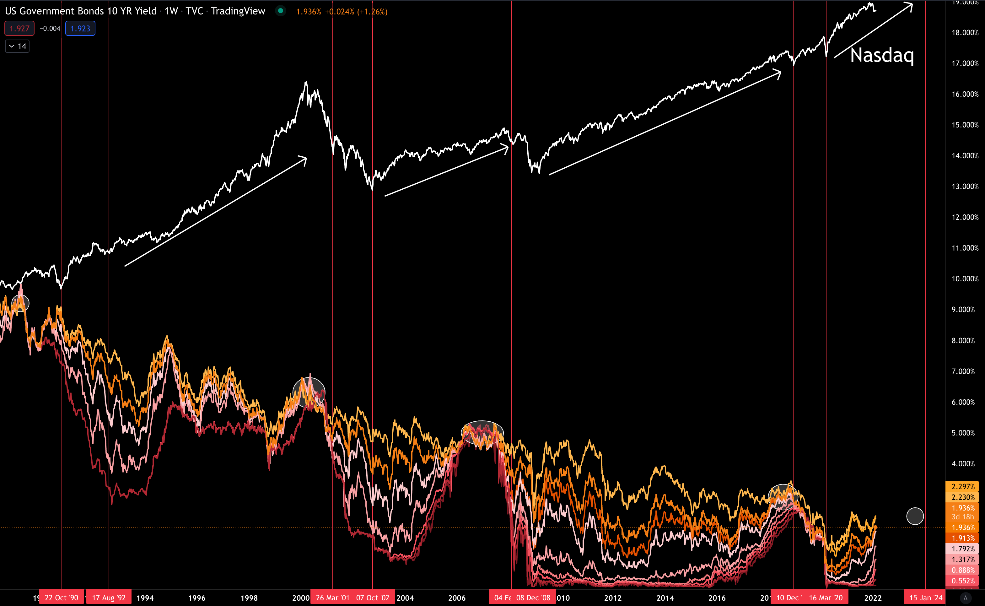
After this time period, the market resets and marches higher until yields contract again. This contracting tells you when it’s time to start unwinding investments.
Based on this oversimplified way of looking at the Nasdaq we can see that once yields start to compress again, we can worry about high growth assets like crypto. Until then, it’s more about listening to gossip with a grain of salt.
Consider this a playbook for the coming two years. More importantly, we can use this analysis as a way for us to watch Jerome Powell’s commentary with less worry.
In the meantime, don’t let the JPow cloud your judgement. Let him raise rates. And instead focus on where to allocate your next slug.
Your Pulse on Crypto,
Ben Lilly


