When Will Bitcoin's Top Happen?
The On-chain data says this bull market will rage on
They are called HODLers.
Many interpret it as those who “Hold on for dear life”. While this isn’t too far from the truth, its origins date back to a bitcointalk forum post from December 2013. At the time price breached $1,000 per bitcoin for the first time and immediately started to sell off.
Needless to say the poster was a bit emotional, and if you have 30 seconds to spare, it’s a nice historical account of where HODL comes from. You can read it here.
Moving on… The post sums up the mentality of many investors within crypto. These are the believers, and they will only sell after years of holding. These multi-year holders have bared the brunt of a bear cycle and are realizing gains as bitcoin rises in parabolic fashion.
What’s most interesting is we can track these HODLers on-chain. That’s because coins in a wallet age, and this age is something data junkies can track thanks to how bitcoin works under the hood.
Once the data is queried, you can showcase it in a fun looking chart with various colors. It’s now referred to as a HODL Waves chart.
What’s interesting is using this chart we can view the HODLers over time… or smart money in a sense… and when they tend to unload their bitcoins to realize gains.
Here are two glassnode charts that highlight this. The first was is the 2013 bull run, the second is the 2017 bull run.
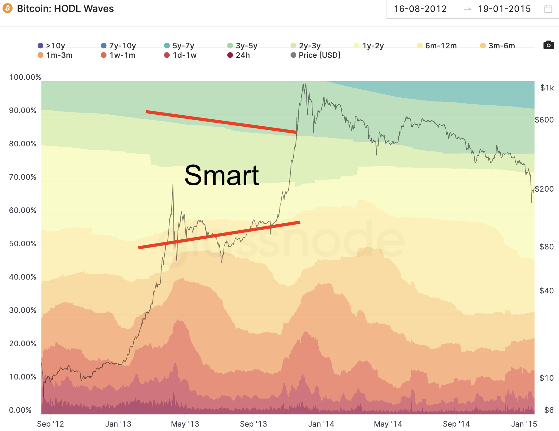
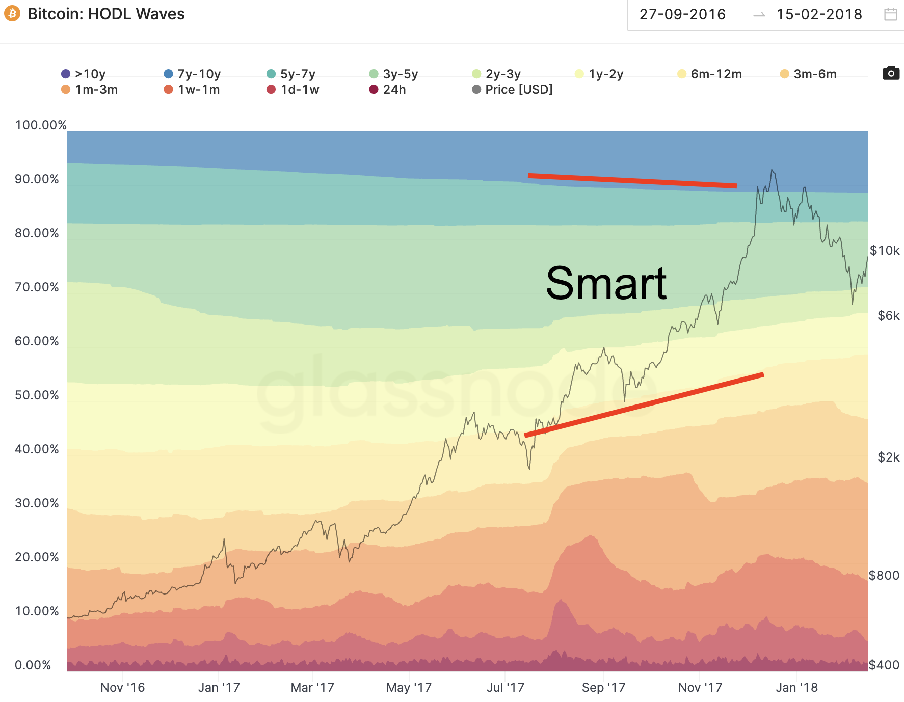
The color bands refer to the amount of coins within an age group. For our purposes we broke down coins in 2013 as “smart” if they are between 1yr - 3yr. For 2017 we looked at coins being “smart” if they fell between 1yr - 7yr. The difference has to do with how old bitcoin was at the time, and I understand that might upset some people.
If my labeling upsets you, just remove the top red line. The theory still holds.
Now, in both bull markets we saw smart money bands get smaller before price topped out. This on its own doesn’t provide much guidance as a “top” indicator.
Instead it’s helpful to determine how far along in the cycle we are. So how far along are we based upon those two HODL waves?
Well, here’s the current HODL wave chart…
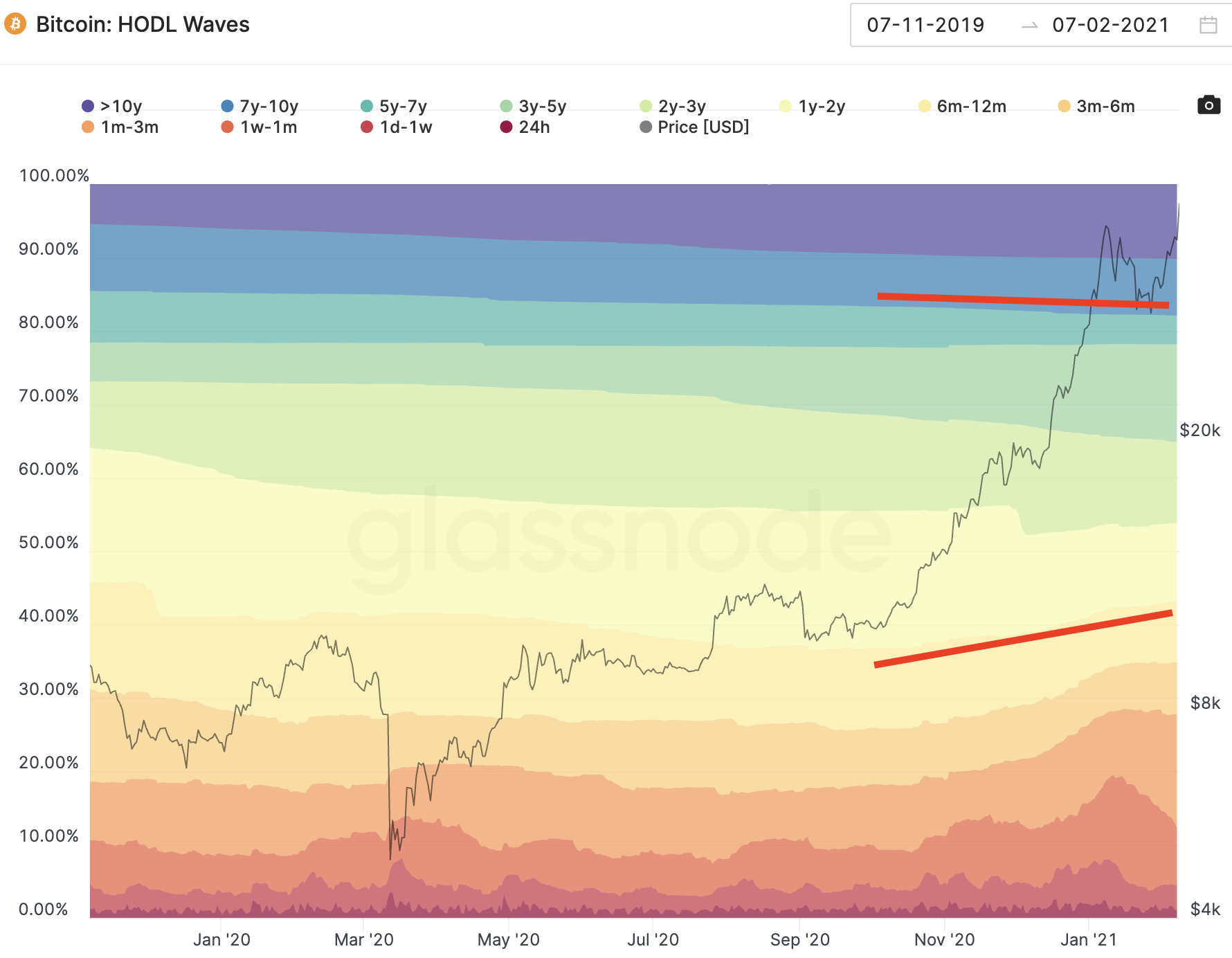
Three things stand out to me. The first is the smart money is starting to sell.
Based on our previous two bull cycles, this fact alone helps us determine if this bullish leg is in fact the major cycle we think we are in.
You’re probably now saying to yourself… Great Captain Obvious, that doesn’t help me much. To that I say, I agree… Keep reading please.
The second thing is the 3yr-5yr group. It’s the sea-green band that’s expanding since September. These HODLers currently entering this group are a unique demographic.
They purchased bitcoin in late 2017 to early 2018 when BTC price was at its previous all-time high. This group has held through the bear cycle and will likely be the first to sell.
The reason being is these investors bought in during the FOMO and likely have the weakest hands. And while they are bracketed as both "smart money" and FOMO money, I still consider it smart in the sense they are waiting for a new all-time high.
Now the third thing we can look at is how much the HODLers 1yr+ dropped before price topped out. This is where we can get an idea for when a top might be approaching.
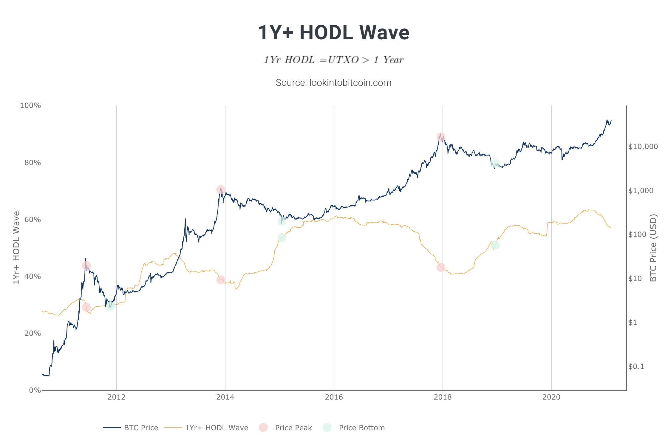
To make it easier let’s look at this chart from lookintobitcoin.com. The yellow line below is simply the percent of HODLers or bitcoin that hasn’t move in over a year.
Digging into these cycles a bit more…
In 2013’s cycle the greatest the 1yr+ HODLers figure reached was 48%. When bitcoin’s price topped out, this figure stood at 39% (red bubble).
In 2017’s cycle the stat peaked at 61%. When bitcoin’s price topped out, the figure stood at 44% (red bubble).
This time around the 1yr+ HODLers statistic topped out at 63%.
Assuming this HODLer statistic doesn’t reach a new high… Which based upon the steepness of the yellow line’s slope we can say this is unlikely… then we need to figure out what percent this figure will be when price is near its top.
If subjective analysis can be used based upon only two data points (we can also look at 2011’s high, which was 30%), my feeling is price will top out when this statistic is near 47-48%.
We’re at 57%. Let the bull rage on.
Your pulse on crypto,
B
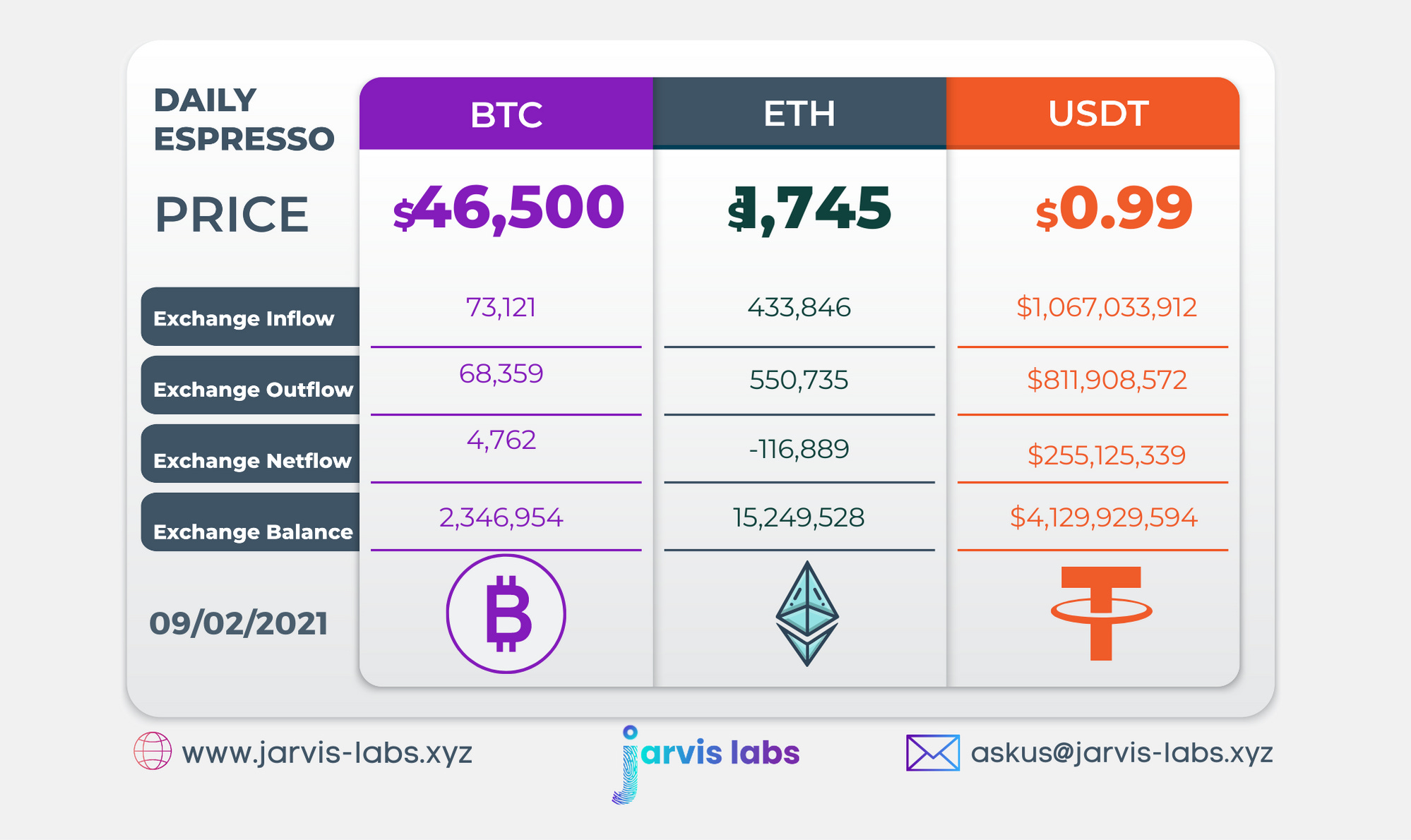
Below is our daily exchange flow data. This is a great gauge for understanding if BTC, ETH and USDT are flowing into exchange or leaving. If BTC and ETH are entering exchanges it can generally be view as bearish. The opposite is bullish.
When USDT enter exchanges it’s typically viewed as bullish. The opposite is bearish.
This should only be a general gauge. Tagging which wallet these flows originate from or enter into helps improve the reliability of this data, which is what we do at Jarvis Labs.
