Web2 Refugees
A CPI index for the Web3 economy


The regulatory barking toward crypto is getting louder.
That’s all well and fine…
Actually, it’s annoying. But it won’t last forever.
Government officials are preparing to release FedNow, the digital dollar system, into the market. It’s v1 of their CBDC. It’s a subject we discussed in the last piece called “The New Financial System.”
This means we shouldn’t expect the Senator Warren and Gary Gensler love duo bark-fest to calm until after FedNow is deployed. Once deployed and enough time has passed, politicians will find a new subject matter to pin their election campaigns on.
In the time leading up to this shift of focus, a silent force will continue to build momentum. One that began in Q4 of last year.
Today I ‘d like to touch on this trend. Then I’d like to introduce a new metric, Ethereum’s very own CPI index and network inflation chart.
In doing so, I hope to stress why now is the time to build despite the roll out of FedNow.
Can Web2 Devs Do Something?
Silicon Valley boardrooms in Q4 2022 were all the same.
Everyday I check Web2 price… bad price.
In such bear market conditions, Web3 inhabitants tend to look towards chat channels and ask, can devs do something? It’s become so common that the mere mention of devs doing something has sparked various memes.
In Web2 land, this doesn’t happen.
Instead, what takes place in those stomping grounds is akin to a slaughter fest.
Meta, Google, Amazon, and Microsoft all cut nearly 70,000 workers.
Zoom, Salesforce, Substack, Loom, Twilio, Twitter, Snapchat, SoundCloud… All dropped between 10–50% of their workforce.
The technology industry that had a labor pool of 5.5 million-strong, growing at a rate of 2.2% per year since 2001… well above the average of 0.4%... is recoiling.
But that’s just one side of the coin.
There is also the inflow of new workers. This figure is not slowing down.
730,000 science, technology, engineering, and mathematics graduates just tossed their caps into the air last year. The new graduates of STEM degrees has been rising year after year. In only a dozen years this equates to nearly 50% more graduates in this domain than before. Suggesting there is a massive backlog of talent underway.
It gets worse.
The job cutting and backlog of tech talent is an issue itself. Where this issue becomes down right scary is when we look at the financial side…
The weight of college debt is becoming insurmountable. The average 35-year-old’s student debt is 287% greater than the value of their original loan. The era of high job growth in tech did little to combat the cost of education.
In fact, the annual growth rate of college costs exceeds inflation by more than 2.5x. Because of inflation alone, you’d need $1,782 today to have the same purchasing power of $1,000 in January 2000. To have that same $1,000 of purchasing power in terms of educational spending, this comes in at an eye popping $4,500 today.
This parabolic rise in cost means the latest graduates are quite literally saddled with debt that can quickly grow to 2–3x in size if not paid off. It’s compounding on a compounding figure.
And since those laid off were more than likely newer to the company, and younger in age... most of the youngest workers of the population are in a very terrible situation.
This issue presents young Web2 developers with a major career decision at a time in their lives when they can still pivot. Do they switch careers despite the highly specialized skills they’ve spent thousands to acquire? Or perhaps they go to another industry where they can apply those skills with the prospect of a major payoff to erase those debts?
Does such a lottery ticket exist, one that can help free themselves from the shackles of debt.
The Migration to Web3 City
Web3 realized a 5% growth in monthly active developers, despite a 70% drop in its bellwether asset price.
The stat isn’t jaw dropping. But it does suggest the migration from Web2 to Web3 is likely already underway. And with the most recent machete-like layoffs, the migration will likely grow.
It’s a trend that can become parabolic.
Web3 currently hosts just over 23,000 monthly active developers. There are not that many Web2 developers needed to truly tip the scales here. When we combine the backlog of talent forming, the recent layoffs, and the small number of Web3 developers building in the industry…
This has a recipe of becoming a significant trend. One that is unfolding just as Elizabeth Warren begins her Crypto War.
As this new wave of developer enters Web3, I’d like to quickly introduce them to a new frame of mind.
In crypto, you may have heard that bear markets are for building.
The reason for this is that building in a bear market lets you realize outsized cash flows in the bull market.
To better understand this, we can apply some of the lessons learned from the recent bout of inflation in the traditional economy to better understand why.
In 2021, supply chains in the global “real” economy were Jerome Powell’s culprit for inflation. Thanks to our trusty macro analyst TD, we realize a lot of this was straight up b.s., since inflation was stickier than politicians were saying… Nonetheless, some of this supply chain bollocks talk had some truth to it.
Shipping lanes were getting backed up. Foreign workers were commanding greater pay. And truck drivers were able to demand greater pay.
This supply chain issue resulted in higher costs for goods. At least in the short term, supply chain disruption did cause some inflation.
This same phenomena takes place in Web3.
In bull markets, blockchain users request more transactions, create more contracts, mint more NFTs, and perform many other activities on the network. It’s a bottleneck that makes the post-pandemic supply chain issue look like a hiccup.
Using this line of thinking, my team (major hat tip to AJ for this one) went out and built out what might literally be the first Consumer Price Index (CPI) for Ethereum.
For those that don’t know, CPI in the global “real” economy is how we measure inflation. CPI basically tracks price changes in a basket of certain goods over time.
Yes, this basket changes year-to-year based on what consumers buy and don’t buy. For instance, at one point it was normal to buy a gallon of unpasteurized milk, so that’s what CPI used in its measurement. But that same basket item could be substituted for something else, like oat milk, if enough consumers buy it (that was for you, Nic, if you’re reading). This makes the items in the basket a bit dynamic.
To account for this in our Ethereum CPI, we did something similar. We bucketed transactions into a few different categories. Then, we went ahead and made these categories the basket items. And then, we changed the weighting of each basket item based upon the popularity of the transactions on a specific day.
Confusing enough?
To use a more tangible examples… Transactions back in 2015 were mostly just users sending ETH around to different wallets. So that’s what mostly made up the basket. In comparison, in 2020, we saw a lot of token swaps on decentralized exchanges like Uniswap. This type of transaction can cost over 100,000 in gas units. And as its popularity rose, its weighting in the basket changed.
Ethereum CPI and Inflation
This gives us a way to compare what the normal user on Ethereum is experiencing in terms of cost today versus several years ago.
In the chart below, we have a few categories of transaction types. Note, before DeFi summer in 2020, the blue line was not very significant. The blue bar represents DEX swaps. This means the basket of good in late-2020 versus early 2020 were different. The teal line that really shows up in 2021 has a few transactions within it, one of which is NFT sales. Another change to the basket of typical transactions.
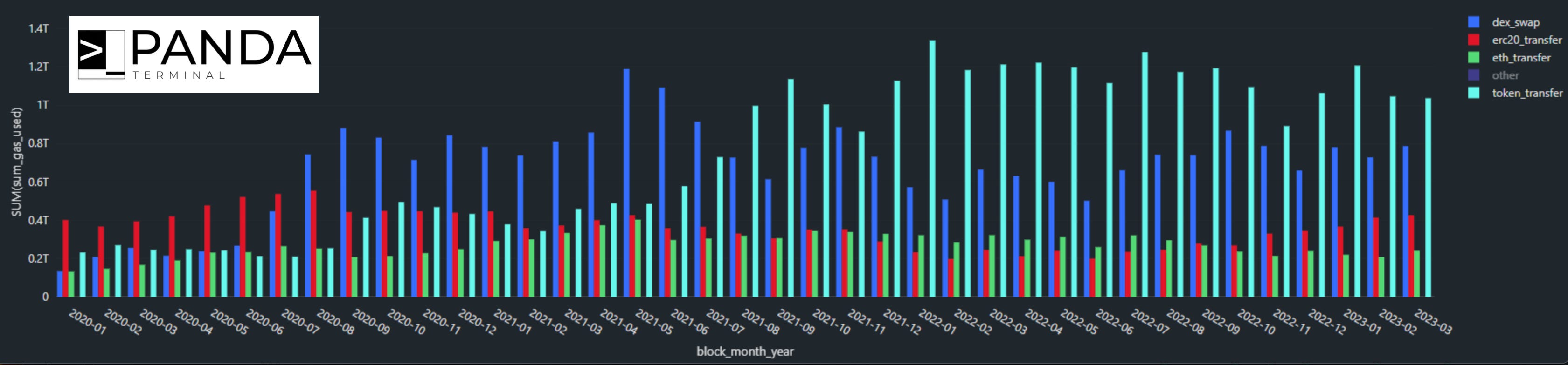
What’s important to note is this results in more gas used as these transactions are more complicated than a simple send of ETH from one wallet to another.
Now, these transaction types only pertain to gas usage. There is another variable we need to factor in… which is the premium placed on each unit of gas. The way to think of this is similar to shipping cargo.
The cost of shipping cargo mostly depends on two things: the cargo’s weight and the current market cost of the space for sale on the ship carrying it.
The heavier the cargo, the more expensive the shipment. I like to think of this analogy as the cost to compute in a transaction. This is the amount of units of gas that a transaction needs.
Meanwhile, the price for each block of space on a cargo ship is the market’s current rate. For Ethereum, this is the cost per unit of gas. It’s often expressed as gwei. It’s the straightforward number to better understand just how expensive it is to make a transaction.
Said another way, if a transaction that requires 100k gas, it costs 100k in gas no matter the day. What changes is the cost for each unit of gas… Which is why a transaction that is $5 today, might cost you $200 in a bull market.
Which means for our CPI here, there are two things we take into account… the first is gas used. That was in the chart before.
We then need to address the cost of each unit of gas based upon the day’s market price.
That’s in this chart. Similar takeaway as before, just note how large of a difference the blue line and teal line separate from the red and green line (red = ERC-20, green = ETH simple send).
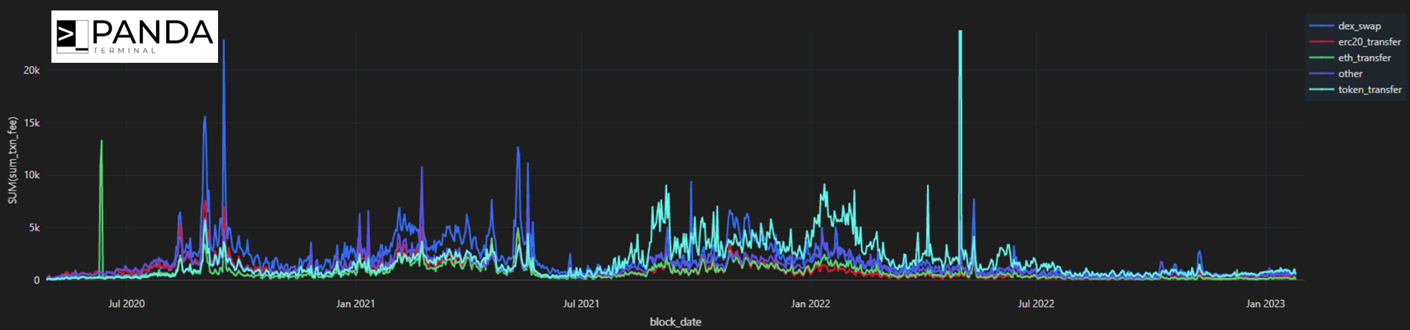
This big difference alludes to the network participants electing to spend more costs for a transaction. In an economy view, this would be a business willing to purchase higher cost items to produce a higher cost output. It’s a sign of increasing productivity taking place. You want to see this happen.
I know that last part is a bit of a stretch for some of you as much of the activity on Ethereum is speculation… really all of crypto. But there are lots of smart contracts created, ERC-721 NFTs created, and other items that lend itself to a business being created. So don’t just dismiss it… it’s just this new frame of mind I’m getting at.
Anyways, when we combine all these things we can produce Ethereum CPI. If we ignore the market price of gas, we get a form of CPI that tells us that the basket of transactions are consuming more gas.
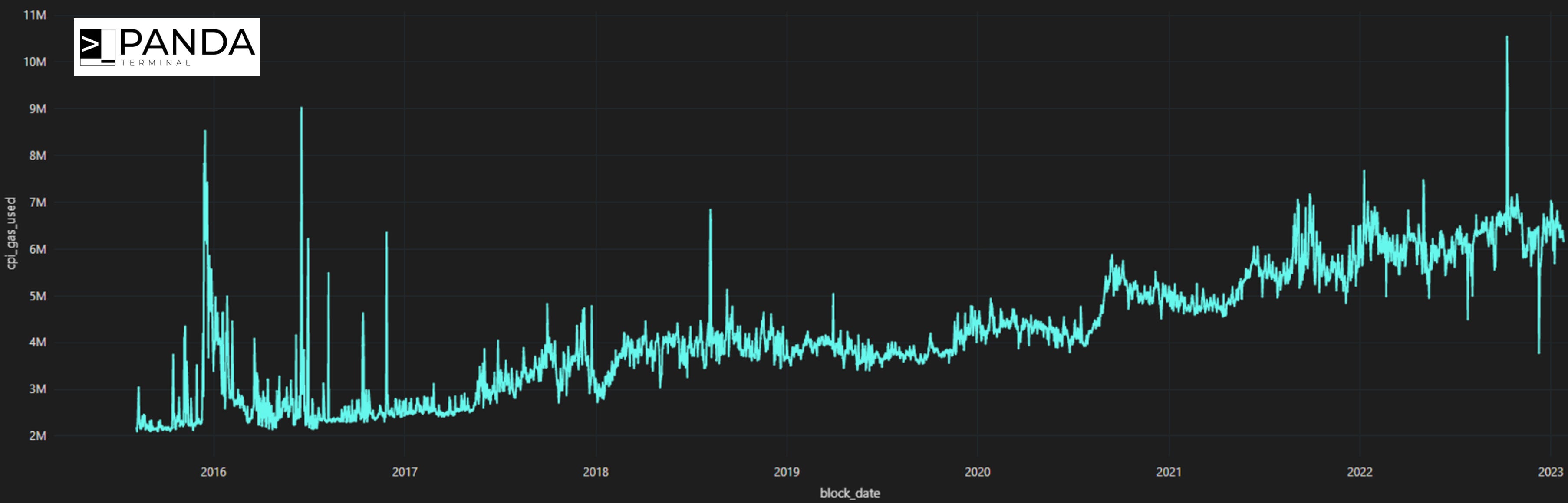
Again, this is good. It’s showcasing the network becoming more productive over time.
If we now bring into the mix, market price of gas… things get a bit more interesting. Once we factor in the cost of gas we can start to see CPI surge in late-2020. Anybody using the chain back then can attest to transaction fees sky rocketing. So this isn’t really anything too enlightening, yet.
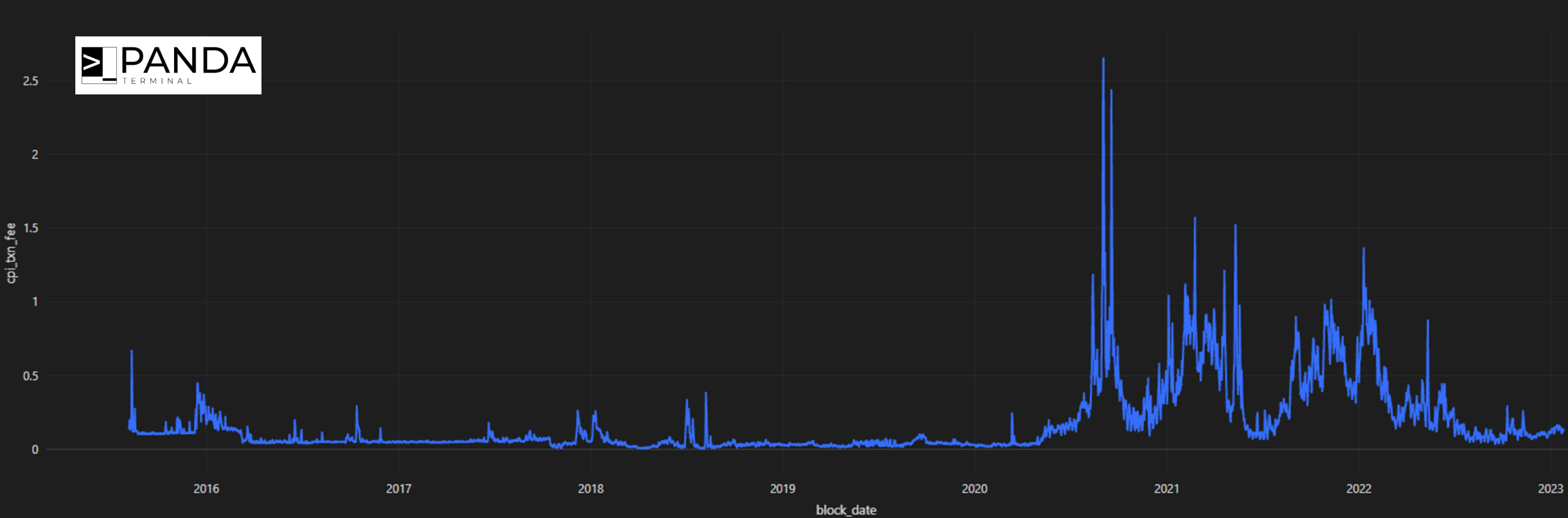
Now, if we go ahead and take the YoY%, we get the chart below, inflation.
For the new inhabitants of Web3, the developers who are setting up a business that accepts ETH onto their balance sheet… We now have network economy inflation.
Today, I’m merely just introducing this concept to help create form a new frame of mind. We will re-visit this soon as we iterate on this metric and really dive into it all.
Consider it just a v1 for now. There’s a lot more work to be done to help the new inhabitants of Web3 get better acclimated.
Enjoy your Sunday.
Your Pulse on Crypto,
Ben Lilly


