This is Why We Work
Market Update: 31 December 2023


Life is a continual fall from bliss.
Think about it…
Before your life begins, you are in your mother’s womb and all your needs are met without the faintest of thoughts.
And when you’re finally born, the first experience is unhappiness… Cold, breathing air, unfamiliar touch, pain… It’s the first veil removed from your immaculate existence of life.
I had this thought come over me as I watched three generations of family members gather around as I wrote this on Friday. The younger being naive to the world’s events while the elders understand events to a depth I can’t yet fathom.
It led to me wondering how this fall from bliss relates to a person’s life force and energy in general…
As that exact thought came over me, I realized I needed to 1) top up my drink and 2) get back to my desk in the morning. As much as I’d like to ponder the meaning of life, I have some other tasks to get done.
Turns out, I wrote most of what you see here that evening.
Scratch that itch they say.
No time for philosophical grinding of gears right now with the bull market ramping up. Because my motto for 2024 will be: This is why we work.
Sure, I took Christmas off… And even two partial days this week.
But here I am having idle thoughts creep in at a time where I’d like to stay focused on my goals.
There is limited time to consider how atrophy and wisdom are like the water and air in your cup - as one is drawn lower with each sip you take, the other grows in volume.
I plan to return to those thoughts in time…
But for now and specifically 2024, it’s about maximizing the now to also maximize the tomorrow.
So with the time many of us have taken this week to be with family, let’s do a quick chart session on the market as we prepare to tackle the week and months to come… And over the next few Espressos, we can form a thesis on the market.
I tend to do this whenever I miss a few updates.
Top down - Macro to Crypto, let’s do it.
Macro
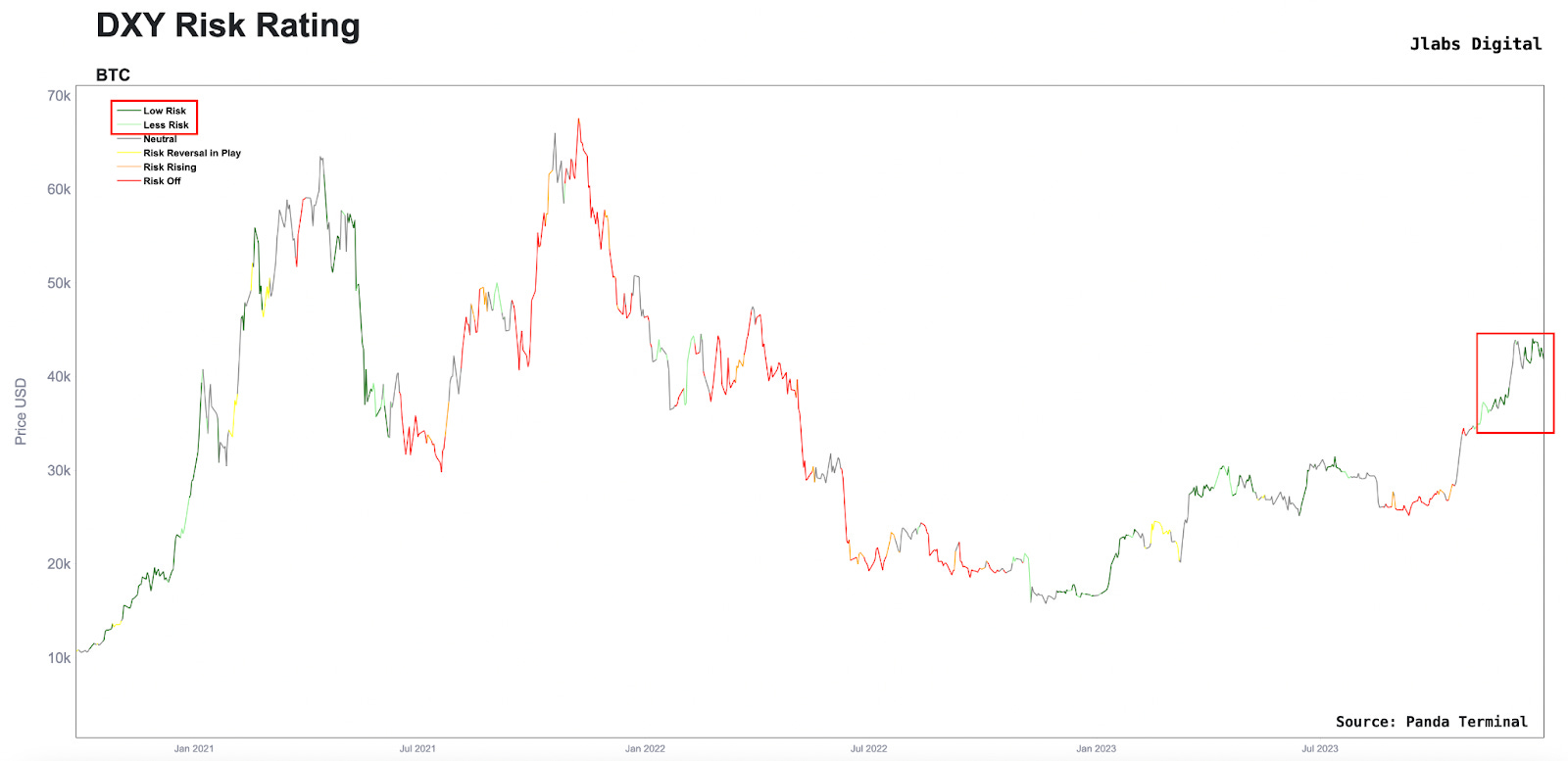
Let’s start wide with the macro and work our way down. Starting with our DXY Risk Rating metric… It’s a metric that tells us when the U.S. Dollar might create headwinds or tailwinds for crypto assets.
When the U.S. Dollar is trending down, it tends to be a good sign for risk assets such as crypto and reflect gray to green hues in the chart below.
When the U.S. dollar is strengthening, we tend to see yellow, orange, and red in the chart below.
For nearly two months, our model has said the U.S. dollar is acting as a tailwind for crypto.
And since I get asked this question a lot, I’ll go ahead and address it early on here…
The charts you see with “Jlabs Digital” in the upper right corner and “Panda Terminal” in the bottom right corner are in-house charts. These charts will be made available to our lifetime J-AI subscribers in January via our platform.
For those with an active J-AI annual subscription, the new platform will be made available once after we onboard our lifetime users.
Then for TARA holders… the platform will be made available to you once we onboard annual subscribers.
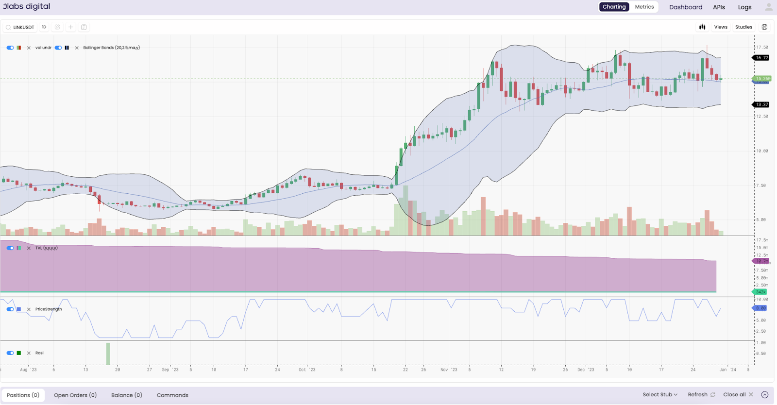
It’s an exciting time. We are opening up our metrics and models to you. Lots will be coming your way. Even some of your favorite models like ROSI and CARI will be at your fingertips. Here’s a glimpse below.
The subplots are TVL, price strength model, and ROSI… Even has some overlays there such as volume and a bollinger band. Lots of fun stuff to help your decision making. For those that also have a J-AI autonomous trading subscription, you can now monitor your positions across various exchanges on this same platform.
If you’re not in one of the aforementioned groups and want access, stay tuned. We will let everybody know when we open up J-AI trading subscriptions again via our Telegram channel here.
This will be the first time we have opened up subscriptions to the autonomous trading system J-AI in over a year.
There will only be 8 seats available to the J-AI trading service, so be sure you turn on your notifications if you’re interested. Priority will be given for those interested in lifetime subscriptions (if that’s you, go ahead and reach out to @benjamin_bc on telegram to express your interest).
OK, enough of that, back to the charts.
The Federal Reserve was vocal about their pivot in the last meeting as Jerome Powell stood at the podium releasing doves into the sky…
Meaning the expectation for rates became more accommodative. This is a good sign for economies since lower rates reduce the cost of borrowing money. Asset prices tend to do better as a result.
With this pivot from the Federal Reserve, the question then became, when does the rate cutting start and how low will the Federal Reserve go?
To better track this sentiment, we can watch this chart. It’s the expectation of what rates will be at the June 2024 FOMC meeting. I honed in on the 4.25%-4.5% probability line below.
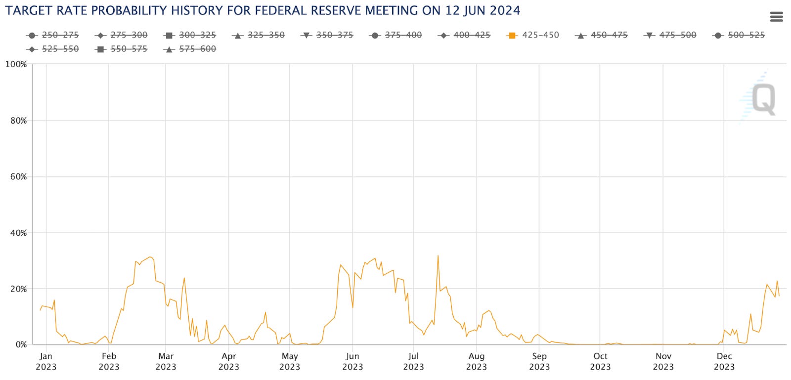
The current rates are at 525-550 bps (5.25-5.5%). The chart above is the probability that rates will be 425-450 bps by the June meeting in 2024, and as you can see it's rising of late.
Right now, it’s hovering between 16-22% odds, which is incredibly high when looking back over the last quarter.
If this trends higher, then that would mean the market is pricing in more cuts over the first half of 2024. The market is currently pricing in three rate cuts, so if the line in the chart above continues to rise, a full 100bps or four cuts would begin to get priced in.
That would be a major tailwind for the economy and asset prices - especially crypto.
But when it comes what we should watching for… It’s more about witnessing a change to this bullish trend in macro. Because that would likely slow down our current rally.
So keep track of any speeches or signaling that might come out of the Federal Reserve or certain journalists with the start of the new year.
Crypto
Options
Among all this positivity in macro, we would expect nothing but bullish vibes in the Web3 domain…
This week, we had a massive options expiry pass without much fanfare.
You can see what the Open Interest looked like before it all rolled off, and what it looks like today.
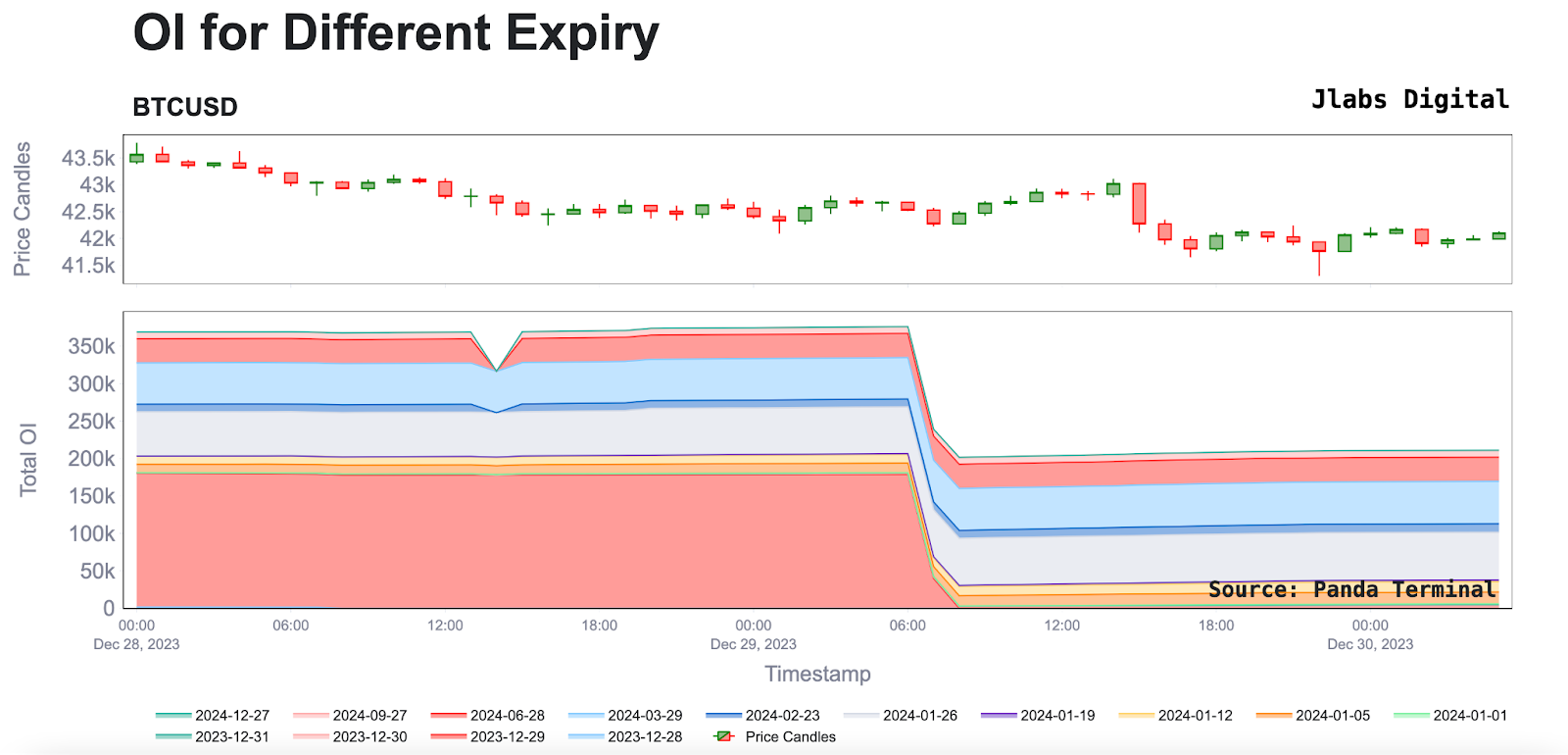
All of this open interest raises the question of where it’ll show up again… And when it does, what does that structuring mean for the market?
2023 was a year of suppressed volatility. Major options players were content in selling any big rise in volatility.
Over the last month, we’ve witnessed a slow change in this trend with consistent and mechanical like positioning for staged moves higher. Our analyst JJ has been convering it in the xChanging Good live streams that happen Tuesday and Thursday each week.
We can expect him to keep an eye out for when all this open interest returns to the options market because it will likely shape what the first quarter of 2024 will look like.
As of now, we are not seeing open interest surface for any of the meaningful expirations in 2024. Here is January’s monthly contract and the quarterly contracts below so you can see there is not much movement happening.

I don’t necessarily expect that open interest to quickly surface. But the fact that there is a price premium surfacing for January options and nobody is any rush to sell it yet is notable.
Below you can see this rise in just the last ten days for the January contracts with the red arrow.
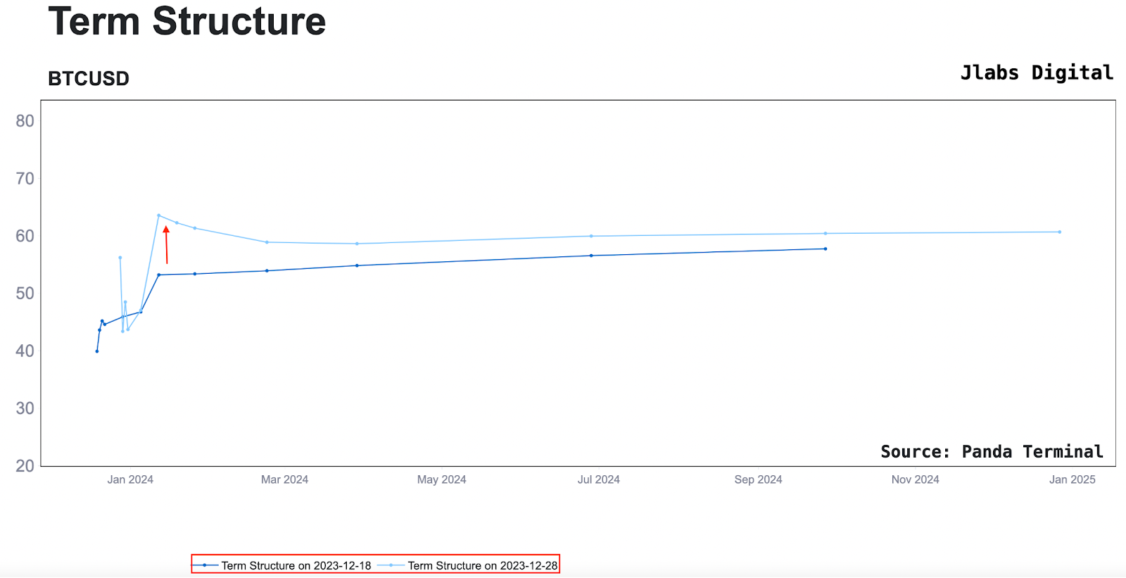
This tells us that with the looming Bitcoin ETF decision happening in a week or so, the market is starting to price in volatility… And the market is not thinking it’s something to bet against yet.
Again, this is another metric to watch in January. I get the feeling that most of the market does not appreciate how much of the market structure is being driven by the position in the options market… But as we see more open interest come in or volatility return in the market, hopefully we can showcase it in the months to come here in Espresso.
Spot Demand
Now, to get a better gauge on where we sit in crypto, I like to zoom out and focus on a couple key points that express market demand.
After all, if there is no demand, how can prices keep chugging higher?
The first metric I like to pull up is cumulative volume delta of spot markets. It’s a way to see if buyers are aggressive or sellers are aggressive for spot Bitcoin.
In the chart below, we can see it’s a bit indecisive right now. Over the past few months, any change in trend here has resulted in price showing strength. I’ve shown them below with blue vertical lines.
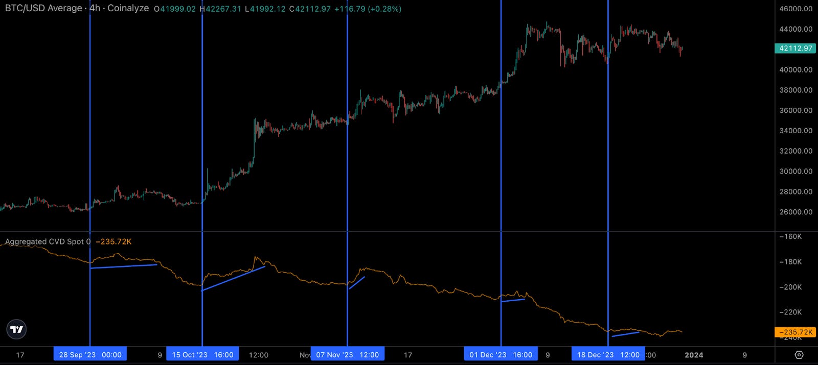
Right now this new trend is continuing. It is showing signs of exhaustion. So to dig into spot demand a little more, we can check out Coinbase price versus Binance’s USDT market.
This difference in price tends to be the result of outsized demand for Bitcoin from fresh dollars (Coinbase is a major fiat ramp) as opposed to money that is already in crypto via USDT (Binance tends to be money already in crypto).
The vertical red lines below showcase times when Coinbase became cheaper than Binance’s market prices. That’s where we sit now, and this tends to hint at softness.
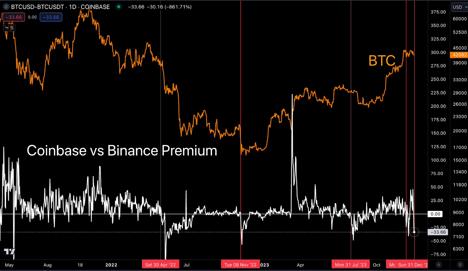
To me, this is enough to say that this rally is losing steam from the spot market. Derivatives can keep pushing this rally even more.
Of course the ETF approval can change all of this on a dime, which is expressed in the volatility mentioned above. As far as CVD in the last few charts, this will likely trend higher, fast… And if anybody wants to fade that rally, wait for demand to slow before scratching that short itch.
Many are expecting a sell the news event… I’m not trying to form any bias on that until the data starts to come in on the tape, but for now, one thing I am looking at is whether or not Bitcoin can continue dominating the market.
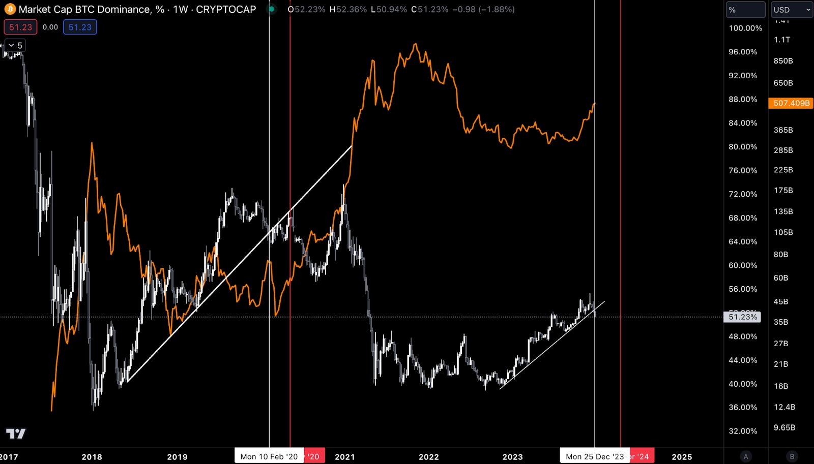
To do so, let’s pull up the Bitcoin Dominance chart.
A Bitcoin Phase
I went ahead and added in the total market cap of crypto minus Bitcoin and Ethereum in the orange line (probably should have not made it orange, but it’s getting late).
The chart shows that Bitcoin lost its trend in dominating the market. The red vertical lines are halving dates…
Note the white vertical line. Four years ago in the prior halving, the total market cap of crypto outside of BTC and ETH (TOTAL3) was very bullish as Bitcoin lost its dominance - much like today.
Then Bitcoin’s dominance had strength prior to the halving. It then gave way to the rest of the market post-halving. Take note of that.
I want to see if this pattern happens again or rhymes with the ETF news. If we see something similar to last halving play out in this chart, then it’s time to go down the risk curve if the overall market is trending higher.
The last chart I’d like to drop in here is simply Bitcoin’s return based upon the three 8-hour trading sessions of Asia, Europe, and U.S.
We break down the day into three sessions to see which session is realizing the most gains or losses in order to determine any trends. If the U.S. is trending higher, it’s a sign of good momentum in the market.
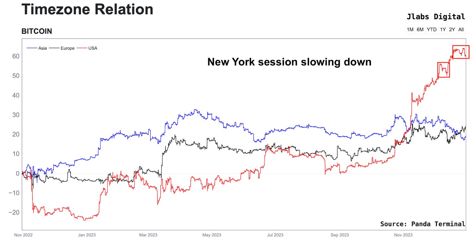
The timezone chart is suggesting a bit of a cool off taking place.
Last time we saw it was on December 8. I placed a vertical line in the chart below so you can see what happened in the days that followed.
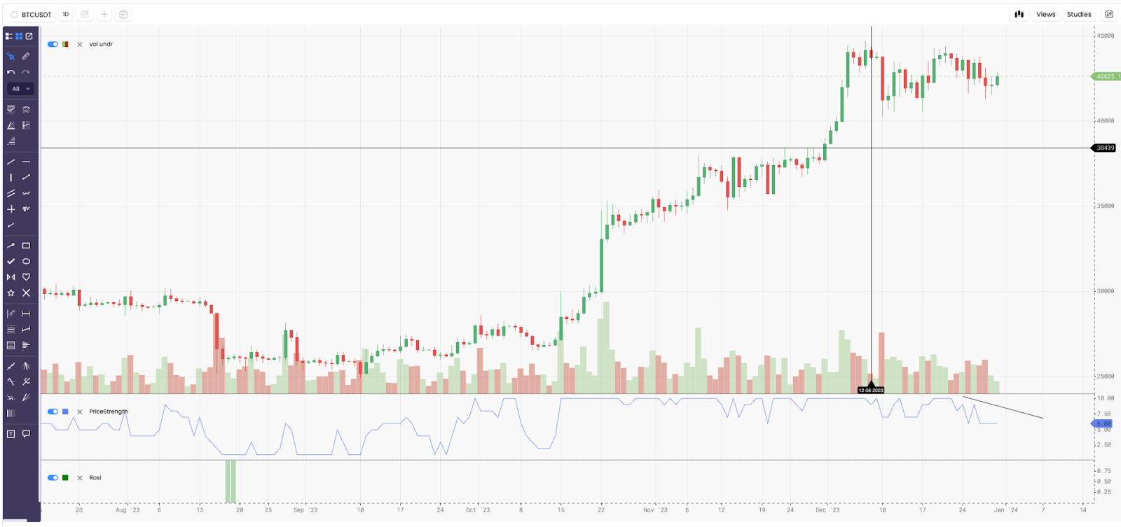
Price carved out its new range. It didn’t go back to its previous trading range, meaning it didn’t lose its bullish structure. So this loss of momentum isn’t me saying to watch out sub-$38k levels.
If anything, it’s more like another data point to stick in the back of your mind as we approach Bitcoin’s ETF decision and also the return of more liquidity and volume next week.
With such volatile news on the horizon, don’t try to form concrete opinions on what will happen. Let price play out and simply interpret the data as it comes in with these - macro, options market, spot demand, and timezone returns - charts in the back of your mind.
Consider these charts as being broad based to help you trade with more confidence.
Thanks for taking a read of 2023’s last Espresso issue. Expect to see a lot more of us in 2024, a year where hard work will pay off.
Time to get at it.
Your Pulse on Crypto,
Ben Lilly