The Uncomfortable Truth About Crypto
The QTT Essays: Part Four


Note From the Editor: This is Part 4 of an essay series that debuted earlier last month.
“Fundamentals have no value in crypto.”
Nothing makes my blood boil like when people say that. Mostly because it might actually be true.
Back when the altcoin market really picked up momentum in crypto between 2017–2018, a lot of my job involved tracking over 50 cryptocurrencies on a daily basis.
The task was literally impossible.
Sure, I had my price charts to scan through. But back then, fundamental research was reading forum posts, diving into the cesspool of a project’s Telegram channel, wading into Discords, and following founders on Twitter.
The time suck was painful.
To help cut through the noise, I took the time to get free trials with nearly every major data provider at the time.
One shop I was particularly fond of allowed users to build out their own metrics from the data.
There was a learning curve, but it was worth it knowing I might not need to join another Telegram channel.
Well, one morning there was a bug in the system. And I suddenly had access to nearly every firm’s custom metrics. I won’t name names, but you can likely guess many of them.
I binged.
And before the bug was found and fixed, I had that moment many of us come to realize as we grow older…
“Those who know, do not speak. Those who speak, do not know.”
I saw the same thing over and over. When price rises, the metrics look good. When prices fall, those metrics look bad. Then, when these metrics look to be a certain degree of “bad,” it’s a buy signal. When they look to be a certain degree of “good”, sell.
There was nothing that showed me anything unique. It was the same thing I saw on Twitter almost daily.
It was one of those eye-opening moments where you thought the adults in the room knew something you didn’t… But all of a sudden, you realize you know just as much as they do… And you ask yourself, “What the hell am I doing here?”
After all, here I am, using some of the best data money can buy. I’m looking at the metrics that all the giants in crypto were looking at back then… Which they thought was private.
Later in the day as I read another poetic tweet thread from one of those same entities, I had the same uneasy feeling wash over me…
The emperor was naked…
And maybe fundamentals have no value in crypto.
Fast forward to today, and this is why “narratives” are so popular. Nobody knows what to look at. So we quite literally just tell ourselves what matters.
It could be something as absurd as the number of new posts and users coming to a certain Telegram chatroom associated with a project, which various venture capitalists were actually tracking back in those days. Some might still be doing this.
And yet, the rocket ship and moon emojis being posted by chatbots don’t deter them. In fact, it helps turn those narratives into a self-fulfilling prophecy when price ends up soaring. They become the proof points to these narratives.
Now, if this makes you feel a bit uncomfortable, good. It means I’m touching on a truth that you may have realized before burying it under the piles of money you’re collecting in your daydreams about the next bull market…
It’s the uncomfortable situation where we turn around in the cave we’re sitting in, and for the first time see the device casting shadows of rocket ships and moons on the wall before the masses.
So, for me, I had to make the decision right there. Do I leave the industry? Do I play along? Or do I take the next step and start pulling data directly from a node to get closer to an answer for the same question: Do fundamentals matter?
Luckily, my now-business partner at Jlabs Digital, Benjamin, informed me he had spun up a node on Bitcoin and had started to track wallets.
We did this not because we were onchain sleuths… It was simply pure unadulterated juicy alpha.
It took another year to come back to asking the same question again on fundamentals. Reason being, Benjamin and I could usually figure out what moved price on a time scale of two months or shorter, but for anything beyond that, we had a massive question mark.
That mystery is why I speak… because I do not know.
And through these papers, I hope together we figure it out. I genuinely believe this public-facing discovery phase will help bring all conversations up another level.
Today is another step in that progression. Thanks for coming on this journey with me.
Let’s look at the next iteration of our discussion on token supply…
The Chart
When we last spoke, I dropped some of the team’s charts on Ethereum’s (ETH) supply over time.
That supply was broken down into categories of M0, M1, and M2.
M0 was the most liquid form of tokens, while M2 was the least liquid. M2 represents tokens that are locked up in a smart contract, and require an action before they can be traded.
For this reason, having more tokens that fall into the M2 category means the token has higher forms of usage beyond just holding it or using it for payment.
And as we saw in the last essay, this rise in M2 creates fertile ground for a secondary catalyst to spur abrupt changes in price.
It’s the powder keg analogy… More M2 creates conditions where a catalyst can spark major moves in price higher.
The opposite is also true… A drop in M2 and rise in M0 or M1 creates conditions where a spark can cause bigger drops in price.
There are also two combinations where more M2 reduces the extremity of a price drop, while a drop in M2 limits a price’s rise… But for now, let’s focus on the other two examples above that create larger moves in price. It will help explain a concept about token supply we can describe as elasticity.
OK, so over the last week at The Lab (what we call our research department at Jlabs Digital) our team calculated the M2 figures and compared them to the total supply. We then jammed the ratio into a simple model we like to use that showcases the strength or weakness of a particular metric.
You can think of this as your normal 1–10 type of index.
A “10” rating creates a dark green color and indicates this token supply metric is strong. A “1” creates a dark red color and indicates the metric is weak.
Here’s what it looks like when compared to the price of ETH over the last few years.
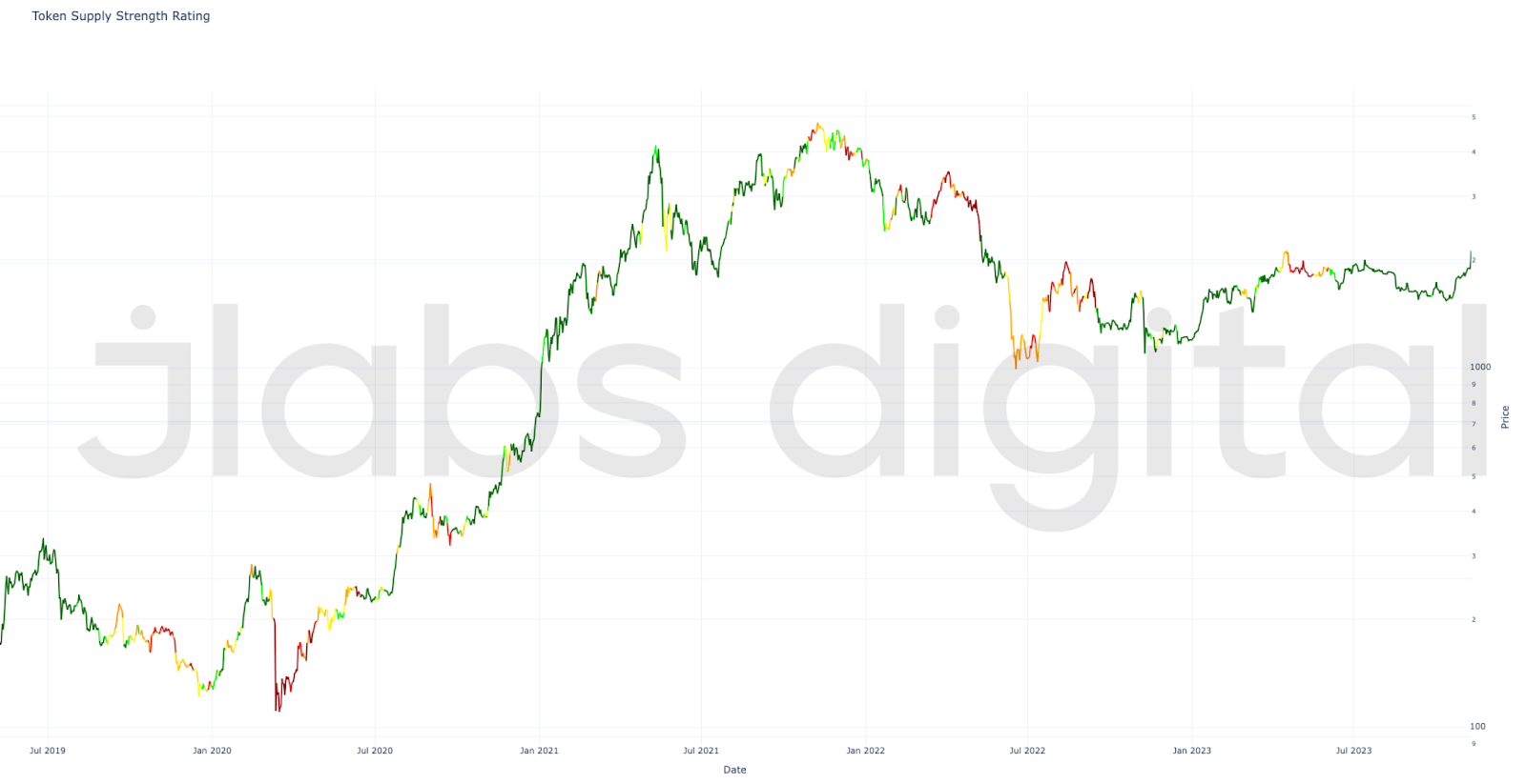
If I may say so myself, what a beauty.
Now, this is just an early version of this metric. We’re already aware of some of the errors that exist in this chart.
In particular, the time period around the LUNA crash in May 2022 shows as dark green when it shouldn’t be. This is because of a sudden uptick from the data source as a new source of locked tokens came online at this time.
To be clear, this chart shouldn’t be construed as bad data. The data is good. It’s just for this particular use case, some more work needs to be done.
Most don’t understand just how messy data is in crypto until you dig into it. Dozens of tradeoffs are made with every analytics provider.
OK, enough about that.
So the chart itself… You can see the colors have some significance.
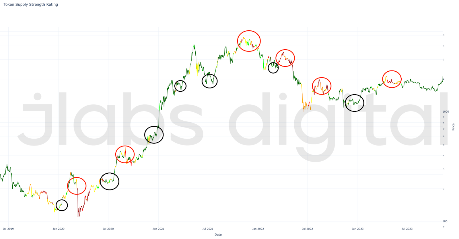
The orange and red colors tend to surface prior to significant price movements lower. While the dark green regions tend to surface prior to price movements higher.
This isn’t mathematical, just a simple eyeball test that yes, there is something here.
On the surface, this is the type of fundamental metric that looks to have merit.
But here’s where things get difficult…
In our Quant department, this is “fuzzy” alpha. But we prefer models with a high strike rate, defined risk, and highly repeatable alpha before they can be used.
For now, this M2 idea is merely theoretical and good for somebody like myself to ramble on about for hours on end.
In fact, when we apply just a simple 30-day (green dotted line) and 90-day (pink dotted line) correlation between this metric and price, we see there is a long way to go. Correlation in the chart below is measured on the secondary y-axis, on the left.
Correlation for this type of metric should be high, meaning as this metric’s strength rises, price should rise as well. As it weakens, price should fall. As the two move together whether up or down, the correlation should be not only positive, but at least greater than 0.5.
In the chart below, you can see we are all over the map.
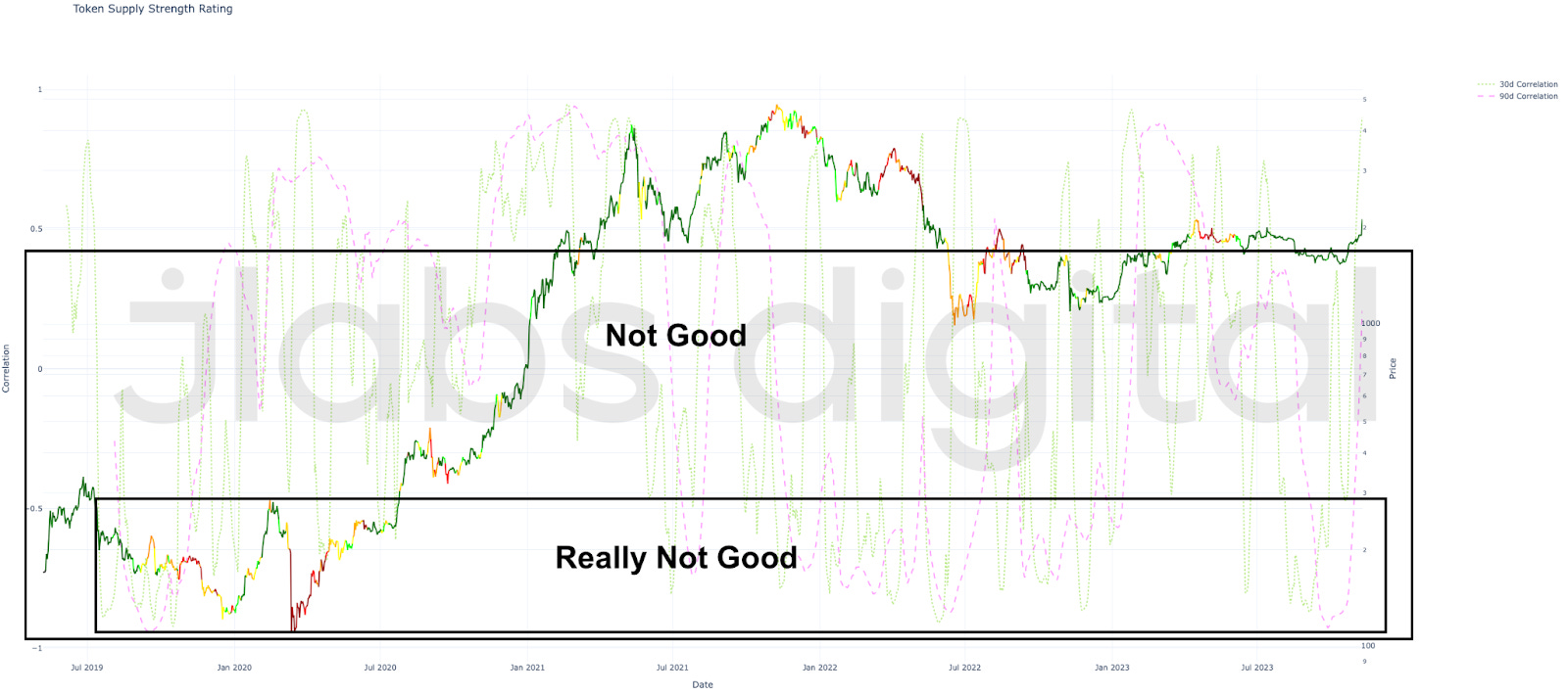
Seems we have some more work ahead of us.
Which comes back to our data work. We need to collect, index, and compute metrics with a certain end goal in mind. This helps us consider a set of tradeoffs that better lead to reliable price predictions.
Which is why for now, we will table this particular model.
We plan to come back to it very, very soon. That’s because as we saw in the first chart, there’s something very tangible. But to tease out the type of alpha that we can replicate with a high degree of certainty, we need to do a few things first.
In the meantime, this work can still be applied. Specifically, to the mental framework we touched on a few QTT essays ago.
The Mental Framework
To jog that memory, here’s the equation I look to form a mental framework around:
P =( M*V ) / Q
It’s the quantity theory of money equation, just slightly rearranged to isolate “P.” This is a mental model that can be used to better understand how the supply of money (M), the frequency at which that money moves around (V), and essentially how productive people or entities are with the money (Q)... relates to the price level of an economy.
We will address each one in the upcoming essays in the QTT series. For now, we are wrapping up our discussion on “M.”
Today, we touched on how “M” or a token’s money supply can become more sensitive to price. This is referred to as elasticity.
And with the chart we showed earlier, what we see is that a token’s supply changes how elastic or inelastic it is at any given time. In this way, we are beginning to apply a “weighting” to our “M” value here.
We can think of this as how much elastic potential energy or simply elastic energy a token supply has. This energy might not create any change in price on its own, as it still needs a catalyst to trigger it.
So to update our mental framework for how to understand what makes a token’s price go up or down, this is where we sit:
P = (uM * V) / Q
The “u” here acts as a weighting to the number of tokens in circulation. As this weighting approaches 1, we can think of this as all the supply sitting in the highly liquid value of M0. As more tokens get locked up in higher forms of usage, this “u” value would decrease.
Right now, based on what we read in the previous essay, this “u” value is decreasing. Meaning the potential price level of ETH is set to rise. Another way to view this is that ETH is becoming much more responsive to changes in “V” and “Q.”
In the next grouping of essays, I expect to dive into these some more.
Your Pulse on Crypto,
Ben Lilly


