The Rising Trend
Market Update: Pay Attention to New York

The Nasdaq traded nearly 5 billion shares yesterday.
That’s over $200 billion… on one exchange.
When you start factoring in the nearly 1,000 futures contracts offered by the Chicago Mercantile Exchange… trade volumes start to become unfathomable.
Which is even before you begin layering in the New York Stock Exchange, Chicago Board Options Exchange, or the FOREX markets at ICE.
These are the largest financial markets in the world. They pale in comparison to cryptocurrencies and their 24-hour market.
Binance for instance, the largest exchange by volume, fell just short of $14 billion in spot volume yesterday… With two other exchanges limping across the $1 billion mark.
Which means when the trading bell rings in New York, capital flows pick up significantly. And any bullish sentiment that exist at the open can translate to sizable capital moving to and from crypto.
In fact, ask any trader in crypto what market open they pay attention to and you are sure to hear that New York’s open is the one they care about.
To make things even more concentrated on one timezone, financial markets are moving in lockstep with the rhythms of U.S. Federal Reserve Chairman… Godfather of central banks… The Don of markets… Jerome Powell more than ever before.
Every crypto twitter talking head including myself cannot stop watching yield curves, rate projections, job numbers, inflation, and more… All to attempt and play chess with a blindfold on in terms of knowing what The Don will do next.
The concentration only heightens the attention around how markets behave during the 13:00-21:00 UTC timeframe.
And what you’ll see in just a moment is that crypto is no different. New York matters.
Just how much is what we will show you. But what’s more is knowing how to play this trend as it continues in order to take advantage of it.
Let’s get to it.
The Gains are in New York, New York
The gains that have taken place in Bitcoin (BTC) and Ethereum (ETH) of late have taken place predominately during the New York trading session. This is in contrast to the other two timezones of Europe and Asia.
To break it down we assume each session is eight hours long. The U.S. trades at 9am its time or 13:00 to 21:00 UTC. Asia follows, and then Europe fills in the remaining period.
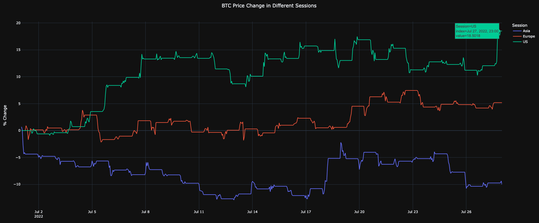
Here is BTC for the month of July. Price is up 18% during New York trading hours (green) while Asia is down ten percent (blue). Europe is in red at around 5%.
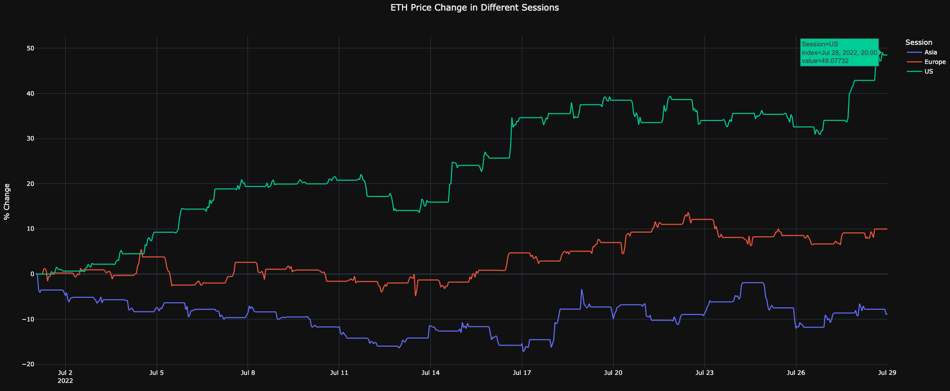
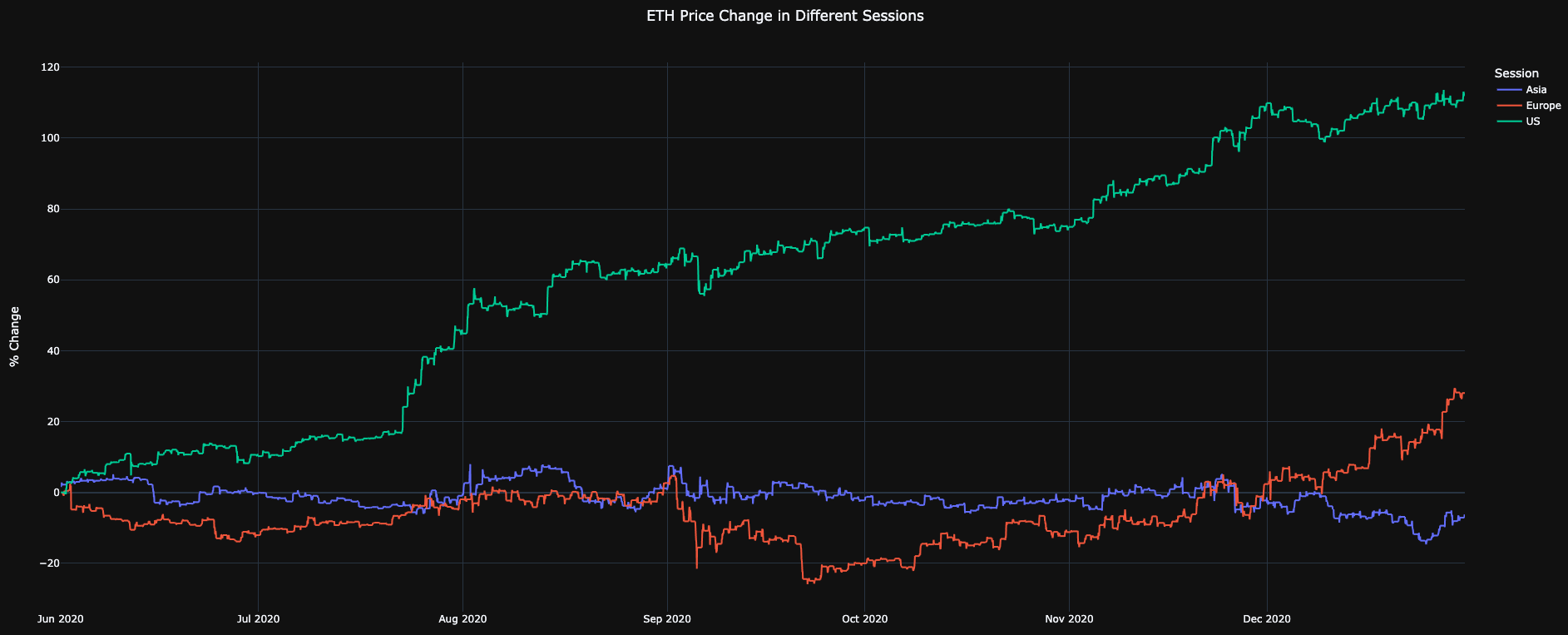
Same story applies, but with a more pronounced difference with ETH at about 50% gains during NYC hours. Europe on the other hand was single digit gains and Asia at -9%.
This tells us we shouldn’t fade the NYC rally unless the closing bell is being rung.
This immediately led to the team asking more questions about how long this trend has existed. We all intuitively knew this type of behavior takes place from time to time in the markets. But we wanted to find out if there was some insight we were overlooking here.
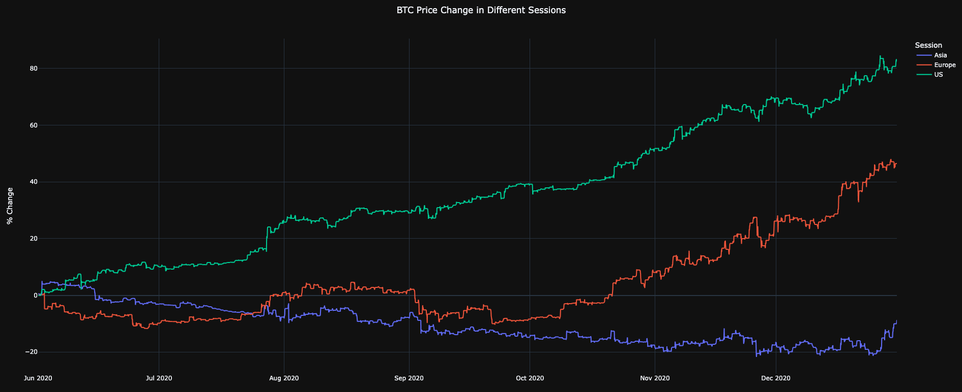
First up was to look into the start of the most recent bull run, which started in 2020…
Here is the second half of 2020. BTC during NYC trading hours was up over 80%. Asia was down, again, while Europe sat in between the two.
ETH showed the same thing, but even more extreme. NYC timezone was up over 110% while Asia was slightly negative.
To see if we can get a three-peat here, let’s pull up the sizable rally that happened around July of last year.
Here is BTC once again, and we see the same thing with BTC up over 50%, Asia flat, and Europe doing its own thing.
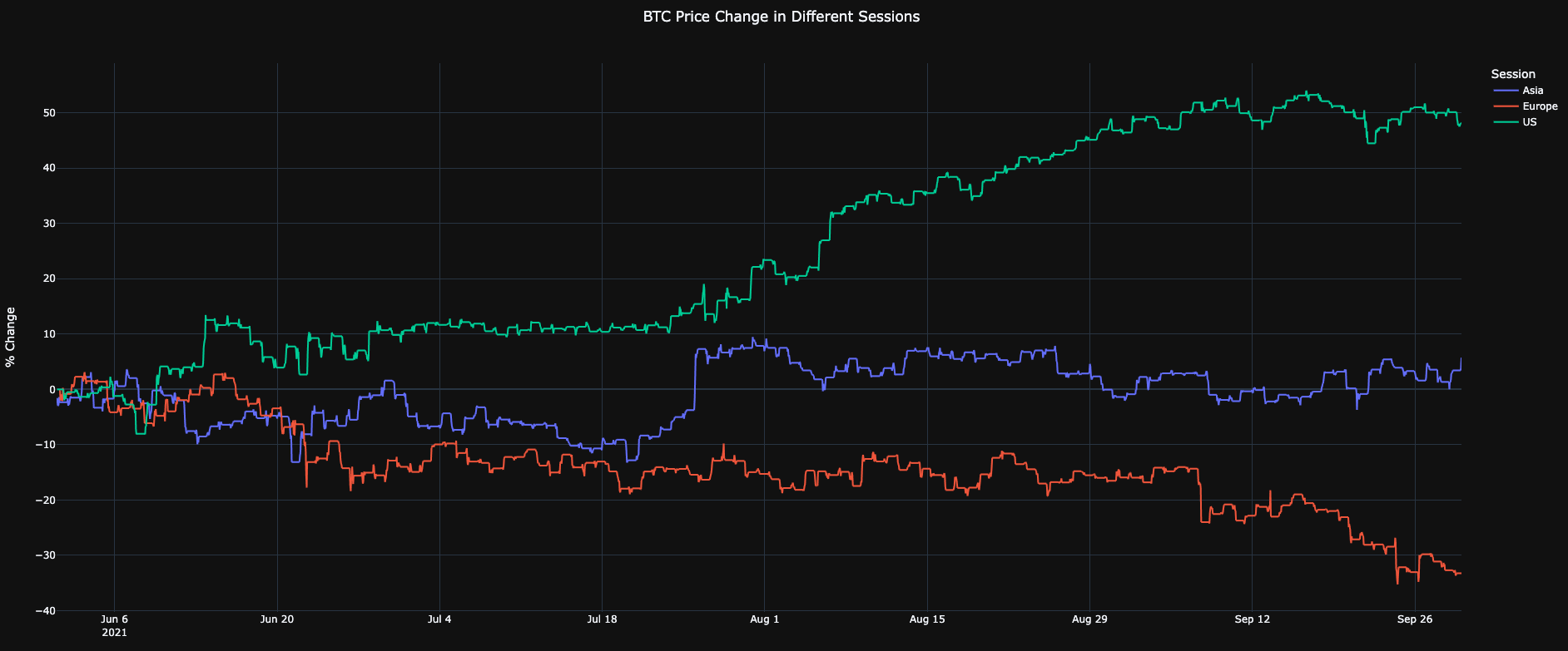
You probably don’t need me to show you what happened in ETH based upon the BTC chart. NYC timezone was up over 50%.
The conclusion here is simple: when NYC is a hog at the trough in terms of gains, don’t fight it.
But does this happen when things trend bearish? This was the first question that came to mind after seeing such massive moments to the upside…
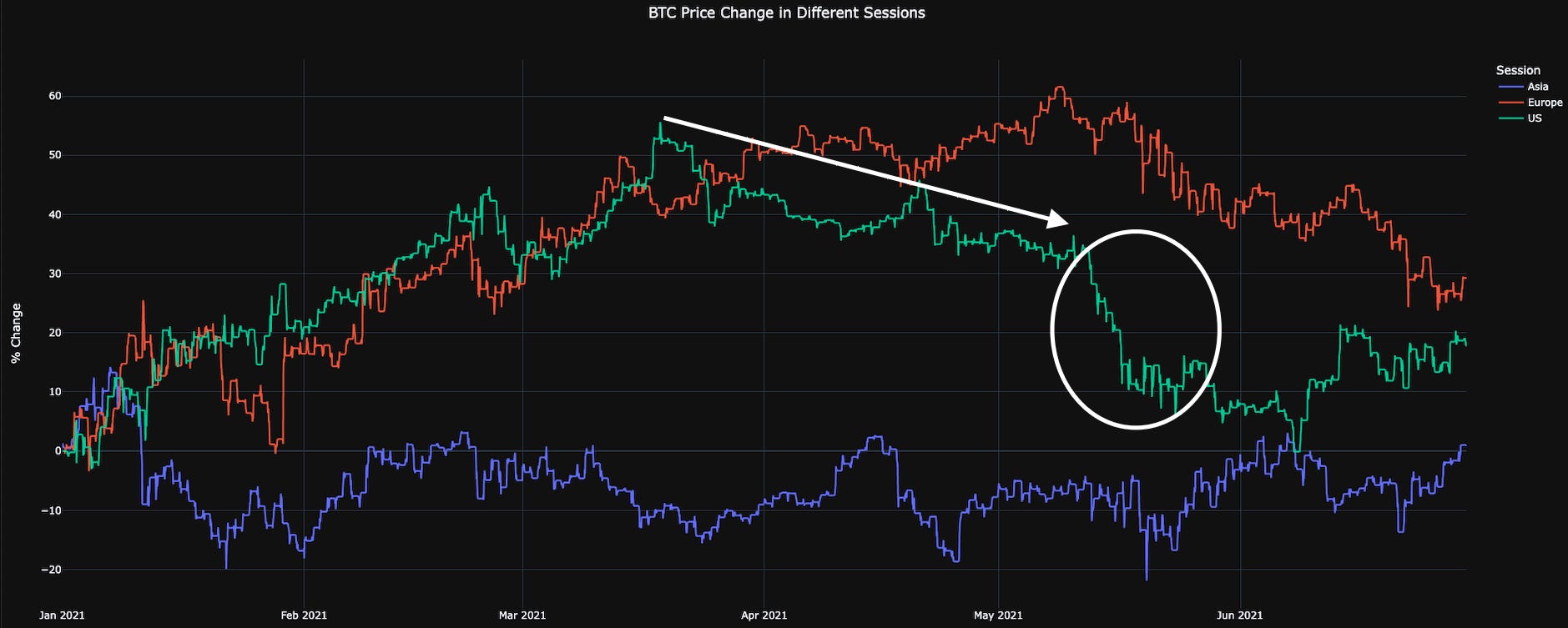
The first bearish time period we can look at is May 2021… You know it. Elon Musk on Saturday Night Live acting like a moonboy. BTC went from about $60k to sub $30k in days.
Note the downtrend in gains already taking place within the NYC timezone (green line) before the white circle (Elon Musk on SNL). This foreshadowing was happening while Asia and Europe were both trending up.
The white circle marked below is the start of the massive May 12th drop that took place. Which means the U.S. was already signaling a soft market before the major selloff.
ETH was less pronounced as BTC was above. But instead of bore you with another half a dozen charts, I’ll try to get to what we need to focus on by bringing up just two more…
Here is the Luna selloff in May that led to industry wide garbage fires that are only now being properly investigated.
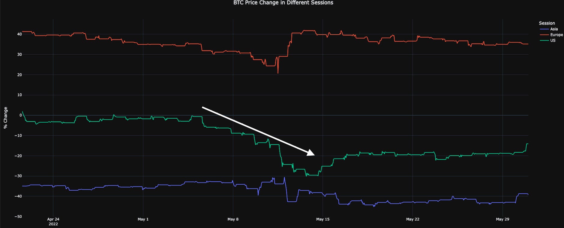
The chart above looks a little bit different since the time frame starts in October (not seen), and believe it or not the Asia session slowly trended downwards the entire time.
Meanwhile, NYC trading session was more responsive to larger selloffs like the one experienced around the turn of the year (2021 → 2022) where price went from $52k to about $33k in a few week.
This all points to the same point that we’ve been hitting on, which is ever since The Don turned on the world’s largest money printer, the crypto markets have become very NYC-centric. And we should be paying more attention this.
Looking Forward
The current rally showing a trend within the NYC timezone is something to note with each daily open.
The trend is stronger than what we anticipated when we first began digging into it last week. And as the week progresses we plan to dig further into some onchain metrics using the same mentality.
Reason being is we think we can find a bit more signal than currently exists than what we can see in the charts above.
For example, here is our onchain ETH Divergence chart. The white box below shows both whales and smaller wallets accumulating via the red dots.
This activity tends to proceeds rallies. And just as whales turned off their activity, price responded in lockstep by softening.
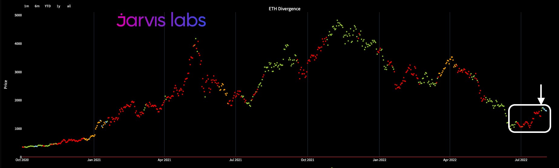
This hints to us the pattern we hit on earlier with NYC trading hours - it is likely to show itself with onchain data.
So stay tuned for next week as we dive into this a bit more and hint at what clues the market structure is giving us for what the rest of Q3 and perhaps Q4 have in store for us. You want want to miss it.
Until next time…
Your Pulse on Crypto,
Ben Lilly


