The Napkin's Clue
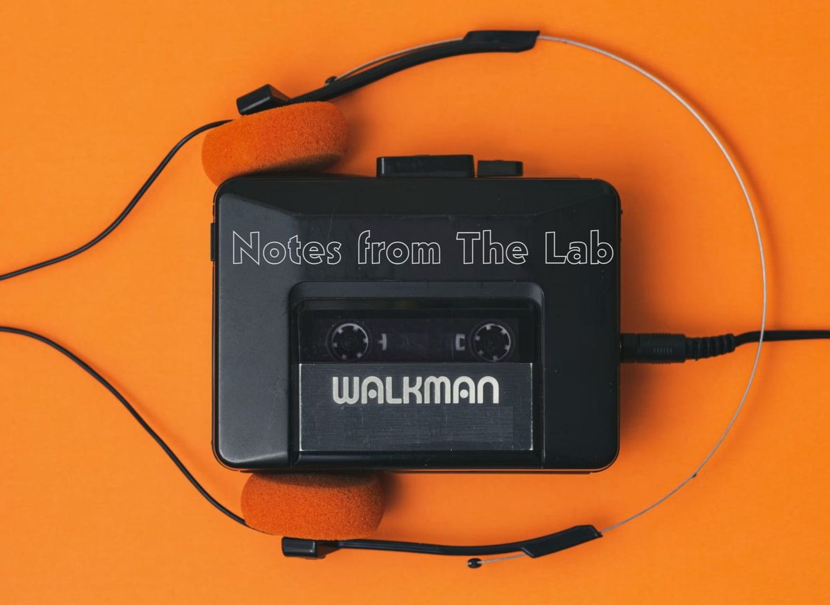
Notes from The Lab: NYC is Trending

Hi there, my friend put my playlist on something called Spotify. It lets me share my mixtape with you all. You can follow along here as you read Notes from The Lab today, enjoy!
Every evening after work I have the same routine.
It happens in the time between the last Jarvis Labs team member clocking out and me getting home to watch Nick at Night with my nocturnal pet duck, Orthis.
Just before I begin my final round of sweeps and scrubs, I rewind my Walkman, clip it to my coveralls, and press play... It’s old, but to me, it puts me into that meditative state.
It takes a few seconds and the vibrations do their magic.
“… and I shoulda been gone!”
The intro to Steve Perry’s Oh Sherrie kicks off and I’m in my zone.

At night as the halls are quiet and room are empty, the lab gives clues for the work of the day. And I’ve been around long enough that at times, the data left around gives me a glimpse into their thoughts.
This is “JJ’s World”, and it’s where I find meaning behind their charts. And now look to share them with you all.
The Napkin
Bitcoin was trading just under $21,000… Which means it was Tuesday night, about an hour before midnight.
The team finally checked out for the night. Toilets were done, halls swept, and both double doors were locked.
I once again had the lab to myself.
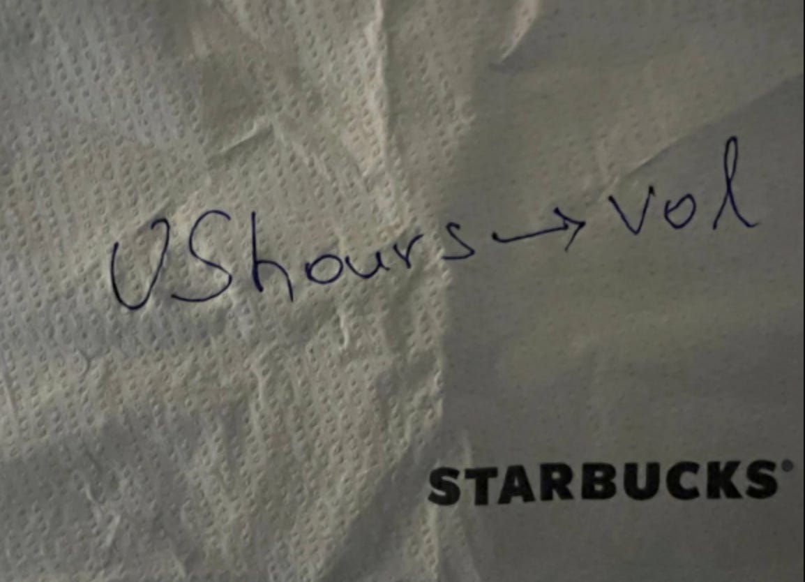
The last trash bin to empty for the day was the one by Mr. Benjamin’s desk since he tends to be one of the last to leave… Often times I’ll still find him scribbling things on his notepad and kindly remind him of the time as I think he tends to lose track of it - not the case tonight.
Instead as I nudged the door open with my shoulder, the lyrics to Ace Frehely’s New York Groove began, and this week’s chart was on full display.
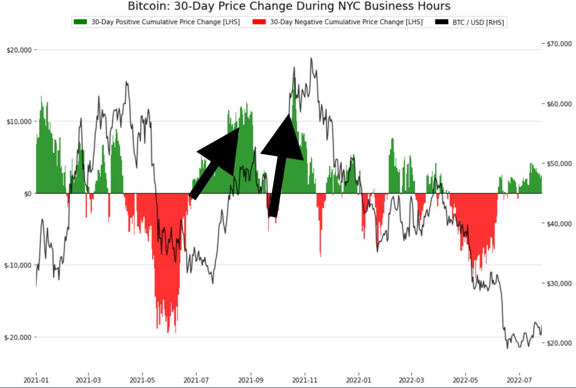
The window on his monitor showed a chart with bars and the price line of BTC. Here is the photo I snapped below.
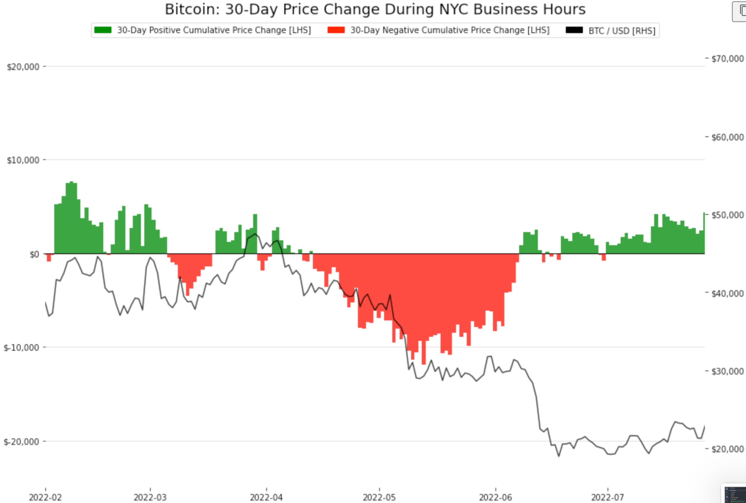
At first it didn’t look like much, but then I saw one of Mr. Benjamin’s scribbles on his desk… It said “U.S. hours → Vol”.
That’s when I realized what the chart showed…
The bulk of BTC bought this month took place during New York City’s timezone between 9am – 5pm (13:00 -21:00 UTC). The bulk of the volatility is taking place during the U.S. timeframe!
The trend continued throughout the week and those Bitcoins that were valued at 21k on Tuesday night were worth around 24k as I write this on Friday night.
Cue up the next song…
“I’m back! Back in the New York grooooove!”
To help you guys understand this better I went ahead and got another copy of the chart from one of Mr. Lilly’s new trainees - everybody is willing to help out it seems, even the newest employees. The new trainee said the code came from @data_always and I should look into the repo more - seems interesting, but I don’t know how to write computer code.
Anyways, it seems like Mr. Benjamin was looking at how many times this New York timezone thing happens... And what I found was right now actually has some similar looks to last summer’s strong rally!
My Janitorial Analysis
Analysts like to talk about how U.S. stocks are correlated to the price of BTC. But they rarely look at the time of day correlation between BTC price and US stock market hours.
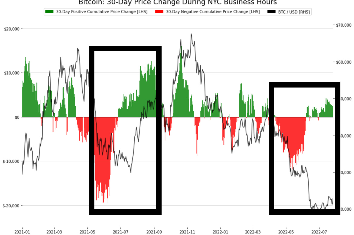
The chart you see down below shows the gains and loses generated during New York City hours since the last quarter of 2020.
The green and red bars represent the gains and loses during these hours on a 30-day basis. Their amounts are on the left Y-Axis. The black line is BTC’s price.
We can see that the first arrow marks the transition to a much softer market in April 2021 as the green bars switched to red.
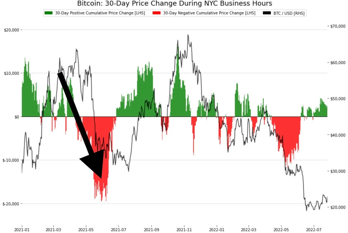
This means the price movements were taking place during the daytime for traders in New York. The selling kept going all the way through July 2021 when BTC was near 30k.
Shortly after the gains were being realized by New Yorkers just as bitcoin also reversed. New York traders were the ones seeing all the action and were moving BTC’s price.
If we then follow the second set of arrows up as red bars switch to green bars, we see price followed along. I remember that time period since there was a humongous short squeeze that helped push BTC gains over 100% as it passed $65k in November.
U.S. traders were making serious dollars compared to the hours for Asia and London traders.
The third series of arrows go on to show that New Yorkers began to see price move to the downside more so than other times of the day. Price went on to fall by over 50% in the first two months of this trend. New York traders again realizing the bulk of price action.
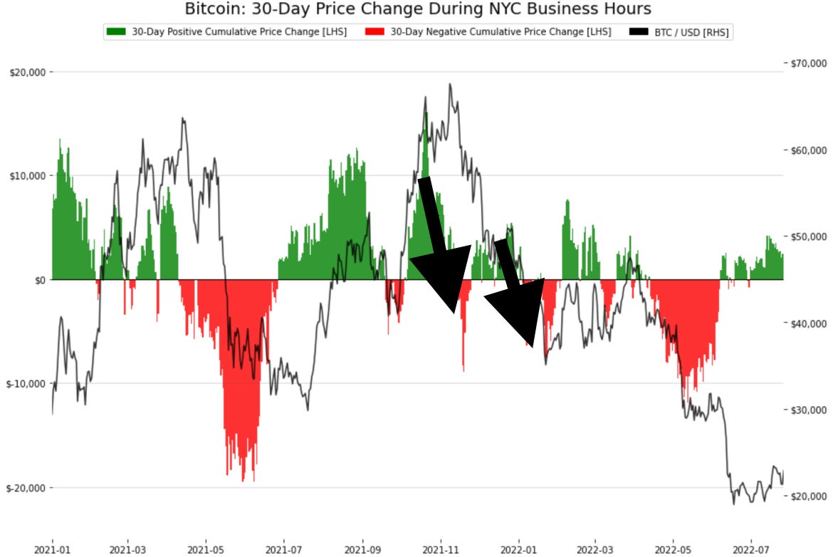
The last period we can check out is June to now. The setup looks somewhat similar to what unfolded in June and July of last year. There was a long period of low prices before the market sprang back to life.
This seems to go against what I found last week, the ETH-Perp volume being greater than BTC-Perp volume chart. That hinted at a potential selloff.
I’m excited about this chart, but will try to temper my expectations. I know my limits as an analyst. Perhaps I can become one some day.
For now, I think I’ll wait and see if The Bens have something to say about it next week. Based upon how the chart was not in their template, my guess is they will likely expand on what this trend might mean.
What do you think might happen in August based on this chart?
Thanks for reading my notes!
JJ


