The Final Flush
Liquidity Maps and Negative Exchange Flows


Data transparency in crypto is awesome.
It means you can pull anything you want. Find out whatever it is you’re looking into. No need to guess on what’s hiding behind the curtain. It’s all out in the open.
And for data scientists and data junkies, this is what makes crypto a field day.
You can query and manipulate data until your heart’s content.
There is so much data it can literally make your head spin. It’s in part why so many services and providers exist in the space.
Everybody looks to make sense of the endless data.
In fact, there’s so many ways to look at the same thing that services are even built upon one another. There’s literally more than enough to go around for everybody.
It reminds me a bit of DeFi where some applications depend on other applications, that yet rely upon another set of applications. And the more applications and services exist, the better the result can be for the end user.
This same concept unfolds for traders as well.
Take this series of tweets from Whale Alert.
These are massive movements on-chain. All happening one after another after another.
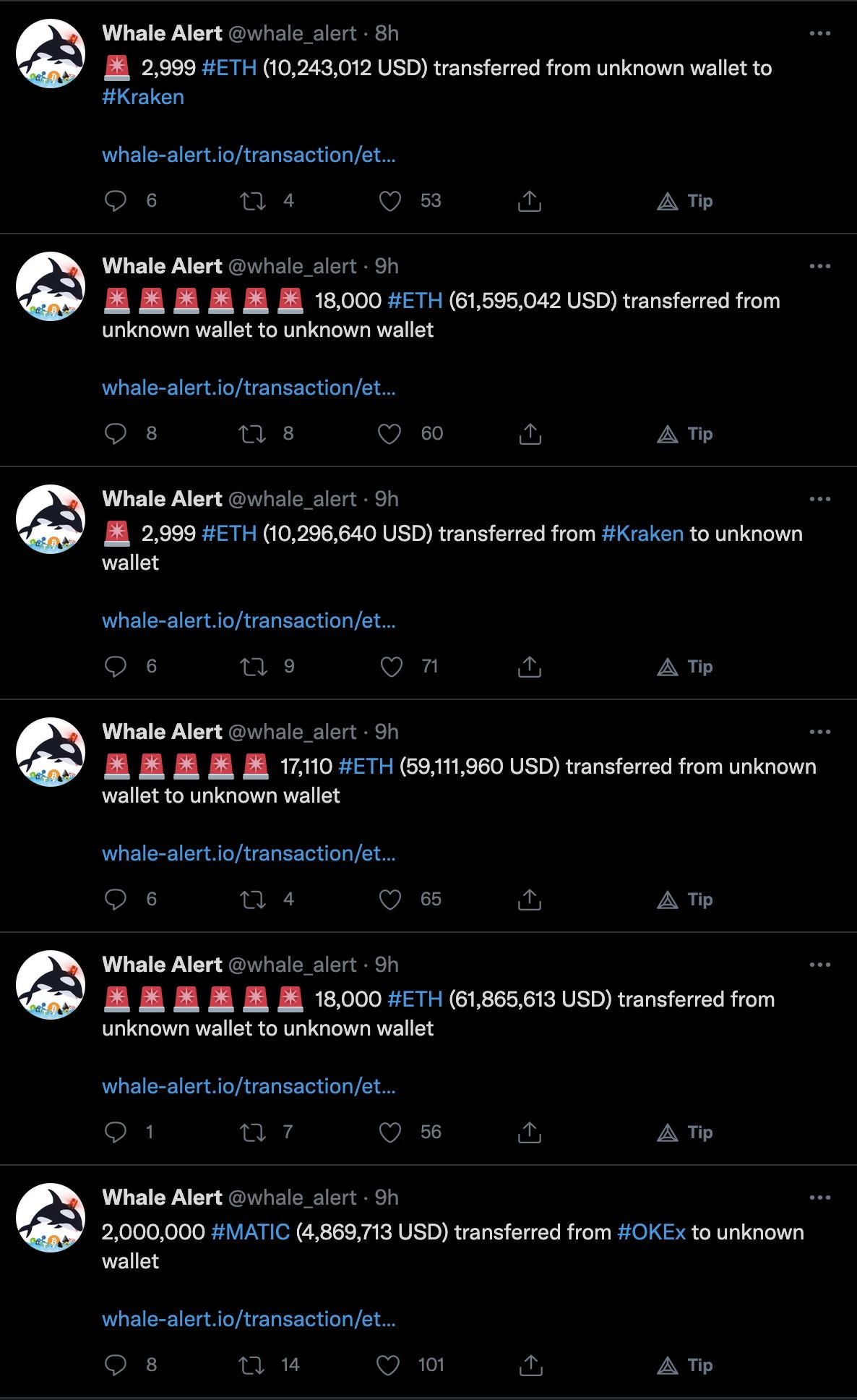
Whenever you get asked if crypto is just nonsense, just send this to whoever is spewing hater-aide. Ask them when was the last time you saw Western Union move money that fast?
It’s also a great way to see what chains are active, which chain is being used to send or receive crypto, and even what exchanges are lighting up when volatility is heightened.
To me, I love the guy who made this. It’s awesome. Much thanks go out to him.
But for anybody using it to generate an actionable trade…
You’re trying to find a needle in the haystack. Consider this your user friendly version of block explorers. It brings these transactions into one place. Like an aggregator.
Now, to make it actionable, you need to create insights to it. Separate the noise from the signal. Create the intelligence side of things.
That’s where we come in.
Our team looks to turn this data into consistent alpha. Meaning if a signal comes in ten times, we expect the signal to generate a return based upon a specific risk management strategy a certain percentage of the time.
If that signal falls below our threshold, it’s no longer actionable and becomes noise.
And to us, there are various entities in crypto that we view as market movers. These are the ones that create momentum for price. When they start moving, the market shifts in their direction.
For our team, that’s how we generate consistent alpha.
Blame it on Elon, call it a black swam, call it institutions trying to run a carry trade on CME, it doesn’t matter. At the end of the day money needs to be moved to conduct a trade.
On-chain is your lens to see where and when money is flowing.
And that’s the end of my TED talk.
The daily beat at Espresso is delivering insights for crypto traders using on-chain data. And in doing so, help you gain a better understanding of the current structure of the market.
The above rant was a simple reminder on why we look at the data we do.
At the end of the day we need to generate consistent alpha month after month… Otherwise we cease to exist.
The best way we’ve found to do this is by depending on a box of tools. And just like most handy men, they have a handful of tools they use more than the rest.
A tool we like to use to decipher market structure is exchange flows. Once we start to see exchange flows ‘flip’ from positive to negative or vice-versa then the structure is said to be changing.
Right now, we just witnessed a small inkling of negative flows.
This means the amount of bitcoin entering is less than the amount coming out, indicating selling pressure is less than the day before.
It’s our first little pulse to pay attention to.
What’s more, the amount of liquidity built up around $42k is growing. Here is a liquidity map. It helps visualize the amount of capital that can get wiped out at various levels. The bigger the bubble, the more capital. The greater the amount of bubbles, the more capital.
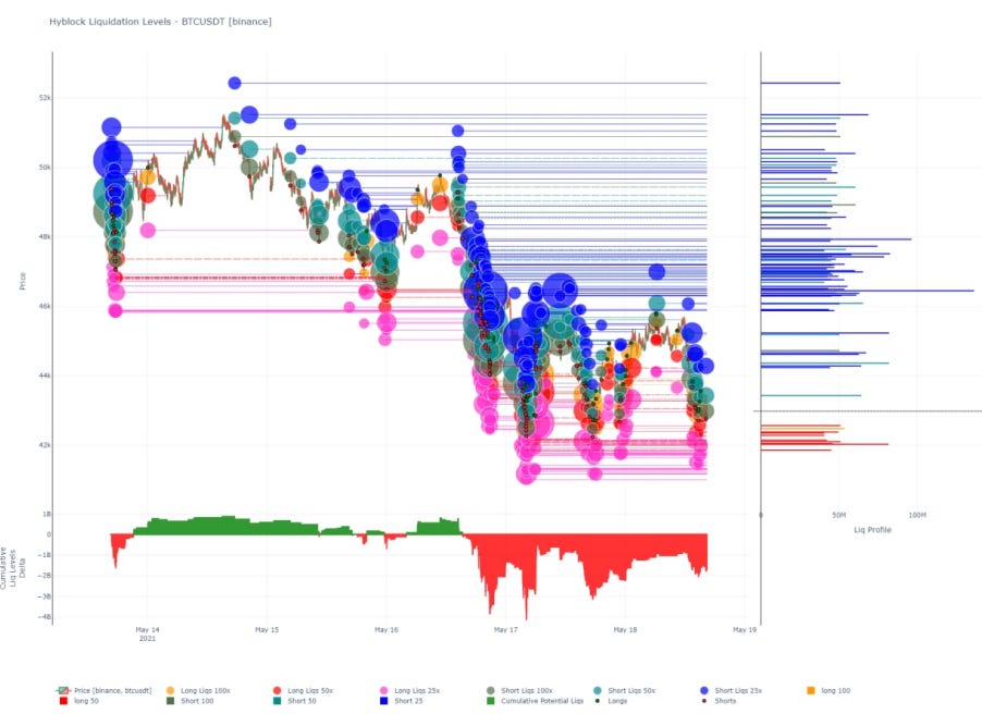
The interesting insight in the chart is seen in the bubbles underneath the buried price line… The pink bubbles. They represent 25x leveraged longs.
Red is 50x longs, which hardly exists. And yellowish orange is 100x longs, which is virtually non-existent.
This is compared to the bubbles above the price line that are showing not only a large amount of 25x shorts, but also 50x and even 100x.
This tells me we are nearing capitulation to the downside. Or in the traders entering long positions.
Capitulation is the point at which traders trying to enter longs begin throwing in the towel.
And based upon how far price has fallen and for how long, another flush lower just might cause it.
If we get a flush and see the netflows print another negative reading tomorrow this would be one of the first positive developments we see outside of more USDT being printed.
Stay tuned. No need to rush into anything here… Unless you enjoy flying down mountainsides in a squirrel suit.
Your Pulse on Crypto,
Ben Lilly


