Standing At Low Tide
Market Update: 18 Jan 2024


I have to imagine Gary “shades” Gensler is now weeks to months away from capitulation.
He had a good run… One that peaked back on April Fools day of 2023 - the day he changed his Twitter profile picture to him wearing digital shades.
But just like crypto’s selloff exposed the dumpster fire of FTX and SBF…
I have to imagine the descent from the peak of Gary’s power tripping days will soon make way for Gary standing like a prune at low tide.
And while it won’t be pretty, at least investors will be protected.
I bring this up because of the courtroom battle between the SEC and Coinbase. The judge overhearing the case sounds like they are moments away from asking Gary to apologize to Brian Armstrong’s family for causing such turmoil.
It’s incredible, especially when you realize the courtroom dialogue paired up with Tradfi interns tossing out narratives into our X/Twitter timelines like they are crypto degens.
What a sight.
And it’s one that we should hold on to as we go through today’s Espresso. I’ll be painting some bearish tones here, but don’t fret. This is all near term analysis. What I mentioned regarding Gary capitulation, that impacts price discovery later on.
Meaning once Bitcoin, Ethereum, and the rest of crypto decides to go into price discovery mode, there will be less gravity holding it back.
If anything, consider this a nice time to prepare for the next leg higher.
Dollar Update
This week I had the opportunity to join the xChanging Good live stream with our very own JJ.
If you missed it, have a listen here. For those that tuned in, you’ll know we painted a picture that hinted at some headwinds. Particularly with the U.S. dollar and the U.S. Federal Reserve.
Earlier this month the U.S. dollar index as measured by the DXY began to show hints at reversing. As it generated some momentum, it started to set its sights on some longer term moving averages. You can see that below.
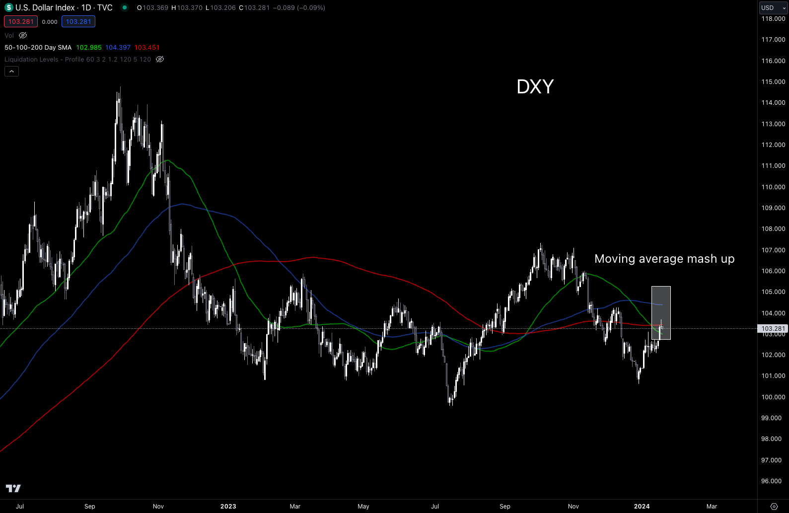
This type of move tends to result in the U.S. dollar’s strength being felt in other markets. It’s the type of thing we like to keep an eye on at Jlabs Digital.
Our model on DXY risk also gave us a warning sign. You can see that below with Bitcoin’s price line changing from green to gray during its last run up. It even flashed yellow for a day, likely a bit hard to see so I drew a black line there to point it out.
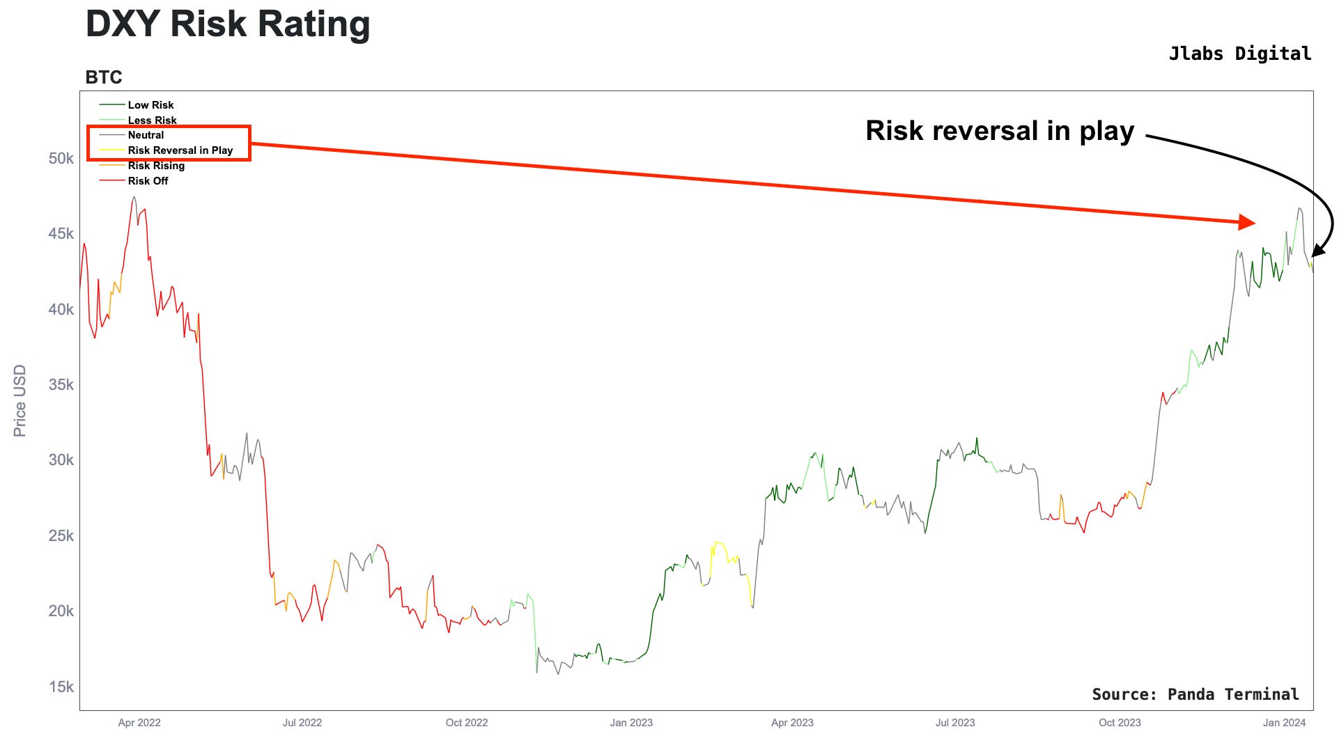
These conditions act like a headwind to crypto. It doesn’t mean Bitcoin and crypto as a group cannot overcome it… It just means it needs strong momentum behind it to do so.
To see if it can, we can check out some fundamentals and then technicals to wrap up our market update.
Crypto Update
At the lab, we’ve been applying an internal token framework to price charts in order to see if theory can be applied in practice. It’s been a great project as the framework was made well over a year ago.
It’s been made possible with the incredible work by our group to build a new onchain/offchain infrastructure. Some of this recent work will become part of our upcoming suite of Token Ratings that will also act as the foundation for our formal research reports. You will start to get a glimpse of some of the models we built for our first batch of tokens: Bitcoin, Ethereum, Solana, EVM L1s, and ERC-20s.
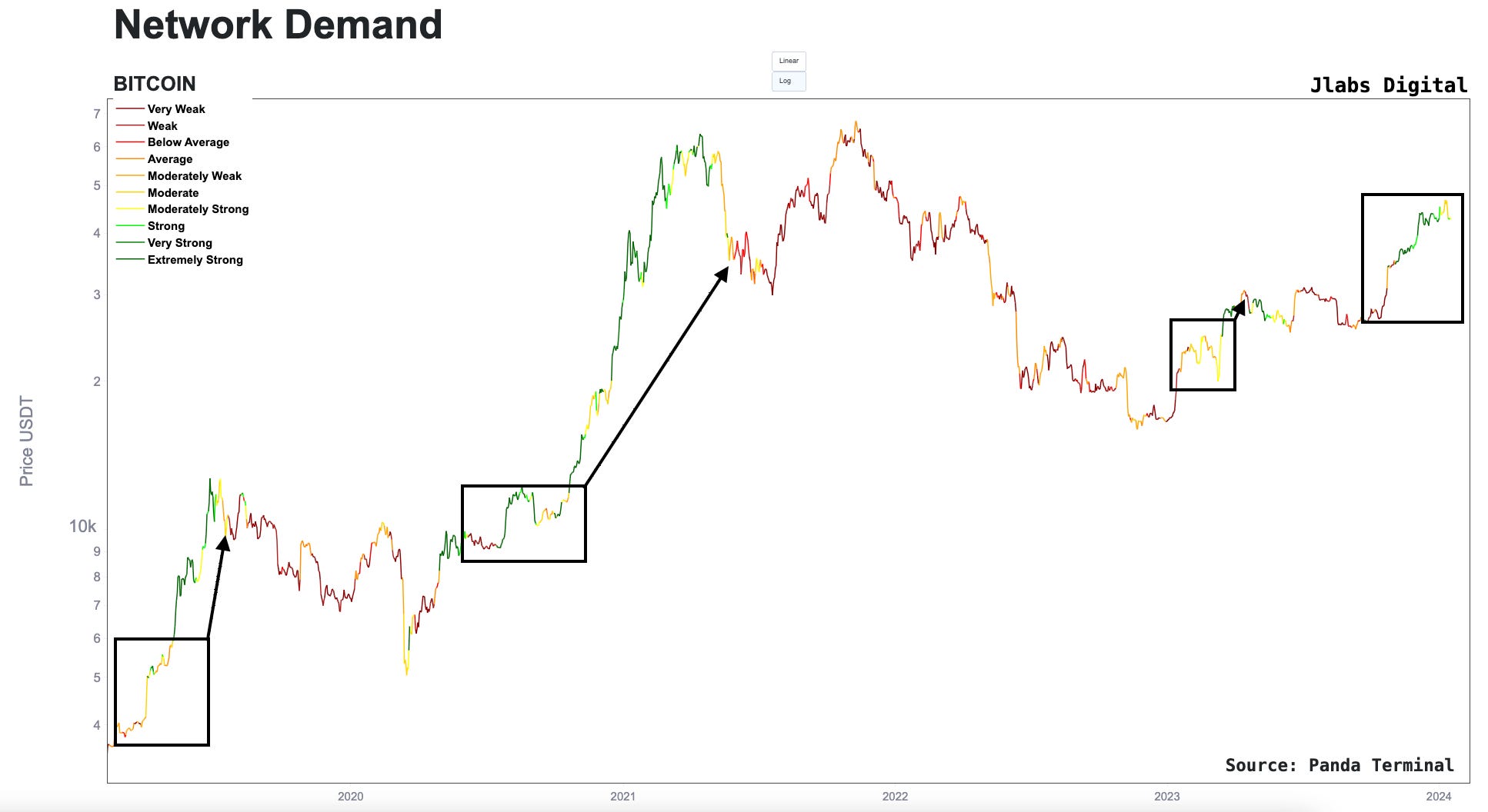
The first one we will bring out is based on demand of the Bitcoin network. Focusing on just demand gives us a nice glimpse into price momentum. That’s because if price is being driven with good fundamentals behind it, we should expect it to have some long legs.
To showcase this some more, in the chart below I boxed severals periods in the last few years where network demand went from weak to strong, then pointed out when it went back to weak. It’s a similar period we see ourselves in now - just without the return to weak.
Many of these timeframes acted like consolidation and or healthy bull corrections. This is a positive long-term structure to Bitcoin, and any return to strong in the coming weeks would tell us any move higher has momentum behind it.
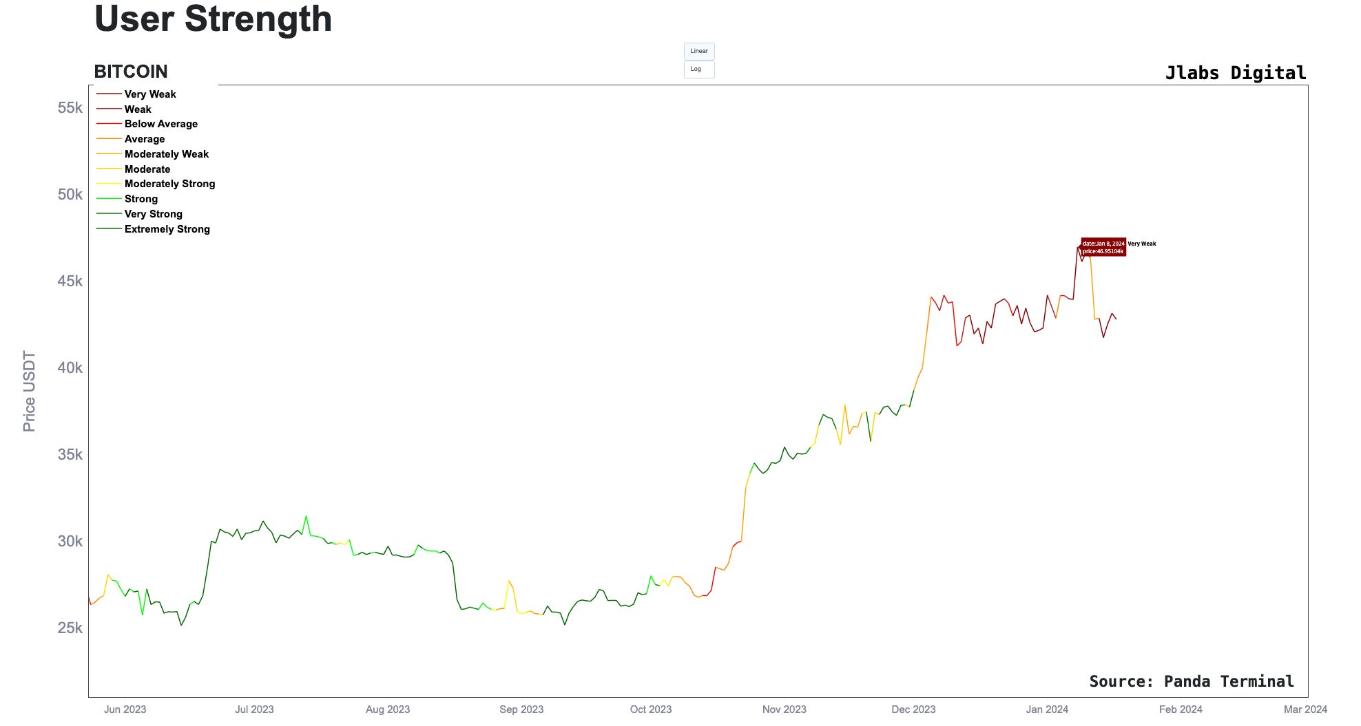
Another fundamental we can look at today is based on a network’s user activity. This tends to be a good early indicator.
We want to see slow changes back and forth between the various colors. This gives us greater confidence in the model that momentum will be present.
The current reading turned negative at the end of 2023, and into the Bitcoin ETF approval. This means higher upsides in the near term will be more difficult to achieve.
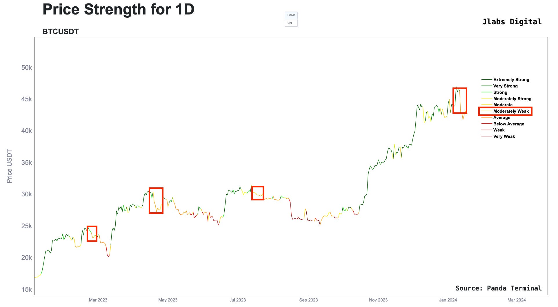
Then when we move to one of our models for non-onchain activity, we see price is losing strength. I went ahead and boxed similar periods as we have now.
This is further indication that Bitcoin is experiencing a bit of a headwind when it comes to its onchain and technical readouts.
With all that ugliness out of the way, we need to ask ourselves what to expect in the coming days to weeks. For that, we can lean on liquidation pools. These pools help us see where liquidity is likely to sit in the market.
And since price tends to be attracted to liquidity, they become areas of interest for us to monitor for potential trades.
Here’s what the latest readout looks like. We can see there is a cluster forming to the upside around $44k and a cluster at $41k.
I maintain that the market needs a bit of a scare with price dipping below $40k. This is more about how the options market is behaving, which was a conversation JJ and I had in the livestream. The expected amount of volatility seems way too low. A dip below $40k would heighten fear and help generate more liquidity in the market.
And if we are to expect markets to be a bit quieter until the halving, then liquidity engineering will be at its finest. This quietness will be a subject we can dive into in a later essay.
For now, that’s it out of me. For those that want to know more about the Pendle tweet, I expanded on the thought within the P.S. below. Otherwise, chat more soon…
Your Pulse on Crypto,
Ben Lilly
P.S. - The Ethereum market is beginning to expect stETH yields to rise. We track the stETH yield curve using Pendle Finance data. You can see it below.
The blue and green lines are the market showing an expectation that yields will rise. That’s why they are above the red line, which is the current yield of stETH.
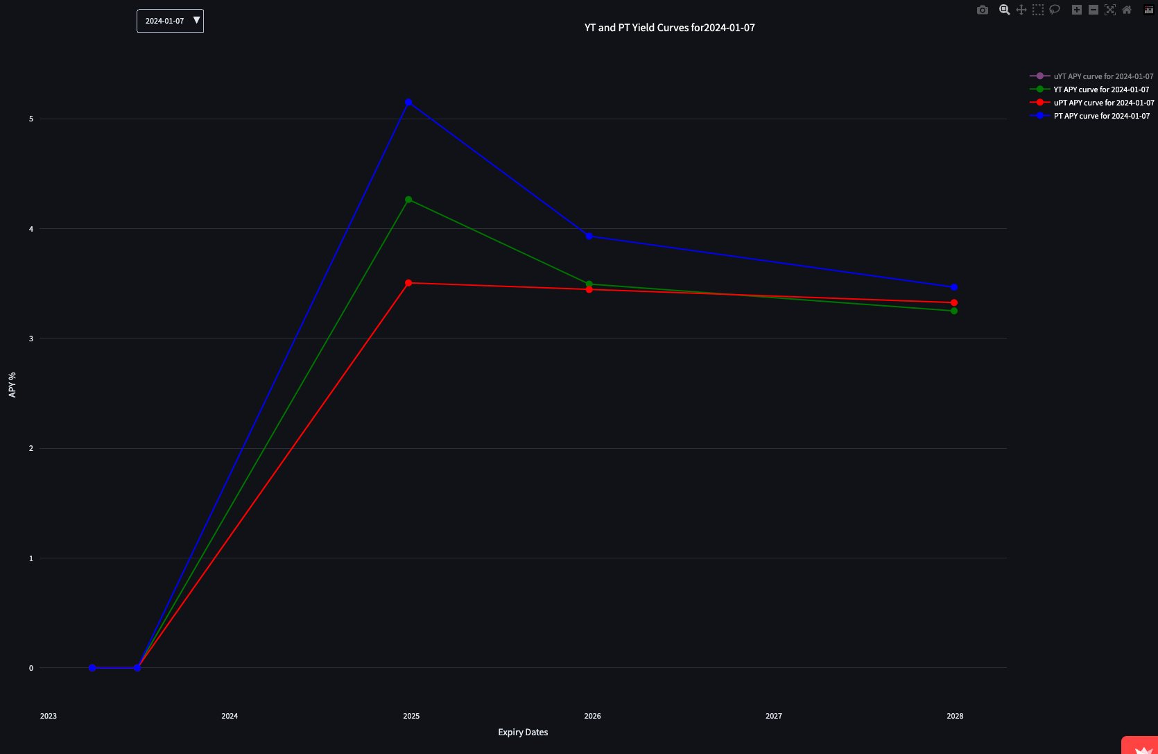
This movement is creating a bit of an opportunity on Pendle Finance. To better understand what I’m referring to, the chart above quickly drops back down in yield for Dec 2025.
This difference in expectation can be seen better if we look at what the market is pricing its YT token at below. The dark blue line below is Dec 2024 while the pink is Dec 2025. This difference shouldn’t be so wide.
In fact, the Dec 2025 YT token technically has more upside on its price due to the benefit of more time until expiration. Meaning as the bull market starts to run, this token has more room to run higher than a YT token with less time before expiration.
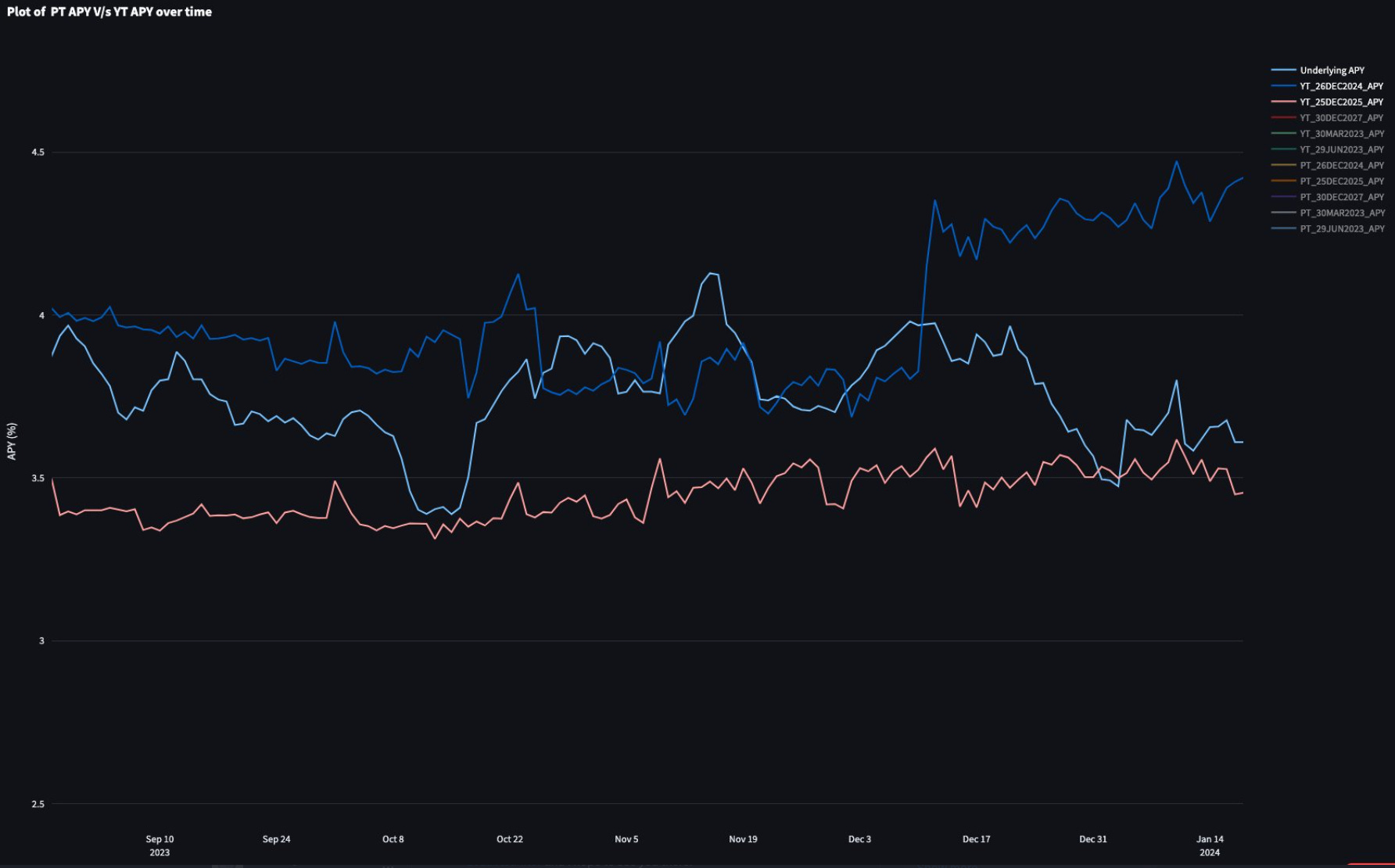
For those that don’t understand Pendle very well, the elaborate and overly gas consuming move is to deposit stETH into the protocol… This creates PT and YT tokens. The Dec 2024 YT tokens are at a premium, so moving the proceeds into Dec 2025 YT tokens would give you a Dec 2024 PT token and Dec 2025 YT token. When the market responds to a bull market, the Dec 2025 YT token will be a good sell while Dec 2024 PT tokens can be held until maturity where it’ll equal 1 stETh token.
The simpler and more gas efficient move is to simply get Dec 2025 YT tokens while keeping an eye on slippage / liquidity.
It’s a tough market to understand, but it’s one of my favorite to monitor. I hope one day soon they enable cross-margin leverage to buy one contract while selling another in order to express a trade better. Until then, only these longer term trades are possible.