It's July 2017
We have five more months

The previous bull market lives on as a vivid and simultaneously distant memory.
Looking back on it is can be nostalgic. But more importantly, it provides us with a helpful roadmap that can be used in navigating the current cycle.
Now, bull markets in bitcoin tend to ebb and flow around its halvings. These are events written in code that take place every four years. The event itself is a reduction in the rate at which new bitcoin are minted.
The most recent one was in May 2020, and we’re seeing the effects of this reduction in new supply first hand.
The time before the most recent halving was in July 2016. The month is something to note as it falls two months later in its respective year. And the bull market in this epoch persisted until about December 2017.
When we compare the on-chain data of this halving epoch with the previous one, we can get a gauge on how far along we might be in the bull phase.
If you missed yesterday’s Espresso it’s recommended you give it a read. It’s based upon on-chain data that looks at how long-term holders (HODLers or the smart money) act when price rises. The takeaway was when bitcoin is likely to be topping out. You can read it here. I’m going to piggyback on some of that discussion in today’s issue.
Jumping right into it…
Here’s a chart of the last bull market:
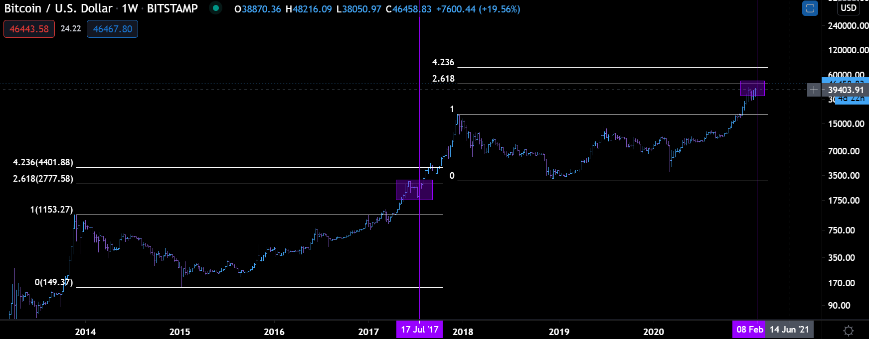
The horizontal white lines are Fibonacci extensions. It’s a way to look at the price action in terms of technicals. Looking at these lines a little closer we can see the price action near the 2.618 extension in both bull cycles look relatively similar.
Based on these similarities if we were in the previous bull market the date would be some point in July 2017.
The comparison is in the purple vertical lines.
Switching gears a bit and looking at the HODL wave chart from yesterday, in particular the 1yr+ HODL chart…
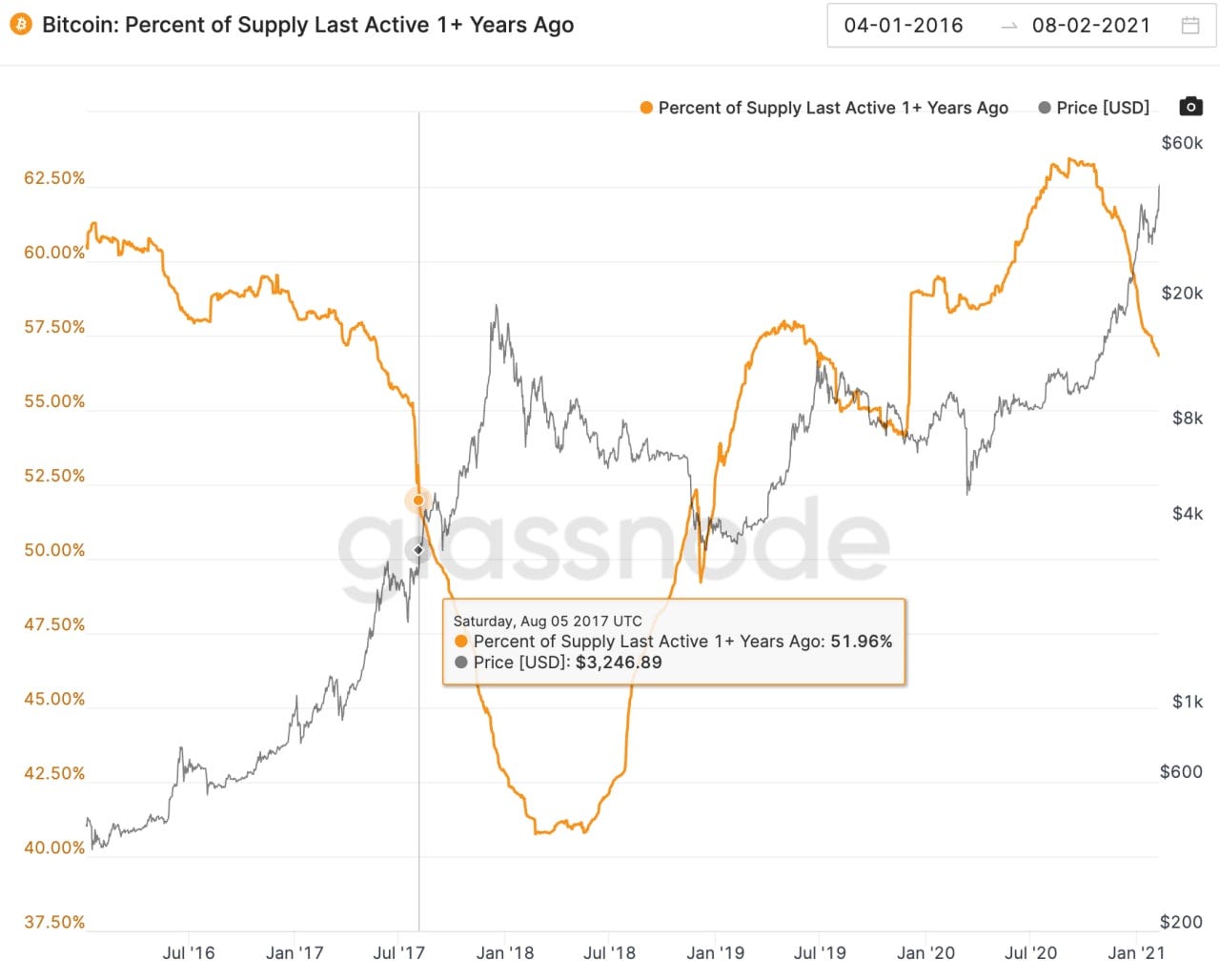
The vertical line in July/August 2017 is where I think we are currently.
Currently, the percent of supply that was last active one year or more is just a hair below 57%. It’s my belief the equivalent from the last cycle is around 52% or 53%. That’s because the yellow line topped out a bit higher in this cycle. Meaning the upcoming low won’t be as low… it’s why the percentages vary between the comparison.
Recall, from yesterday’s Espresso that the fact the 1yr+ HODL stat is decreasing indicates we are in a bull cycle. And from yesterday the top in bitcoin’s price might happen near the 47-48% mark. This seems to act as a tipping point of sorts where the smart money is being replaced by the newer buyers.
That moment is still a ways off based on the data.
If we run with this assumption then we see the technicals and the on-chain data are placing us in late July 2017 if we were placing ourselves in the last bull cycle.
This gives us approximately five months until the end.
It’s February 10. Based upon this you have until about early August to make your money.
Get to it.
Your pulse on crypto,
B
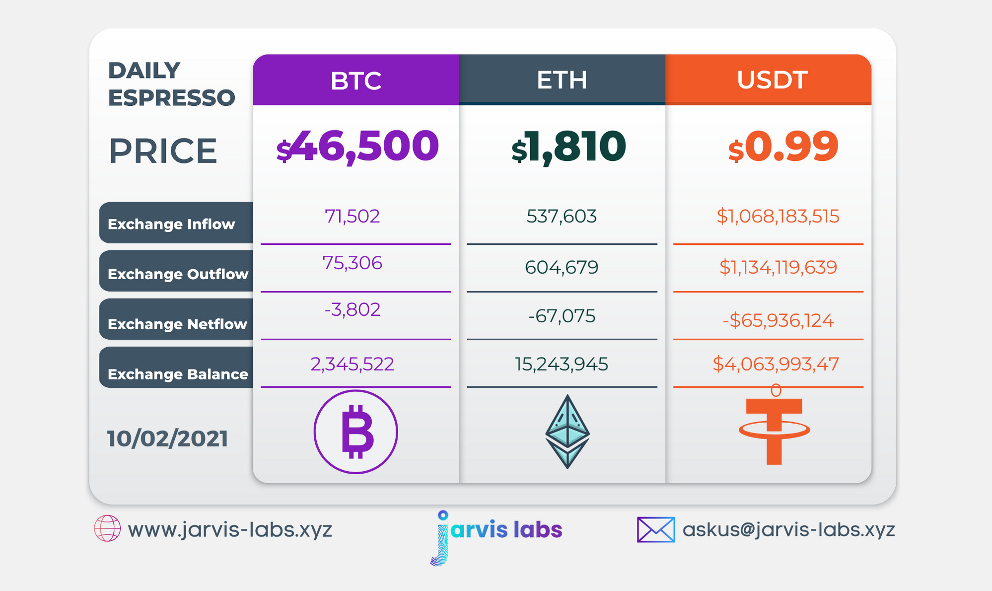
Below is our daily exchange flow data. This is a great gauge for understanding if BTC, ETH and USDT are flowing into exchange or leaving. If BTC and ETH are entering exchanges it can generally be viewed as bearish. The opposite scenario is bullish.
When USDT is flowing into exchanges it’s typically viewed as bullish. The opposite scenario is bearish.
This should only be used as a general gauge. Tagging the exact wallets these flows move into or out of helps improve the reliability of this data, which is what we do at Jarvis Labs. To date we have over 800 market mover wallets and 16 million wallets tagged all together. Consider us your on-chain trackers.