Insensitive Ethereum
There's a reason why ETH's price move will be one for the record books, and it's not for the reason you think.


Each time I see the chart, I'm quickly reminded that our industry is going to get really good at building value for a token.
The chart I'm referring to conceptualizes why prices change with intensity... Or move like a sloth.
It stems from the arm chair study of common sense - economics.
The chart itself, when it make its way into an essay or journal... it ignores the way markets work. Which is one of the points I'd like to rip in two today.
Reason being it'll help us understand why ETH is going ballistic - the main point of today's write up.
To explain, let's first dive into Bitcoin. It has a hard coded max supply of 21 million BTC.
At first blush in economics, this means supply is inelastic. Which is to say when the market demands more of the asset, supply is still 21 million (yes, we're not quite at 21 million, but let's not get too technical here)...
Inelastic supply is fascinating because when demand surfaces, we see market shocks that cause prices to go ballistic. We could look at oil prices in 1973, 1979, and 1990 as an example. And even COVID-19. But those are more supply shock events, not demand running into inelastic supply.
Now, running with this 21 million supply cap logic, economics 101 would teach us to create a supply and demand chart that looks like this.
Price is on the y-axis, quantity of coins on the x-axis. Then where the supply and demand curves meet gives what midcurvers (aka economists) would say is the market price.
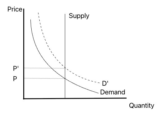
And when demand rises from "Demand" to D', price rises by a similar amount. From a high level, the chart showcases this market shock dynamic.
The truth is, this line of thinking is pervasive in crypto. And I don't like it because it limits our understanding on what makes an asset more valuable... Or have more moneyness... than other assets.
But to truly belabor the point, let's dig up two examples.
Dan Morehead from Pantera diagramed Bitcoin's halving several years ago by layering in the idea that an uptick in demand via PayPal increasing accessibility of investors buying Bitcoin will create a major price swing higher.
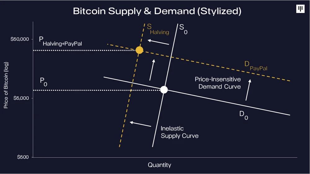
He tilts the supply curve ever so slightly to the right since increasing demand can cause more chain activity. Which causes the average time to mine Bitcoin to shrink. This technically creates more supply than normal until the algorithm resets the block difficulty to get closer to 10 minute intervals.
And while I'll butcher this later, I still like that nuance.
Morehead also goes on to say holders are price insensitive because they are more cult-like. That's an important behavioral caveat I'll bring up later.
Nonetheless, his chart is a small improvement over the first one I showed.
Then we also have this chart. Its made its way to some more academic takes on the Bitcoin market. It shows a similar vertical supply line in black, which shifts over time as more Bitcoin enter the market.
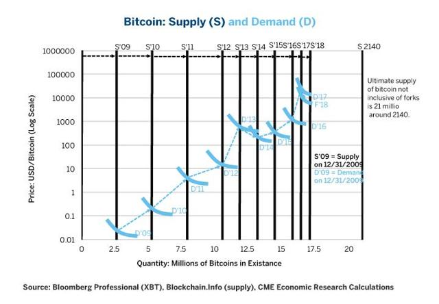
I like this little effect because the author is showing how supply shifts over time.
But still suffers from reality... All the charts neglect how markets actually work.
To understand why, let's bring up a chart that is an oldie, but a goodie.
The HODLer Behavior
A supply curve in economics measures the relationship between the price of a good or service and the quantity that producers are willing to supply at that price.
That's the textbook definition. Apologies on the dryness there...
But let's adjust the definition slightly so we can apply it to markets better:
A supply curve in economics measures the relationship between the price of a good or service and the quantity that HOLDERS are willing to supply at that price.
Go ahead and substitute traders, investors, or whatever strikes your fancy. Point being, somebody who holds the asset can introduce more supply to the market. Not just new blocks.
This means when it comes to supply, we want to measure how sensitive a holder or trader is to a change in price or demand.
A classic way to look at this for Bitcoin is the HODL wave chart (insert warm nostalgic feeling here for my all time favorite chart). It was made by Dhruv Bransal from Unchained Capital.
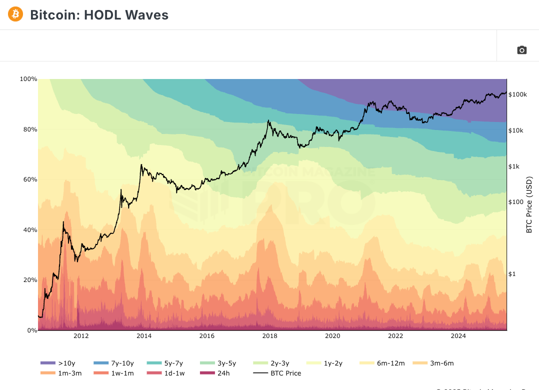
Each color represents how long Bitcoin has been held. Its a visual on how sensitive the holders are to a change in price.
If we zoom in on Bitcoin that hasn't move in 5+ years, we can see this cohort is truly insensitive to price. The group represents more than 40% of all Bitcoin. Pretty remarkable.
When we dive into the cohort between 3-5 years (light green above), we see a sliver of sensitivity in 2017. But not much afterwards.
Now, when we hone in on the 1yr to 3 yr cohort, we see something emerge.
We see when price rises, the percentage that this group holds in terms of BTC drops by 15-20%.
This tells us that from a behavior sense, more supply becomes available when prices begin to rise. That goes against the inelastic mental model from earlier...
See where I'm going here?
If we hone in on the cohort of supply being held for less than 1yr, things really start to get fun. That's because we start to see the 15-20% change in holdings show up in newer holders.
This means the uptick in demand in the market (aka rise in price), resulted in supply becoming available in the market.
Armed with this set of information, we can start to tweak our chart from earlier to better reflect market behavior.
We know there will always be a group of holders that will never sell. So while 21 million is the total amount in supply, there will never be 21 million available in the market.
I can sense the Bitcoin enthusiasts perking up in their chairs here... But don't worry, I'll let you down soon enough.
So we know more supply becomes available as prices rise. Which is to say the curve starts to bend outwards similar to S* in the chart below.
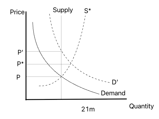
It's why prices don't rise as much as many analysts tend to forecast.
But what's more here, the spot market is not the only exposure to the asset.
We have BTC CME Futures, Microstrategy, new digital asset treasuries (DATs), options, perpetual futures, and other forms of exposure that spring up as demand starts to push higher.
This means for investors or traders wanting to gain exposure to Bitcoin, the market provides more than 21 million units of supply.
Applying this mental framework to our rudimentary chart, the S* line is still not representing actual market dynamics. That's because as price rises, the available supply for those wanting exposure widens well past 21 million.
The market is pretty incredible in this regard. It finds substitutes even when there doesn't seem to be substitutes available in the market. Financial ingenuity at its finest.
If the underlying thesis on holding an asset like Bitcoin is to hedge against the erosion of the dollar or to capture speculative upside, that isn't unique to holding the actual currency itself. There are substitutes available for that demand, and that's often what many tend to neglect these other forms of exposure when modeling out price movements.
So while the uptick in DATs (Digital Asset Treasuries) will push demand up, the proliferation of DATs will simultaneously limit the effect on price.
It's a catch-22 that we don't have a say on.
This dynamic is in part why I think the emergence of DATs will be short-term good for price. But longer term, I think their presence will limit the upside of Bitcoin, Ether, and others.
Removing the wet blanket for a moment, and getting back to the takeaway for today, it's important to understand from a first principle perspective how market dynamics change the supply curve.
It's why assets like Bitcoin and ETH don't have inelastic supplies as is often believed.
But... And here's the good news... if we can intuitively understand WHEN the supply curve is shifting one way or the other, then we can better grasp the magnitude of price changes.
That's market opportunity.
Which leads me to what just took place with ETH.
The Shift
Now, in the last Espresso Will Price Stay Above $100k, I was short-term bearish when price began to sag at $108k. In the essay I noted a bounce was at play as price traded at $105k due to the shift in bids.
To highlight my wrongness, here's what I wrote:
I'm expecting to see bids come in at $102.5k. At that level, traders are left out in the cold wishing for that 200-day moving average and support line retest. Those wanting that 200-day retest and support line to get hit represent capital that's willing to re-enter the market.
And what better way to pull them in by stirring up some FOMO.
After all, funding rates are already pretty low. This chart uses the price of Bitcoin and paints dots on it to represent what percent of assets have a funding rate below 0%.
We are getting quite a few readings in the 60%+ region, which isn't that common.
Well, price never tested $102.5k. Instead it hit that first checkpoint and ran like Do Kwon from the police.
FOMO did kick in, and the bears were left out in the cold.
The reason for why price ran with such velocity is due to what I teased out here:
...there's quite a bit of strong developments happening on the supply side for Bitcoin and Ethereum. There are some undercurrents at play that suggest the market has plenty of fuel to give a rally higher plenty of boost.
But we can spill more ink on that if and when conditions present themselves.
To best way explain what I'm referring to is by bringing up the way our team views how that supply curve from earlier can shift in real time.
Drum roll into the main point of today's Espresso....
We built what's called the Moneyness Ratio.
Before discussing it, here's a quick thought experiment.
If you're earning 5% yield on your asset, are you willing to sell if price rises 20%? How about 50%?
What if we change that yield to 1%.
Depending on how we change the yield and price change, you'll see that we're getting into some behavior analysis. It's similar in a way to the HODL Wave chart from earlier where we could see certain cohorts were not willing to sell on major price moves.
But to sum up this concept of Moneyness Ratio simply, as the percent of tokens being used for productive (aka yield) purposes rises, the less likely fresh supply will enter the market.
In an even simpler sense... As more tokens get squirreled away onchain, the more inelastic supply becomes.
Moneyness Ratio is a proxy for measuring that elasticity and its done by tracking how much of an asset is being held for productive purposes.
If there are not many tokens being held to earn staking yield, yield from lending, or yield from LPing on a DEX, then the token doesn't have productive properties. Meaning the holders at large are more likely to sell given a price change.
If the token's supply at large is being used for staking and other forms of yield, then the holder is less likely to sell given a price change.
Higher ratio, more inelastic. Lower ratio, more elastic or supply willing to show up to the market (aka those married bags collecting dust in your wallet).
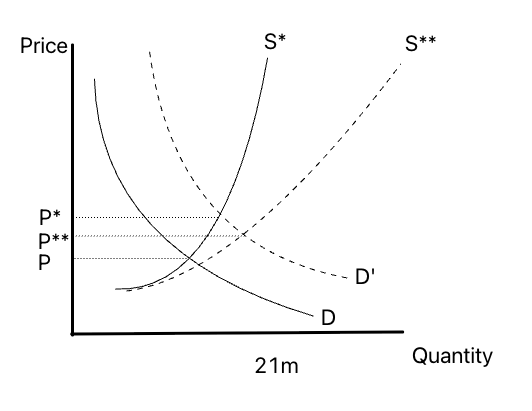
Let's use an actual example to really strengthen this concept at a high level. It'll help get into the major undercurrent at play I alluded to last Espresso, and closer to explaining why ETH is running higher at such a fast clip.
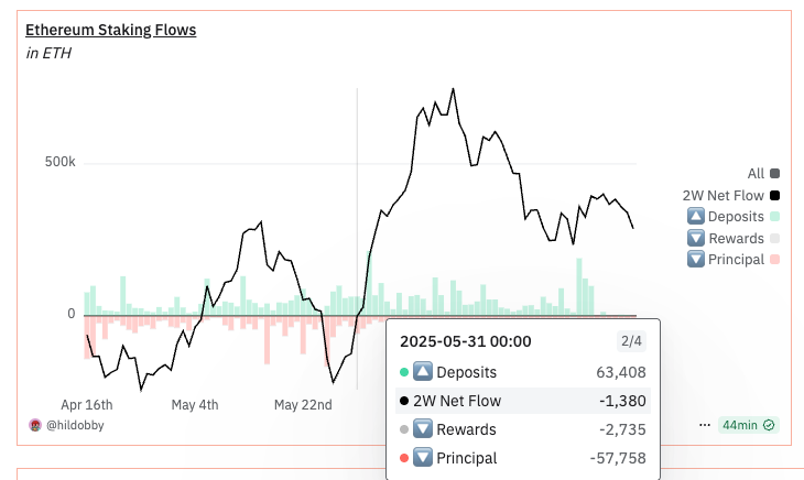
On May 31, the two week flow of ETH into staking turned positive. It has yet to turn negative since. In fact, since this date, there's been an increase of 1.5 million ETH staked to the network.
When an ETH holder stakes their asset, its typically not for a short period of time. That means from a behavior context, that supply is less liquid in the market.
In turn, this creates a change to the shape of that supply curve we hit on before. From a high level, this is how that shift would look.
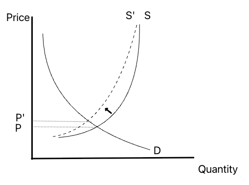
Price doesn't really change a whole lot. But we can see that if demand were to shift, the rate of price change really ramps up since that curve doesn't bow out to the right as much.
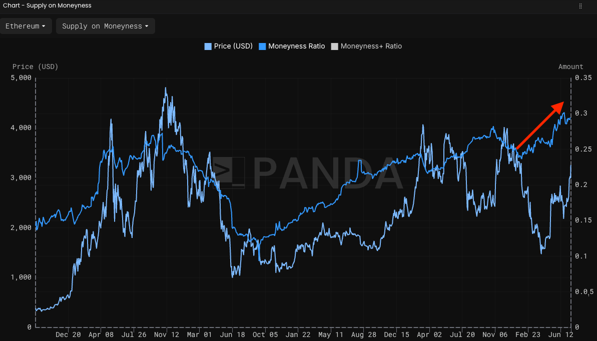
This is what I've been touching on for the last several months to anybody reading our public telgram. I shared a post I made using PANDA Terminal that hit on the fact that supply was undergoing a major shift. You can read it here. I'll pull a quote for some humble self shilling:
Moneyness is a metric that tells us whether supply of an asset is looking better or worse.
We can often think of this like supply shocks. When tokens go into productive use cases such as staking or lending, this reduces the available supply in the market. This acts as tailwinds if demand shows up.
Given the market movements recently where ETH rose over 40% in May, there should be questions on whether supply conditions unwound. Turns out the opposite.
Moneyness is starting to rise sharply...
Now, near the end of that write up, I mentioned demand for ETH still hadn't shown up. Gas fees were 6 feet underground, and the hike in gas limits only made the situation worse.
Well, something else filled that void.
DATs A Lot
Enter stage right: Digital Asset Treasuries (DATs). They have completely changed that dynamic. DATs have unleashed a major demand push on ETH (h/t Joe Lubin and Tom Lee).
DATs represent a new market participant entering the picture. Its the PayPal addition that Morehead hit on in the chart near the top. Only this time it's demand in the $100s of millions.
To put this in perspective, Ethereum sees about 130 billion units of gas used up per day. Each unit of gas costs about 5 gwei. So my back of the envelope math means we're looking at 650 billion gwei per day or 650 ETH. Which is like $2 million worth of network demand at today's prices.
For network demand to be significant, it needs to be about 3-4x the current amount. At $10 million per day, the network is heating up.
DATs are demanding $100s of millions worth of ETH. Do you see how massive the change in demand is that's happening right now?
To bring us back to orbit for a moment and get back to my tradingview created supply and demand chart... Here's what happens when we push that demand curve up on that new supply curve:
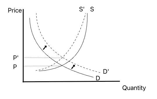
It's a much bigger move for market prices.
If supply hadn't changed before these DATs came in like rockstars, the push in demand would not have yielded as big of a result. Which means we're likely not near the end of this move.
That's because we've never seen the Moneyness Ratio this strong.
Now, the Moneyness Ratio is pretty detailed here. Reason being is that not all staked ETH are created equal. ETH natively deposited to the Beacon Chain is less liquid than its LST or LRT variety. So a LST like stETH doesn't get tracked here unless its locked up as collateral.
It also doesn't track DATs.
(We're considering adding a version that does because these entities from a behavioral sense are not likely to sell tomorrow. And their impact on the market is striking.)
So the point here is the recent move on ETH is not just a byproduct of DATs.
It's also a byproduct of its token's use case rising. More holders are using it for productive purposes.
Yes, ETH will run hot for while. The crypto market has literally never seen this type of dynamic play out - a combination of rising moneyness AND a massive demand shift... WITH low supply growth.
This will be a move for the history book.
But in a more heart warming take home message for you all...
Other tokens could learn from this and expand the utility their token provides. If holders shift how they hold their token from sitting in their wallet to more productive forms of usage, projects can shift their token's supply curves.
It's monetary policy in crypto form.
For now, let's continue to monitor this change in supply and let the current demand shift play out and spill over into the half a trillion dollars of assets sitting Ethereum's network. It's a good thing for everyone.
Higher from here. Bid on.
Your Pulse on Crypto,
Ben Lilly
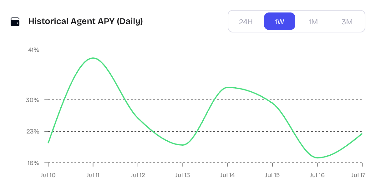
P.S. - I'm co-founder of deploy.finance where users are currently realizing more than 40% apy by deploying an agent that generates income from funding rates, in a fully self custodial manner.
Here's just the last week...
Getting started only takes a few clicks to deploy the agent. You won't want to miss out being ready to take advantage of this income play when you're ready to lock in your profits to make money while you sleep. It's truly hands off, and is becoming a favorite tool for our community.
The team running Deploy.finance has been building autonomous systems like this since 2018, have seen $200m+ in assets on our systems at any one time, and do $3bn+ in volume each month on our systems to this day.
Give it a try and let us know what you think. Any questions, come ask us here. We're always in the chat room.