If BTC Goes Higher, It'll Run
A few charts to help you be in the know this weekend


It’s healthy.
Two steps forward, one step back.
The fact you’re further along than you were three steps ago, it’s progress. When you string a series of these three step patterns, it starts to look a lot like bitcoin’s price action over the last week.
In the past week we’ve witnessed four drawbacks of about 5%.
This is a good sign of healthy profit taking.
Watching price go vertically is only healthy when breaking all-time highs. It’s what we call price discovery. Nobody really knows what to expect.
But if price were to blast to the all-time high without some selling pressure, it’s concerning. You want a bit of selling as it creates the type of market where there’s a clear winner and a clear loser.
Meaning, once the sellers run out ammo they are left on the sidelines. And if price goes on a run, they are forced to consider another entry.
Some might call this a fight against dumb money and smart money.
In order to discern who’s on what side, we took a look at some wallets and found heavy accumulation taking place.
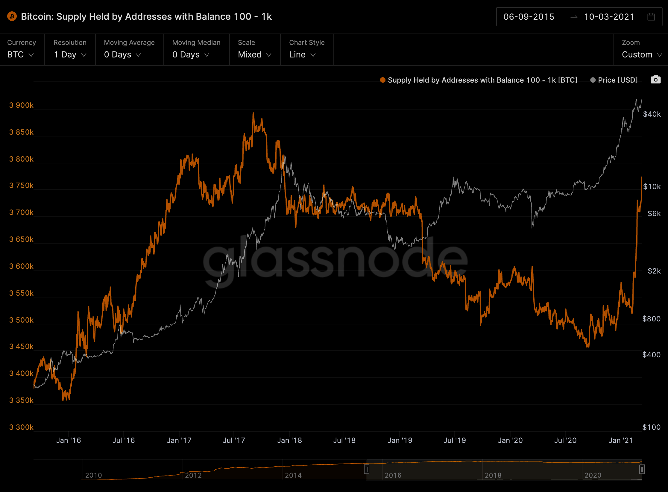
The most interesting chart was on wallet sizes holding 100 to 1,000 BTC. These wallets hold about 63k more BTC than they did on February 28th, which was the bottom of this current pattern.
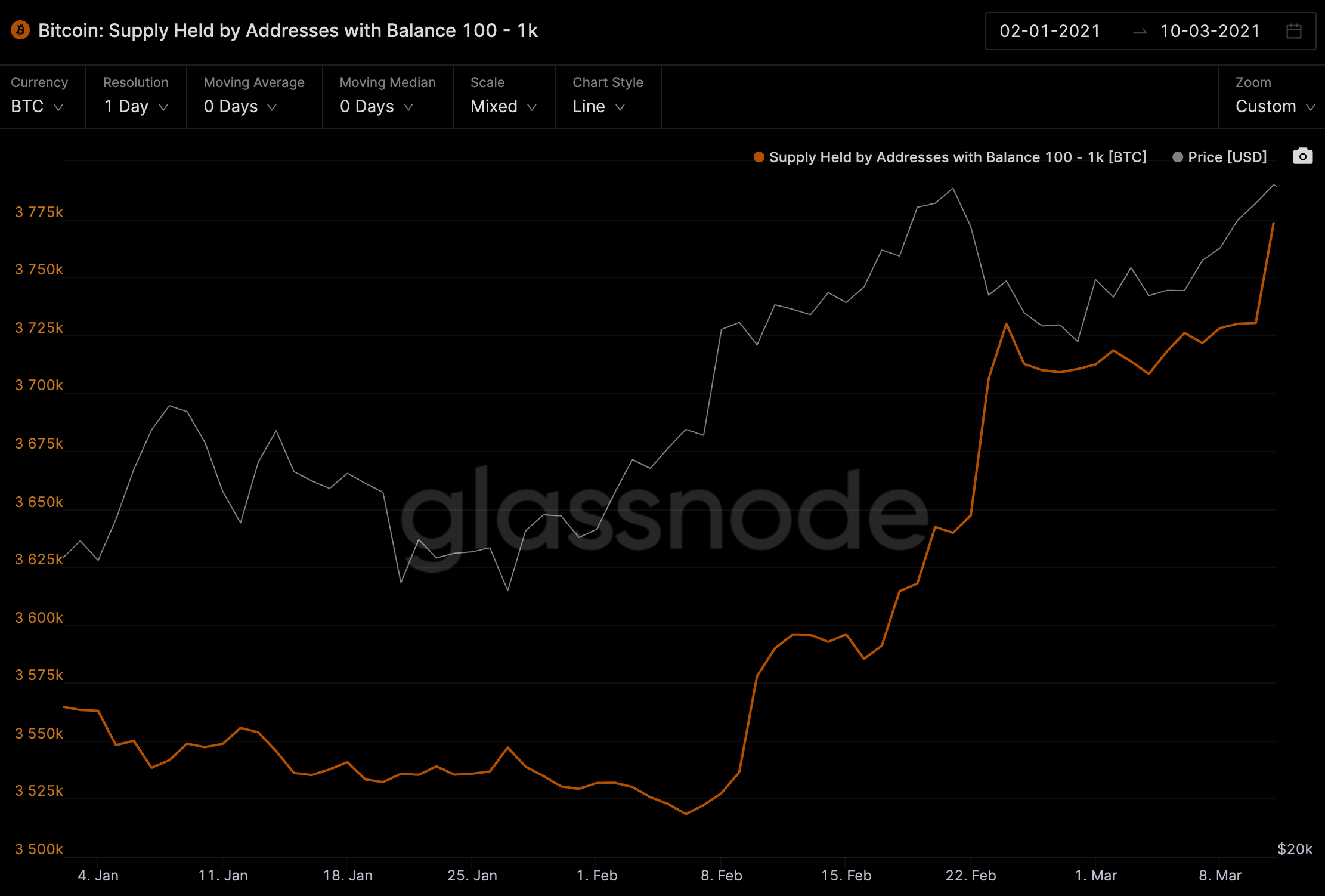
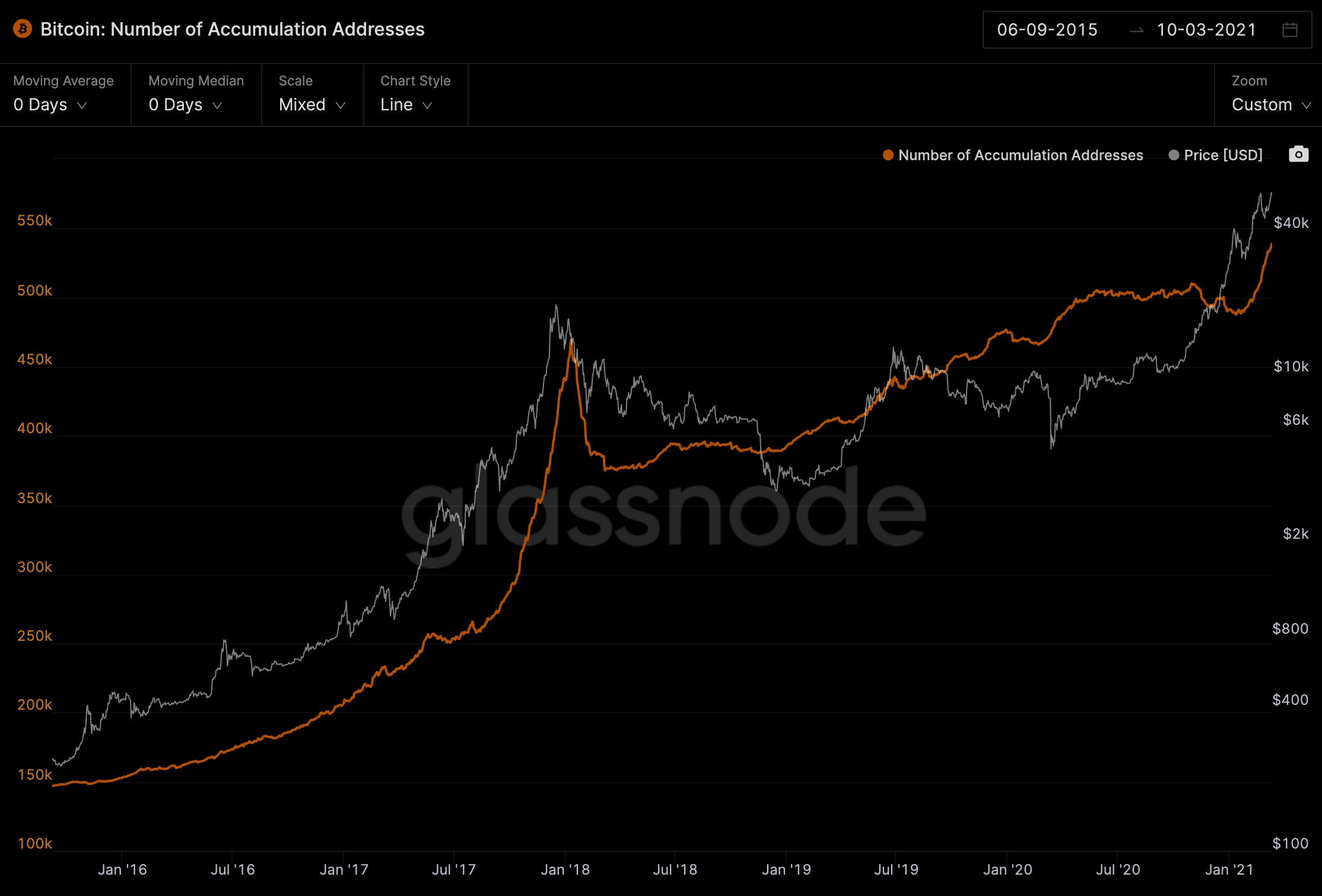
This is great since this class of wallets were the ones that timed the 2017 rally the best. You can see that in this chart below with the orange line (number of wallets in this category) accumulating until just prior to the peak.
This lines up with another on-chain statistic that tracks the number of wallets accumulating. These are wallets that have at seen at least two transactions going in (small amounts are omitted as well as exchange wallets and wallets over seven years old).
As you can see, heavy accumulation is taking place since we broke $20k. It hasn’t slowed down.
Last time we saw accumulation that was this aggressive was back in August 2017. The top of that market cycle wasn’t seen for another four months.
Now, this type of stuff is usually reserved for our Monday spot. So we will likely revisit this string of charts in a few days because they line up with our general view of the market.
We find the most useful piece of information right now is to keep a pulse on where we are in this bull cycle relative to prior cycles. Opposed to trying to guess what the price might be in four to six months.
Essentially we think it’s wiser to see what the price is when the data says we’re near. This way we don’t get too caught up in chest pounding headline grabs and get self conscious of being wrong… Because let’s face it, if I told you $700k was possible and it wasn’t close to happening, my tiny fragile ego might get bruised.
Also, our team was pretty excited to include these in this issue because you might be left wondering over the weekend if bitcoin has legs or not if it were to break its all-time high.
So in order to avoid any confusion on what we’re trying to say with these charts… Bitcoin has room to run here. If it decides to rip, it’ll go.
The best part… Grayscale is a non-factor. So don’t be too surprised when you hear about a legacy tech giant stacking BTC on its balance sheet.
We’ll see… It’s almost the weekend, I’m feeling loose, so take it like you would if your friend said he was going to ship glacial meltwater from Greenland.
Anyways… Back to reality.
Going into the weekend our indicators are looking pretty good.
Our Risk Meter is sitting at 62. This means the markets aren’t over stretched as we sit near the all time high. If the risk is high then it’s likely we can get some vicious moves.
Our Fuel Meter is sitting at 70. This means there’s enough liquidity and dry powder in the market to push it higher. We’ve seen this steadily climb as the stimulus made its way through Congress and eventually given the green light.
Combine this with Tether minting USDt over the last ten days and the dips being bought up, then we can see bullish momentum continue over the weekend.
If we see the all-time high get smashed don’t be surprised if price doesn’t retest that level before moving higher. In this bull run a break out and retest of the prior resistance has been rare.
For our clients reading this, we expect our Jarvis AI trading software to compound on its positions upon a break.
Have a great weekend everybody. Let’s touch base on Monday. Until then…
Your Pulse on Crypto,
B
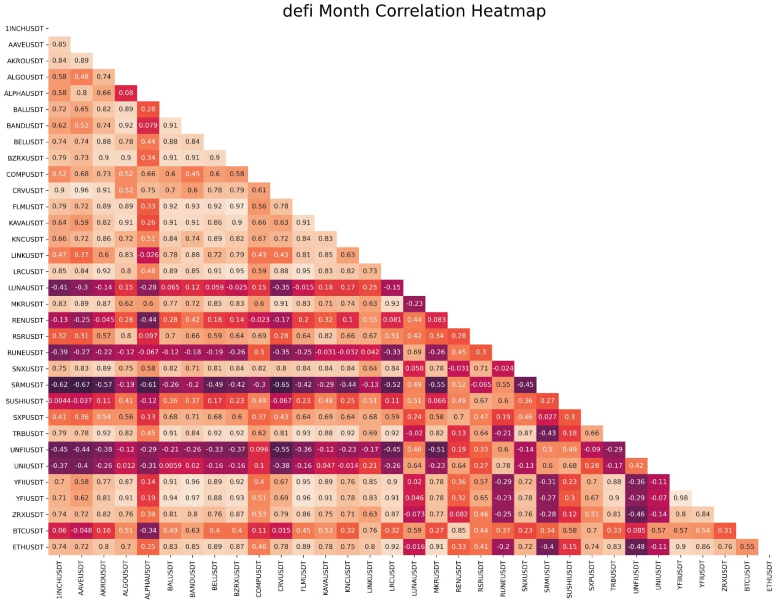
P.S. - I’ve forgotten two days in a row to add in this correlation matrix one of our new guys made.
Consider it some free alpha. It’s a correlation heatmap on DeFi tokens, ETH and BTC. It’s not as closely correlated as you might imagine.
This is another one the tools we’re building for ChainPulse. Enjoy! And if you like this, please share our newsletter with your friends. The more you share the more cool stuff we are likely to showcase.
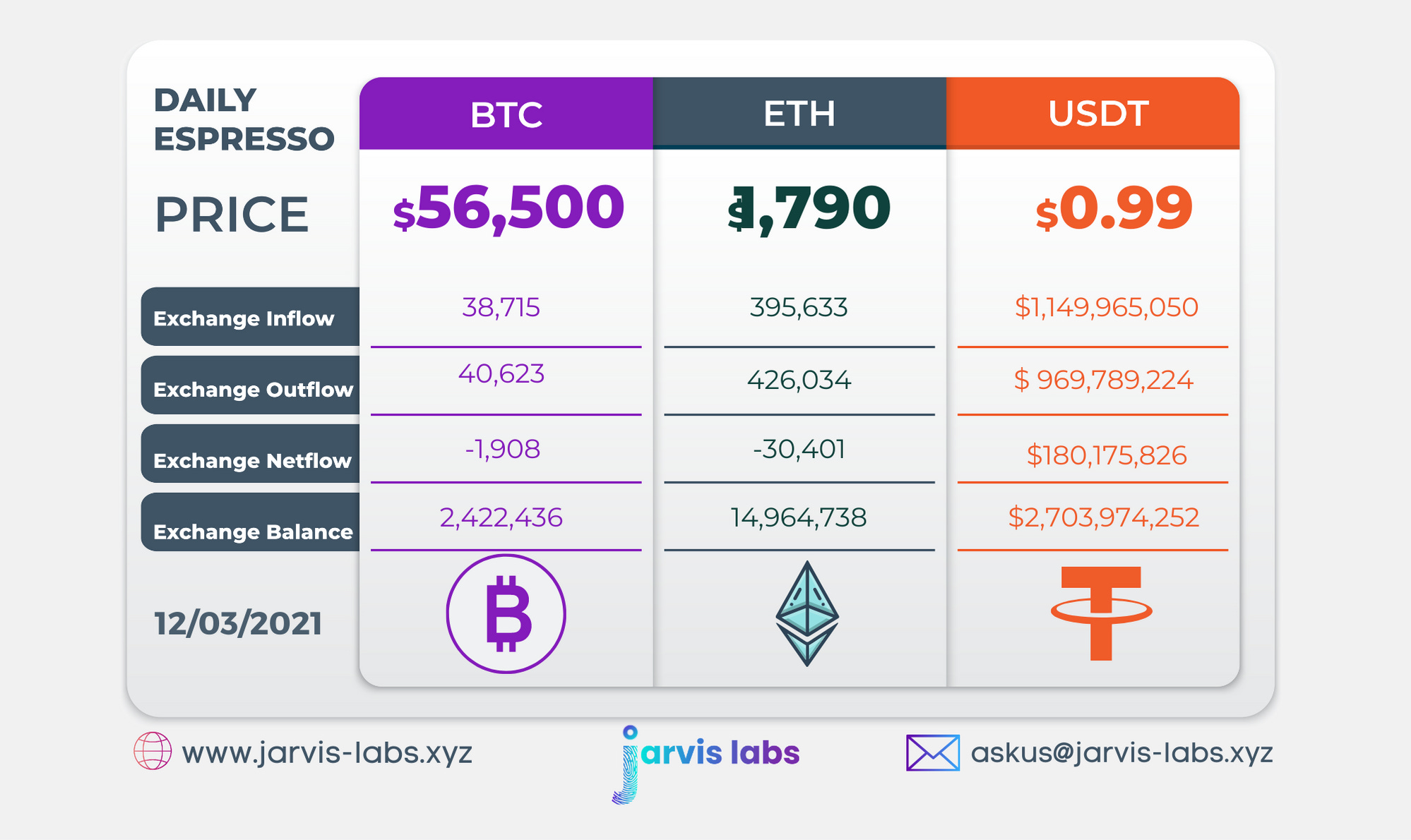
Below is our daily exchange flow data. This is a great gauge for understanding if BTC, ETH and USDT are flowing into exchange or leaving. If BTC and ETH are entering exchanges it can generally be viewed as bearish. The opposite scenario is bullish.
When USDT is flowing into exchanges it’s typically viewed as bullish. The opposite scenario is bearish.
This should only be used as a general gauge. Tagging the exact wallets these flows move into or out of helps improve the reliability of this data, which is what we do at Jarvis Labs. To date we have over 800 market mover wallets and 16 million wallets tagged all together. Consider us your on-chain trackers.