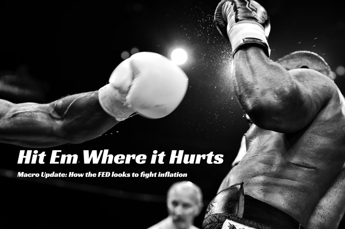
Hit Em Where it Hurts
Macro Update: How the FED looks to fight inflation

Quick note from me, Ben Lilly, before you start today’s piece.
Espresso is changing.
What originally began as a quick 100-200 word update on the crypto market has evolved into a destination for fresh insights across crypto, macro, and traditional markets.
We look to embrace this two year progression by delivering more. To do so, we will begin introducing you to the analysts that make these insights possible.
It has been six months in the making. And soon we will reveal the name of where we plan to host all of this content. Very exciting times ahead.
For now, keep enjoying Espresso as you always have. And know that the writers that emerge in the months to come have helped make what you already enjoy, possible.
So while they may seem new, you’ve already been enjoying their work.
Now without haste, ladies and gentlemen… I’d like to introduce you to our analyst that delivers some of The Labs’ most unique insights when it comes to traditional and global markets.
Welcome to the limelight, TD.
Hello World
Tires screech as my head jolts forward.
The pillow to my right tumbles to the ground while carry-ons begin shifting overhead.
Touch down.
Another day. Another city.
As the silver bird starts to glide to the terminal, the sound of seat belts unbuckling chimes louder than your local Christmas bell choir concert and drowns the aircrew’s frantic and hopeless pleadings of asking the passengers to stay seated and refrain from opening the overhead compartment.
The excitement of travel grapples me and would not let me go.
“First time here?” The lady in front of me smiled and attempted to strike up a conversation as everyone lined up in the aisle and waited to disembark.
Before my sleep deprived, semi-coherent brain reacted, the stewardess standing next to the emergency exit saw me and blurted out “Good to see you again!”
Call me a Wanderlust. Or better yet, TD. Everybody at the lab calls me touch down or TD as I’m always touching down somewhere.
I am not one for staying in the cubicle and stationery. Just like a shark, moving around constantly is what keeps me alive. Most of them don't even know what I look like as I rarely stay for long. Always out gallivanting and seeking out new places to visit.
It’s this varied perspective that provides me with a fresh perspective of the markets. Whether it’s new sights, scents, sounds, people, or culture… the travel always manages to heighten my senses to look at the market from a fresh angle.
And that’s what I look to provide to you. Unique insights on macro and global markets to keep you a step ahead.
-TD
Hit Em Where it Hurts
The best that ever stepped into the ring.
Marciano. Ali. Leonard. Spink. Holyfield. Tyson. Mayweather. Pacquiao.
In their prime each boxer displayed unimaginable blends of physical force, intelligence, and elegance.
Float like a butterfly, sting like a bee was the tag line that highlights this mythical combination to this day.
And what this sport cherished more than anything… a trait that has since been dismissed with the recent rise of Ultimate Fighting Championship… is stamina. The ability to endure pain round after round after round.
It’s this long game mentality that made the kidney shot so powerful.
It’s where the boxer holds their ground, dances around the opponent, and waits for the ideal moment… One where they lure their tired opponent to expose a portion of the back where the kidney resides… Inviting a boxer to strike with precision.
If done well, it’s a blow that brings a world of hurt. It’s not the flashy one-two punch that leaves the opponent trying to remember what day it was.
The kidney shot ends the match because it hurts.
And it’s this kidney shot that the Federal Reserve chair Jerome Powell is looking to deliver to the household balance sheet. At Jackson Hole, the FED chairman made no attempt to mask his intention to weaken the economy and attack inflation from the demand side.
Powell does not want to destroy the household balance sheet completely. Therefore, a knockout punch is not what he is looking for, but he wants to make sure he hits it where it hurts and there might be a particular asset class that he has in mind.
Put on your glove, lace up those shoes and let’s step into the ring for a few rounds with JPow Pow.
Round One
The first step is to investigate how the ring is set up.
The two charts below illustrate why some pundits in 2021 failed to see the world would walk into an inflation problem.
The first chart below is M2 supply. In simple terms, M2 is the total money supply in the system.
The second chart reflects M2 Velocity. Velocity of money measures how many times each dollar in the system is spent. The higher the velocity, the hotter the economy. This in turn sparks inflation.
As the charts demonstrate, while the US government started its loose money policy in 2000, there was a sharp rise in the curve in the top chart and the velocity dwindled in the bottom chart.
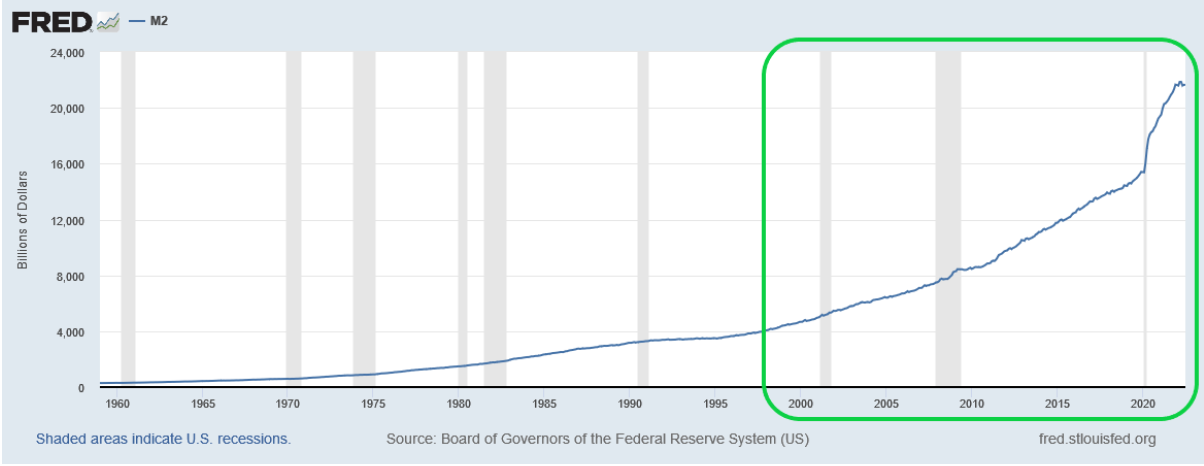
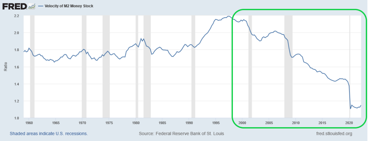
The “inflation is not possible” experts reasoned that while the money supply increased, the velocity headed lower and lower.
Inflation mostly happens when the velocity of money goes up, not down.
Which begs the question: Why did velocity keep falling?
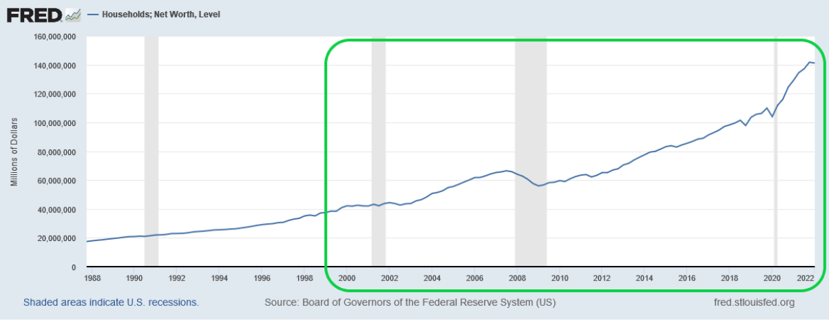
Given the red hot stock market and the stellar performance of the US housing market over the past few years, we began to see some clues. The excess liquidity that the US government provided to illicit business expansion and economic growth all went into financial instruments or assets. Instead of financing and generating productive activities to the economy, the stock market and house market acted as a blackhole that sucked up every nickel and dime.
The chart below shows the net worth of US households since 1988. The trajectory of the line in this chart versus the M2 supply chart is eerily similar.
Same similarity applies to housing sales data.
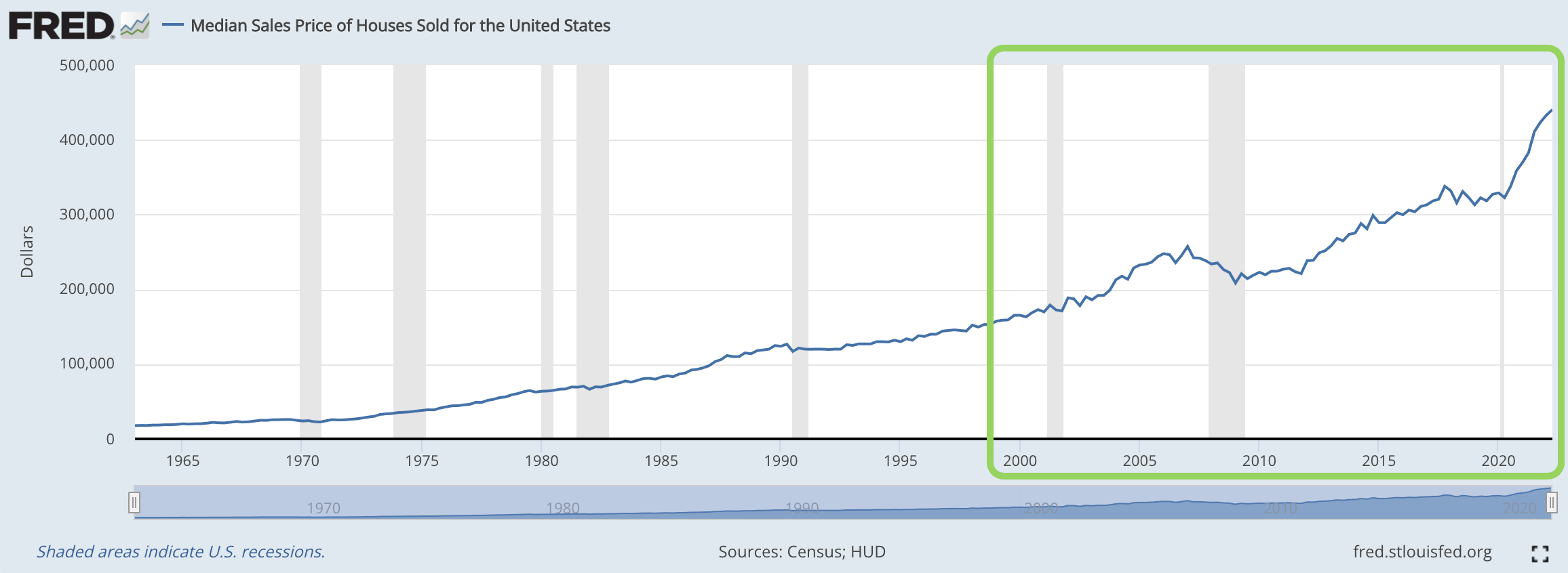
These data points help explain why velocity went down even though money supply increased - No one was spending. Instead the general public invested in real estate and stocks.
As the public stuffed money into these inflation sink holes, the velocity of money slowed down and it simultaneously gave birth to the largest asset inflation we’ve ever seen.
Which is where the real story begins.
Round Two
Despite JPow Pow unleashing jab after jab, the housing market is still quite resilient.
Per the chart below, housing has gone nowhere but up since the 2008 subprime mortgage crisis. The trajectory of the line in this chart coincides with our previous charts… And similarly, lines up well with M2 money supply.
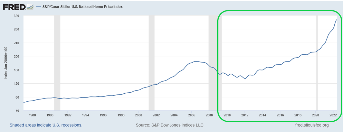
In fact, here are the two lines together since 2008.
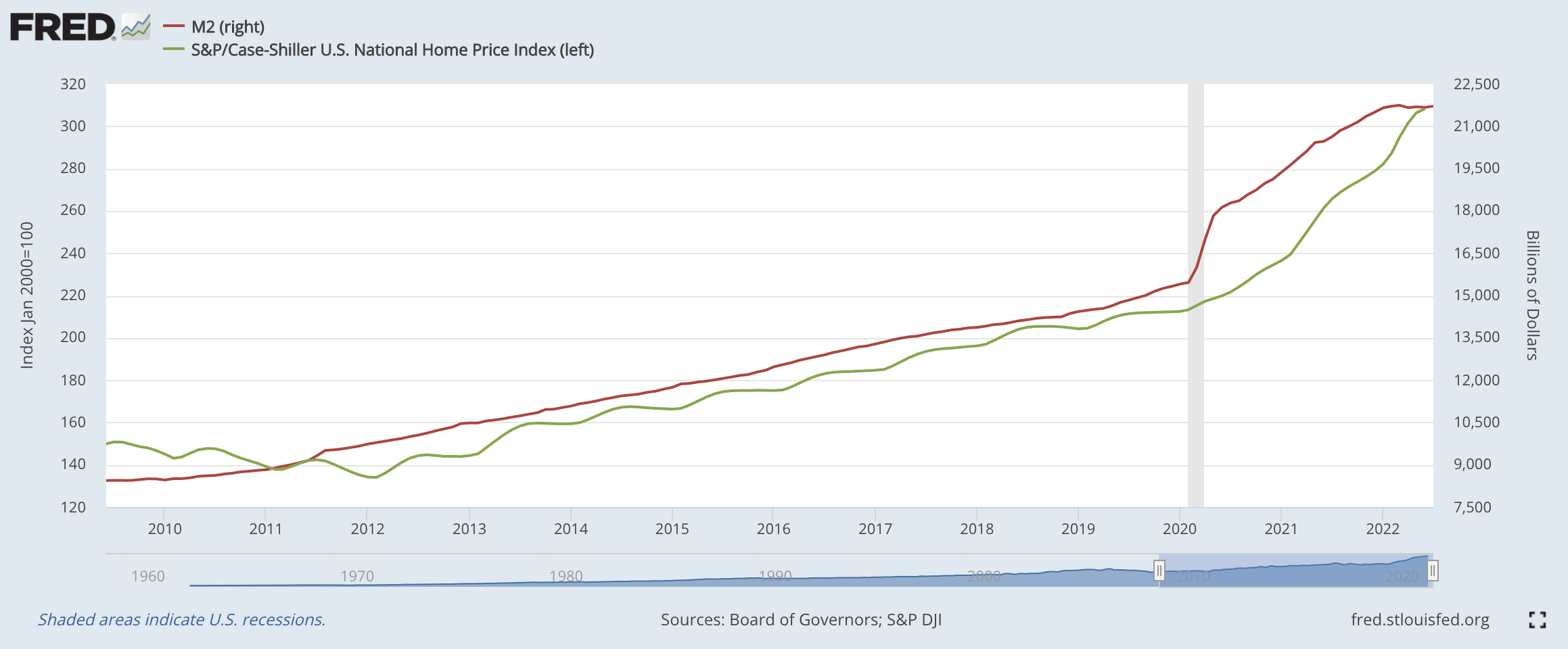
Housing is a component or asset class in the household balance sheet that the Federal Reserve might be targeting to curb inflation.
But why single out the housing market?
Housing is a major component in the calculation of the Consumer Price Index (CPI). CPI is the go-to benchmark of inflation for the Federal Reserve. And the FED formulates its policy with CPI reading.
While stock market prices do not factor in the calculation of CPI, housing price does play a pivotal role in the formulation of the CPI. Meaning any major movements in housing prices can mean doom or create a cause for celebration for the FED.
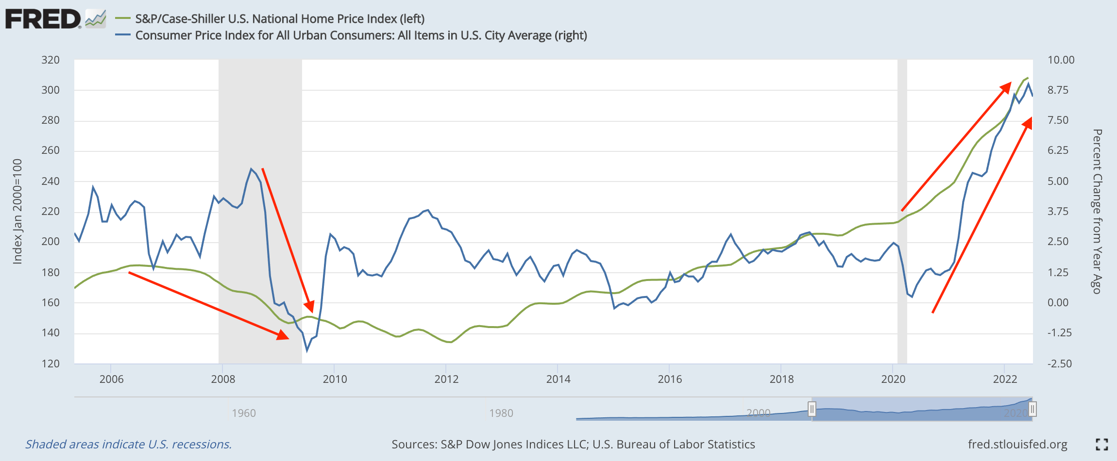
It’s what happened on the heels of the 2008 financial crisis. You can see inflation turning negative as the housing index took a nose dive. Then more recently, you see housing prices elevate, with inflation following close behind. These are annotated with the red arrows below.
To really expose the backside of the economy, we have a chart of all the components and its percentage weight that made up the CPI reading. The components are re-weighted every year. The kidney… or housing… is in orange below.
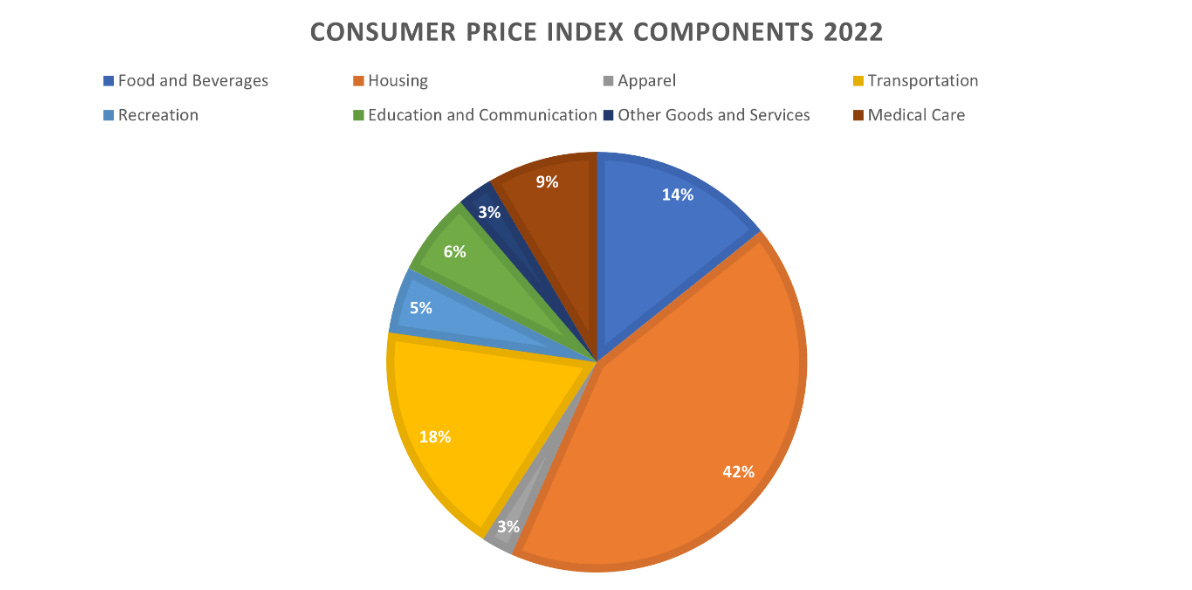
BLS Relative importance of components in the Consumer Price Indexes, December 2021
Housing and its associated costs account for 42% (42.363% to be exact) of the CPI calculation. Moreover, if we drill it a level deeper, there are two line items within the Housing category that reflect the cost of housing.
One is the rental cost and that is under the name of “rent of primary residence”. The other one is called “owner’s equivalent of rent of residences.” It sounds like a mouthful, but it is just the replacement cost of how much a homeowner has to pay to live in his or her current neighborhood.
The rental cost stands at 7.398% of the housing component and the replacement cost is 24.251% of the housing component. These two combine for 31.649% of the housing cost in the CPI formula. Taking this calculation one step further, rental cost and replacement cost are roughly 13.407% of the entire CPI calculation.
Housing cost is a heavy hitter. Meaning the FED has every incentive to cool down the housing market.
Slowing down the housing market reduces the household balance sheet/net worth and it should make the general public more aware of their financial health. In turn this will mean lower inflation.
For heavyweight JPow Pow, this is all about delivering the kidney shot. And he won’t stop until he gets it.
I hope you enjoyed my first piece. Please comment below if you have any thoughts of your own you would like to share or any questions at the top of your mind. I look forward to getting to know you all.
Wheels up as I head to my next destination…
Talk soon,
TD


