Another Weapon
Place the Thermocap in your toolbox for later


At a certain point they begin to look the same.
Those were my thoughts when bitcoin was bottoming out in late 2018. It was a time when capitulation was on full display. Crypto projects were raising capital, cutting staff, and even closing up shop.
A Bloomberg news story captured the state of the market relatively accurately… “Crypto Market Crash Leaving Bankrupt Startups in its Wake”.
This was the nuclear winter every bitcoiner, crypto project founder and business owner feared. Bitcoin was being left for dead.
For me I was scouring chart after chart, metric after metric, and anything I could get my hands on to determine if this was the bottom or not.
And one evening I was looking at one metric, and thinking it was a different one than it actually was. That’s when I shut my computer down and realized they all look the same.
So I went back to the fundamentals of what bitcoin was, where it was going, and if it could make it during the next halving.
The next few days were spent finding out how many developers were in various communities and making sure the nebulous of the networks were still intact. This is what mattered most in my opinion since the technology was still be developed.
And while the conferences were night and day from the 2017 and 2018 years, suits were beginning to out number hoodies. Meaning smart money was still interested.
Now, I tell this story to say while charts do tell you a lot, they don’t tell you everything. And this type of in person research is important to build conviction when charts are bottoming out.
But when it comes to a top, finding the signal in the market is not as easy.
Conferences will be active, scammers will be seemingly ubiquitous, and crypto projects will be raising gobs of cash. This we all intuitively know.
Charts in a euphoric setting act as a better guide than during a capitulation period. When they start signaling we might be near a top, we can start to look for the signs elsewhere for confirmation.
So in order to prepare, our team is running through the library of indicators and metrics we plan to lean on when we’re questioning if we are at a top or not.
That’s because some will flash before others, and if we have a good base understanding of what the metrics are, then it’ll be easier to dismiss the flash or consider taking action.
So today, we add another chart to our arsenal and hit on the Market cap to Thermocap ratio.
The ratio is a metric first put forth by Nic Carter from CoinMetrics. It takes market cap and divides it by Thermocap.
Thermocap is the “aggregated amount of coins paid to miners and serves as a proxy to mining resources”.
It’s a rather stuffy way of saying cash flow or revenue paid to miners.
Many say it serves as a proxy for the amount spent on security. There’s definitely some merit to that as the network is secured by miners.
So in a crude sense this is how much the market is valuing the security of the network.
In this way we can see if the market is overvaluing it or undervaluing it on a historical context as thermocap is the aggregate amount… Which means total amount ever.
Now, looking at the chart below we have a green zone at the bottom, which indicates bitcoin’s marketcap is trading at a discount to the security of the network. And then a red zone which is indicating it’s a premium.
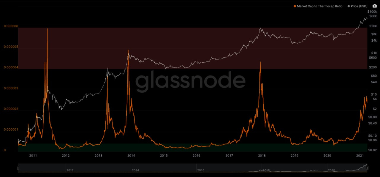
Historically this metric can move very fast at peaks. So when it spikes into the red zone it’s a great time to check out other on-chain metrics asap and assess if the time is now.
I tend to place some weight on this one as there’s more fundamental guidance to it compared to a chart of moving averages… Looking at you Pi Cycle.
Currently, we’re climbing on the Market cap to Thermocap Ratio which tells us what we seem to be repeating day in, day out in a chanting drum beat circle type of manner…
We still have more room to the upside.
Your Pulse on Crypto,
B
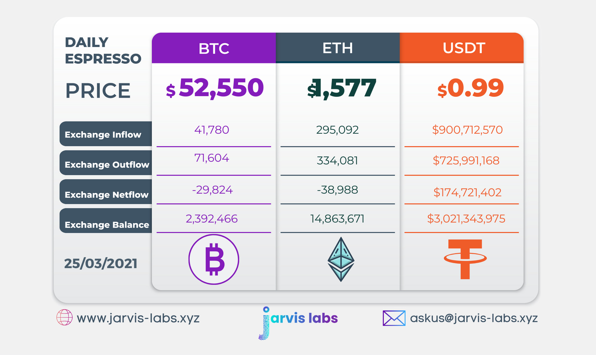
Below is our daily exchange flow data. This is a great gauge for understanding if BTC, ETH and USDt are flowing into exchange or leaving. If BTC and ETH are entering exchanges it can generally be viewed as bearish. The opposite scenario is bullish.
When USDt is flowing into exchanges it’s typically viewed as bullish. The opposite scenario is bearish.
This should only be used as a general gauge. Tagging the exact wallets these flows move into or out of helps improve the reliability of this data, which is what we do at Jarvis Labs. To date we have over 800 market mover wallets and 16 million wallets tagged all together. Consider us your on-chain trackers.