A Higher Trajectory
A Macro On-chain Analysis
I was running late.
It happens more often than I care to admit.
My tendency is to blame my mother in saying I was born five minutes late. When in reality I tend to get sucked into whatever I’m doing at the time.
On this particular day I was jotting down a few notes after reading a chapter on Indian tribes. It’s a topic that likely seems random… But in reality I was researching decentralized structures.
In the ensuing rush to get out the door after I realized what time it was, I forgot to place my sell orders for the next trading day.
As I went about my morning routine the next day, I was reminded about this forgotten task as a news line ran across Bloomberg. So instead of logging into my brokerage account later that day and setting up those orders… I decided to take five minutes and review a few facts about the company.
I found a string and gave it a tug.
What unraveled over the next several hours of research was a U-turn decision. Double down on my initial investment. Not to sell.
My thinking was basic. The market was moving in my favor. Fundamentals didn’t scream to me it was overvalued. And the chart showed no immediate signs of slowing.
Why would I clip my winner?
Turns out by taking my time and not rushing to sell my profitable position I made about twice as much then if I sold that morning.
My lesson - sit tight on a winner.
And when it comes to bitcoin and crypto today, it’s a lesson that serves me well. It’s one of the main reasons I keep leaning on these macro on-chain charts. They serve a role in helping me sit tight, let the overarching trend run its course, and let the profitable trades run longer than a younger version of me would.
Which is why I dedicated today’s issue to exactly that. A macro view of what on-chain data is saying in order for us to better understand what the overall trend is saying and when we can start trimming back some positions.
Let’s get at it.
It’s Somewhere in the Middle
To start off let’s first pull up a chart from PlanB.
It’s a chart comparing the price action after the last three halving events. What immediately jumps out is how 2012’s halving peaked out over a month earlier than 2016’s halving cycle (light blue versus dark blue line).
And the current halving cycle (red line) is tracking in between the two.
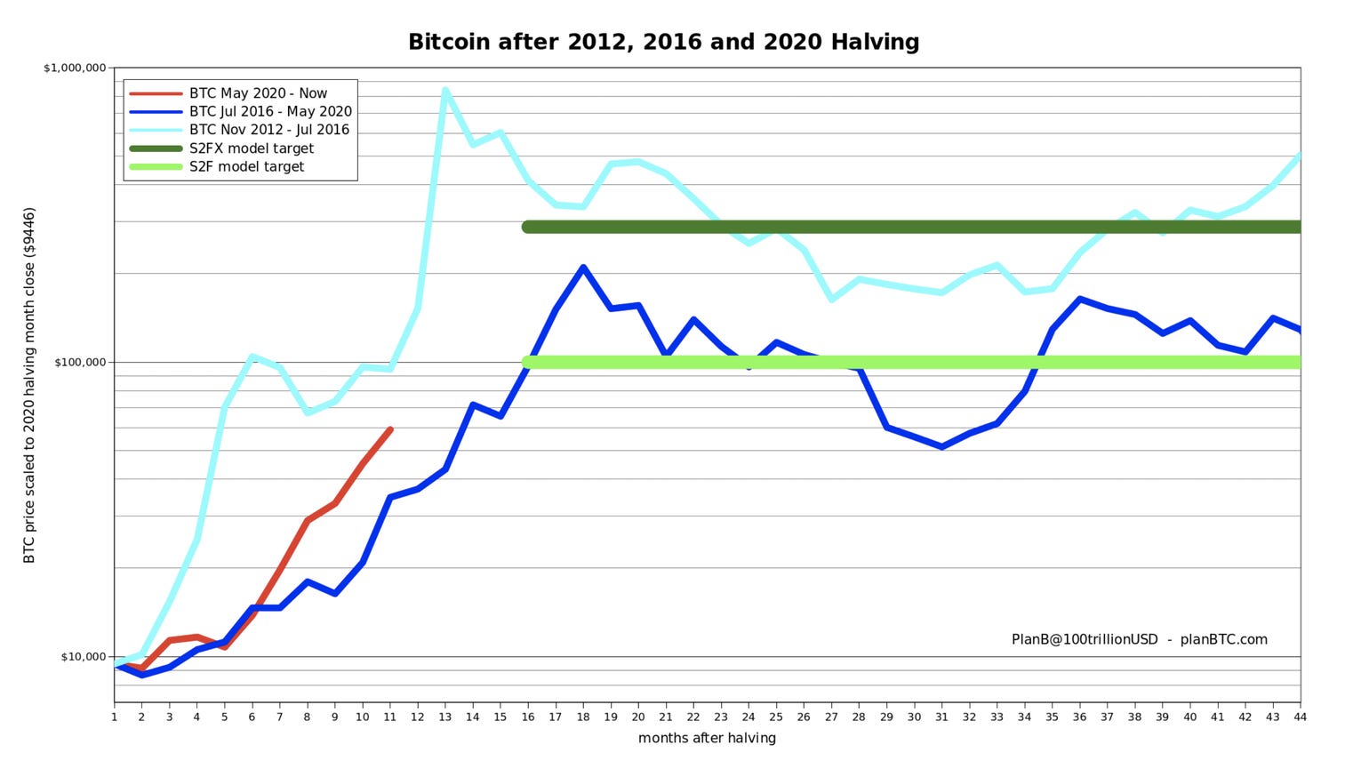
This is important to understand because the blowoff top in 2013 was much faster than 2017. And as you’ll see in a moment, understanding how a top might pan out helps frame our later analysis.
The On-Chain Charts
PnL
The first on-chain chart we’re looking at today is the Net Unrealized Profit/Loss or NUPL.
This is a way to look at how much of the network is in profit or loss. Since price tends to go higher over time, the network tends to be above zero unless it’s in a crypto winter.
In order to differentiate how much of the network is in profit, the Glassnode team color codes the chart. What we care about right now is the areas in blue. This is the euphoria stage.
Taking a look at the chart below we can see if NUPL is blue, it’s not an immediate signal to sell.
In fact, we sometimes witness prolonged periods in the blue stage. This prolonged time in the blue corresponds to faster price action near the peak. In 2017 we got a quick lived moment of being blue (cue some blue man group music) likely because the run up to the peak wasn’t as fast.
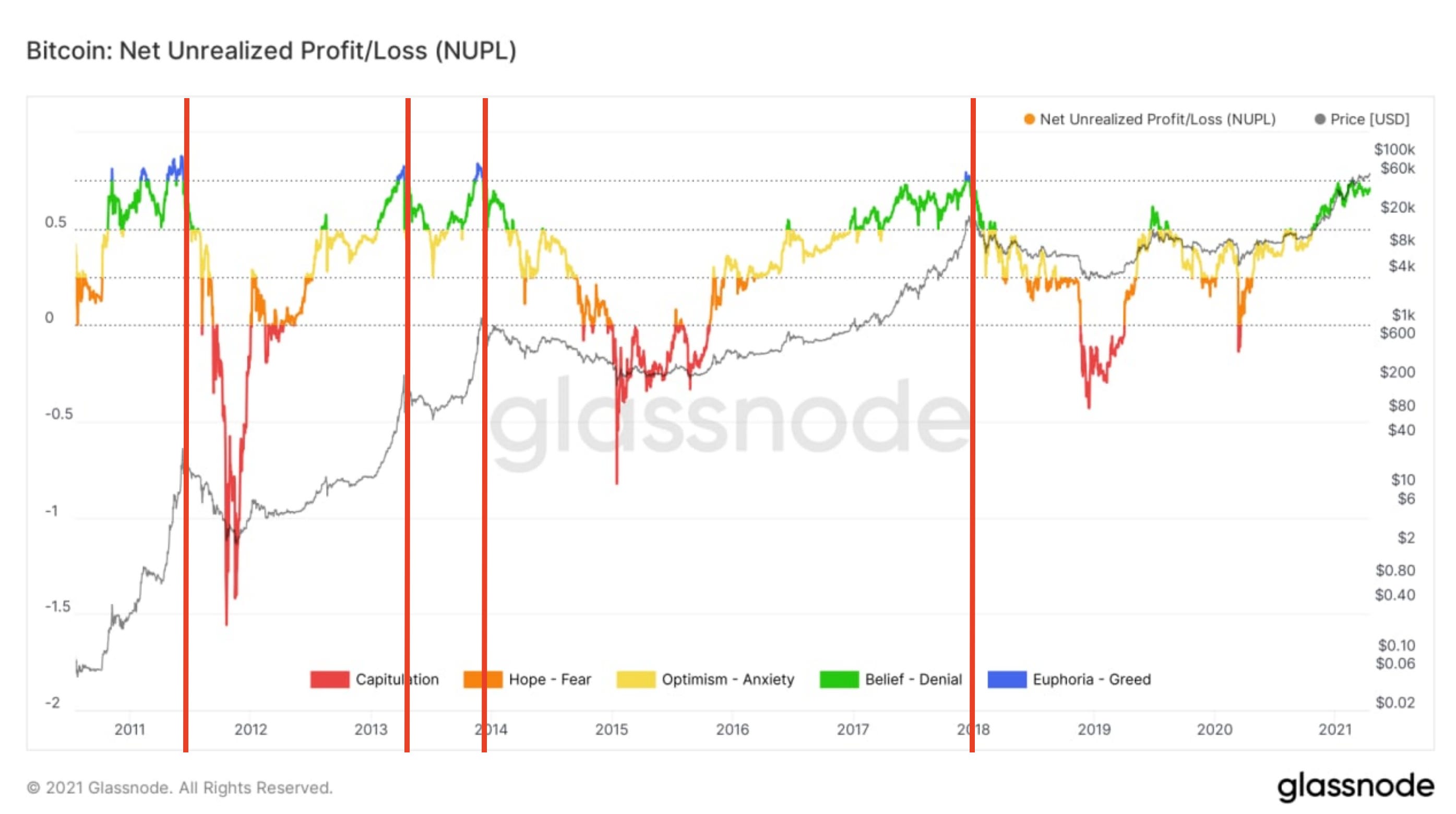
Based upon the first chart of today’s issue from PlanB, we can see we’re setting up for something in between. We should get enough time in the blue to start trimming portfolios before it’s too late.
Exchanges
The second chart of the day looks at the net transfer volume from/to exchanges.
I use a 90-day moving median to take out some noise. This is fine when looking at big picture analysis like we are today.
In doing so an interesting pattern emerges.
Now, if you ignore the green and the red for a minute and simply look at the black circles… We see the metric in this chart below tends to take a strong dip, consolidate for a moment, then go vertical.
Similar to what many in technical analysis describe as an inverse head and shoulders patter.
When the pattern emerges and the metric forms a halving high, price not only rises as well, but it does so with a more vertical trajectory.
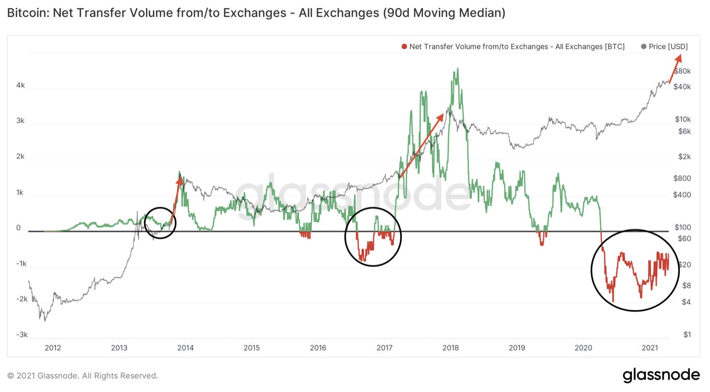
To date, price has risen faster than it did prior in its cycle.
Keep in mind when the net transfer volume forms a new cycle high we saw one month until the peak for 2013 and eight months for 2017.
Circling back to the first chart of the day, we’re somewhere in between. When the metric form a new cycle high we’ll likely be a few months away from the top.
Miners
The third chart of the day looks at miners.
In particular the miner net position change.
This chart is somewhat self explanatory. When the chart is red, miners are selling and when green they are hodling.
Currently, miners are hodling. And looking back over the last two years when miners flip from hodling to selling, we tend to get bullish activity.
Pairing this chart up with the other charts of today, this is also hinting at some aggressive moves to the upside.
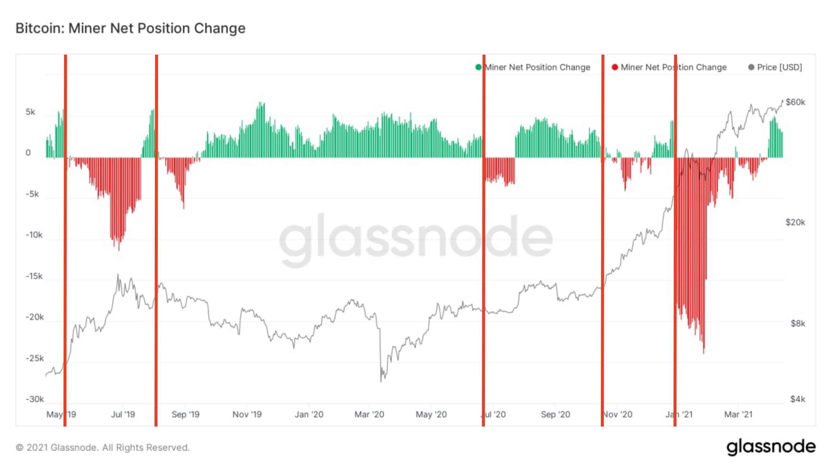
Miners are holding, this historically is a good sign especially when it flips to negative during a bull run.
HODLers
The last chart of the day is one that we hit on a lot here, which is percent of supply last active 1+ year ago.
It’s a way to see if hodlers are now selling to lock in their halving cycle profits.
Right now we’re trending down, which is typical in a bull run. No surprise there. To see how much further it can go let’s take a quick glance at the percent of supply last active when price peaked. I laid it out below.
- 2011: 30%
- 2013: 39%
- 2017: 44%
- Now: 55.5%
Based upon the trend here, let’s make a relatively safe assumption… Let’s say if this metric drops below 50% it warrants our attention.
I placed the black line in the chart below just a hair below 50% for reference. We have some room.
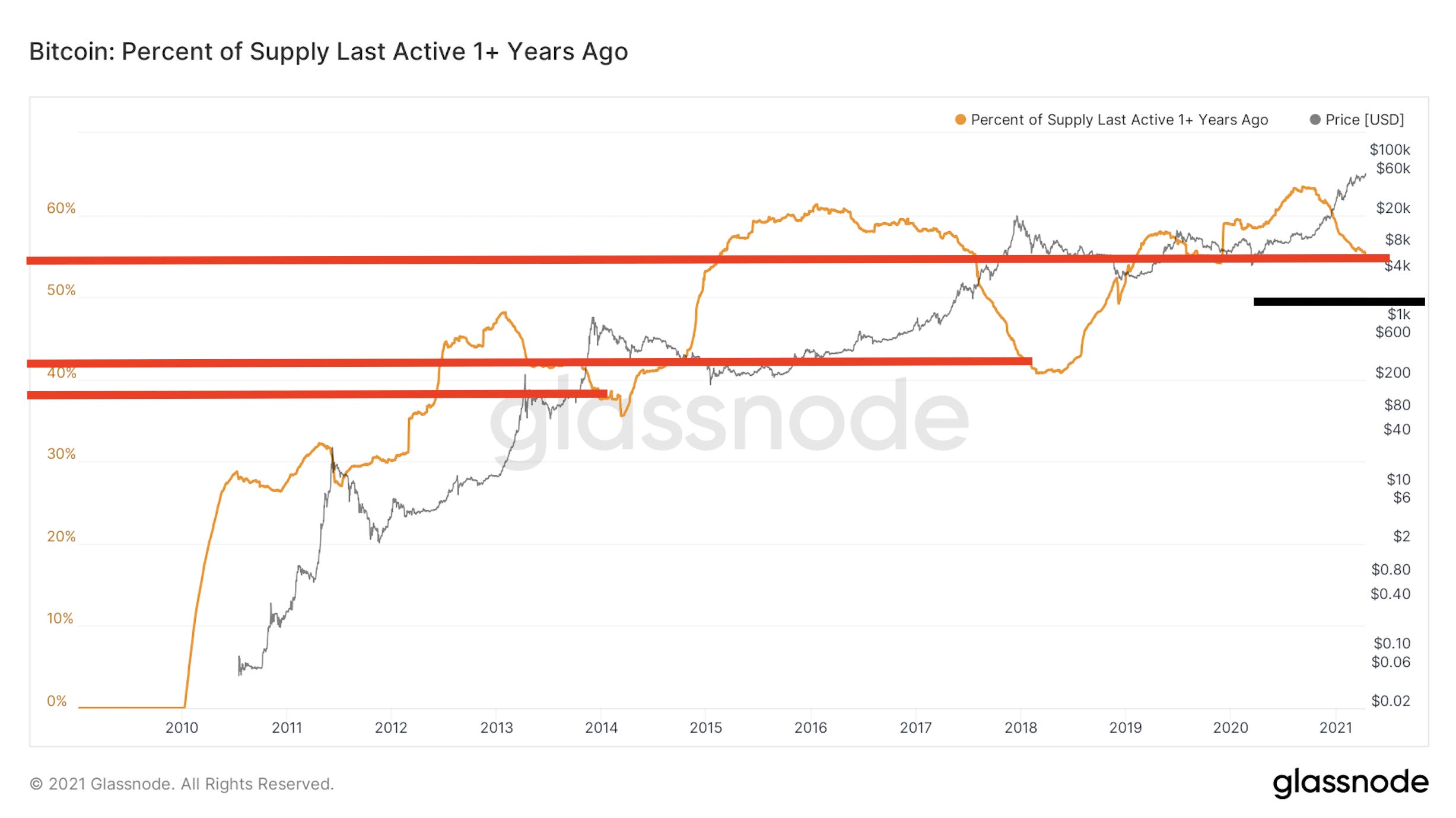
Our macro on-chain view is shaping our thought process at Jarvis Labs. Price appears to be nearing some fast action to the upside and has room to run. But at the same time, there is no rush to the exit in the coming weeks.
As price keeps doing its thing, we will continue to draw on these charts along with the others we’ve covered at Espresso.
Let the trend do its thing.
Your Pulse on Crypto,
B


